
Categories: Fonts

Oscar - Dutch Architectural Lettering
OTF | 12 Fonts | JPG Preview | 3.7 Mb RAR | SALE PAGE
- Oskar is a all-caps type series inspired by Dutch architectural and commercial letterings from the early 20th century, particularly those painted on walls and shopfronts or executed in metal. This style of letters did not exist as printing type but was cultivated by sign painters, draftsmen and architects, and passed on in lettering manuals. A first version of Oskar was initially drawn in 2002 for the lettering of a heritage-protected school in The Hague, designed by architect Jan Duiker in 1929. Since then, the family has been expanded into multiple styles and weights. Oskar is available in two ‘flavours’ — One and Two — each in three weights, and each weight accompanied by an inline variant. Oskar One stands firmly in the tradition of Dutch 1920s lettering, with pointy apices and expressive, less conventional letterforms. Oskar Two is more tamed and regular, closer to classical geometric sans-serifs yet still exuding its relation to the Art Deco style. The carefully drawn (and manually hinted) inline styles highlight Oskar’s qualities as a versatile display and titling face, on screens as well as on facades.
Categories: Fonts

Macula - Three-Dimensional Letterforms
OTF | 5 Fonts | JPG Preview | 4.1 Mb RAR | SALE PAGE
http://www.boldmonday.com/en/macula/
- Macula can be described as the ‘impossible typeface’, since its design is based on the concept of impossible objects. This optical illusion was explored into great detail in the 1930’s by the Swedish artist Oscar Reutersvärd, and simultaneously made very famous by Dutch artist M.C. Escher. Macula comes in five styles, some are great to use just by themselves and some are specifically meant for use in layers. By stacking different styles of Macula on top of each other, beautiful multi-coloured typography becomes possible.
Categories: Fonts » Single Fonts

Courtesy Script Pro
OTF | 1 Font | JPEG Preview | 1 Mb RAR | SALE PAGE
- As in Victorian times, the precious, hand-lettered look of custom stationery is back in vogue. Enter Courtesy Script, an original creation by Alejandro Paul. Courtesy captures the elegance and propriety of finely practiced Spencerian penmanship, in particular the Zanerian school. Its lowercase is notably understated, a simple monoline with very wide connections that ease readability. In the capitals, Courtesy adds variety in both the weight of the strokes, and in degrees of flourish — from merely fancy to over-the-top engrossery. Based on an alphabet found in a 19th-century penmanship journal, Ale created hundreds of additional, stylistically complementary letterforms. Alternate capitals and lowercase letters, swashed lowercase forms, and ending and ornamental swashes; numerals, punctuation, and non-English and accented characters. With virtually endless ways to customize its use, Courtesy helps designers create fluid, signature looks on stationery and invitations, book covers, fashion layouts, and packaging.


Categories: GFXTRA Special » Special Fonts

Horizontes Script Font Family
OTF | 2 Fonts | JPEG Preview | 4.5 Mb RAR | Horizontes Script Font Family
- Horizontes Script is the result of Panco’s personal experimental calligraphy project. Designed with the goal of finding a balance between spontaneity, elegance and beauty, his first typography was born and inspired on the horizon´s blue line from the city he was born. Relaxed, energic and very natural. With different alternatives of proportion, a wide range of ligatures, initial letters, terminals, floritures, Horizontes Script comes in two weight for large and small formats. “Horizontes Script” results in an ideal font for titles and short texts that find something else to show more than just words. A casual and harmonious font with strong personality. Great for projects that need to connote class and style without being too formal. Ideal for design that need to transmit warmth and humanity feel to be applied on invitations, labels, poetry, songs or thoughts. Created by Panco Sassano, under the supervision of the experienced typographer Ale Paul – in a duo work - “Horizontes Script” is the latest typeface by Sudtipos.
Categories: Fonts

Arbordale Font Family
OTF | 2 Fonts | 590 KB | Sale Page
- A calligraphic script with roots in the midwest, Arbordale™ intends to be elegant yet straightforward. OpenType users benefit from an array of alternate glyphs for lowercase characters including optional non-connecting (contextual alternate) characters for word endings. Other features include crossbar ligatures for common letter pairings, case-sensitive quotes and smart apostrophes. Arbordale Pro extends the character set to support Eastern European and Baltic languages.
Categories: Fonts

FF More Font Family - 30 Fonts 859€
30 OTF | 27 MB | Sale Page
- The family has 30 weights, ranging from Light to Black in Condensed, Normal and Wide (including italics) and is ideally suited for advertising and packaging, book text, editorial and publishing, logo, branding and creative industries as well as small text.FF More provides advanced typographical support with features such as ligatures, small capitals, alternate characters, case-sensitive forms, fractions, and super- and subscript characters.It comes with a complete range of figure set options – oldstyle and lining figures, each in tabular and proportional widths. As well as Latin-based languages, the typeface family also supports the Cyrillic writing system.
Categories: Fonts


Catalina Italics Font Family - 34 Fonts 340$
OTF | WOFF | 13.7 MB | Sale Page
- Earlier this year I visited a bakery in Newport Beach, CA and fell in love with the organic design and typography of the place. Hand-drawn menus, table cards, chalkboards, and wall quotes surrounded the charming spot. It inspired me to create a new font family based on the combination of hand drawn fonts. Included in this package are 5 font families, with 2 graphic ornament fonts. Each font family contains at least a light, medium and bold.Here is a breakdown of what’s cookin' at Catalina’s Bakery:Catalina Anacapa: Tall and skinny, this font comes in 3 weights for both sans and slab serif styles. It includes contextual alternatives (giving 3 versions of each letter), stylistic alternatives for select letters (A, K, P, Q, R, Y) and also includes Small Caps.Catalina Avalon: Based off Anacapa, this sub family has a high contrasting line weight. It comes in light, regular and bold as well as an inline alternative for both sans and slab serif styles. Avalon also includes opentype features such as contextual alternatives (giving 3 versions of each letter), stylistic alternatives for select letters (A, K, P, Q, R, Y) and small caps for each letter.Catalina Clemente: In a more standard width, Clemente is one of the two sub families that can be used for paragraph text as well as headlines. It’s organically geometric in style and comes in ALL CAPS and lowercase, includes upright and custom italics, and has the opentype feature giving 3 versions of each letter.Catalina Script: A great compliment with the display sub-families, Catalina Script rounds out the package with a hand-drawn cursive flair. It includes contextual alternatives (giving 2 variations to each letter) as well as stylistic alternatives for many of the capital and lowercase letters. It has special ligatures for some letter combinations, and titling alternatives for all the capital letters.Catalina Typewriter: The second of the paragraph text sub-families, this typewriter inspired hand-drawn font family works great as either a display or paragraph text. It has contextual alternatives with 3 versions of each letter, and comes in both upright and custom italics versions.Catalina Extras! These two fonts go perfectly with the Catalina Family. They includes borders, frames, arrows, banners, flourishes and more. Catalina Flourish has all of it’s options in a light and bold style, to use the light version type all lowercase letters, then to make something bold, used it’s uppercase (or shift+) characters. For a breakdown of graphic/letter correlation, see the breakdown PDF.All of Catalina was drawn by the same hand, using the same ink and technique. While they contrast in their type styles, they work together perfectly to create one cohesive font family.
Categories: Fonts

Hand Shop Pack Font Family
OTF | TTF | 8.67 MB | SALE PAGE
- We’re really excited to unveil our all-new line of ‘HAND SHOP FONTS’. As the name suggests, these are fonts that have a hand-made or hand-typography feel reminiscent of shop signboards from the past with an attentive focus by the shop owners, always looking to discover exciting and unique ways to promote their products or services.
- While for decades typography has strived hard for perfection, one of the routes taken by the typography world as a whole has been to eliminate any form of ‘human imperfection’ in the typesets, but what about the times when you DO want to send across emotions of a personal human touch through your fonts?We did a step back...these fonts will give your shop-signs a personal touch, telling your buyers that they will get personalized attention, be it through an online or an offline business…We hope you love them as much as we do.![/center]
Categories: Fonts

Movatif Font Family
OTF | TTF | 584 KB | Sale Page
- Movatif is a 7-weight, mashed up 20th Century sans, with ideas from a variety of fonts from that Century. OpenType savvy applications automatically swap certain letters to add more visual interest and completely freak people right out. So, let’s say you use M and A together, they’ll likely snap together in a cool or at least somewhat interesting kind of way. Familiar parts interact in a unique way that will give your design a customized look and kind of a bleak 1970’s malaise. . . also a bit of hipster twerpiness. For best effect: juxtapose with images of fixies, unicorns, Phil Collins, man-purses and red VHS tapes.

Categories: Fonts

Valeria Script Font Family
OTF | 2.1 MB
- A mix of elegance, sensuality, legibility. This Open Type, called Valeria Script, tries to be sentimental.Very useful to those who love flowing script, based on calligraphers, with a personal touch of the designer Maximiliano Sproviero. This ornate is commonly used on signature flourish to invitations, packaging, restaurant menus, display, because of its decorative qualities. Valeria Script has all the Open Type functions, meaning every written word will be original, with the possibility to make every glyph look different. The type has lots of alternate characters, decorative ones, swashes to simulate signatures, ligatures which ligate Caps with minuscules.Valeria Script Cola Pen is the choice for those who are more sensitive. Cola Pen is the name of a calligraphy home-made tool being its particularity that it makes ink explosions while writing. A word written by Valeria Cola Pen will be unique; the ink splats give the sensation of a real manuscript with a gorgeous landscape.


Chameleon - 3 Completely Different Designed Types
16 OTF Fonts | 1.87 MB | Sale Page
- Chameleon consists of 16 fonts based on 3 completely different designs. Different but specially designed to complement each other. Together they form a well-balanced design kit suitable for many different projects, e.g. invites, menus, magazines, brochures, packaging, etc.Chameleon comes in three styles: 2 outline versions and a basic (solid) version. To combine Chameleon with Chameleon Fill, you will need an application that allows you to stack text frames. Once you start layering different fills, like a true chameleon, you can change colors and patterns. Simply place several layers on top of each other, choose from 7 fills to determine your pattern and assign a color to the fill. Always place one of the outline versions of Chameleon on the top layer.Chameleon Pen was added to give you the possibility to spice up your design with a personal touch. It is a charming handwritten font, which was first written out with a dip pen and ink, then scanned in and digitalized. It comes in regular and italic.And then there is Chameleon Sketch for a bit of nonchalance to add to your designs. The Outline, Hatch and Solid version can be used separately, or stacked to create a shadowy or multi-colored effect. On top of that, you'll find 102 glyphs of extra fun to play with in Chameleon Sketch Extra.

Galano Classic - A Modern Interpretation of The Geometric Genre
40 TTF | 40 OTF | SALE PAGE
- It pays again tribute to the geometric shapes of Futura, Avant Garde, Avenir and the like. However, instead of again resulting in a modern interpretation of the geometric genre, Galano Classic prefers to stay in the past, characterized by a moderate x-height and details like the long stretched leg of uppercase “R”, as well as the traditional shaped lowercase “g”, to mention only a few. Galano Classic, compared to Galano Grotesque, includes lots of redesigned glyphs and consequently adjusted kerning pairs, an extended number of alternative characters, ligatures and opentype features to match a great amount of design applications. It comes in 10 different weights with matching italics containing 555 glpyhs per font. Although, Galano Classic was planned to be the display version of Galano Grotesque, it feels great in small sizes and long text passages, too.

Galano Grotesque - Harmonization of Width & Height
40 OTF | 40 WoFF | 3.5 MB RAR | SALE PAGE
- Galano Grotesque is a geometric sans in the tradition of Futura, Avant Garde, Avenir and the like. It has a modern streak which is the result of a harmonization of width and height especially in the lowercase letters to support legibility. Galano Grotesque aims to be a universal weapon not only because it works great in headlines, short and long copies but also because of its subtle neutrality. It comes in 10 different weights with matching italics and is equipped with a set of powerful opentype features including alternative glyphs, fraction, arrows, ligatures and many more. An extended character set, supporting Central, Western and Eastern European languages, rounds up the family.During the design process of the alternative glyph shapes of Galano Grotesque, the interest of creating a standalone version emerged rapidly. This was the birth of Galano Grotesque Alt. Not only because of the legible and unique character created by the alternatives, but also because this could be the small copy embracing stylistic companion to Galano Grotesque. In addition to the alternative glyphs, the height of descender and ascender was increased, supporting structure and rhythm. When finishing Galano Grotesque Alt, it turned out to not only work great in small and long copies but also to be a great performer in headlines and short copies.I'm proud to introduce: Galano Grotesque and Galano Grotesque Alt.[/center]
Categories: Fonts
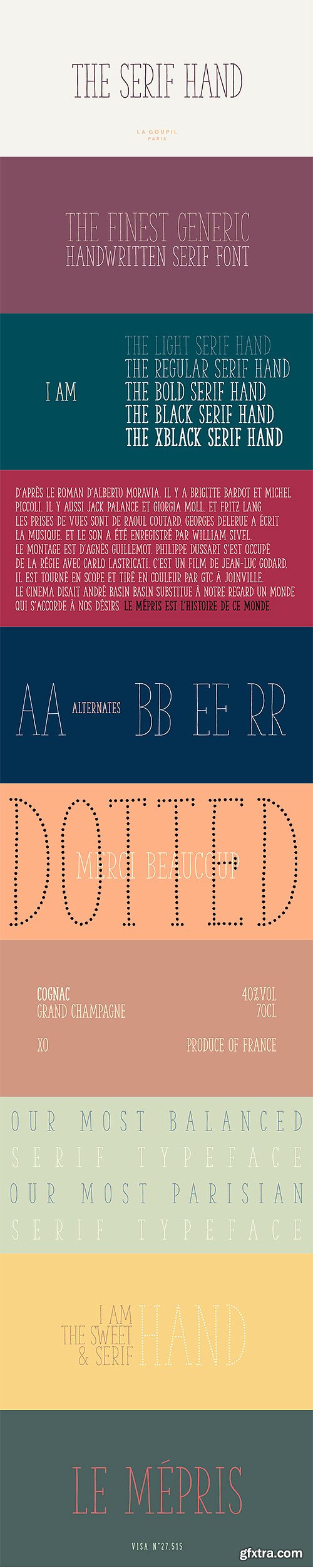
The Serif Hand - Handwritten Font Family
6 OTF Font Files | Designers: Fanny Coulez, Julien Saurin | SALE PAGE
- The Serif Hand is a handwritten font designed by Fanny Coulez and Julien Saurin from French foundry La Goupil Paris. We wanted to create the most generic, readable and balanced serif handwritten font, to work well in every kind of design. It’s an all-caps font with 5 weights and alternates : all the uppercase letters are different from the lowercase letters. We also designed a regular dotted version so you can vary your effects, and a sans serif version of this typeface, The hand.
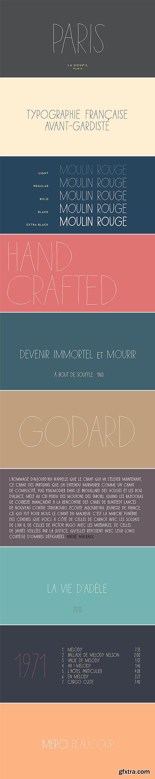
Paris Avant-Gardist Handwritten Font Family
5 OTF Font Files | Designers: Julien Saurin | SALE PAGE
- Paris is an avant-gardist handwritten font by La Goupil Paris. It’s an all-caps thin font, with extended glyphs for many languages. But the little difference of Paris from other handwriting typefaces is the Art Deco feeling that brings it a retro and directly familiar look.
Categories: Fonts
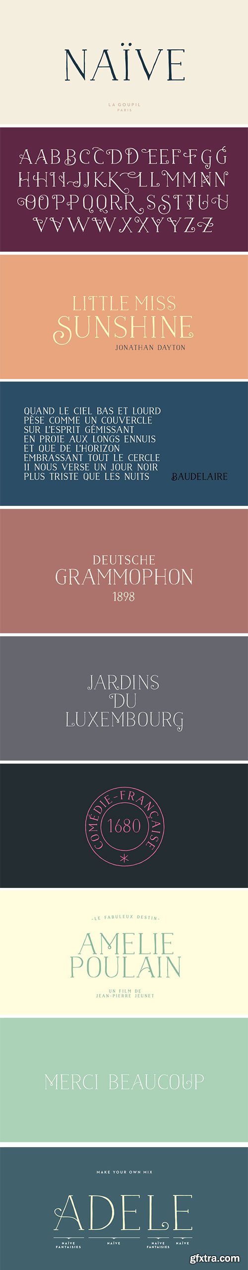
Naive Serif - Handwritten Fonts
6 OTF Font Files | Designers: Fanny Coulez, Julien Saurin | SALE PAGE
- Naïve is a serif handwritten font designed by Fanny Coulez and Julien Saurin from the french foundry La Goupil Paris. The three weights of this new parisian typography can be enhanced with three weights of two alternates fancy glyphs for each letter, the “Fantaisies”, to improve your designs and bring a more poetic and unusual feeling.
Categories: Fonts » Font Bundles

Naive Inline Sans Handwritten Fonts
7 OTF Font Files | Designers: Fanny Coulez, Julien Saurin | SALE PAGE
- Naïve Inline Sans is a handwritten font by Fanny Coulez for La Goupil Paris. The three weights of this new sans serif parisian typography can be enhanced with a bicolor interior, ribbed or full, to improve your designs and bring a feeling more modern and unusual. To do this, you must simply superimpose the 2 elements : the weight above, the interior below.
Categories: Fonts

Fierro - Heavy Geometric Retrofuturistic
2 OTF | 2 WOFF | Designer: Jko Contreras | SALE PAGE
- Fierro is a heavy-geometric-retrofuturistic typographic construction that, without any curve, still retains good legibility. These shapes are based on great bended metal pieces, which represent its name, meaning “hardware store”. It has been designed to be used in large sizes and for designs with character that look to create a strong visual block. Designed by Jko Contreras.
Top Rated News
- MRMockup - Mockup Bundle
- Finding North Photography
- Sean Archer
- John Gress Photography
- Motion Science
- AwTeaches
- Learn Squared
- PhotoWhoa
- Houdini-Course
- Photigy
- August Dering Photography
- StudioGuti
- Creatoom
- Creature Art Teacher
- Creator Foundry
- Patreon Collections
- Udemy - Turkce
- BigFilms
- Jerry Ghionis
- ACIDBITE
- BigMediumSmall
- Boom Library
- Globe Plants
- Unleashed Education
- The School of Photography
- Visual Education
- LeartesStudios - Cosmos
- Fxphd
- All Veer Fancy Collection!
- All OJO Images
- All ZZVe Vectors
 Categories


