

http://www.myfonts.com/fonts/hanoded/andorra-script/
Andorra Script is a hand written font - it is very legible, quite elegant (in an informal way) and useful. Andorra Script comes with all diacritics.
OTF | 2 Fonts | JPG Preview | 1 Mb RAR

http://www.myfonts.com/fonts/mawns/monsta-tag/
OTF | 1 Font | JPG Preview | 1 Mb RAR

http://www.myfonts.com/fonts/mawns/optien/
OTF | 1 Font | JPG Preview | 1 Mb RAR

http://www.myfonts.com/fonts/mawns/ordinatum/
TTF | 3 Fonts | JPG Preview | 1 Mb RAR

http://www.myfonts.com/fonts/mawns/ornamental-versals/
OTF | 2 Fonts | JPG Preview | 1 Mb RAR

http://www.myfonts.com/fonts/mawns/pennybridge-1563/
An old, handwritten medieval blackletter font.
TTF | 1 Font | JPG Preview | 1 Mb RAR

http://www.myfonts.com/fonts/fontdiner/american-highway/
American Highway - You can smell the chrome coming through this Art Deco inspired sans-serif, a tribute to industrial machines and American sweat!
TTF | 1 Font | JPG Preview | 1 Mb RAR

http://www.myfonts.com/fonts/fontdiner/warning/
When its gotta be urgent, send a WARNING! This retro stencil font is just the ticket to ward off any would-be troublemakers up to any shenanigans.
TTF | 1 Font | JPG Preview | 1 Mb RAR

http://www.myfonts.com/fonts/fontdiner/lionel-text-steam/
Lionel Text Steam - Take this 1940s inspired sans-serif for a spin on the Pennsylvania RR in its elegant lightest weight!
TTF | 1 Font | JPG Preview | 1 Mb RAR

http://www.myfonts.com/fonts/fontdiner/als-motor-inn/
Al’s Motor-Inn - Take Exit 49 to Al’s Motor-Inn, enjoy free color television, air conditioning and all the comforts of home with this fine 1940s style upright connecting script!
TTF | 1 Font | JPG Preview | 1 Mb RAR

http://www.myfonts.com/fonts/fontdiner/swinger/
Dig it Kitten! This 1950s style beatnik cut-paper style font is sure to knock those squares back into shape.
TTF | 1 Font | JPG Preview | 1 Mb RAR
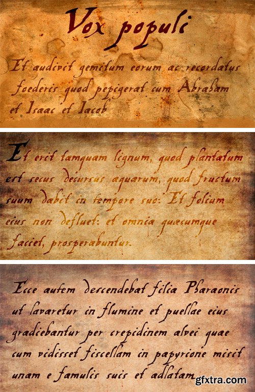
http://www.myfonts.com/fonts/hanoded/vox-populi/
Vox Populi was modeled after an early 17th century Latin translation of a Greek epos. It is a cursive typeface with a rough edge to it - not unlike the rather decayed original. Vox comes with a whole bunch of alternates and ligatures for that ‘ancient parchment look’.
OTF | 1 Font | JPG Preview | 1.6 Mb RAR
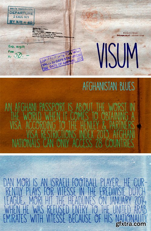
http://www.myfonts.com/fonts/hanoded/visum/
Visum means Visa in Dutch. The name was inspired by Dutch soccer club Vitesse’s rather sad decision to leave Israeli player Dan Mori behind, after he was refused a UAE visa because of his nationality. Visum font is a tall and proud all caps typeface. It comes with alternates for the lower case letters, some ligatures and an impressive language support. Of course, upper and lower case glyphs can be freely interchanged.
OTF | 2 Fonts | JPG Preview | 5.4 Mb RAR
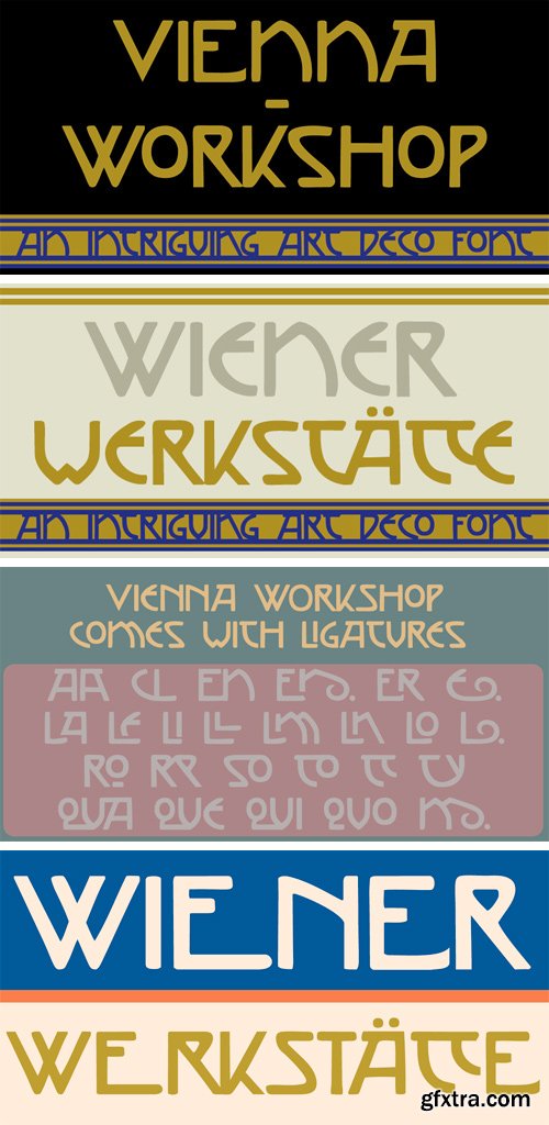
http://www.myfonts.com/fonts/hanoded/vienna-workshop/
The Vienna Workshop was a production community of visual artists, which operated from 1903 to 1932. The emphasis lay on fine craftsmanship and its motto was: “Better to work 10 days on one product than to manufacture 10 products in one day”. The typeface before you was based on some of the artwork produced by Vienna Workshop artists, in particular that of Koloman Moser. Vienna Workshop comes with some unusual glyphs, intriguing ligatures and Babylonian language support.
OTF | 1 Font | JPG Preview | 1 Mb RAR
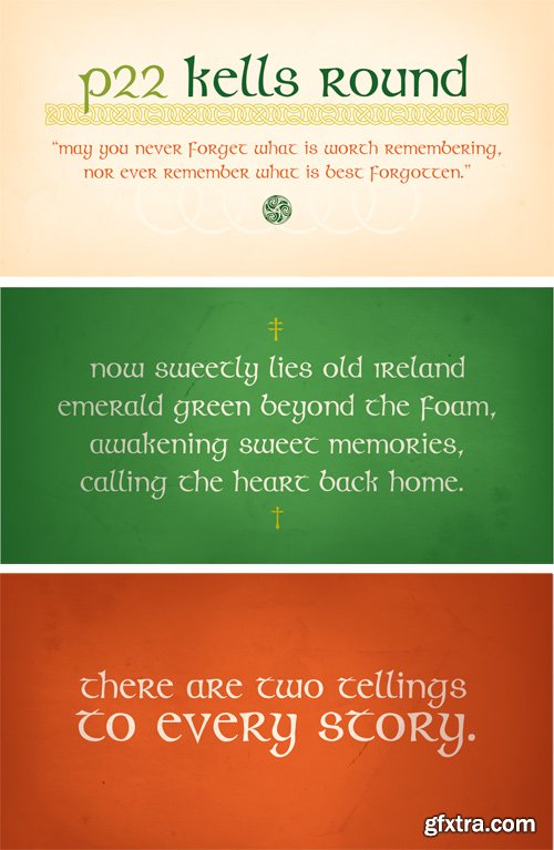
http://www.myfonts.com/fonts/p22/kells-round/
The Book of Kells is a ninth century gospel created in the British Isles and is considered to be the finest existing example of early Celtic art. The book itself is now housed in the Trinity College Library, Dublin. This computer set combines historical accuracy with functional readability and features 72 elements and linking borders.
TTF | 3 Fonts | JPG Preview | 2.6 Mb RAR
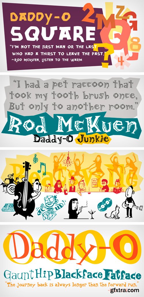
http://www.myfonts.com/fonts/p22/daddy-o-hip/
Based on the lettering and graphic design of the Beat Generation era, Daddy-O was produced in conjunction with the Whitney Museum of American Art to coincide with the exhibition Beat Culture and the New America: 1950-1965. These way gone fonts and extras both capture and affectionately satirize the graphic design of the era. Package now features poet Rod McKuen in an updated version of the Beatsville album cover from 1959.
TTF | 8 Fonts | JPG Preview | 1 Mb RAR

http://www.myfonts.com/fonts/hanoded/wayang/
Wayang font was named after the beautiful shadow puppets from Indonesia. The font was hand made, using a bamboo pen and Chinese ink on rough, eco-friendly Italian paper. Wayang is spiky, ultra-thin, yet extremely legible. It comes with extensive language support.
OTF | 2 Fonts | JPG Preview | 1 Mb RAR

http://www.myfonts.com/fonts/hanoded/weltschmerz/
Weltschmerz, world-weariness… I love the sound of it, so I chose this name for my new font. Weltschmerz font is a hand made Jugendstil typeface which was modeled on a 1910 poster from Austria. Weltschmerz is a classy typeface, a little melancholic, but with a positive uplift in the end. Weltschmerz comes with extensive language support.
OTF | 2 Fonts | JPG Preview | 1 Mb RAR

http://www.myfonts.com/fonts/hanoded/yellow-balloon/
Yellow Balloon is a typeface named after my two year old son’s favorite book: The Yellow Balloon by Dutch author/illustrator Charlotte Dematons. Every night before he goes to sleep, he wants to read the book and manages to find the yellow balloon on every page. Yellow Balloon is a cartoonesque font with an uneven baseline. It would look great on book covers or posters. Yellow Balloon comes with extensive language support.
OTF | 2 Fonts | JPG Preview | 1 Mb RAR

http://www.myfonts.com/fonts/hanoded/zeebonk/
Zeebonk (literally ‘Sea Chunk’) is Dutch for a sailor - in particular, a large, pickled and brined, seven-seas-been-there-done-that specimen. The font itself brings back memories of the outrageous tattoos those same ‘zeebonken’ used to have. Zeebonk comes with extensive language support, alternates for the upper case (and some lower case letters as well) and a healthy dose of good old fashioned sea dog humor!
OTF | 1 Font | JPG Preview | 1 Mb RAR

http://www.myfonts.com/fonts/mawns/pineapple/
TTF | 1 Font | JPG Preview | 1 Mb RAR

http://www.myfonts.com/fonts/mawns/r-2014/
OTF | 2 Fonts | JPG Preview | 1 Mb RAR

http://www.myfonts.com/fonts/mawns/radio-187-5/
TTF | 3 Fonts | JPG Preview | 1 Mb RAR

http://www.myfonts.com/fonts/mawns/roskrift/
OTF | 1 Font | JPG Preview | 1 Mb RAR
Top Rated News
- MRMockup - Mockup Bundle
- Finding North Photography
- Sean Archer
- John Gress Photography
- Motion Science
- AwTeaches
- Learn Squared
- PhotoWhoa
- Houdini-Course
- Photigy
- August Dering Photography
- StudioGuti
- Creatoom
- Creature Art Teacher
- Creator Foundry
- Patreon Collections
- Udemy - Turkce
- BigFilms
- Jerry Ghionis
- ACIDBITE
- BigMediumSmall
- Boom Library
- Globe Plants
- Unleashed Education
- The School of Photography
- Visual Education
- LeartesStudios - Cosmos
- Fxphd
- All Veer Fancy Collection!
- All OJO Images
- All ZZVe Vectors
 Categories


