
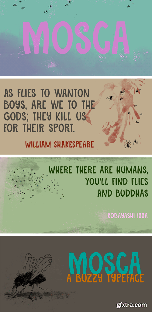
http://www.myfonts.com/fonts/hanoded/mosca/
Mosca means ‘fly’ in Spanish - the flying type, not the one in your jeans…). The font is quite lively, loose and elegant at the same time.
OTF | 2 Fonts | JPG Preview | 1 Mb RAR
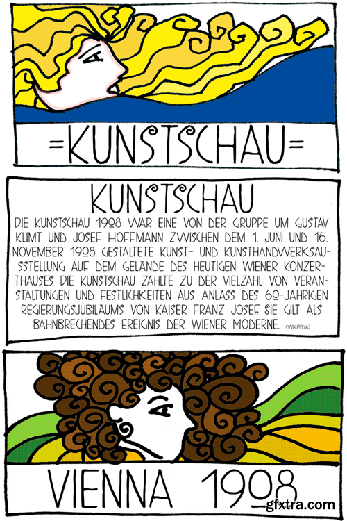
http://www.myfonts.com/fonts/hanoded/kunstschau/
OTF | 2 Fonts | JPG Preview | 1 Mb RAR
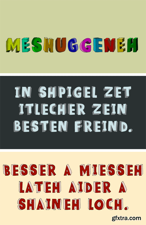
http://www.myfonts.com/fonts/hanoded/meshuggeneh/
Meshuggeneh means ‘crazy fool’ in Yiddish. The typeface before you is kind of crazy as well: it is 3D, twisted, with light and shadows in all directions. Meshuggeneh comes with all diacritics, oy veh!
OTF | 1 Font | JPG Preview | 1 Mb RAR
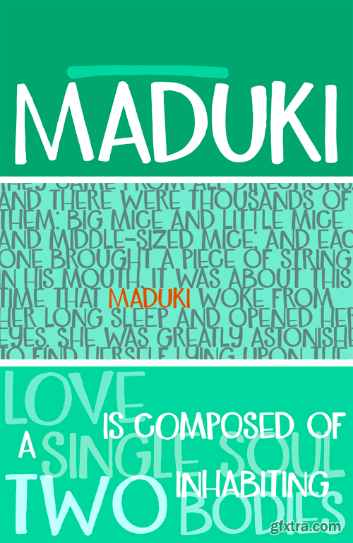
http://www.myfonts.com/fonts/hanoded/maduki/
This time the font’s name is meaningless. Maduki doesn't mean ‘cool’ in Swahili, nor does it mean ‘cup cake’ in Sranantongo. It is just a nice name. Maduki is a playful font, created with one of my 2 year old son’s marker pens (the 'no stain, wash-out' variety), a couple of cups of coffee and a whole bunch of ‘speculaas’ cookies. Now you're wondering what speculaas is, right? I'll tell you later - in a couple of fonts... Anyway, there’s not much meaningful to say about Maduki font. It is nice, it is cute and it comes with alternates!
OTF | 2 Fonts | JPG Preview | 1 Mb RAR

http://www.myfonts.com/fonts/hanoded/ghost-reverie/
Scary, creepy, brushed horror font.
TTF | 3 Fonts | JPG Preview | 2.4 Mb RAR

http://www.myfonts.com/fonts/hanoded/galangal/
Galangal, or Laos, is a root belonging to the ginger family, which is used in Indonesian cuisine. Since this font has the same design characteristics as Kurkuma, I thought naming it after a root was quite appropriate. Galangal is pretty unique, with thin and fat areas, bizarre glyphs and rough edges. Upper and lower case are fully interchangeable and the typeface comes with a full range of diacritics.
OTF | 1 Font | JPG Preview | 1 Mb RAR

http://www.myfonts.com/fonts/hanoded/kurkuma/
Kurkuma (Turmeric in Dutch) is a spice I use in all of my curries. And I love curry! It’s not more than fair to name a font after my favorite ingredient, so here you have it: Kurkuma. It is a unique and somewhat bizarre font with both an angelic and a diabolical side. I wouldn't set a whole text in it, but it does look great in headlines, posters and websites.
OTF | 2 Fonts | JPG Preview | 1 Mb RAR

http://www.myfonts.com/fonts/hanoded/kolkata-hotelroom/regular/
Hotel rooms in Kolkata don't top the list of ‘luxurious habitations’. They are dingy, fly-ridden, dirty and noisy. But if you look really hard, you will find traces of long gone grandeur. This font is all of the above and more: it is sloppy and messy, it spikes and sags, but it does give your designs that extra oomph you are looking for.
TTF | 1 Font | JPG Preview | 1 Mb RAR

http://www.myfonts.com/fonts/hanoded/kerberos-fang/kerberos-fang/
A creepy, blood-splattered horror font, made entirely with brushes and ink. Ideal for websites and halloween.
TTF | 1 Font | JPG Preview | 1 Mb RAR

http://www.myfonts.com/fonts/hanoded/joe-schmoe/
Joe Shmoe is the regular guy, the one who doesn't attract too much attention, but is always there when you need him. So is Joe Shmoe font: it is an easy-going, regular, nothing fancy kinda font and it comes with all the accents!
TTF | 1 Font | JPG Preview | 1 Mb RAR

http://www.myfonts.com/fonts/hanoded/inky-fingers/
Inky Fingers… Well, the name says it all! This rather obese font was made by hand (literally) using my index finger, some sheets of paper and a lot of Chinese ink. As the eco-paper absorbed quite a lot of ink, I had to do a second ink-run! Inky Fingers is a very legible typeface, ideal for headlines, books and posters. It comes with Babylonian language support - including the Schwa/schwa glyphs for the Azeri speaking crowd. Ain't I nice?
OTF | 2 Fonts | JPG Preview | 1 Mb RAR

http://www.myfonts.com/fonts/hanoded/harimau/
Harimau means Tiger in Bahasa Indonesia. It is a very easy to read, playful font, which makes it ideal for children’s books and posters. Harimau comes with extensive language support.
OTF | 1 Font | JPG Preview | 1 Mb RAR

http://www.myfonts.com/fonts/hanoded/hasty-tasty/
Hasty Tasty looks like a hastily penned down recipe, a quickly jotted down note or just someone’s messy handwriting. It is legible, useful and comes with a full range of accents.
OTF | 1 Font | JPG Preview | 1 Mb RAR
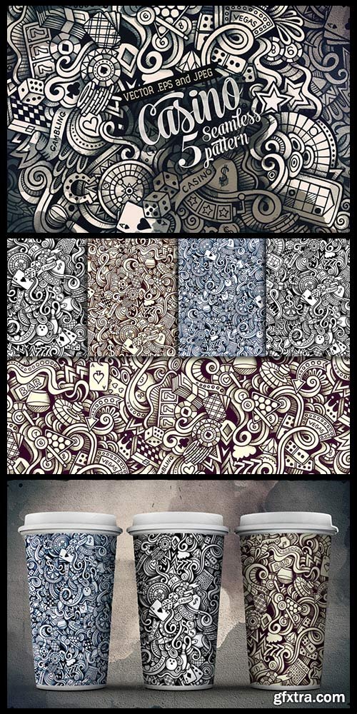
CM 514430 - 5 Casino Doodles Patterns
Set of 5 graphics hand drawn CASINO doodles seamless patterns. Graphic line art vector backgrounds. Different tone and layout. Seamless pattern can be used on backgrounds, wallpaper, invitations, cards, banners, scrapbooking, posters, web graphics, blogs, decorations, wrapping paper, fabric design, packaging, clothes and more!
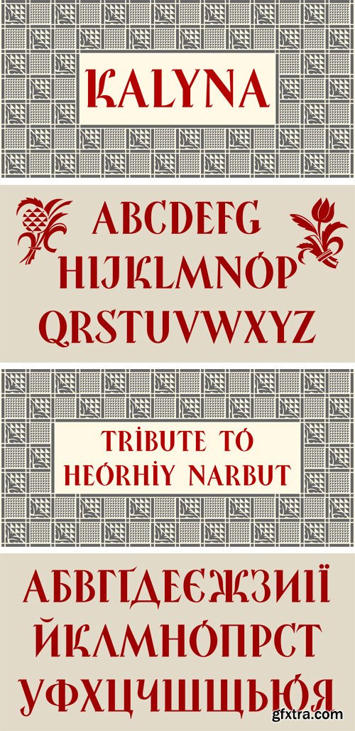
http://www.myfonts.com/fonts/2d-typo/kalyna/
The Kalyna font is interesting with its stylistic implementation through asymmetrical serif. Such design is characteristic for the Ukrainian style. The drawing of the font is based on the sketches of a famous Ukrainian graphic artist of early 20th century Heorhiy Narbut. His work set the whole school in the Ukrainian graphic art and is still very influential nowadays. The font is capital and also includes a set of ornaments in addition the standard set of symbols.
OTF | 2 Fonts | JPG Preview | 1 Mb RAR
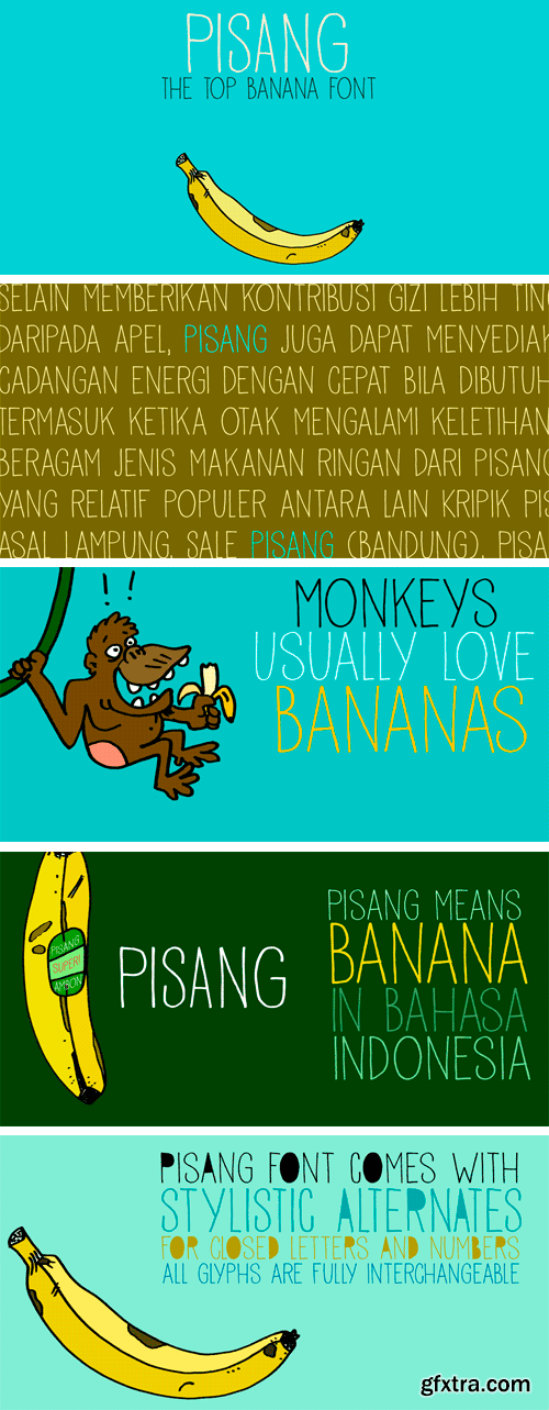
http://www.myfonts.com/fonts/hanoded/pisang/
Pisang means banana in Malay and Bahasa Indonesia. It is a tall, narrow and very clear font, ideal for books, recipes, food labeling and posters. It comes with a full range of diacritics and some interesting alternates for the closed glyphs as well.
OTF | 2 Fonts | JPG Preview | 1 Mb RAR
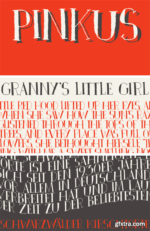
http://www.myfonts.com/fonts/hanoded/pinkus/
Pinkus is a nice, uncomplicated serif font. It was hand drawn on plain white copy paper, hence the roughness. Pinkus is an all-caps affair, but upper and lower case letters can be interchanged. Pinkus can be used on posters, postcards, books, magazines and whatever else you fancy. Enjoy!
OTF | 1 Font | JPG Preview | 1 Mb RAR
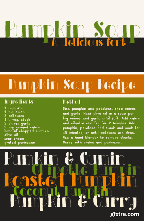
http://www.myfonts.com/fonts/hanoded/pumpkin-soup/
Pumpkin Soup is delicious! And so is the font. 'Nuf said!
OTF | 2 Fonts | JPG Preview | 1 Mb RAR
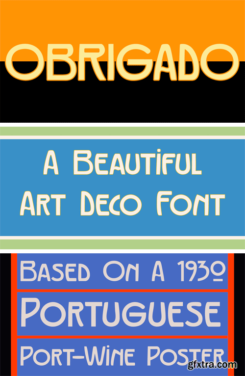
http://www.myfonts.com/fonts/hanoded/obrigado/
Obrigado means ‘Thank You’ in Portuguese. It is my way of saying thanks to the unknown designer of a Portuguese port-wine poster from the thirties. Obrigado font is based on that poster. As I had to work with a handful of glyphs, I designed the missing ones myself. Obrigado is a quite elegant and refined art deco font, which would be ideal for posters and logos. Obrigado speaks most Roman based languages.
OTF | 2 Fonts | JPG Preview | 1 Mb RAR

http://www.myfonts.com/fonts/hanoded/moonlight-shadow/
Moonlight Shadow is a weird, but surprisingly versatile font. It is curly, messy - yet elegant and comes with all the accents.
TTF | 2 Fonts | JPG Preview | 1 Mb RAR

http://www.myfonts.com/fonts/hanoded/louise/
Louise font was based on the art of Louise Marie (lou) Loeber, a Dutch painter. She was born in Amsterdam in 1894 and flirted with several styles like De Stijl, Cubism and Bauhaus. Her artworks are characterized by a sober use of geometric shapes; lines, rectangles and triangles. Louise font consists of Caps, but the lower and upper case glyphs are quite different. Louise comes with extensive language support.
OTF | 1 Font | JPG Preview | 1 Mb RAR

http://www.myfonts.com/fonts/hanoded/pardesi/
Pardesi font is named after a song from Raja Hindustani, a 1996 Bollywood movie directed by Dharmesh Darshan. The lead roles were played by Aamir Khan and Karisma Kapoor. Together they sing: ‘Pardesi, pardesi, jaana nahi’, meaning so much as: 'Foreigner, foreigner, don't go'. I remember this song very well, as I was backpacking through India and Nepal at the time and it was played over and over again on all long distance buses I took. Pardesi font is a fat, rounded, marker-pen font, ideal for books and posters. It comes with extensive language support.
OTF | 1 Font | JPG Preview | 1 Mb RAR

http://www.myfonts.com/fonts/hanoded/quid-pro-quo/
Quid Pro Quo is a nice, handwritten, trashy font. Cursive and decorative, straightforward, yet twisted.
TTF | 1 Font | JPG Preview | 1 Mb RAR

http://www.myfonts.com/fonts/hanoded/nyctophobia/
Nyctophobia - a pathological fear of the dark. Hopefully no fear for this font, as it will add that bit of horror to your projects. Comes with kerning and the most used accents.
TTF | 1 Font | JPG Preview | 1 Mb RAR
Top Rated News
- MRMockup - Mockup Bundle
- Finding North Photography
- Sean Archer
- John Gress Photography
- Motion Science
- AwTeaches
- Learn Squared
- PhotoWhoa
- Houdini-Course
- Photigy
- August Dering Photography
- StudioGuti
- Creatoom
- Creature Art Teacher
- Creator Foundry
- Patreon Collections
- Udemy - Turkce
- BigFilms
- Jerry Ghionis
- ACIDBITE
- BigMediumSmall
- Boom Library
- Globe Plants
- Unleashed Education
- The School of Photography
- Visual Education
- LeartesStudios - Cosmos
- Fxphd
- All Veer Fancy Collection!
- All OJO Images
- All ZZVe Vectors
 Categories


