
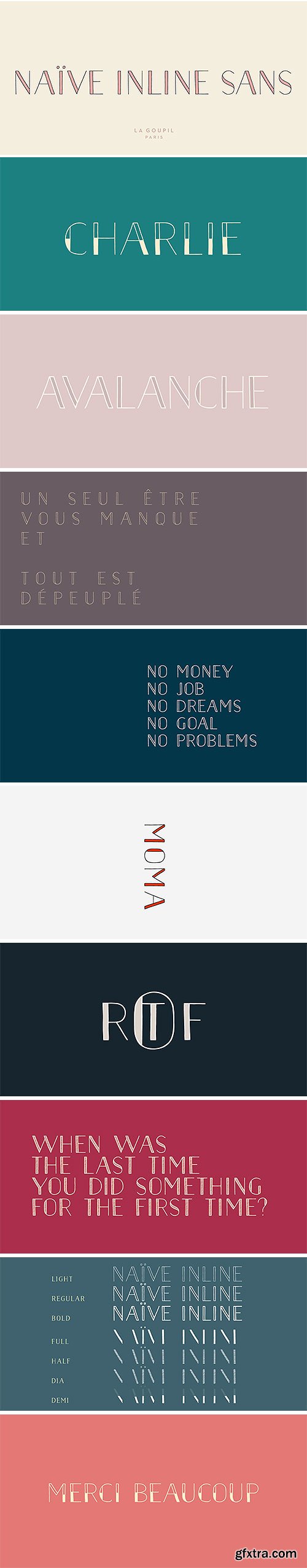
- Naïve Inline Sans is a handwritten font by Fanny Coulez for La Goupil Paris. The three weights of this new sans serif parisian typography can be enhanced with a bicolor interior, ribbed or full, to improve your designs and bring a feeling more modern and unusual. To do this, you must simply superimpose the 2 elements : the weight above, the interior below.
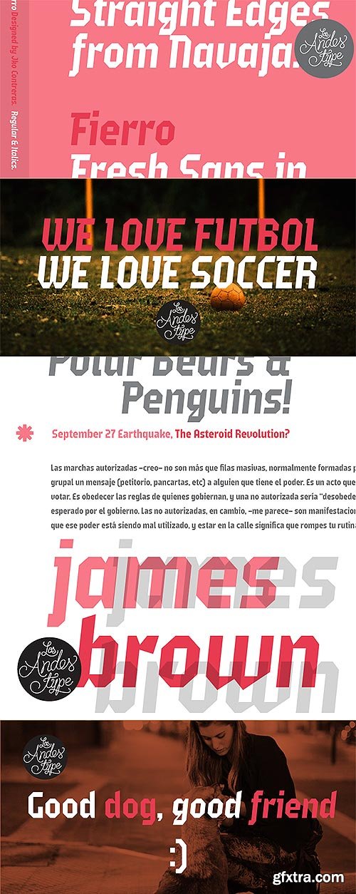
Fierro 2 Fonts - Heavy Geometric Retrofuturistic
Designer: Jko Contreras
- Fierro is a heavy-geometric-retrofuturistic typographic construction that, without any curve, still retains good legibility. These shapes are based on great bended metal pieces, which represent its name, meaning “hardware store”. It has been designed to be used in large sizes and for designs with character that look to create a strong visual block. Designed by Jko Contreras.
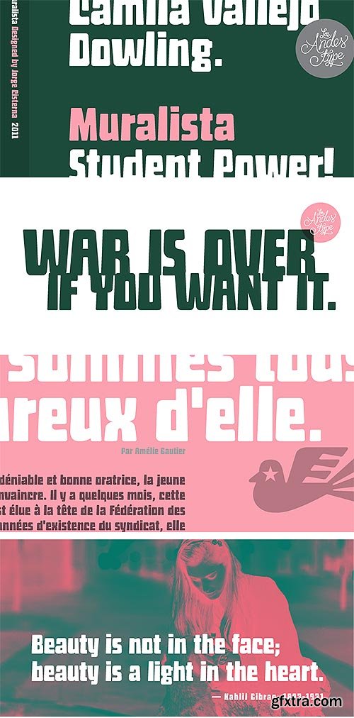
Muralista Retro Font for Murals & Posters $29
Designers: Jorge Cisterna
- This typeface is inspired by 60s and 70s Chilean murals and posters artwork. On the walls, big and heavy letterforms were presented pictorially for political propaganda. Muralista is a low contrast condensed typeface, similar to classic forms of the early nineteenth century humanist grotesque. The sinuous, rounded and asymmetric terminations remind us the artist’s brush strokes. This typeface is ideal for editorial sentences and logo designs. Designed by Jorge Cisterna.
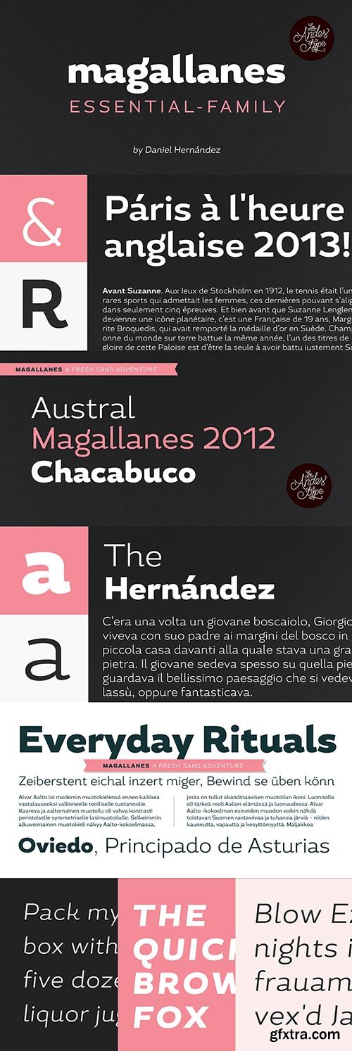
Magallanes Essential 8 Fonts $89
Designer: Daniel Hernandez
- Magallanes Essential a contemporary neo-humanist sans serif font designed by Daniel Hernández. Its strokes and terminals are related to the calligraphic strokes from humanist typefaces. Every weight comes with alternative glyphs for a more dynamic use. Magallanes is the perfect titling font to complement text faces in magazines, logotypes, etc.
- It is a essential family of 8 fonts, 4 weights and italics. This typeface no contains alternate glyphs and add only Windows 1252 Character set (219 Glyphs).

Legacy Edition features 269 handwritten glyphs. The font is extremely clean and readable even at smaller sizes.
TTF | 269 items | 88 Kb

OTF | 13.4 MB
Sale Page
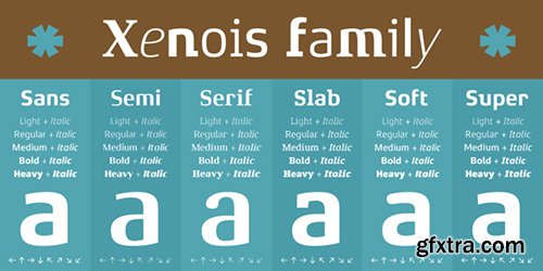
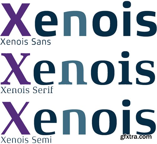
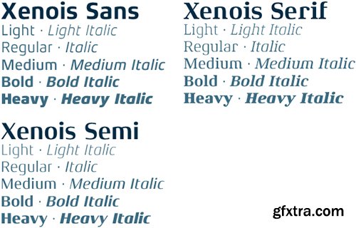
Xenois is a sweeping suite of designs that will provide solutions for a multitude of projects. Annual reports, restaurant menus, business correspondence, corporate identity programs, movie credits and advertising campaigns can all be set with various faces from the family. Interrelating perfectly, the sub-families within the series include Xenois Sans, Serif, Semi, Soft, Slab and Super.The designs have a common and obvious design bond, yet each is able to stand on its own as a distinct typestyle. The Xenois typefaces are based on a common underlying model; they have the same cap height, the same lowercase x-height, the same stem weights, and the same basic character shapes. This unity of shape and proportion results in a remarkably complementary set of typeface designs.
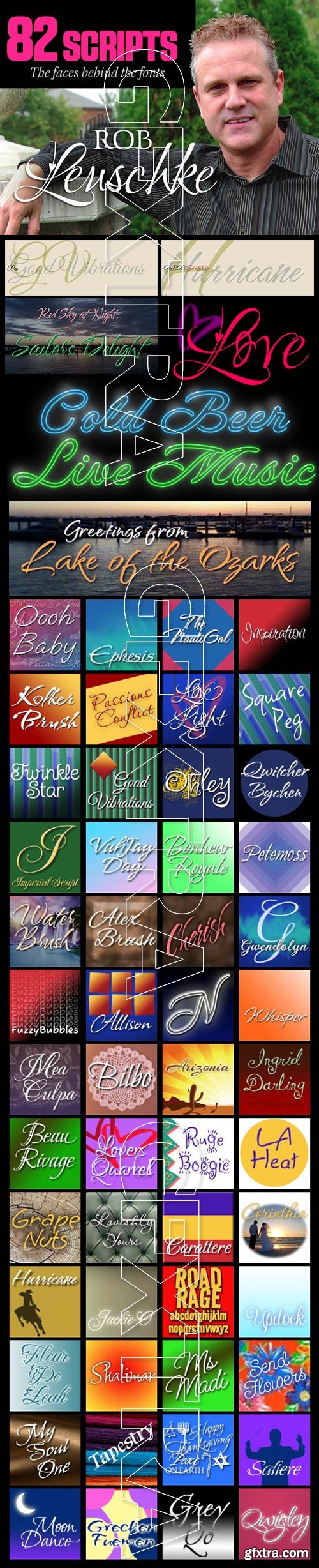
- Rob Leuschke: A former lettering artist at Hallmark Cards, Rob Leuschke now has his own thriving design businesses, Alphabytes and the new TypeSETit. Growing up in St Charles, Missouri, where he still lives, Rob showed great artistic promise at an early age. He earned a BFA in graphic design at the University of Missouri at Columbia. After graduation, his stint at Hallmark Cards gave him the opportunity to learn from and work with some of the best lettering artists in the industry. Rob struck out on his own in 1987 and now boasts a long list of clients from all over the world. Rob has created over 250 custom typefaces, and his work has been exhibited in New York. Ambiance BT is Rob’s first typeface published by Bitstream, with more to follow. Rob Leuschke enjoys continued success as a lettering artist and graphic designer with emphasis on typography and hand-lettering. His work consists of design work for a number of products in multiple industries— social expression, advertising & visual communications, and multimedia. He graduated in 1981 with a Bachelor’s of Fine Arts (BFA) degree from the University of Missouri – Columbia with concentration in illustration and graphic design.

New Renaissance Commercial Fonts Bundle - 13 Typefaces
Ricks Classic Italic | Ricks Decorated Uncial | Ricks Folklore Roman | Ricks Relaxed Hand
Sevillia Dancing Text | Sevillia Standing Text | Sevillia Tiles | Soest St Mary
- New Renaissance: The reclaiming of one baby that got thrown out with the bath water in today’s technological revolution – the good aspects of yesterday’s ways of doing things, how things that work well can also be beautiful and feel good, how a rich variety of different skills can illuminate one another, how the arts can achieve amazing effects on the way people behave, how musical and artistic harmony can be a model for human harmony...
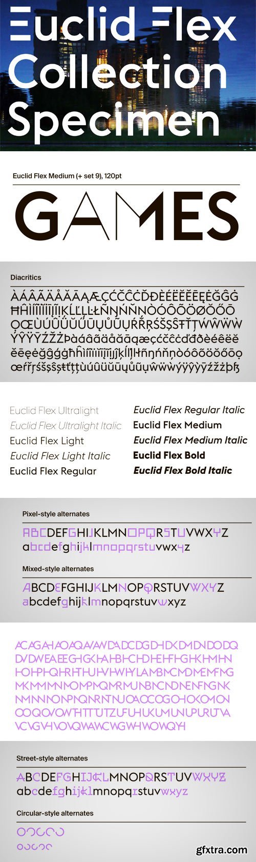
Each single weight of Euclid Flex contains more than 500 alternate characters and ligatures. Thanks to font engineering and the OpenType font format, these characters can be activated using the OpenType Stylistic Sets and Discretionary Ligatures functions in any OpenType/Unicode-savvy application, or via the Glyphs Panel of the application.
OTF | 10 Fonts | JPEG Preview | 9.2 Mb RAR
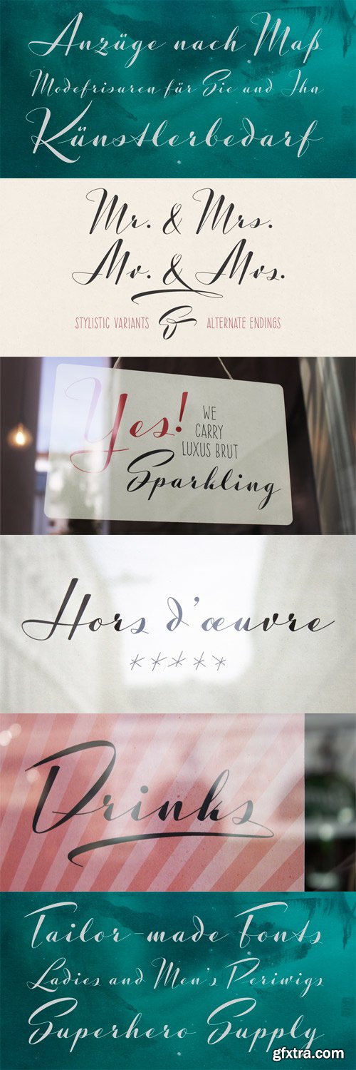
Luxus Brut Sparkling developed from sketches for a bolder version of Luxus Brut (2009) that I made for a poster design. Interventions like slightly tightening the (still generous) spacing and amplifying the contrast between thick and thin strokes ended in a complete rework of the original font. All the shapes have been redrawn in respect of their distinctive origin in mid 1900’s signage lettering. It has now even more timeless elegance! For several characters you can choose alternate forms, accessible via two OpenType Stylistic Sets. Contextually substituted ending forms are available, as well as Numerators, Denominators, Superscript, Subscript and Fraction features, along with and a handful of underlining swashes for your Logotype designs.
OTF | 1 Font | JPEG Preview | 4.1 Mb RAR
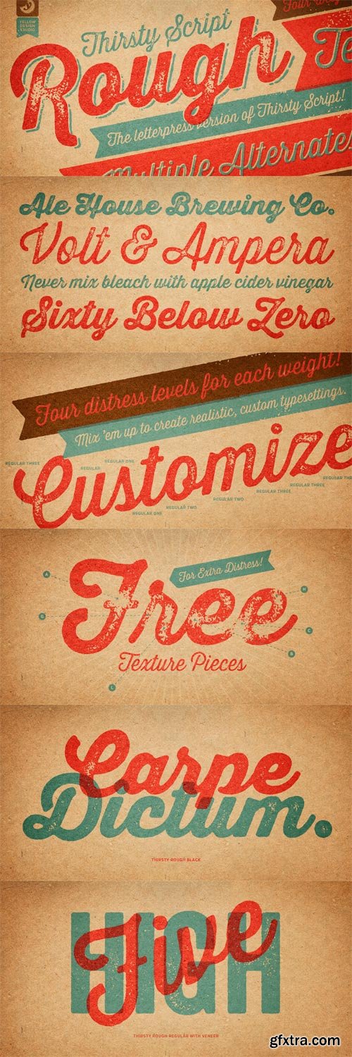
Thirsty Rough - Authentic Qualities 21xOTF
OTF | 21 Fonts | JPEG Preview | 30.7 Mb RAR | SALE PAGE
Thirsty Script Rough from Yellow Design Studio is the warm and weathered version of
Thirsty Script with texture that captures the authentic qualities of letterpress printing.
It’s highly customizable with four alternate versions of every weight ranging from
very light to heavy distress. Because it’s remarkably detailed, it looks great even at large sizes.
For extra customization and fun, it includes a set of matching texture pieces.
Top Rated News
- Finding North Photography
- Sean Archer
- John Gress Photography
- Motion Science
- AwTeaches
- Learn Squared
- PhotoWhoa
- Houdini-Course
- Photigy
- August Dering Photography
- StudioGuti
- Creatoom
- Creature Art Teacher
- Creator Foundry
- Patreon Collections
- Udemy - Turkce
- BigFilms
- Jerry Ghionis
- ACIDBITE
- BigMediumSmall
- Boom Library
- Globe Plants
- Unleashed Education
- The School of Photography
- Visual Education
- LeartesStudios - Cosmos
- Fxphd
- All Veer Fancy Collection!
- All OJO Images
- All ZZVe Vectors
 Categories


