
Nota - New, Narrow, Technical Sans Serif Fonts Family $129
14 OTF Font Files | Designer: Gert Wiescher | Design Date: Mar 25, 2015 | TURKISH SUPPORT
http://www.myfonts.com/fonts/wiescherdesign/nota/
![]()
![]()
![]()
![]()
![]()
![]()
![]()
![]()
![]()
![]()
![]()
![]()
![]()
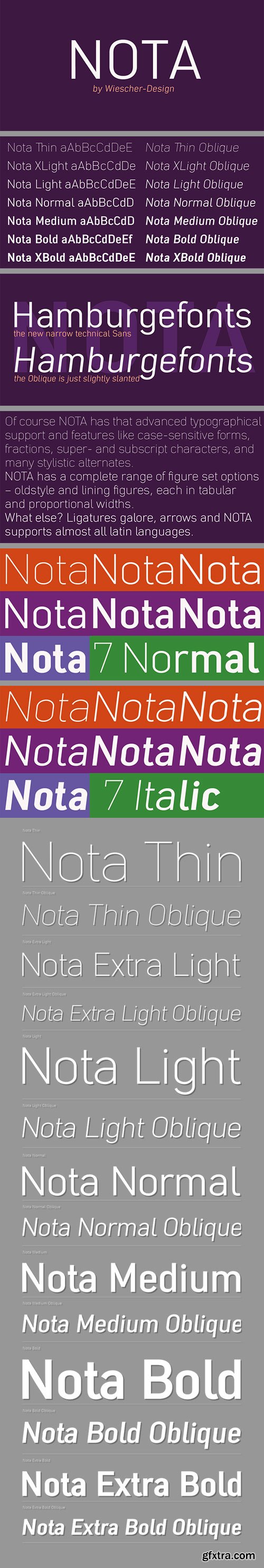
»NOTA« is a new, narrow, technical font– designed by Gert Wiescher in 2014 and 2015 – has 7 weights with corresponding oblique cuts. »NOTA« is well suited for advertising, logo, billboards, small text, signage, branding, packaging, editorial, posters, web and screen design. »NOTA« is an OpenType family for professional typography with an extended character set of over 700 glyphs and extensive kerning. It supports more than 40 Central- and Eastern-European as well as many Western languages. Ligatures, different figures, fractions, currency symbols and small caps can be found in all cuts.
Solida - Ggeometric Angular Look Display Typeface $40
10 OTF Font Files | Designer: Pablo Balcells
http://www.myfonts.com/fonts/graviton/solida/
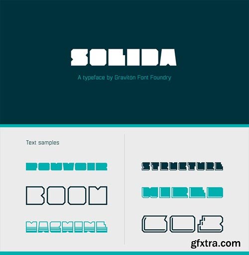
Solida font family has been designed for Graviton Font Foundry by Pablo Balcells in 2012. It is display typeface with a geometric angular look. Solida consists of 10 styles.

Oboe - Geometric Rounded Sign Typeface
6 OTF Font Files | Designer: Pablo Balcells
Oboe font family has been designed for Graviton Font Foundry by Pablo Balcells in 2012. It is display typeface with a geometric rounded look. Oboe consists of 6 styles, 2 of which are free.
Et Cetera - Beautiful Hand-Lettered Script $25
OTF Font File | Designer: Anton Scholtz | Design Date: May 23, 2015
http://www.myfonts.com/fonts/scholtz/et-cetera/
![]()
![]()
![]()
![]()
![]()
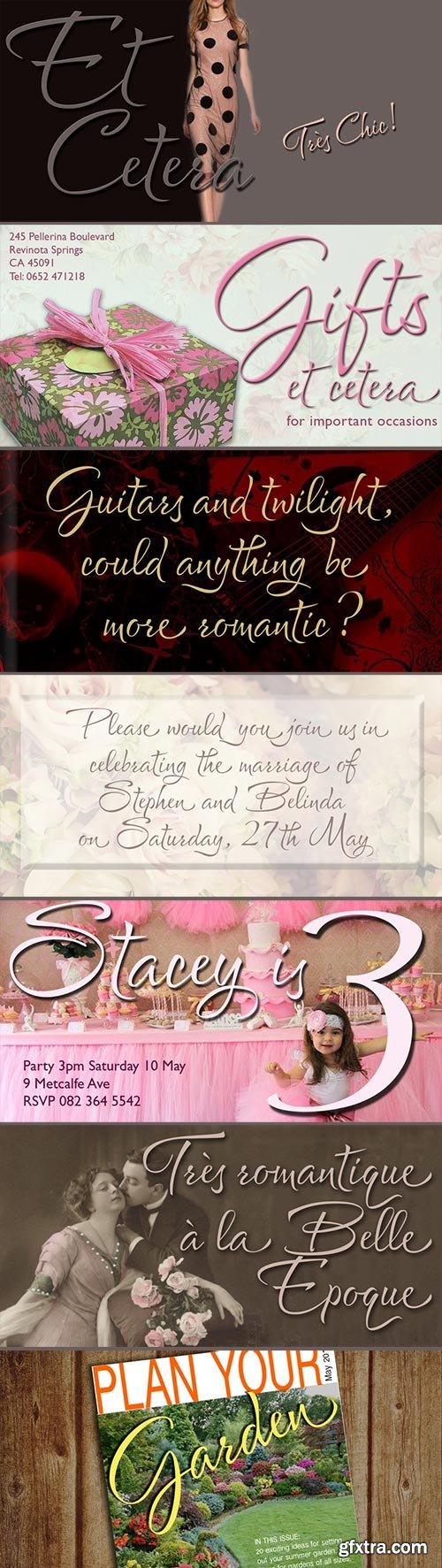
Et Cetera is a beautiful, hand-lettered script. It abounds in OpenType features such as terminal swashes and ligatures and is best used with OpenType savvy software with the “standard ligatures” and “contextual alternates” features turned ON. Et Cetera is comprehensive yet understated. Most letters in the font are connected, but, as in typical handwriting fonts, NOT ALL are connected. Most characters have a consistent shape within the font, but NOT ALL Some characters in Et Cetera are sensitive to their position in the text and change depending on the adjoining characters. This contributes to the casual and relaxed style of Et Cetera; not allowing the features of the font to get between the reader and the message. A wealth of OpenType features lie beneath the mellow exterior of Et Cetera. These Open Type features make few demands on the user and this makes for a versatile script font that requires no expertise from the user, performs well at larger sizes, and remains legible even when setting copy at very small sizes. Et Cetera is a breezy, light, yet expressive font that is perfect for titling work, product packaging and romantic stationery.
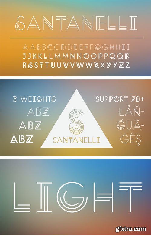
Santanelli - All Caps Display Typeface $49
3 OTF Font Files | Designer: Gilberto Moya Perona | Design Date: Apr 25, 2015 | TURKISH SUPPORT
http://www.myfonts.com/fonts/pisto-casero/santanelli/
![]()
![]()
![]()
![]()
![]()
![]()
![]()
Santanelli is a rounded all caps display typeface. It is intended to be used in posters, editorial headlines and logotypes. It comes in three weights: Thin, Medium and Bold. Each letter has been designed with two different styles or flavors: decorative and clean. You can access each of them by typing uppercase and lowercase respectively. These two styles fit perfectly when combined within the same word or message.
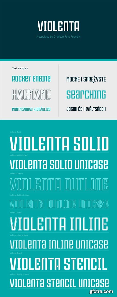
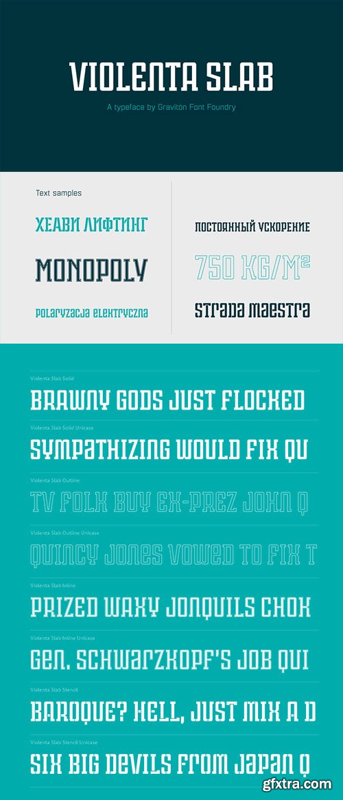
Violenta - Display Condensed Geometric Typeface $90
8 OTF Font Files | Designer: Pablo Balcells | Design Date: Mar 31, 2015 | TURKISH SUPPORT
http://www.myfonts.com/fonts/graviton/violenta/
![]()
![]()
![]()
![]()
![]()
![]()
![]()
![]()
![]()
![]()
Violenta font family has been designed for Graviton Font Foundry by Pablo Balcells in 2015. It is a display, geometric typeface, with a condensed design and sharp angles that provides an aggresive and strong appearence. Violenta consists of 8 styles. Each containing glyph coverage for several languages.
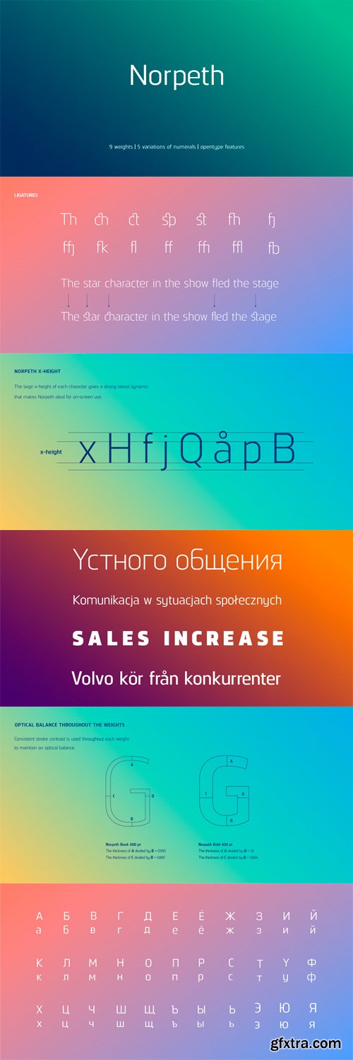
Norpeth - Modern Humanist Sans Serif Typeface
9 Weigts | 5 Variations | OTF | 18 Fonts | 3.9 Mb RAR | Norpeth Font Family
The proportions of each character have a strong lateral dynamic that
makes it ideal for on screen uses.
Also consistent stroke contrast is used throughout each weight
to maintain an optical balance.
Details include 9 weights and italics, over 570 characters,
manually edited kerning and opentype features.
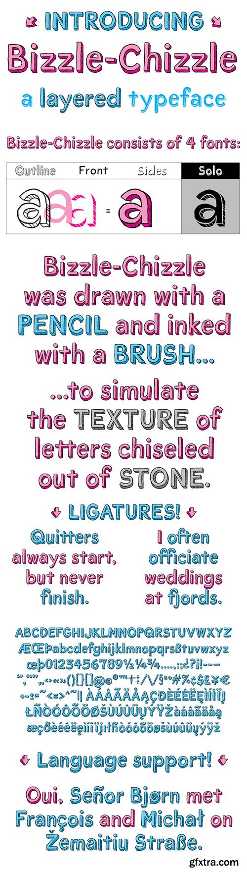
Bizzle Chizzle - An Expansion of Lettering Sketches $69
4 OTF Font Files | Designer: Terry Biddle | Design Date: May 20, 2015
http://www.myfonts.com/fonts/terry-biddle/bizzle-chizzle/
![]()
![]()
![]()
![]()
Bizzle-Chizzle is an expansion of lettering sketches initially made for my personal website. Each glyph is drawn by hand and inked by brush to simulate the texture of letters chiseled out of stone. Bizzle-Chizzle is meant to be used for dynamic layouts and prefers to be as large as possible. Bizzle-Chizzle is an OpenType font package that consists of four individual fonts:
1. Bizzle-Chizzle Outline
2. Bizzle-Chizzle Front
3. Bizzle-Chizzle Sides
4. Bizzle-Chizzle Solo
The first three combine to form Bizzle-Chizzle’s three dimensions, while Bizzle-Chizzle Solo can be used individually. Feel free to mix and match for fun effects!

Pebl - Smoothed Shapes Display Typeface $25
OTF Font File | Designer: Ian Clewett
![]()
![]()
![]()
![]()
![]()
![]()
![]()
http://www.myfonts.com/fonts/formation-type-foundry/pebl/
Pebl is inspired by the naturally simplified and smoothed shapes of beach pebbles. The result is a bold, super-rounded display typeface. It’s pared back to just the most basic, smooth outlines without counters, for a friendly and organic look. It’s ideal for logos, branding, headlines or just abstract type shapes in print, in displays, on the web, on T-shirts, wherever. Enjoy.
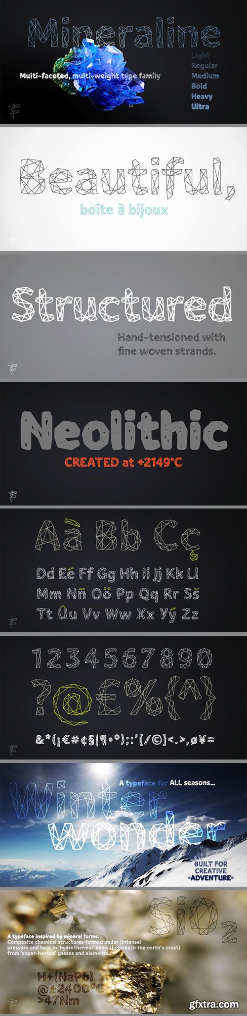
Mineraline - Complex Linear Structured Frameworks $100
6 OTF Font Files | Designer: Ian Clewett | Design Date: May 19, 2015
http://www.myfonts.com/fonts/formation-type-foundry/mineraline/
![]()
![]()
![]()
![]()
![]()
Mineraline is inspired by the crystalline, faceted forms of minerals. This unique display typeface is made of a complex linear structure, giving the letterforms a dynamic, intricate and dimensional feel – especially suited to display use in very large sizes. The unique linear structure allows the line-weight of the character framework to be varied, to give the family a varying ‘visual’ weight, rather than altering the traditional stroke width. Used at smaller sizes, the type is incredibly detailed, almost woven looking. At larger display sizes the framework and bevelled joints become more obvious and striking. From the delicate Light through to the solid and angular Ultra, Mineraline is perfect to give your work a distinctive, modern and creative edge. Its multiple weights are ideally suited to work across Branding, Logo & Identity, Retail, Point of Sale, Packaging, Advertising, Fashion, Digital and Film, or any other experimental graphic and typography tasks.
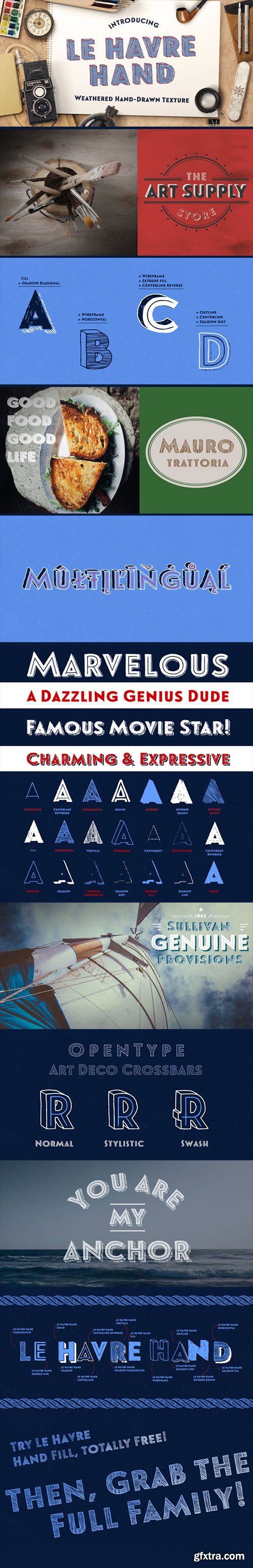
Macaroni Sans - New Rounded Typeface $510
17 OTF Font Files | Design Date: May 18, 2015
http://www.myfonts.com/fonts/typeassociates/macaroni-sans/
![]()
![]()
![]()
![]()
![]()
Macaroni Sans evolved from our search for an extended font family consisting of a range of weights in both uprights and obliques, with a contemporary appeal. The desired character was to be sympathetic with a range of high-tech consumer products so a friendly, soft approach was called for. The resulting mix of geometric shape, rounded terminals, subtle italic angle of just six degrees and a few quirky stroke endings met with an enthusiastic response. As its subject product line exhibits brilliant color and imagery, a style was called for that conveyed contemporary appeal and readability but would not compete with the savvy products. We arrived at a clean, modern, sociable look that would suit a broad subject field in either text, semi display or signage. Its simple lines and monoline strokes fit well with logo usage or screaming posters, enhancing letterheads or websites, for foodstuffs to autos, insurance to swimming pools, lawfirms to babyfood. Macaroni Sans is the perfect typeface for branding, logotypes, may even flatter challenging viewing conditions. Rounded types have been around (pardon the pun) for centuries; numerous examples can be seen on old wood type posters, which in a small way prompted the name: in fashion Macaroni was a term used in mid-eighteenth century Europe to describe a dandy, a chap who displayed flamboyance in dress and hairstyle and spoke outlandishly or in an effeminate manner. Hence the term macaronic verse.
Scotch Modern - Victorian Typeface Popular in Books and Magazines $499
9 OTF Font Files | Designer: Nick Shinn | TURKISH SUPPORT
http://www.myfonts.com/fonts/shinn/scotch-modern/
![]()
![]()
![]()
![]()
![]()
![]()
![]()
![]()
![]()
![]()
![]()
![]()
![]()
![]()
![]()
![]()
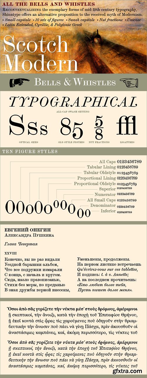
Recontextualizing the 10-point type of a scientific report published in 1873, Nick Shinn has produced sleekly refined, micro-detailed vector drawings by eye, without the assistance of scans, thus presenting an ironic critique of the way in which mechanical imagery beguiles us with the trite veracity of simulacra. This beautiful genre of type, so popular in books, magazines and advertisements during the Victorian era and much of the 20th century, was derided by advocates of both the Arts & Crafts movement and 20th century modernists, and has never been properly adapted to hot metal, phototype, or digital media -- until now. Now the full range of typographic expression is possible in this style. The OpenType fonts support Western and CE encodings, Cyrillic (with Bulgarian alternates) and Polytonic Greek. There are many special features, including small caps, unicase, italic swash capitals, ten sets of figures per font, and both slashed and nut (vertical) fractions. Together with Figgins Sans, comprises The ModernSuite of matched fonts.
TCF Plastico - 60's Modular Typeface
OTF Font File | Designers: Pedro Leal, Dino dos Santos | Design Date: May 15, 2015 | Turkish Support
http://www.myfonts.com/fonts/typecult-foundry/tcf-plastico/
![]()
![]()
![]()
![]()
![]()
![]()
![]()
![]()
![]()
![]()
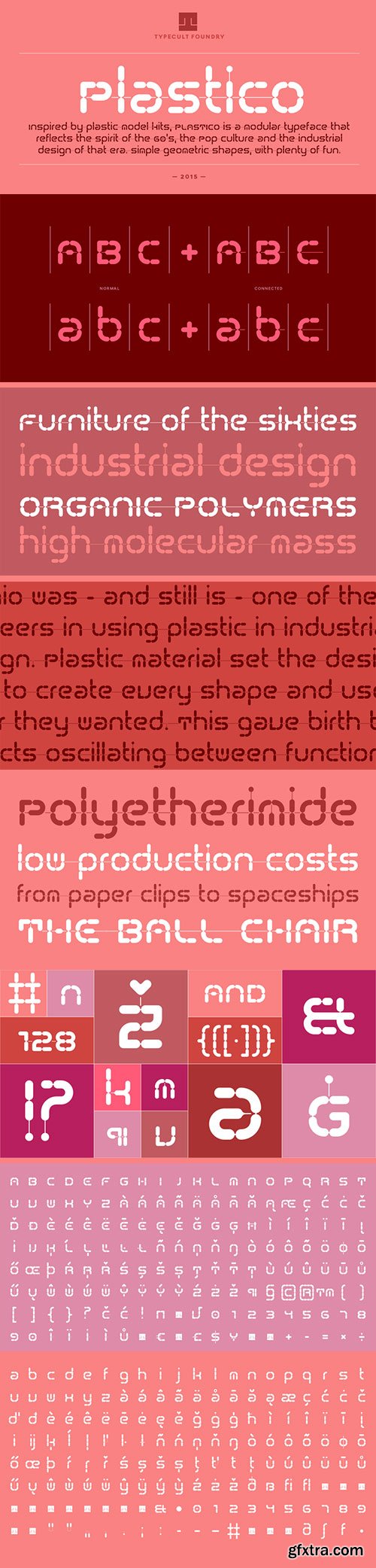
Inspired by the idea of the plastic model kits, TCF Plastico is a modular typeface that reflects the spirit of the 60’s, the Pop culture and the industrial design of that era. Despite the very simple and straightforward geometric shapes, TCF Plastico is a very delightful and humorous typeface. TCF Plastico was designed with a couple of special OpenType features in order to ensure the connection between all of the characters, but only when necessary.
Yasemin - for Display, Sign and Logos $79
6 OTF Fonts | Designer: Bülent Yüksel | Design Date: May 14, 2015 | Turkish Support
http://www.myfonts.com/fonts/world-of-the-fonts/yasemin/
![]()
![]()
![]()
![]()
![]()
![]()
![]()
![]()
![]()
![]()
![]()
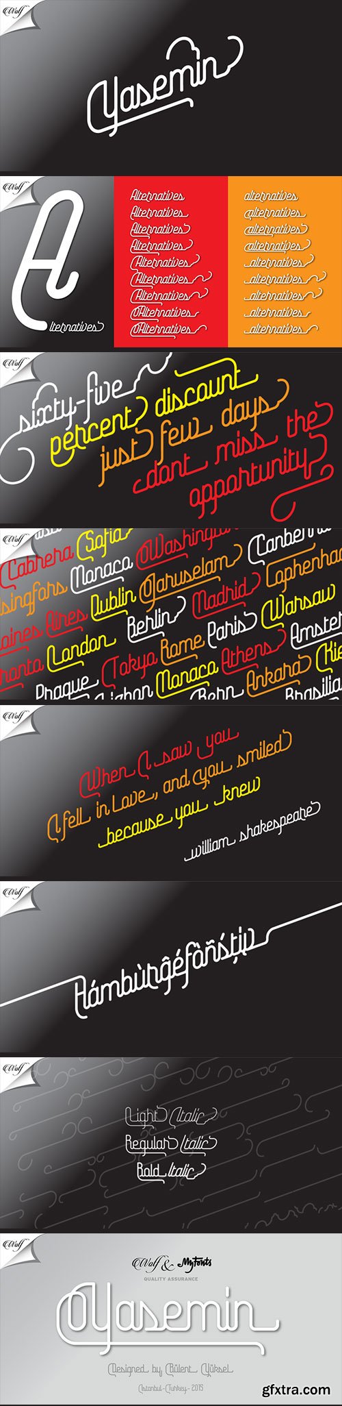
Yasemin is an OpenType font that contains 1045 glyphs. Ligatures, alternates, starting, endings, a wide range of latin languages and a set of ornaments. And words specially designed to use in advertising slogan, stationery for weddings, birthdays, etc.
TIPS : Try using Yasemin at a 20º angle so that the slanted strokes, ornament become perfectly vertical. Having the decorative ligatures feature (dlig) activated is a good option to see letters dance.
TECHNICAL : It is absolutely recommended to use this font with the standard ligatures feature (liga) activated. It makes letters ligate perfectly and also improves the space between words.
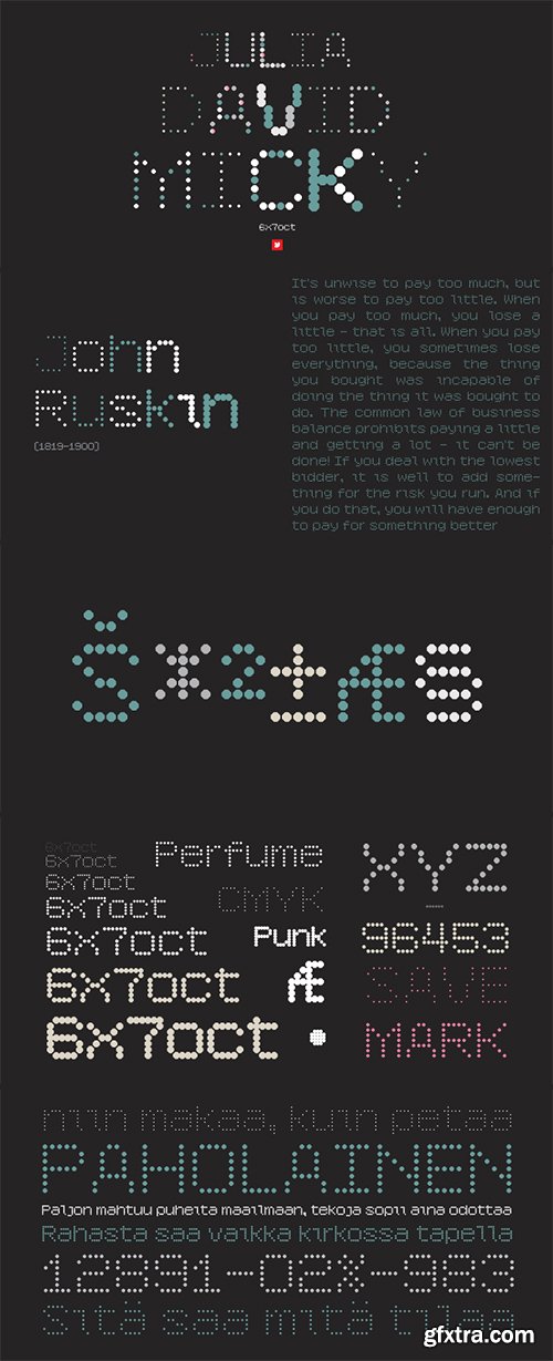
12 OTF Font Filkes | Systematical Circles for readout
http://www.myfonts.com/fonts/ywft/6x7-oct/
YWFT 6x7oct was originally inspired by found maps that were drawn with only octagonal shapes. When creating this typeface, we used different influences such as punch cards and other electronic devices that use systematical circles for readout. YWFT 6x7oct has been used in advertisements by the popular hat store Lidz and for VH1 brand spots.
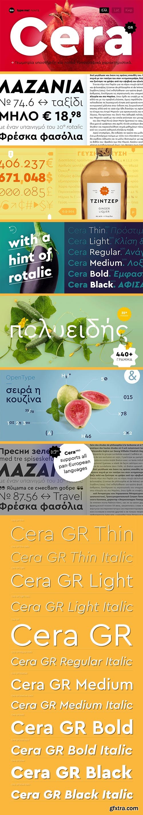
Cera GR - The Newest Sans-Serif Typeface $227
12 OTF Fonts | Designer: Jakob Runge | Design Date: Apr 14, 2015
http://www.myfonts.com/fonts/type-me-fonts/cera-gr/
![]()
![]()
![]()
![]()
![]()
![]()
![]()
The sans-serif typeface – designed between 2013 and 2015 – is supporting pure geometry plus Greek script and basic Latin letters. With over 440 glyphs per weight Cera GR cares about all monotonic letter shapes plus ordinals and provides matching OpenType Features. Equipped with six precise weights, a clean Italic – carefully slanted to 10 degrees – and useful dingbats plus arrows, Cera GR is a good companion for setting clean text and headlines for print and screen in modern Greek Script and all its facets. For the upright shapes there is a stencil version available as well.
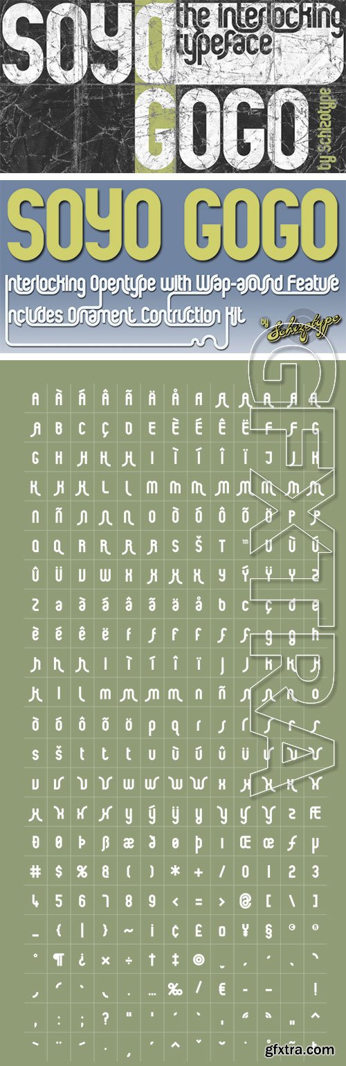
Soyo Gogo - Interlocking Opentype with Wrap Around & Ornament Construction Kit $24
OTF Font File | Designer: Dave Rowland
http://www.myfonts.com/fonts/schizotype/soyo-gogo/
![]()
![]()
![]()
![]()
![]()
![]()
![]()
Soyo Gogo was conceived to really make the most of OpenType features. Using contextual alternates, the letters change depending on what type of letter they're next to. The changes happen as you type, with stems wrapping round curves of neighbors in a cool graphic style. But even if you choose not to engage the alternate forms, it’s still a highly usable typeface. The package includes a pdf guide to using the Ornament Construction Kit to really spice up the text.
Top Rated News
- MRMockup - Mockup Bundle
- Finding North Photography
- Sean Archer
- John Gress Photography
- Motion Science
- AwTeaches
- Learn Squared
- PhotoWhoa
- Houdini-Course
- Photigy
- August Dering Photography
- StudioGuti
- Creatoom
- Creature Art Teacher
- Creator Foundry
- Patreon Collections
- Udemy - Turkce
- BigFilms
- Jerry Ghionis
- ACIDBITE
- BigMediumSmall
- Boom Library
- Globe Plants
- Unleashed Education
- The School of Photography
- Visual Education
- LeartesStudios - Cosmos
- Fxphd
- All Veer Fancy Collection!
- All OJO Images
- All ZZVe Vectors
 Categories


