
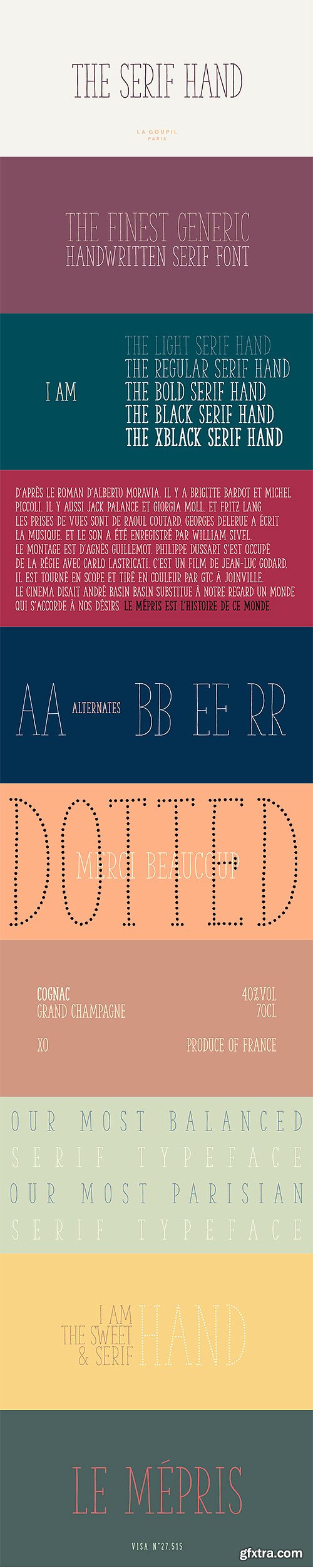
The Serif Hand - Handwritten Font Family
- The Serif Hand is a handwritten font designed by Fanny Coulez and Julien Saurin from French foundry La Goupil Paris. We wanted to create the most generic, readable and balanced serif handwritten font, to work well in every kind of design. It’s an all-caps font with 5 weights and alternates : all the uppercase letters are different from the lowercase letters. We also designed a regular dotted version so you can vary your effects, and a sans serif version of this typeface, The hand.
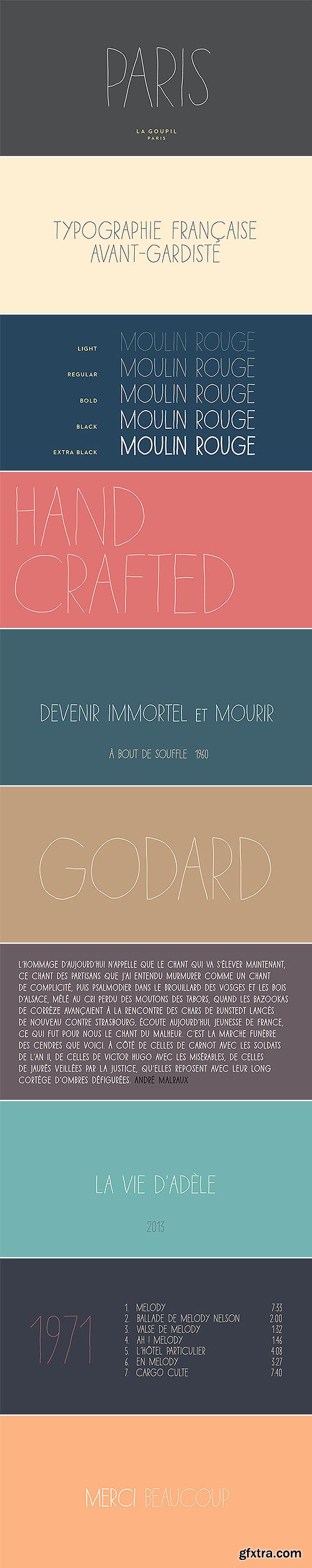
Paris Avant-Gardist Handwritten Font Family
5 OTF Font Files | Designers: Julien Saurin | SALE PAGE
- Paris is an avant-gardist handwritten font by La Goupil Paris. It’s an all-caps thin font, with extended glyphs for many languages. But the little difference of Paris from other handwriting typefaces is the Art Deco feeling that brings it a retro and directly familiar look.
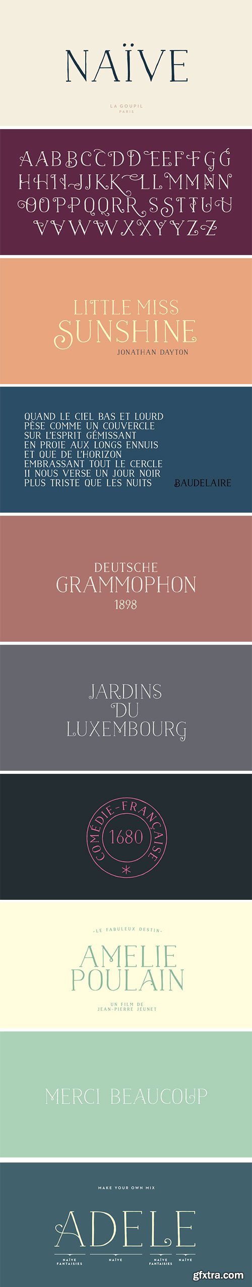
Naive Serif - Handwritten Fonts
6 OTF Font Files | Designers: Fanny Coulez, Julien Saurin | SALE PAGE
- Naïve is a serif handwritten font designed by Fanny Coulez and Julien Saurin from the french foundry La Goupil Paris. The three weights of this new parisian typography can be enhanced with three weights of two alternates fancy glyphs for each letter, the “Fantaisies”, to improve your designs and bring a more poetic and unusual feeling.

Naive Inline Sans Handwritten Fonts
- Naïve Inline Sans is a handwritten font by Fanny Coulez for La Goupil Paris. The three weights of this new sans serif parisian typography can be enhanced with a bicolor interior, ribbed or full, to improve your designs and bring a feeling more modern and unusual. To do this, you must simply superimpose the 2 elements : the weight above, the interior below.

Fierro - Heavy Geometric Retrofuturistic
2 OTF | 2 WOFF | Designer: Jko Contreras | SALE PAGE
- Fierro is a heavy-geometric-retrofuturistic typographic construction that, without any curve, still retains good legibility. These shapes are based on great bended metal pieces, which represent its name, meaning “hardware store”. It has been designed to be used in large sizes and for designs with character that look to create a strong visual block. Designed by Jko Contreras.
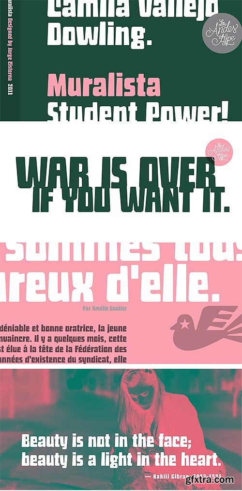
Muralista - Retro Font for Murals & Posters
OTF | WOFF | Designers: Jorge Cisterna | SALE PAGE
- This typeface is inspired by 60s and 70s Chilean murals and posters artwork. On the walls, big and heavy letterforms were presented pictorially for political propaganda. Muralista is a low contrast condensed typeface, similar to classic forms of the early nineteenth century humanist grotesque. The sinuous, rounded and asymmetric terminations remind us the artist’s brush strokes. This typeface is ideal for editorial sentences and logo designs. Designed by Jorge Cisterna.

Magallanes Essential Font Family
8 OTF Fonts | WOFF | JPG Previews | SALE PAGE
Designer: Daniel Hernandez
- Magallanes Essential a contemporary neo-humanist sans serif font designed by Daniel Hernández. Its strokes and terminals are related to the calligraphic strokes from humanist typefaces. Every weight comes with alternative glyphs for a more dynamic use. Magallanes is the perfect titling font to complement text faces in magazines, logotypes, etc.
- It is a essential family of 8 fonts, 4 weights and italics. This typeface no contains alternate glyphs and add only Windows 1252 Character set (219 Glyphs).

OTF | 13.4 MB | Sale Page
XENOIS | Sans Pto, Semi Pro, Serif Pro, Slab Pro, Soft Pro and Super Pro 60 OTF Fonts in One!
- Xenois is a sweeping suite of designs that will provide solutions for a multitude of projects. Annual reports, restaurant menus, business correspondence, corporate identity programs, movie credits and advertising campaigns can all be set with various faces from the family. Interrelating perfectly, the sub-families within the series include Xenois Sans, Serif, Semi, Soft, Slab and Super.The designs have a common and obvious design bond, yet each is able to stand on its own as a distinct typestyle. The Xenois typefaces are based on a common underlying model; they have the same cap height, the same lowercase x-height, the same stem weights, and the same basic character shapes. This unity of shape and proportion results in a remarkably complementary set of typeface designs.

- Rob Leuschke: A former lettering artist at Hallmark Cards, Rob Leuschke now has his own thriving design businesses, Alphabytes and the new TypeSETit. Growing up in St Charles, Missouri, where he still lives, Rob showed great artistic promise at an early age. He earned a BFA in graphic design at the University of Missouri at Columbia. After graduation, his stint at Hallmark Cards gave him the opportunity to learn from and work with some of the best lettering artists in the industry. Rob struck out on his own in 1987 and now boasts a long list of clients from all over the world. Rob has created over 250 custom typefaces, and his work has been exhibited in New York. Ambiance BT is Rob’s first typeface published by Bitstream, with more to follow. Rob Leuschke enjoys continued success as a lettering artist and graphic designer with emphasis on typography and hand-lettering. His work consists of design work for a number of products in multiple industries— social expression, advertising & visual communications, and multimedia. He graduated in 1981 with a Bachelor’s of Fine Arts (BFA) degree from the University of Missouri – Columbia with concentration in illustration and graphic design.

Luxus Brut Sparkling Font
OTF | 1 Font | JPEG Preview | 4.1 Mb RAR | SALE PAGE
- Luxus Brut Sparkling developed from sketches for a bolder version of Luxus Brut (2009) that I made for a poster design. Interventions like slightly tightening the (still generous) spacing and amplifying the contrast between thick and thin strokes ended in a complete rework of the original font. All the shapes have been redrawn in respect of their distinctive origin in mid 1900’s signage lettering. It has now even more timeless elegance! For several characters you can choose alternate forms, accessible via two OpenType Stylistic Sets. Contextually substituted ending forms are available, as well as Numerators, Denominators, Superscript, Subscript and Fraction features, along with and a handful of underlining swashes for your Logotype designs.

Euclid Flex Font Family
OTF | 10 Fonts | JPEG Preview | 9.2 Mb RAR | Euclid Flex Font Family
Each single weight of Euclid Flex contains more than 500 alternate characters and ligatures. Thanks to font engineering and the OpenType font format, these characters can be activated using the OpenType Stylistic Sets and Discretionary Ligatures functions in any OpenType/Unicode-savvy application, or via the Glyphs Panel of the application.

ITC Chino Font Family
TTF | 10 Fonts | JPEG Preview | 3.9 Mb RAR | SALE PAGE
- ITC Chino is a type family (Display & Text) designed by Hannes von Döhren and Livius Dietzel. ITC Chino Pro brings legibility and distinction to text copy. It is also a friendly design that will invite readers into content at large or small sizes. It is a melding of soft brush stokes and crisp edges. This is readily apparent in the bolder italic weights where the straight stems provide a counterpoint to the cursive terminals. The Typefamily is highly legible in a wide range of sizes. The text side of the family contains five weights of roman, each with an italic companion. Ranging from Light to Black, ITC Chino Pro provides a rich typographic palette. The OpenType fonts have an extended character set to support Central and Eastern European as well as Western European languages. Each font includes small caps, fractions, old style-, lining-, tabular numbers, scientific superior/inferior figures and a set of arrows.

Grafolita Font Family
OTF | 565 KB | Sale PaGe
- Grafolita is a type family of three fonts. It offers great versatility in composing layouts with different point sizes, as it allows the user to balance the weights between bigger and smaller letters.Grafolita Script originally started in its bold weight, as a costum font for Grafolita®, a brand of letterpress products. It was later developed into a fully functional OpenType typeface with 3 grades, named: regular, medium and bold.Grafolita is a warm and casual typeface that evokes the liveliness of writing, but doesn't try to emulate it. It assumes its mechanical side, with carefully uniformed shapes and letter connections that avoid having special ligatures or alternate letters that would be needed otherwise. Besides the great advantage of having three weights available, Grafolita Script’s OpenType goodies include six figures styles. That allows for combining numbers and currency symbols in different sizes and baseline-relative positions.[/center]
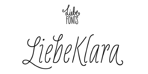

LiebeKlara - Tasty Variety of Ligatures
OTF | 1 Font | JPEG Preview | 14.2 Mb RAR | SALE PAGE
- LiebeKlara is LiebeFonts’ most delicious gourmet creation yet. The mouth-watering look of savory swashes and the fine aroma of masterfully sprinkled contextual alternates will make everyone happy—your spouse, family, and friends. LiebeKlara is festive enough to sit on wedding menus, but still warm enough to give everyday dinner invitations the personal flavor they deserve. LiebeKlara also likes travelling! She speaks most Western languages fluently and with a cute accent. Try it for yourself—LiebeKlara is calorie-free but (or because) she is very delicate. We hope you like her as much as we do! LiebeKlara comes with a tasty variety of ligatures and alternative forms available through OpenType features. (Please make sure your software supports OpenType if you wish to use the advanced features.) The font contains over 580 carefully hand-crafted glyphs—so it’s more like two or three fonts in one.

JAF Bernini Sans Font Family
50 OTF Font Files | 1.77 MB | SALE PAGE
- JAF Bernini Sans’s finely balanced weight distribution and open shapes make it a great text face, while the wide variety of weights and widths provide the designer with a rich toolbox for headings and display typography. What is more, each style of Bernini Sans includes two fonts: JAF Bernino Sans and his sister JAF Bernina Sans – a more playful version with alternate shapes such as round dots and a double-storey g.

Cavole Slab Font Family
OTF | 12 Fonts | JPEG Preview | 4.6 Mb RAR | SALE PAGE
- Cavole Slab is a new slab serif, designed in early 2011, that has a strong influence from Dutch typography. The name is an altered form of the Portuguese word for feather, emphasizing the typefaceís soft and friendly character. Slab serifs give this face plenty of impact and make it an excellent choice for contemporary designers. The font family includes a very dark and powerful black all the way down to a hairline thin weight, giving a tremendous versatility. The family also features dynamic italics that add plenty of emphasis and momentum. Cavole Slab is suitable for both headline and text settings and should easily find its place in a number of different settings, from corporate identity to magazine body copy. There are six weights that come with complementary italics, and each font includes over 450 characters and extended Latin-based language support. The typeface family comes in OpenType format, and OpenType alternates are easily accessible through OpenType enabled applications such as the Adobe suite or Quark. Please see the informative .pdf brochure to see what OpenType features are available and to see them in action.


Aeonis LT Pro - LinoType 42xOTF $2,236
http://www.myfonts.com/fonts/linotype/aeonis/
http://www.linotype.com/610294/Aeonis-family.html
- Aeonis™ is the second large family of typefaces by Erik Faulhaber. The basic Aeonis sans-serif form references Ancient Greek lapidary inscriptions from the 9th century BC. Between the poles of antiquity and modernity, a deliberate contradiction of round and rectangular forms gave way to a new and energised font: Aeonis.
- Aeonis is available in three widths and seven weights, all of which have been carefully coordinated in terms of their proportions. The clear contrast in the bold stroke intensity emphasises the organic nature of the font and creates exciting aesthetics. In light of their open forms, the letters guarantee a good level of readability, even in small point sizes. Given that the dynamic individual forms of Aeonis also fit perfectly in a functional image, this typeface is ideal both for complex, text-heavy documents as well as for logos and display text settings.
- Particular attention was paid to ensuring carefully coordination proportions: all styles and weights have the same cap height, as well as identical ascender heights, x-heights, and descender lengths. The widths of all figures, currency symbols, mathematical operators, and special characters have been carefully aligned for tablular settings.
- Aeonis is an extremely systematic design. All of its widths and weights may be combined with one another, without restrictions. For users who do not like the open A, an alternate A with a crossbar is included in each font as well.

Ando Font Family
5xOTF | 15 MB
http://www.myfonts.com/fonts/jcfonts/ando/
- Ando is a condensed typeface family consisting of 5 weights. Its modular design works particularly well for headlines & display use, where its soft curves & distinctive letterforms can create an instant eye-catching effect. The fonts, provided in Opentype format, include standard ligatures, diacritics for most European languages and some Opentype features (case sensitive forms & proportional/tabular figures).

Clair De Lune Font Family
3 OTF Fonts with 3 WebFonts | 26 MB
http://www.myfonts.com/fonts/hanoded/clair-de-lune/
- Clair De Lune is part of the famous Suite Bergamasque, written by Claude Debussy in 1890, and published in 1905. It means Moonlight in French, a kind of romantic name. The name is exactly what I had in mind for this übercute font. Clair De Lune can be used to design postcards and posters, liven up websites and give your designs an overall happy feel. Clair De Lune was handmade using a 0.5 pen, eco friendly Italian paper and a wooden kitchen table.

Delphi Font Family
4 OTF | 4 WOFF | http://www.myfonts.com/fonts/positype/delphi/
- Delphi grew from a logotype Lily Feinberg produced using Greek-column-inspired letterforms. As that concept expanded to include more and more letters, the typeface had its beginnings. Intertwined, kinetic, and deliberate, Delphi carves itself onto the page and screen, encouraging variation and experimentation. The letterforms’ unique construction and predispostion for experimentation inspired two varying sets: Delphi Dio, comprised of two-line strokes, and Delphi Tria, built of both 2- and 3-line strokes.
- With a design as elaborate, yet tightly tuned as this, the desire to add more and more was irresistible—you'll see a number of stylistic, swash, and titling alternates (and even more hidden away in further stylistic sets). Because Dio and Tria could only hold so much, alternate cuts were produced to better organize your options: the Delphi Alt fonts feature certain letter styles and stylistic alternate sets distinct from those in Delphi.
- Delphi’s sophisticated, striking letterforms make it an ideal display face for use at large sizes, and with so many unique details and alternate letterforms, it’s simply fun to use.
Top Rated News
- MRMockup - Mockup Bundle
- Finding North Photography
- Sean Archer
- John Gress Photography
- Motion Science
- AwTeaches
- Learn Squared
- PhotoWhoa
- Houdini-Course
- Photigy
- August Dering Photography
- StudioGuti
- Creatoom
- Creature Art Teacher
- Creator Foundry
- Patreon Collections
- Udemy - Turkce
- BigFilms
- Jerry Ghionis
- ACIDBITE
- BigMediumSmall
- Boom Library
- Globe Plants
- Unleashed Education
- The School of Photography
- Visual Education
- LeartesStudios - Cosmos
- Fxphd
- All Veer Fancy Collection!
- All OJO Images
- All ZZVe Vectors
 Categories


