


Eund Font Family - Smoothed Letterforms 18xOTF
OTF | 18 Fonts | JPEG Preview | 2 Mb RAR | SALE PAGE
- A geometric sans serif with minimal contrast. Shallow curves are smoothed out of rectangular letterforms to produce a fresh, legible typeface best suited to information based applications. Details include 9 weights with italics, 500 characters, 5 variations of numerals, stylistic alternatives, manually edited kerning and Opentype features.

OTF | 1 Font | JPG Preview | 1 Mb RAR | SALE PAGE
- Otsuki-Sama is a sophisticated mix between a serif and sans serif font design. Its elegant balance between heavy contours and subtle lines gives it a modern yet very rich look. Applicable for any type of graphic design, especially for headlines, posters and magazines.

Gelato Script - Overflowing with Opentype Godness OTF
OTF | 1 Font | JPEG Preview | 4.4 Mb RAR | SALE PAGE
- Gelato Script is a smooth-flowing typeface with an air of familiarity. Influenced by both formal scripts and mid-Twentieth Century hand lettering. The power of OpenType is used with precision in the Contextual Alternate feature to make sure letters connect seamlessly, t’s cross where they can and swashes don't crash into neighboring glyphs. 781 glyphs make up this font, which is capable of speaking in many different languages. Alternate forms are grouped into stylistic sets to make it easy to change the mood of the text. For example, ss01 makes droopable letters drop below the baseline to break it up a little if required.

Lintel Font Family 16xOTF
OTF | 16 Fonts | JPEG Preview | 5.2 Mb RAR | SALE PAGE
- A modern san serif typeface with a pure clean line form. The idea has been to design a font with a proportioned and balanced structure that is applicable to a wide variety of uses. Details include 8 weights with italics, 500 characters, Cyrillic lettering, 5 variations of numerals, manually edited kerning and Opentype features.


CreativeMarket - La Provence Font 175207
TTF | 1 Font | JPG Preview | 3.6 Mb RAR | [leech=v]SALE PAGE[/leech]
La Provence Font is a handmade calligraphic type.
This font contains uppercase, lowercase and multilingual glyphs.

Krul - Amsterdam's Popular Script Typeface
OTF | 1 Font | JPEG Preview | 4 Mb RAR | SALE PAGE
- ‘Krul’ is a typographic interpretation of the lettering style created by Dutch letter painter Jan Willem Joseph Visser at the end of the 1940s, which decorated the traditional brown bars of Amsterdam. In the beginning, these letters were strongly associated with the pubs connected to the Amstel brewery, given that Visser was the company’s official painter. As the years passed, the style became increasingly popular, and various business owners in Amsterdam and other Dutch and Belgian cities also commissioned its use. In the 1970s and 1980s, Leo Beukeboom, another talented letter painter, continued and expanded this lettering tradition while employed under the Heineken brand. Much of his work can still be found in the Jordaan and De Pijp neighborhoods in Amsterdam.

Abitare Sans Font Family
TTF | 30 Fonts | JPEG Preview | 7,5 Mb RAR | SALE PAGE
Abitare Sans was originally commissioned by the group Rizzoli Corriere della Sera. It’s a typeface of 30 weights designed to be used in Abitare magazine. The request of the president Mario Piazza was a new CP Company with some redesigned glyphs, but the result is a radical evolution of its concept being intended to be used as a font for text far more readable. In Abitare Sans was kept the geometric structure without neglecting the numerous editorials requirements.

Altis - 10 Optically Balanced Weights
OTF | 10 Fonts | JPG Preview | 4.6 Mb RAR | SALE PAGE
- Altis combines geometric regularity and soulfulness into one font family. It resembles the traditional sanserif from the early 20th century, which communicates friendly and reads extremely well. Bring out its optimistic airiness with light styles or exploit the masculine strength of the bolds. Altis has been developed to fit present-day editorial conditions and publishing models. There are ten optically-balanced weights and practical OpenType features, which make the family versatile and operationally spot-on.

MrLucky Font Family 7xOTF
OTF | 7 Fonts | JPEG Preview | 3.2 Mb RAR | SALE PAGE
- Mr Lucky is Mr Happy's slab brother and a hand-drawn narrow typeface designed for one of our books. You can layer different styles over the background style to achieve lots of colorful effects. Use just one style to get a single color letter or set Fill over Background or Stripped Background to get a two color mode. Mr Lucky has upper and lowercase characters with up to three alternate glyphs and special alternate uppercase diacritics. Build in OpenType Contextual Alternates feature will automatically set alternate glyphs depending on frequency of appearance of the same character (even in web font but only in HTML5 browsers). The script doesn’t throw random glyphs. For example in the word “HIPPOPOTAMUS” you will automatically get three different “P” glyphs and two “O” glyphs. It really works great but of course you can always fine tune it by hand.

CreativeMarket - Lovely Script 949648
The Lovely is a classy script font. It has an elegant and luxurious style and is perfect for branding and lettering designs.

Tulipan - Lovely Script Family
After Letrista Script, Calderon Estudio returns with a new contemporary and adaptable typeface. Tulipan Lovely Script is a font with three variations resulting in a subtle design that can be smooth as the fresh tulips that inspired it, markedly delineated as a tulip in full bloom, or rough as crocodile skin. Tulipan evokes the soul of vintage brush lettering. See our samples here.
OTF | 11 Fonts | JPEG Preview | 42 Mb RAR

Herbie - Uppercase Display Font
Herbie is a uppercase display font with alternates on every character (upper/lowercase), based only on circles and geometric lines. Herbie is inspired by, as the name might indicate, Herb Lubalin’s work and the decorative style and kerning of his era.
OTF | 1 Font | JPEG Preview | 0.33 Mb RAR

Andalusia is a Romantic Typefaces. bold, elegant & fun Vintage Script font. With almost 423 glyphs and 160 alternative characters, contain with opentype features. Stylistic alternates,swash and more. Can be used for various purposes.such as logos, wedding invitation, t-shirt, letterhead, signage, lable, news, posters, badges etc.
OTF | 1 Font | JPEG Preview | 0.42 Mb RAR

Transat is a geometric sans serif typeface, with caps inspired by Art Deco signage — found inside the “Gare Maritime” (literally “sea station”) ocean liner terminals in both Le Havre and Cherbourg, France, in the early 1930s. The name “Transat” is the common shortening of “Compagnie Générale Transatlantique,” the company that operated majestic ocean liners like the SS Normandie out of Le Havre from 1862–1974. (Transat also has a more rational text-friendly companion font, "Transat Text"). Transat includes many OpenType features, such as ligatures (ff/ft/fft), small capitals, case sensitive forms, stylistic alternates, arbitrary fractions, and a full complement of proportional, tabular, and oldstyle figures. Transat is released in 5 weights plus including optically-corrected obliques.
OTF | 10 Fonts | JPEG Preview | 1.9 Mb RAR
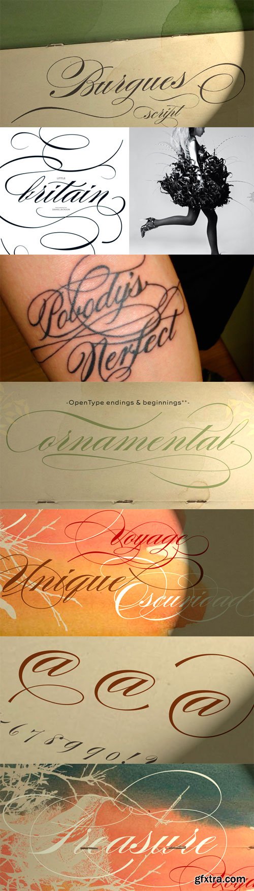
Burgues Script OTF
OTF | WOFF | JPEG Preview | 0.8 Mb RAR | SALE PAGE
- Burgues Script is an ode to the late 19th century American calligrapher Louis Madarasz, whose legendary pen has inspired schools of penmanship for over 100 years. His talent has caused some people to call him “the most skillful penman the world has ever known.” I use the word ‘ode’ in a colloquially ambitious manner. If I was an actual poet, my words would be about things I desire but cannot attain, objects of utter beauty that make me wallow in humility, or people of enormous talent who look down at me from the clouds of genius. But I don’t write poems. My work consists of letters drawn to fit together, that become an element of someone’s visual poetry. I am the poet’s assistant, so to speak. Once in a while, the assistant persists on what the subject of the poem will be. And occasionally, the poet gives in to the persistence. I hope you, visual poet, find my persistence justified in this case.

Adagio Slab - For Company Identities
The Adagio Family is a part of Mateusz Machalski’s, Warsaw Academy of fine arts Master Degree Diploma in multimedia studio, conducted by Professor Stanislaw Wieczorek and his brave PhD student Jakub Wroblewski. Adagio is a modern type family. It consists of 3 main varieties: sans, serif and slab. Each has its own “true italic” set. All of the styles together have over 400 characters in 9 different thicknesses. The Adagio family was created mostly for company identities. The idea was to create a wide range of different varieties that are stylistically consistent. Adagio Slab - Slab variety combines qualities of the Sans and Serif varieties. It has the same contrast as Sans. As distinct from Serif, Adagio Slab contains strong, beamy and symmetrical serifs in the form of pillows. Thanks to large X height, and highly stretched descenders, it also works correctly in longer text, while its strong detail is good for headlines.
OTF | 18 Fonts | JPEG Preview | 4.5 Mb RAR

Mamontov - Massive Asymmetric Serifs
Originally Mamontov has been inspired by poster (usually wooden) types of the end of 19th—the beginning of 20th centuries. The type family was named after Savva Ivanovich Mamontov (1841-1918), Russian industrialist and patron of the arts. Massive asymmetric serifs, stocky proportions, type weight... are traces of harsh imperial reality. And soft forms of ovals, exaggerated compensators, humanistic curves of serifs and horizontal strokes betray the sensitivity and artistry of Savva Ivanovich. Mamontov has 25 styles, ranging from Light to Black and from Condensed to Wide, with more than 1000 characters per font.
OTF | 25 Fonts | JPEG Preview | 5.5 Mb RAR
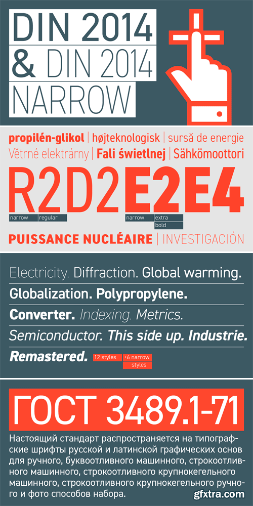
DIN 2014 - Extremely Legible Typeface
TTF | 18 Fonts | JPG Preview | 1.3 Mb RAR | SALE PAGE
- DIN 2014 is a contemporary version of a well-known DIN typeface. The Regular performs well in long text settings, while Light and Bold faces are extremely legible at large sizes. Type family spans 18 faces: 6 Upright with the matching Italics of normal width and 6 Narrow ones. The typeface was designed by Vasily Biryukov and released by Paratype in 2015.

Bringin Script - Bouncy & Smooth
OTF + TTF | JPG Previews | 3.4 Mb RAR | SALE PAGE
- Bringin is informal script lettering font with a bunch of alternative characters to choose. Bringin uses OpenType feature such as swash, ligature and alternates that can be found by using OpenType savvy program such as Adobe Illustrator and Adobe InDesign. Bringin is bouncy and smooth and has a very feel. You have a lot of options to customize it and that makes it perfect for logos, packages and titles.It can be accessed by using OpenType savvy program such as Adobe Illustrator and Adobe InDesign. The Manual that show you how to use OpenType feature was included in the package.
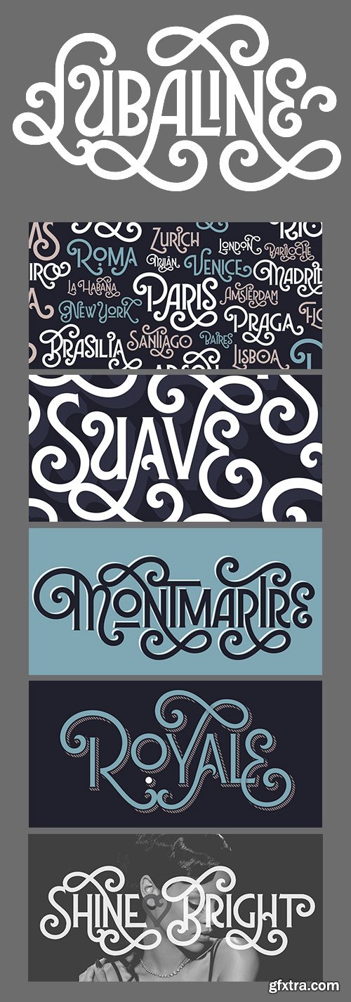
Lubaline Font Family
OTF | 6 Fonts | + JPG Previews | 0.7 MB | SALE PAGE
- SPT Lubaline is a decorative multi-layered all-caps semi-serif typeface family with eclectic Art Deco style, further exaggerated with Shadow, Extras, and swashes aplenty. It is also Maximiliano Sproviero’s humble tribute to the work of Herb Lubalin, a typographic icon who smashed the taboos and sacred rules of type design. Lubaline is ready to perfect your exuberant design briefs, especially those related to branding, editorial, packaging, or anywhere you want to make an eye-grabbing statement.
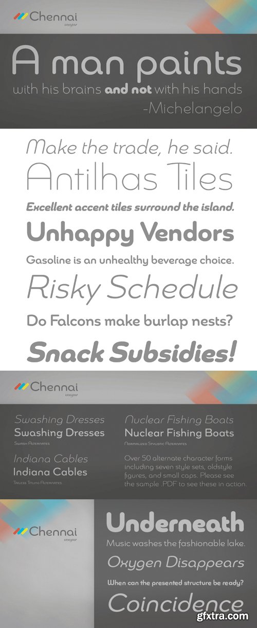
Chennai Font Family
OTF | 12 Fonts | JPEG Preview | 4.7 Mb RAR | SALE PAGE
Chennai contains 12 styles and family package options.
- Updated in 2009, Chennai has new weights and OpenType features. Chennai is a simplified sans-serif with a full complement of OpenType alternates. The typeface is rounded, slightly extended and geometric. Over fifty OpenType alternate characters are available, including swashed lower forms, traditional caps and a traditionally formed lowercase. Chennai also includes seven style sets, oldstyle figures, and small caps. Please see the sample PDF to see these in action. Use Chennai whenever you need a contemporary and versatile sans serif.
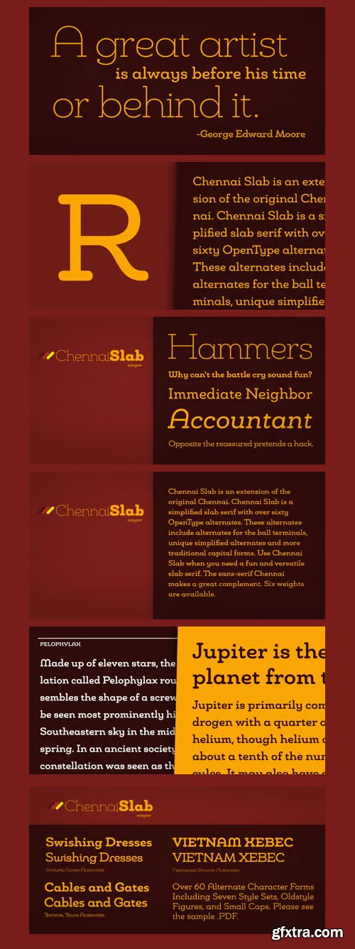
Chennai Slab Font Family
12 OTF and TTF Font Files | 2.3 MB | SALE PAGE
Chennai Slab is a simplified slab serif with over sixty OpenType alternates.
These alternates include alternates for the ball terminals, unique simplified alternates and
more traditional capital forms. Use Chennai Slab when you need a fun and versatile slab serif.

Style Script Font Family
OTF | 8 Fonts | JPEG Preview | 9 Mb RAR | SALE PAGE
- No word describes this font better than STYLE... TypeSetIt has taken things just a step further. It takes the look and simplicity of 1950s and 60s advertising and combines it with up to date design characteristics. With three main styles, Plain, Script and Formal, StylePro transforms the Retro look into a versatile, and powerful font that can be used for nostalgic work, or 21st Century design. Style Script is a beautiful upright script with looks that vary from Casual to Formal in appearance. If you're a professional graphic designer, use Adobe Illustrator®, or InDesign®, to access Style Script Pro’s Opentype features. With over 1275 Glyphs, the OTF programming gives a powerful solution to the needs of design professionals. Special thanks to Maximiliano Sproviero (my good friend) for his keen eye and design suggestions, and a note of appreciation to Mark Simonson for helping with technical issues.
Top Rated News
- Finding North Photography
- Sean Archer
- John Gress Photography
- Motion Science
- AwTeaches
- Learn Squared
- PhotoWhoa
- Houdini-Course
- Photigy
- August Dering Photography
- StudioGuti
- Creatoom
- Creature Art Teacher
- Creator Foundry
- Patreon Collections
- Udemy - Turkce
- BigFilms
- Jerry Ghionis
- ACIDBITE
- BigMediumSmall
- Boom Library
- Globe Plants
- Unleashed Education
- The School of Photography
- Visual Education
- LeartesStudios - Cosmos
- Fxphd
- All Veer Fancy Collection!
- All OJO Images
- All ZZVe Vectors
 Categories


