
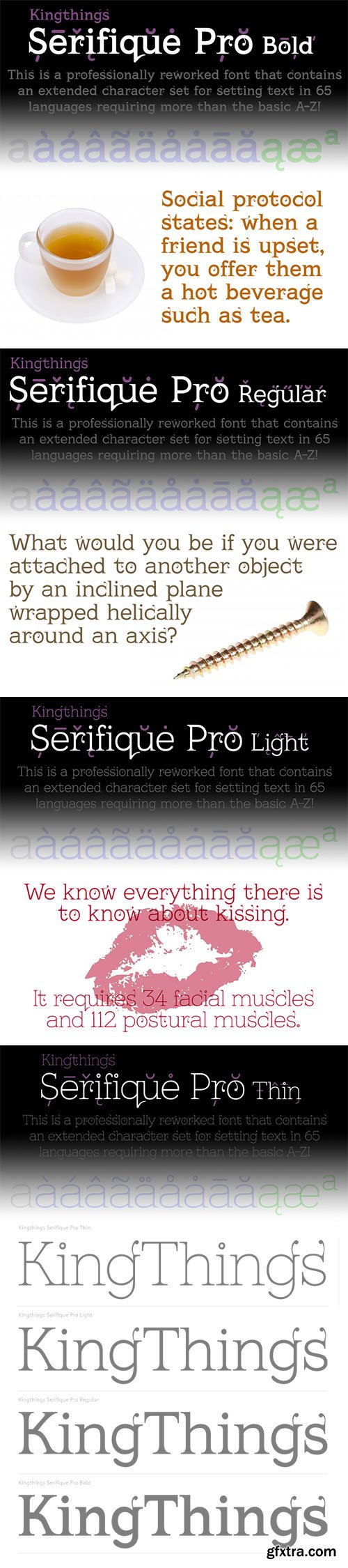
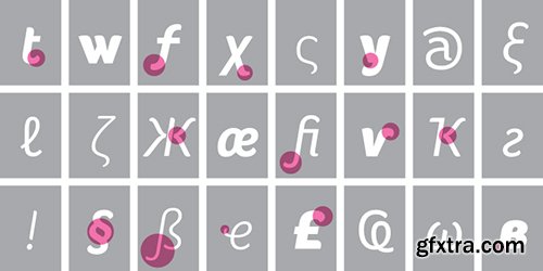
This is what you get when you mix monoline rounded letters with some bracketed serifs and finish it off with a sprinkle of ornamental appendages. The result is very readable, rather original and quite charming. I have fixed some inconsistencies in serif designs across the weights, cleaned up the serif connections - and added a fourth weight. But I have kept all the wonky curves and slightly differing stroke thicknesses, as they are so integral to the charm.
Kevin King says: "I guess all type designers at some point think 'Well, I'll just have a go at a standard text face...' There is a long story here somewhere, suffice it to say that I started with the thinnest version - typical. I wanted to make a standard serif text face - until I saw it in print and thought “Yuk! it looks like everything else!” - still does really but with twiddles and pooneys..."
If you find the “twiddles & pooneys” too much you can tone them down with the OpenType Stylistic Alternate feature (which will make sure they don't appear on three consecutive letters) or remove them completely with the OpenType Swash feature.
ALL fonts from CheapProFonts have very extensive language support:
They contain some unusual diacritic letters (some of which are contained in the Latin Extended-B Unicode block) supporting: Cornish, Filipino (Tagalog), Guarani, Luxembourgian, Malagasy, Romanian, Ulithian and Welsh. They also contain all glyphs in the Latin Extended-A Unicode block (which among others cover the Central European and Baltic areas) supporting: Afrikaans, Belarusian (Lacinka), Bosnian, Catalan, Chichewa, Croatian, Czech, Dutch, Esperanto, Greenlandic, Hungarian, Kashubian, Kurdish (Kurmanji), Latvian, Lithuanian, Maltese, Maori, Polish, Saami (Inari), Saami (North), Serbian (latin), Slovak(ian), Slovene, Sorbian (Lower), Sorbian (Upper), Turkish and Turkmen.
And they of course contain all the usual “western” glyphs supporting: Albanian, Basque, Breton, Chamorro, Danish, Estonian, Faroese, Finnish, French, Frisian, Galican, German, Icelandic, Indonesian, Irish (Gaelic), Italian, Northern Sotho, Norwegian, Occitan, Portuguese, Rhaeto-Romance, Sami (Lule), Sami (South), Scots (Gaelic), Spanish, Swedish, Tswana, Walloon and Yapese.
OTF | 5.02 MB
Sale Page
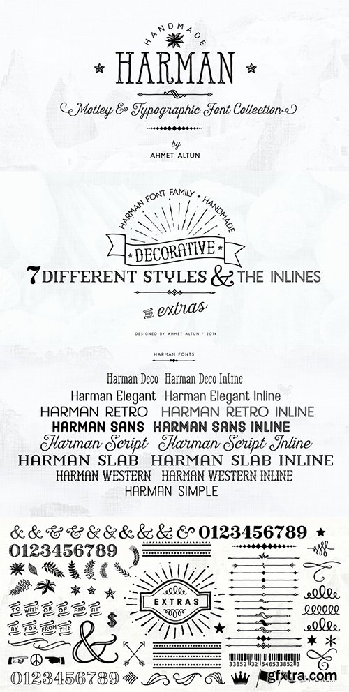
Harman Font Family includes Seven fonts and their inline forms that have different styles from each other but at the same time compatible with together. This font collection is completely hand-made. In addition it includes very useful extra elements.The word “Harman” is a Turkish word meaning the blend in English.Harman Font Family Collection was designed carefully to create the elegant typographic works. It would be a perfect choice to design posters, affiches, logos, t-shirt and magazine prints, eye-pleasing typographic designs and more.
TTF | 1 MB
Sale Page
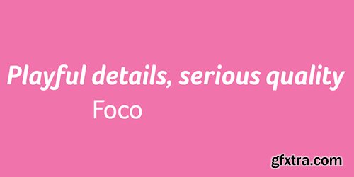
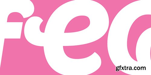
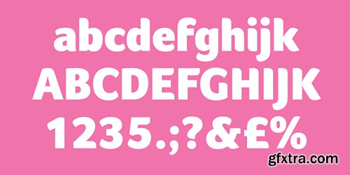
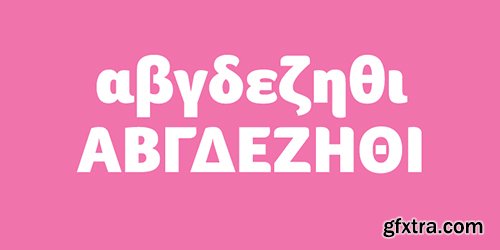
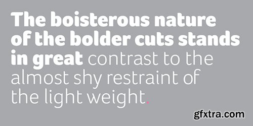
The playfulness of the Foco font family’s design details belie its serious quality. Foco can be equally well employed in the toughest of corporate identities, or to entice in advertisements. While the playful details shine through in titling or display sizes, the font family’s primary task, functionality, is clearly demonstrated at text sizes. The distinctive and open character shapes ensure the highest legibility. Foco is best applied where high visibility and recognition are demanded, yet with careful use it can support quiet communication with a subtle and sympathetic voice.The Foco Standard Edition includes the Latin Extended A character set. Please see the Corporate Edition of Foco for an extended character set including Latin, Greek and Cyrillic scripts.
Logomotion Font for Headlines, Posters & Signage $29
Design Date: Mar 21, 2015 | Designers: Fernando Diaz, Andrej Matic | OTF
![]()
![]()
![]()
![]()
![]()
![]()
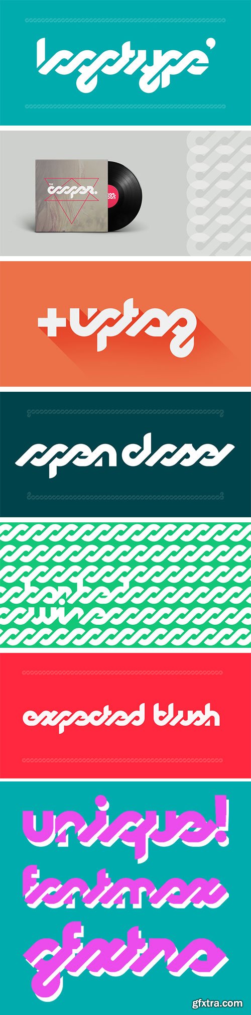
This is a typeface specially designed for logotypes, but can also be used in headlines, posters & signage. It has many OpenType programming features, that give a more playful and rhythmic spirit, creating an interesting geometric-sans and script mixture. The design was based on an awesome logotype created by Andrej Matic.
http://www.myfonts.com/fonts/artlebedev/als-finlandiascript/
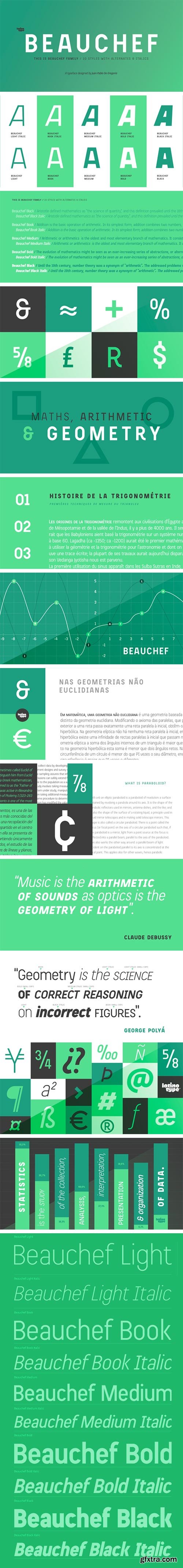
http://www.myfonts.com/fonts/latinotype/beauchef/
OTF | TTF | 750 KB
Sale Page
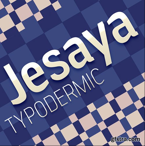
Jesaya’s crisp shapes put a sharp new face on whatever you have to say.
Shaved sharps prevent typographic injury while seven weights give Jesaya range.
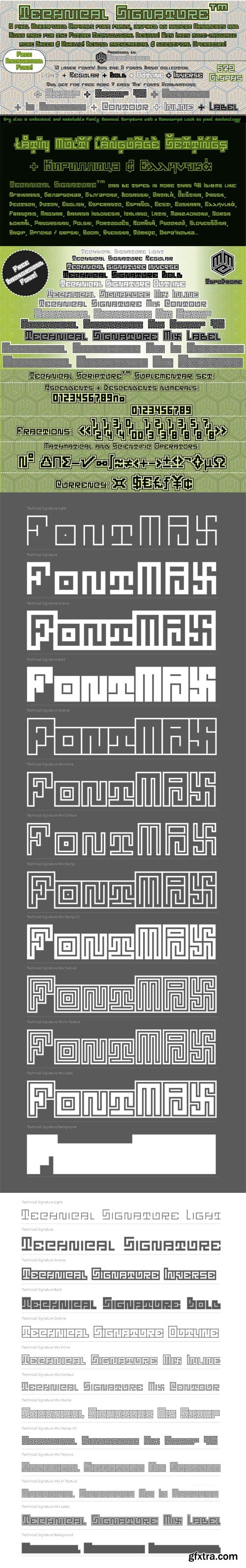
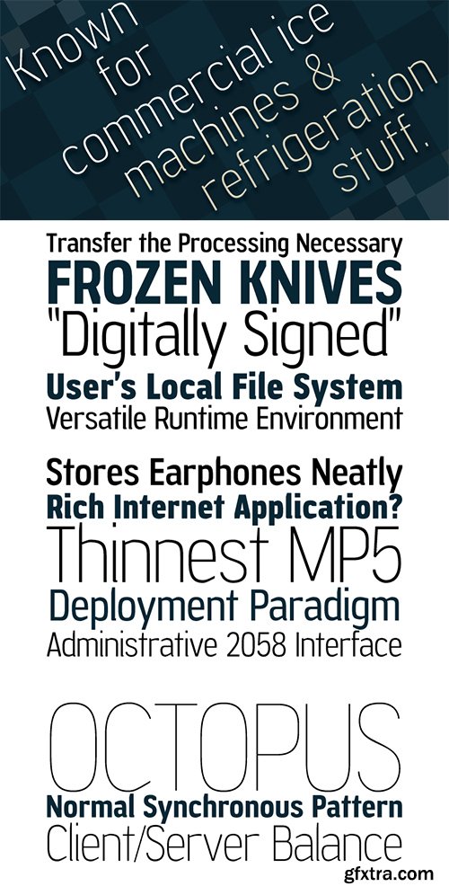
Technical Signature - Modern Pixel Type Font Family $80
13 OTF Font Files | Designers: Andre Themoteo Alves Correa
http://www.myfonts.com/fonts/mmc-typodrome/technical-signature/
![]()
![]()
![]()
![]()
![]()
![]()
![]()
The Font ‘Technical Signature’ is a modern pixel type family inspired by Antigue roman Scripts and Ornaments, with the intention to bring a manuscript look to a technical digital surface . It’s kind a simbiotical typography version with the font family Technical Scripture as the both got the same metrics sizes and also almost half of glyphs in commom, at most same suplementary characters and a few repeated shapes... That is the case of The uppercase letters (D,O,W,M,N) and the lowercase (o,s,z) and the numerals (1,7,8 and 0) such as the currency simbols, math operators and other features like the same greek and cyrillic base letters too. The diferent font weights of the family can be combined in layer work as also there is a dynamic and easy ‘Mix’ sub-family styles with the maximum possible combinations in the complete package. The Complete Family consists of 5 basic font weight styles: Light, Regular, Inverse, Bold, Outline and 7 ‘Mix’ styles: Inline, Contour, Stamp, Stamp Reverse, Texture, In Texture and Label... Plus one free Background font! Total of 13 font styles in each family. If you are interest in both Technical Scripture and Technical Signature, you can use both together! They are compatible in metrics... These Fonts supports Western Latin, Eastern European Latin languages diatrics, plus Baltic, Turkish, Greek and Cyrilic.
OTF | 130 KB
Sale Page
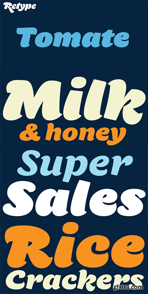
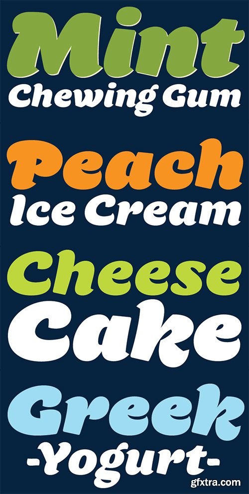
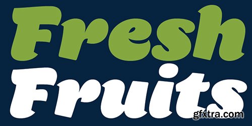
Tomate started in 2013 as a brush lettering exercise for a poster and was later used for the ReType identity.In 2014 its author decided to turn it into a super fat typeface suitable for packaging and mass consumption products.The possibilities of ultra heavy forms are explored in this alphabet; trying to solve the design problems that these sort of forms present.


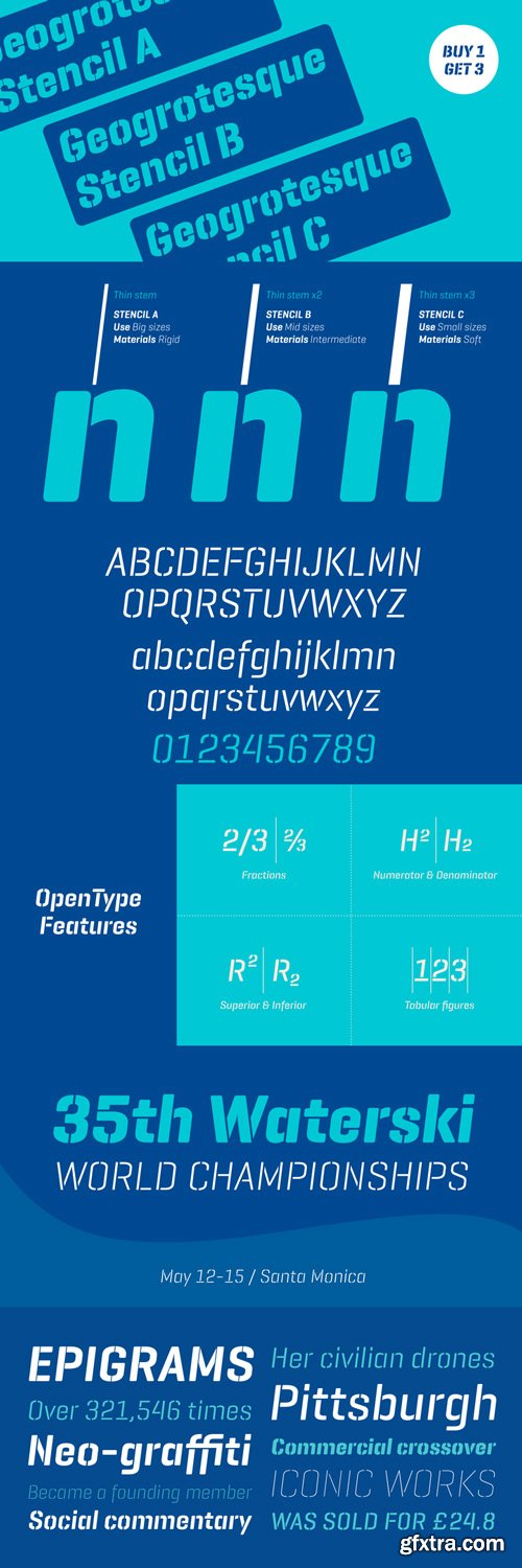
Geogrotesque Stencil Italic Font Family $239 | 21 x TTF and OTF
http://www.myfonts.com/fonts/emtype/geogrotesque-stencil-italic/
Geogrotesque Stencil Italic is the long-awaited companion of the popular Geogrotesque Stencil. As its upright partner, Geogrotesque Stencil Italic comes with 3 widths of cut (A, B and C). These cuts not only allow a better performance when printing at different sizes, you can also move across versions A, B or C in accordance to the rigidity of the material used. The family consists of 21 styles, 7 weights with 3 versions each, all of them in Open Type format with support for Central and Eastern European languages. Furthermore, the combination of both Geogrotesque Stencil families, upright and italic, gives way to a superfamily up to 42 styles. For a non stencil version please see Geogrotesque Family.
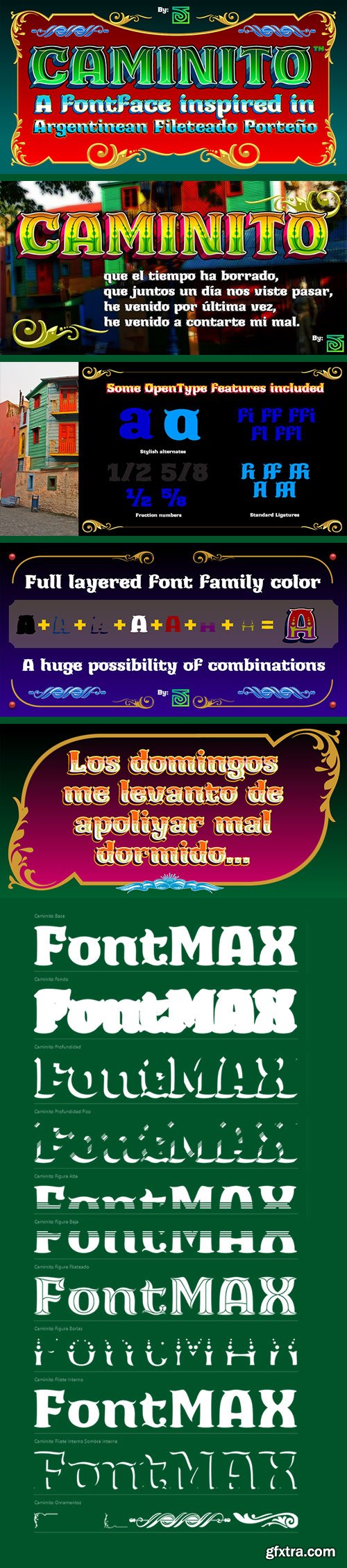
Caminito - Argentinean Classic Font Family $125 NEW!
11 OTF Fonts | Designer: John Vargas Beltran | Design Date: Jan 12, 2015 | TURKISH SUPPORT
http://www.myfonts.com/fonts/vargusjohn/caminito/
![]()
![]()
![]()
![]()
![]()
![]()
![]()
![]()
![]()
This fontface is inspired on Argentinean classic and traditional art craft named as Fileteado Porteno.
Caminito is available in 10 layered styles for compose with multi combinations and a extra of ornaments. Highly recommended to be used for colorized titles and display texts.
Fileteado Porteno is a type of artistic drawing, with stylized lines and flowered, climbing plants, typically used in Buenos Aires, Argentina. It is used to adorn all kind of beloved objects: signs, taxis, lorries and even the old colectivos, Buenos Aires’s buses. Filetes (the lines in fileteado style) are usually full of colored ornaments and symmetries completed with poetic phrases, sayings and aphorisms, both humorous or roguish, emotional or philosophical. They have been part of the culture of the Portenos (inhabitants of Buenos Aires) since the beginnings of the 20th century. One of the most highlighted and recognized artists nowadays is Alfredo Genovese, who does a great job of teaching and claim this art and craft. The name Caminito reminds the emblematic and iconic Buenos Aires neighborhood immortalized by Carlos Gardel in music, in the tango.
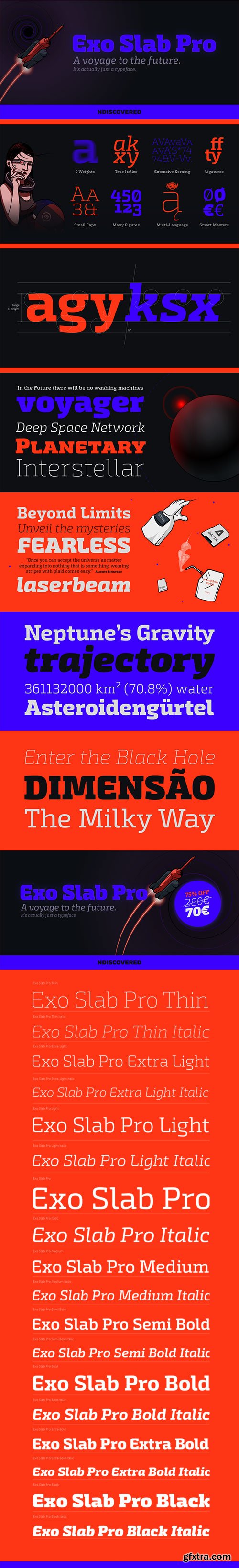
Exo Slab Pro - Newest Technological and Futuristic Slab Serif Font Family $720
18 OTF Font Files | Designer: Natanael Gama | Design Date: Feb 28, 2015 | TURKISH SUPPORT
http://www.myfonts.com/fonts/ndiscovered/exo-slab-pro/
![]()
![]()
![]()
![]()
![]()
![]()
![]()
![]()
![]()
![]()
![]()
![]()
Exo Slab Pro is a slab serif with a technological and futuristic tone. Even though it has a very peculiar look and many distinct shapes that pop out in an headline, it also works well as whole creating a nice shade of text. Large x-height, ink-traps and a modest contrast ensures that this font will work well even on small font sizes. Loaded with opentype features Exo Slab provides a huge versatility. You can use it on rigorous work as well as on more funny projects. From Branding to Editorial, from Paper to Screen, from Today to the Future.
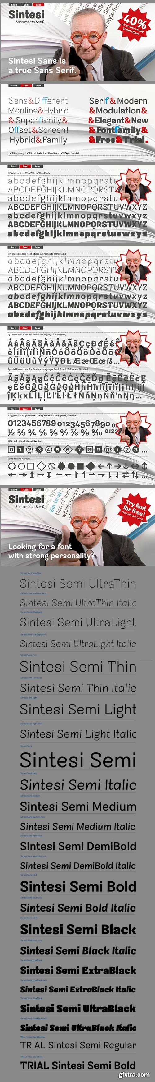
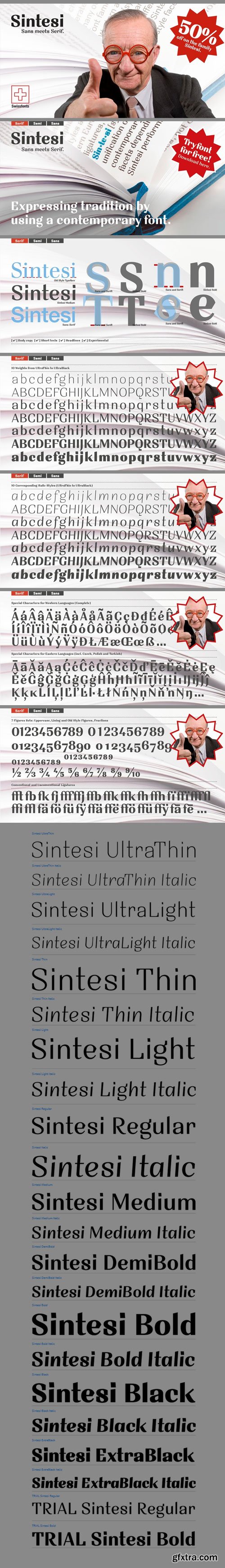
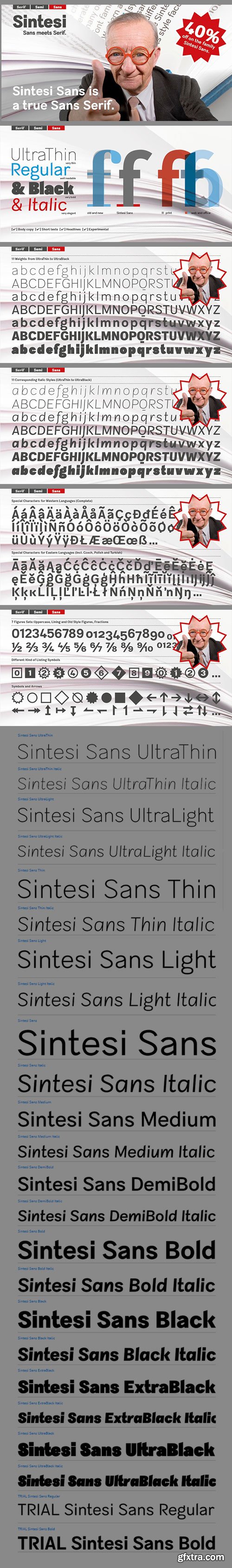
Sintesi Semi - Sans meets Serif $199
22 OTF Fonts | Designer: Filippo Salmina | TURKISH SUPPORT
http://www.myfonts.com/fonts/fsdesign/sintesi-semi/
![]()
![]()
![]()
![]()
![]()
![]()
![]()
![]()
![]()
![]()
![]()
![]()
Are you looking for a robust, contemporary font with strong personality? Sintesi Semi might be exactly what you are looking for. Sintesi Semi is a hybrid font which manages the “synthesis” between Sans and Serif in its own way. Due to its constant stroke the favorite font of the author is closer to a sans serif and scores with its robustness and contemporary style. Its strong serifs though evoke rather a slab serif font. Sintesi Semi builds together with Sintesi (Serif) and Sintesi Sans an extended family.
Prove character too, with Sintesi Semi.
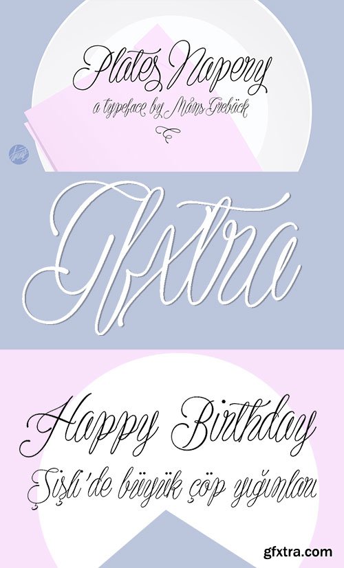
Plates Napery - Elegant Script Type $59
OTF Font File | Designers: Mans Greback | Design Date: Jan 29, 2015 | Turkish Support
http://www.myfonts.com/fonts/mawns/plates-napery/
![]()
![]()
![]()
![]()
![]()
![]()
![]()
![]()
![]()
![]()
Thin and elegant typeface design, with several alternate glyphs.
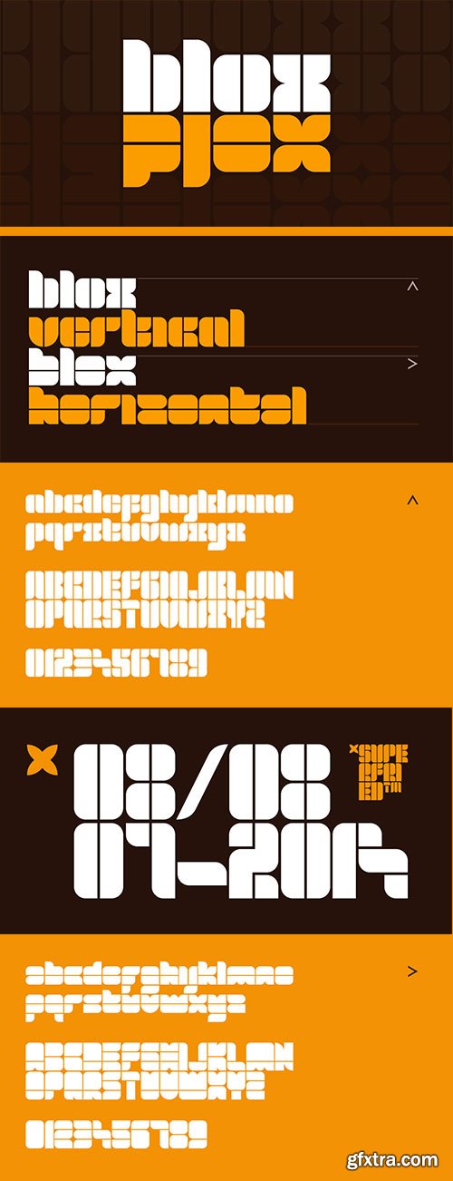
Blox - Simple Geometric Types $41 NEW!
2 OTF Fonts | Created: Feb 20, 2015 | TURKISH SUPPORT
http://www.myfonts.com/fonts/superfried/blox/
![]()
![]()
![]()
![]()
![]()
![]()
Blox is a bold, retro, experimental display typeface designed by Superfried. With a simple geometric structure, tight spacing and cuts, Blox is very distinct with high impact. Available in two styles, vertical or horizontal, Blox has been featured on the Behance curated typographic gallery TypographyServed.com.
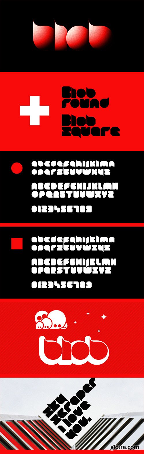
Blob - Simple Geometric Shaped Typeface $41
2 OTF Font Files Circle & Squaere Forms | Created: Feb 20, 2015 | TURKISH SUPPORT
http://www.myfonts.com/fonts/superfried/blob/
![]()
![]()
![]()
![]()
![]()
![]()
Blob, designed by Superfried, is available in two formats Round and Square. It is an experimental, sans-serif display typeface based on simple geometric shapes. Although unorthodox, care has been taken to ensure that it is completely legible. Blob has been featured on the Behance curated typographic gallery TypographyServed.com.
Top Rated News
- Sean Archer
- John Gress Photography
- Motion Science
- AwTeaches
- Learn Squared
- PhotoWhoa
- Houdini-Course
- Photigy
- August Dering Photography
- StudioGuti
- Creatoom
- Creature Art Teacher
- Creator Foundry
- Patreon Collections
- Udemy - Turkce
- BigFilms
- Jerry Ghionis
- ACIDBITE
- BigMediumSmall
- Boom Library
- Globe Plants
- Unleashed Education
- The School of Photography
- Visual Education
- LeartesStudios - Cosmos
- Fxphd
- All Veer Fancy Collection!
- All OJO Images
- All ZZVe Vectors
 Categories


