
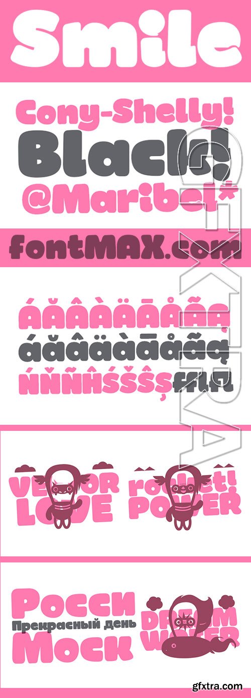
Smile - Fat Kiddy Typeface $15
OTF Font File | Designer: Rodrigo Araya Salas | TURKISH SUPPORT
http://www.myfonts.com/fonts/rodrigotypo/smile/
![]()
![]()
![]()
![]()
![]()
![]()
![]()
![]()
![]()
![]()
![]()
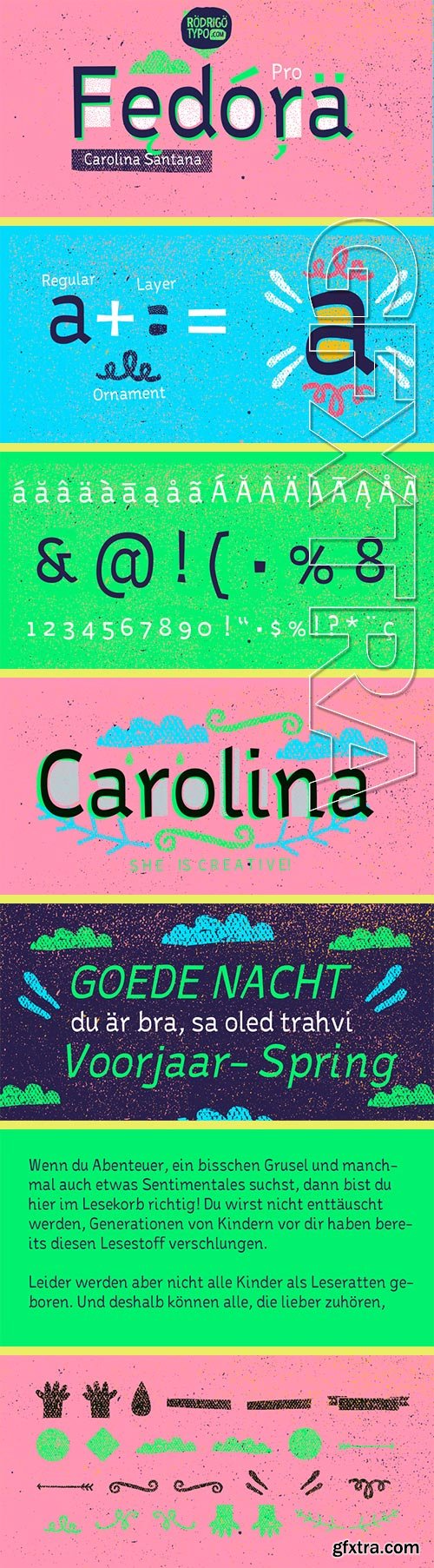
Fedora Pro - Creative Typeset $50
Designers: Carolina Santana | Design Date: Apr 18, 2015 | TURKISH SUPPORT
http://www.myfonts.com/fonts/rodrigotypo/fedora-pro/
![]()
![]()
![]()
![]()
![]()
![]()
![]()
Sans serif typography, playing with alternatives as a layer and another set of ornaments to make your titles something very nice and very entertaining. Styles can also be combined.
Created by Carolina Santana.
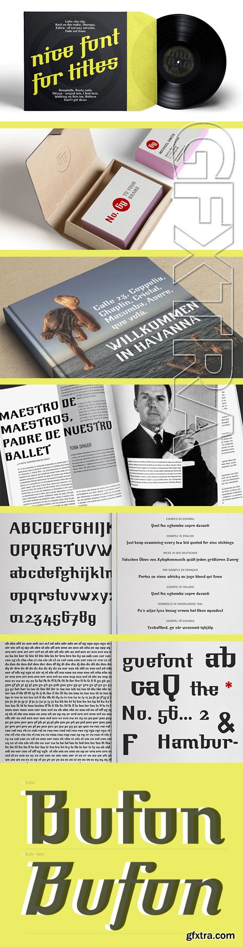
Bufon - Display Typeface $38
2 OTF Font Files | Designer: Daniel DeMilan | Design Date: Apr 18, 2015 | TURKISH SUPPORT
http://www.myfonts.com/fonts/demilan-studio/bufon/
![]()
![]()
![]()
![]()
![]()

Selektor - Technical Geometrical Sans Typeface $99
6 OTF Font Files | Designer: Dusan Jelesijevic | TURKISH SUPPORT
http://www.myfonts.com/fonts/tdf/selektor/
![]()
![]()
![]()
![]()
![]()
![]()
![]()
![]()
![]()
![]()
![]()
Selektor is a small font family characterized as geometrical sans. Inspired and after that designed with charm of technical letters, it contains a few letters with specific endings that gives Selektor a peculiar impression. Global overview of Selektor says it’s a neutral, corporate, stable, well balanced font family, but not cold and heartless to leave readers without remembrance on its characteristics. It is fully appliable in all kinds of publications, from long texts in paragraphs to titles and product names. Contain 3 weights - Light, Regular and Bold and matching Italics. All family members include Small Caps and Fractions as well as additional OpenType features.
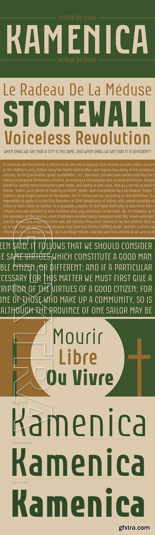
Kamenica - Condensed Retro Display Font Family $68
3 OTF Font Files | Designer: Dusan Jelesijevic | TURKISH SUPPORT
http://www.myfonts.com/fonts/tdf/kamenica/
![]()
![]()
![]()
![]()
![]()
![]()
![]()
![]()
![]()
“Kamenica” - named after a beautiful small mountain river in Serbia - is a font family containing 3 weights: Light, Regular and Bold. The Kamenica river is only a few meters wide. Mostly shallow and cold, clear and green, it was the direct inspiration source for the creation of this condensed typeface. As our other typefaces, “Kamenica” also combines traditional shapes with modern forms, tall x-height and a collection of more than 300 glyphs. Comparing the river with the font, we could say that letters are the fishes that lives in the Kamenica river and that the font weights are the seasons in which this river shows most of its own character.
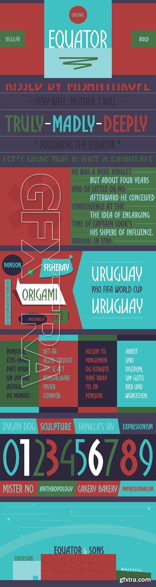
Equator - Modern Angular Typeface $48
2 OTF Fonts | Designer: Dusan Jelesijevic
http://www.myfonts.com/fonts/tdf/equator/
![]()
![]()
![]()
![]()
![]()
![]()
![]()
![]()
![]()
![]()
![]()
Equator is modern angular typeface available in two weights ready for traveling all over the world.
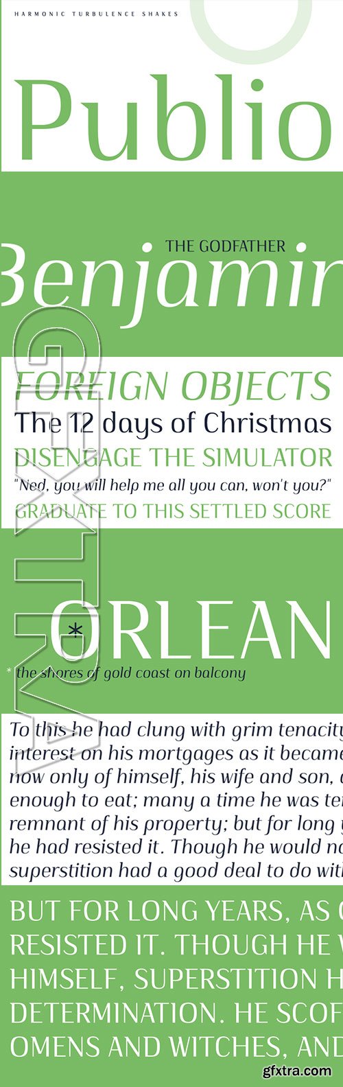
Publio - Sharp, Triangular Semi-Serif Typeface $48
2 OTF Font Files | Designer: Dusan Jelesijevic | TURKISH SUPPORT
http://www.myfonts.com/fonts/tdf/Publio/
![]()
![]()
![]()
![]()
![]()
![]()
![]()
![]()
![]()
Publio is small unusual and unique font family, characterized with sharp, triangular semi-serifs.
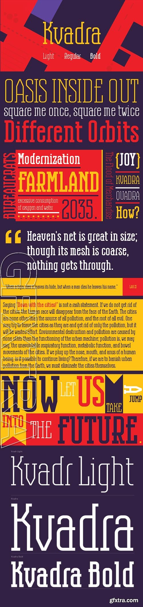
Kvadra - Condensed Slab Serif $81
3 OTF Font Files | Designer: Slobodan Jelesijevic | TURKISH SUPPORT
http://www.myfonts.com/fonts/tdf/kvadra/
![]()
![]()
![]()
![]()
![]()
![]()
![]()
![]()
![]()
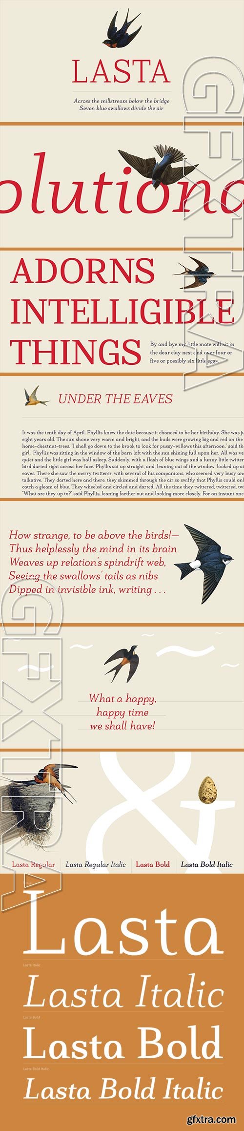
Lasta - Small Serif Font Family $90
4 OTF Font Files | Designer: Dusan Jelesijevic | TURKISH SUPPORT
http://www.myfonts.com/fonts/tdf/lasta/
![]()
![]()
![]()
![]()
![]()
![]()
![]()
![]()
![]()
Lasta is small serif font family with simple elegant shapes, refreshing Italics and poetic endings. Containing 2 weights and 2 italics, with lower x-height which brings more air (empty space, white space...) into paragraphs making text more graceful and legible. Thin serifs bring small touch of dynamic into letter forms, just enough to bring specific tone to paragraph. Beside being mainly imagined as fully text family, Lasta is suitable titles or decorative typography as well for, especially the Italics with fancy curvy endings.
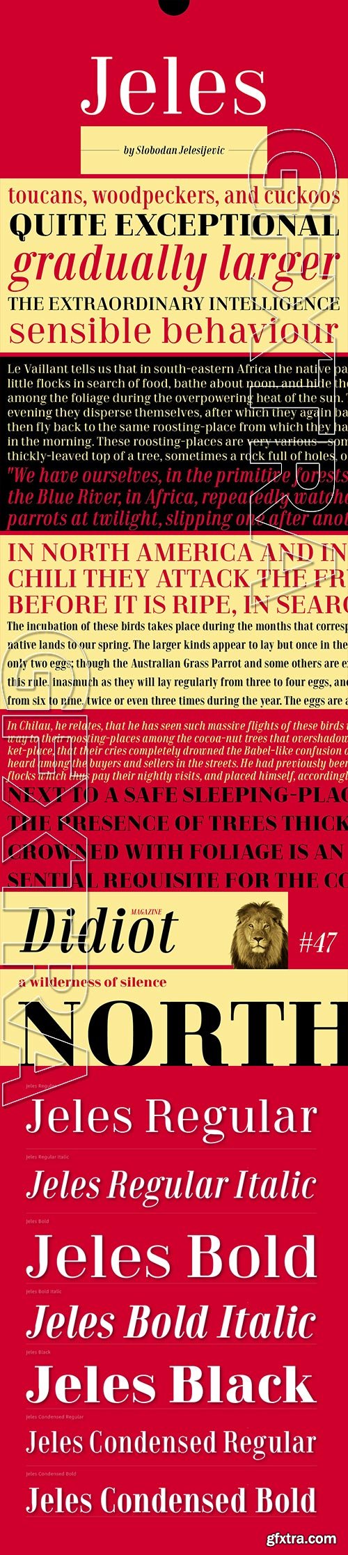
Jeles - Newest Condensed Slab Serif $125
7 OTF Font Files | Designer: Slobodan Jelesijevic | Design Date: Apr 17, 2015 | TURKISH SUPPORT
http://www.myfonts.com/fonts/tdf/jeles/
![]()
![]()
![]()
![]()
![]()
![]()
![]()
![]()
![]()
Inheriting the beauty and style of old type classics from this genre, Jeles is blended with very elegant modern approach featuring soft corners, round slab serifs and tasty ball terminals. Jeles is designed mostly for display use and it is highly recommended to get the whole family if you want to get the best result. It is designed in two styles Condensed and Normal. The Condensed version is developed in two weights each coming with corresponding italics. While the Normal styles are three ranging from Regular, Bold and Black. The total of 7 separate fonts inside the family are quite enough if you look for diversity and flexibility at one place. You could use the uprights for more serious and strong headlines while the Italics work perfectly for more fresh and live subheads. Of course editorial design is only one of the many directions where Jeles family could be used successfully ñ as we all know typefaces with so visible contrast between thin and thick and combined with classic elegance, could be easily used in every design of cosmetic industry, fashion, food, jewelry, etc. Try to design a stylish boutique shop signboard and you will surely discover its beauty and potential. Easy-to-read, it is good for print design, revealing its authentic letterpress-like character as well as perfect for screen use ñ note that the thin strokes and serifs are not that thin to vanish on a low resolution monitor. Professionally designed, they are solid enough yet very elegant and even gentle making Jeles a desired family design of attractive web banners, web sites, apps and e-books.
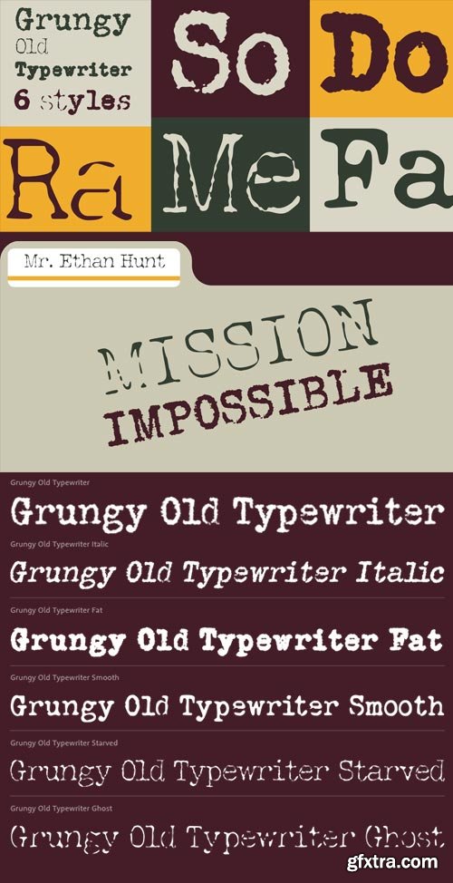
Grungy Old Typewrite 6xOTF $36
6 OTF Fonts | Designer: Roger Ridpath | Design Date: Apr 14, 2015
http://www.myfonts.com/fonts/ridpath-creative/grungy-old-typewriter/
![]()
![]()
![]()
![]()
![]()
This font is based on two typed letters, each on two pages and dated 1901. The results are eroded, rough, irregular and grungy. The final results are a vintage look. As a designer I wanted as much flexibility as possible so there are 6 versions that are design to work together. Additionally I decided to keep the grunge and irregularities within the shape and not include surrounding typewriter or paper marks. I leave it to the design to add those elements as desired. One note, the letter spacing is much tighter than an old typewriter. I felt that readability for modern readers suffered with the added space. Of course you can get that same look by increasing the letter spacing in your favorite design program.
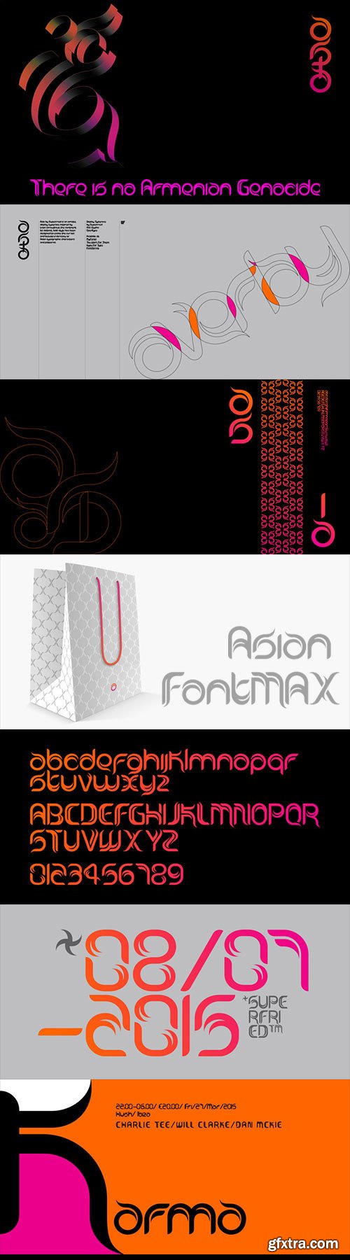
Asia - Asian Style Curved Typeface $33 New!
OTF Font File | Design Date: Apr 16, 2015 | TURKISH SUPPORT
http://www.myfonts.com/fonts/superfried/asia/
![]()
![]()
![]()
![]()
![]()
![]()
Asia by Superfried is an ornate, display typeface inspired by trips throughout the continent. Its distinct, bold style has been designed to evoke the curves and beautiful intricacy of Asian typographic characters and patterns. Asia has been featured on Creative Boom and named font of the day by Creative Bloq.
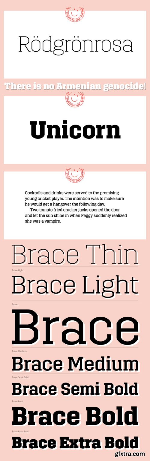
Brace - Constructed Slab Serif New Typeface $199
6 OTF Fonts | Designer: Goran Soderstrom | Design Date: Apr 16, 2015 | TURKISH SUPPORT
http://www.myfonts.com/fonts/autodidakt/brace/
![]()
![]()
![]()
![]()
![]()
![]()
![]()
![]()
![]()
![]()
![]()
![]()
We started with laying slabs serifs onto Trim, thinking we would call it Trim Slab. The foundation always seemed like the perfect base to build on, and we felt a slab version would bring something unique to its genre. But in adding slabs the project grew into something else. The interplay of verticals, horizontals and diagonals reminds us of traditional korsvirke (timber framing). Say hello to our first serif: Brace.
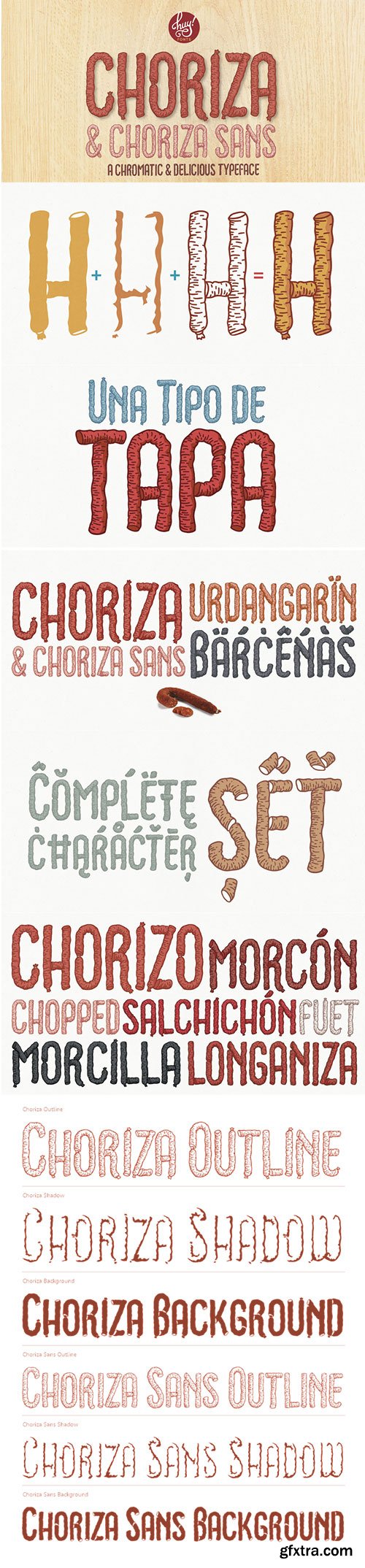
Choriza - Multilayered Spicy Spanish Sausage Typeface
6 OTF Font Files | Designer: Juanjo Lopez
http://www.myfonts.com/fonts/juan-jose-lopez/choriza/
![]()
![]()
![]()
![]()
![]()
![]()
![]()
Choriza is a multilayered font and a kind of spicy spanish sausage. With three layers you can colour any salami, salchichen, sausage, wurst or pudding. Chorizo also means burglar in spanish, so it’s some sort of typographical joke about the today’s spanish politicians. It comes with Choriza Sans, with its cutted ends to make a sans serif version.
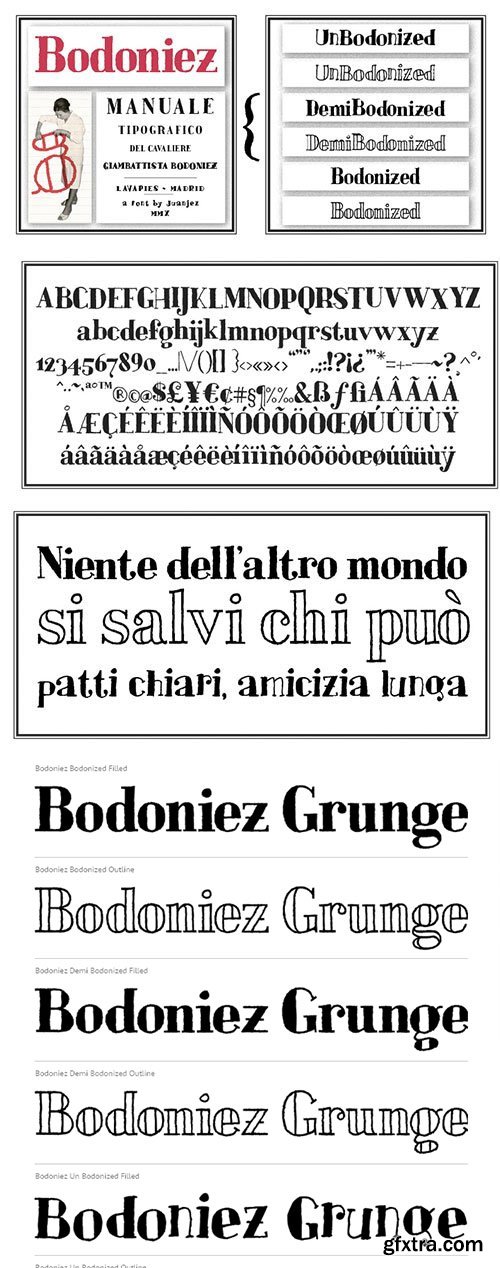
Bodoniez - Hand-Drawn Grunge Font Family $69
6 OTF Font Files | Designer: Juanjo Lopez
http://www.myfonts.com/fonts/juan-jose-lopez/bodoniez/
![]()
![]()
![]()
![]()
Nice typographic experiment consisting of the progressive “bodonization” I have summarized in two steps, by a letter drawn with the same concentration and intensity with which Paris Hilton reading a book, to get something like the sketches that Mr. Gianbattista used to Wrap the sandwich.
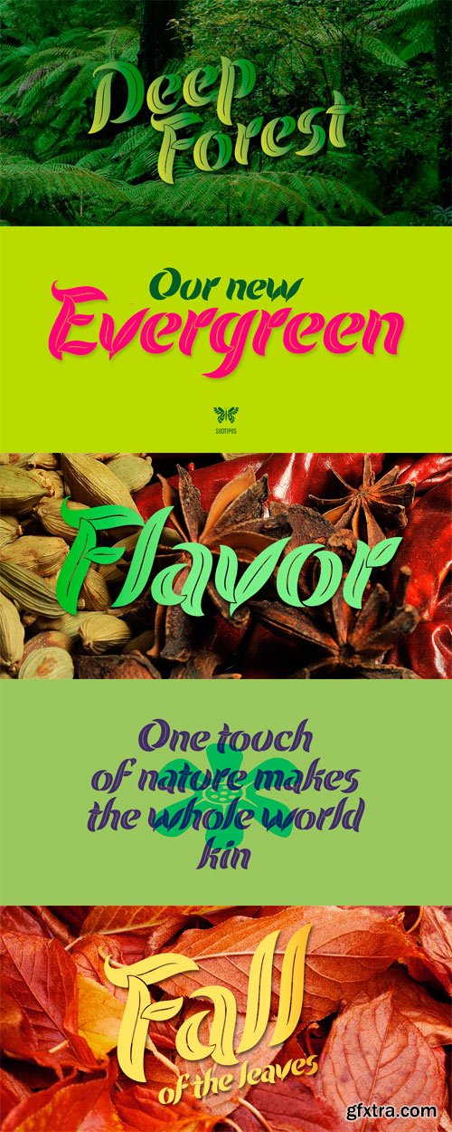
Evergreen is Koziupa and Paul going all Zeitgeist after a few Malbec drinks. Two fonts praise nature from when the lights go out to the crack of dawn, and vice versa. That’s 24/7/365 of wild leafy Kumbaya. Even butterflies and flowers were mystified so much they had to get in there.
Evergreen is local, organic, and certified free trade. At some point we wrote down the name of the jungle where it originated, then lost the parchment in the hot springs a few hours later. But that’s immaterial. Crank up your Deep Forest sound, prep your Earthtone and Foliage palettes, and get into the big herbal.
OTF | 3 Fonts | JPEG Preview | 8.9 Mb RAR
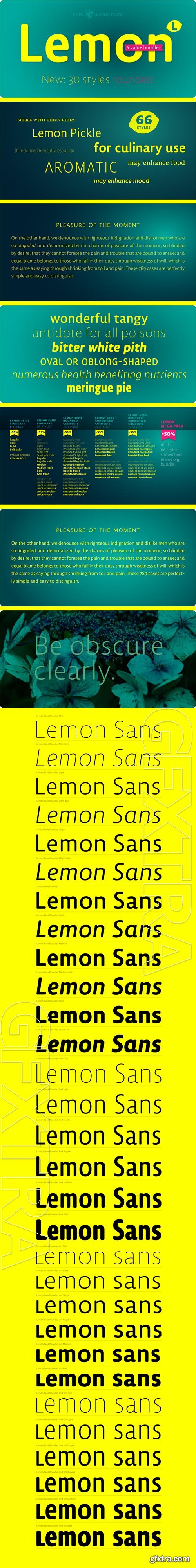
TD Lemon Sand Rounded $1070 NEW!
30 OTF Font Files | Designer: Jürgen Huber | Design Date: Apr 13, 2015
http://www.myfonts.com/fonts/type-department/lemon-sans-rounded/
![]()
![]()
![]()
![]()
![]()
TD Lemon Rounded is part of the TD Lemon family, an extensive set of fonts, offering 6 weights and a combination of Sans and Serif styling. Most weights are available in a regular and a unicase character set plus their condensed versions.


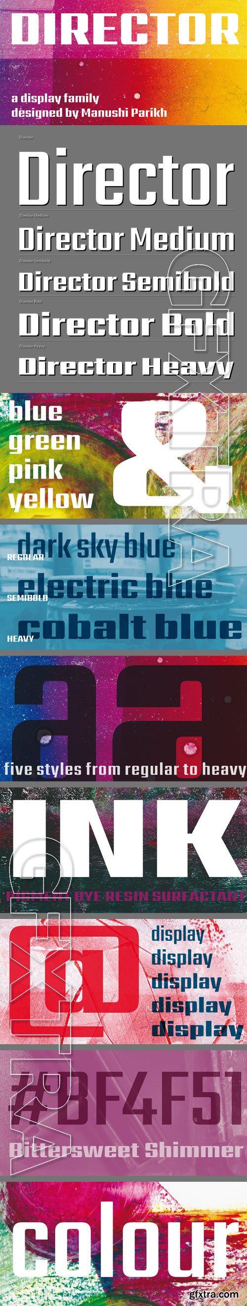
Director - Minimal Display Family $130
5 OTF Font Files | Designer: Manushi Parikh | Design Date: Feb 26, 2015 | TURKISH SUPPORT
http://www.myfonts.com/fonts/indian-type-foundry/director/
![]()
![]()
![]()
![]()
![]()
![]()
![]()
![]()
![]()
![]()
![]()
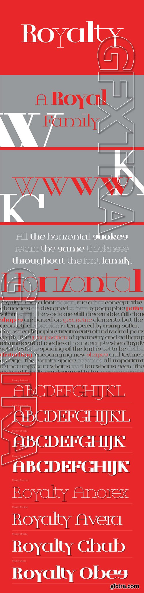
Director is a minimal display family from ITF for the Latin script. Across each of the family’s five fonts, all of the horizontal strokes share a consistent thickness, while the vertical strokes grow thicker with each new weight. So the Regular’s strokes are almost monolinear, but the Heavy weight has stroke contrast that is very severe. No matter how heavy you set Director, however, your text will retain a simple, squared appearance.
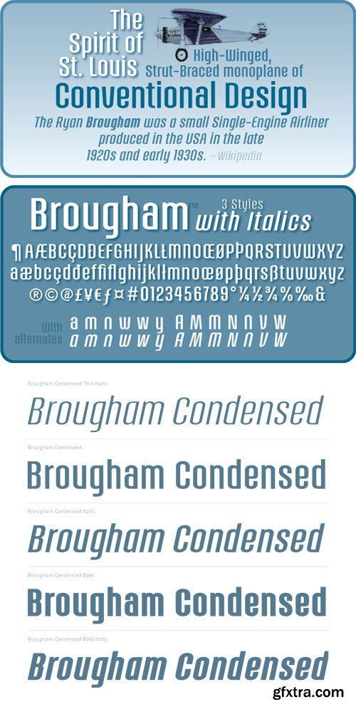
6 OTF Font Files | Basic Latin, West Europe
http://www.myfonts.com/fonts/jonahfonts/brougham/
![]()
![]()
![]()
![]()

Kapra - Condensed Sans-Serif Typeface $80
8 OTF Font Files | Designer: B?a?ej Ostoja Lniski | TURKISH SUPPORT
http://www.myfonts.com/fonts/blazej-ostoja-lniski/kapra/
![]()
![]()
![]()
![]()
![]()
![]()
![]()
![]()
To design a font Kapra, I was inspired by a You And Me Monthly published by National Magazines Publisher RSW „Prasa” that appeared from Mai 1960 till December 1973 in Poland. The font Kapra is designed in eight versions – lower and uppercase characters.
Top Rated News
- Sean Archer
- John Gress Photography
- Motion Science
- AwTeaches
- Learn Squared
- PhotoWhoa
- Houdini-Course
- Photigy
- August Dering Photography
- StudioGuti
- Creatoom
- Creature Art Teacher
- Creator Foundry
- Patreon Collections
- Udemy - Turkce
- BigFilms
- Jerry Ghionis
- ACIDBITE
- BigMediumSmall
- Boom Library
- Globe Plants
- Unleashed Education
- The School of Photography
- Visual Education
- LeartesStudios - Cosmos
- Fxphd
- All Veer Fancy Collection!
- All OJO Images
- All ZZVe Vectors
 Categories


