

Centeria Script
12 OTF | 943KB | Sale PaGe
- Nice calligraphy font with sharp edges. The font is built with advanced OpenType functionality and has a guaranteed top-notch quality, containing stylistic and contextual alternates, ligatures, and more features; all to give you full control and customizability. It has extensive lingual support, covering all Latin-based languages, from Northern Europe to South Africa, from America to South-East Asia. It contains all characters and symbols you'll ever need, including all punctuation and numbers.

Gubia Font Family
OTF | 8 Fonts | JPEG Preview | 5.7 Mb RAR | SALE PAGE
- Gubia font family has been designed for Graviton Font Foundry by Pablo Balcells. It is a geometric, sans serif typeface with a slightly condensed design. It has been conceived to be most suitable for all sized headlines, as well as short and middle length text blocks. The standard styles give texts a classic appearence while alternate styles give texts a playfull one. Gubia consists of 8 styles, 4 weights plus alternates, each containing small caps and glyph coverage for several languages.


Ropa Sans Pro Font Family
OTF | 32 Fonts | JPEG Preview | 4.2 Mb RAR | SALE PAGE
- Ropa Sans Pro is a sans serif font family of 8 weights plus extra designed italics and small caps. While the upright styles pay a distant homage to the technical aesthetics of the early-20th century DIN series, the strongly humanistic italics breathe in quirky freshness and create a unique flavor. Four styles (Ropa Sans, Ropa Sans SC, Ropa Sans Italic and Ropa Sans SC Italic) are available free of charge. Suitable for both body and headline use, Ropa Sans Pro provides advanced typographical support with features such as case-sensitive forms, fractions, super and subscript characters, and stylistic alternates. It comes with a complete range of old style and lining figures, witch are in tabular and proportional widths. In addition to an extensive coverage of Latin-based languages, Ropa Sans Pro provides essential support for the Cyrillic and Greek writing systems.
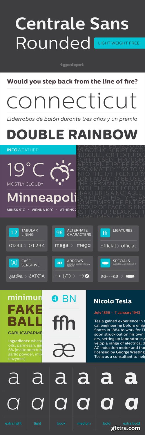
Centrale Sans Rounded Font Family
OTF | 13 Fonts | JPEG Preview | 4.9 Mb RAR | SALE PAGE
- We are proud to announce the release of Centrale Sans Rounded, the rounded addition to Centrale Sans family. With Centrale Sans Rounded we've tried to make a difference - good looking typeface at a reasonable and affordable price. It comes in six weights plus their matching italics and the proper amount of OpenType features and glyphs.

Nimbus Sans BUNDLE
121 OTF | RAR 28.2 MB
Nimbus Sans | Nimbus Sans Novus | Nimbus Sans Round
Nimbus Sans No 5 | Nimbus Sans No 4 | Nimbus Sans Chineese


Saiihah Arabic Display Font
with an extra heavy style. It suits branding, posters and advertising.

Sanelma - Brush Script
OTF | 1 Font | JPEG Preview | 4.9 Mb RAR | SALE PAGE
- Sanelma is a brush script inspired by Hot Rod lettering and sign painting. Sanelma is a very versatile script: It includes two different styles of end swashes, swash caps, small caps, lots of alternate characters and underline option. All in all it has over 1,200 glyphs. Sanelma is bouncy and smooth and has a very organic feel. You have a lot of options to customize it and that makes it perfect for logos, packages and titles.

Pluto Sans Italics Font Family
OTF | TTF | 1.96 MB | /Sale Page
- Type designer Hannes von Döhren has created Pluto, a sweet type family consisting of 16 Uprights and 16 Italics; 32 fonts in all. The fonts are informal and friendly at first sight and lend themselves to display settings, however the straight and upright architecture of Pluto also makes it perfect for longer copy. Because of its large x-height, it even performs nicely in very small sizes. This contemporary type family is ideal for use in retail, cosmetics, food and hospitality applications and advertising.Pluto is equipped for complex, professional typography. The OpenType fonts have an extended character set to support Central and Eastern European as well as Western European languages. Each font includes alternate letters, fractions, lining-, tabular numbers, scientific superior/inferior figures and a set of arrows.

Macarons Font Family
OTF | 7 Fonts | JPEG Preview | 4.9 Mb RAR | SALE PAGE
- Macarons is a display type based on the classic Garamond typeface. It’s inspired by the foodie culture and the slow food movement, which began as a rebellion against fast food and has now grown to a global scale. Every day, thousands of people around the world take pictures of their food, look for new recipes to try and recover old ones, enjoy wine-pairing, and value locally produced food. Macarons is a fresh and spontaneous looking typeface that has been designed by Coto Mendoza, who also has developed a hand-made product line (Ride my Bike, Ride my Bike Serif, Four Seasons, D.I.Y. Time, Dans le Cuisine and In a Jar). This font is not constructed out of modules: each character is drawn by hand. The Macarons font family consists of a monoline version, regular and bold weights, and a set of gestural catchwords, which reflects the use of the ruling pen as a freestyle tool. Ornaments and dingbats are also included. Macarons is ideal for cookbooks, menus, liquor bottle labels, food packaging, wedding invitations, greeting cards, tea boxes, food blogs, small shops, cupcake bakeries and so on. Try! A freshly-baked homemade macaron!


Maxwell Slab Font Family
20 OTF | 1.0 MB | Sale PaGe
- Maxwell Slab is a clean condensed slab serif typeface. It comes in regular and small caps versions, includes custom italics, stylistic alternatives, letter style variations, discretionary ligatures and multiple languages; Cyrillic, Greek, Latin and other Western and Central European languages and works either as a headline font or paragraph text.

Maxwell Sans Font Family
20 OTF Files | 0.9 MB | Sale PaGe
Maxwell is a clean condensed san serif typeface inspired by similar retro fonts from the 1950’s.
It comes in regular and small caps versions, includes stylistic alternatives and
via the glyph panel you can access scientific inferiors, fractions, oldstyle numerals,
Cyrillic, Greek, Latin and other Western and Central European languages.
It can be used as a headline font or paragraph text.

Arame Font Family
OTF | 8 Fonts | JPG Previews | 6.3 Mb RAR | SALE PAGE
This font with the technical feel of movies and games,
was featured in Iron Man Avengers, Halo 4 and Game Reaktor Magazine.
Version 1.2 features Cyrillic, arrows and reorganized family
(Monospaced in all variations) and a new weight.

Showcase - Script, Sans, Slab, Sans Mini & Ornaments
OTF/TTF/WOFF | 8 Typefaces | JPG Previews | 4.7 Mb RAR | SALE PAGE
- Showcase, the new typeface of Daniel Hernandez and Paula Nazal is a handmade font consisting of a set of types that are composed of four styles, one script, one sans, a slab, sans mini and finally a set of ornaments and dingbats, all made to work together in the same language. It’s inspired by a pen that writes different typefaces and ornaments, and casually reaches into a harmonious family. Showcase is very easy to use and allows great versatility, can be used both in a magazine as a restaurant, through windows, cafes, and really anyway you can think of!

Number Five - Smooth & Rough 2xOTF
2 OTF Fıles | JPG Preview | 9 MB
- Number Five is pure Americana, suitable for titling, display, logo, signage, and editorial work. Its two versions, Smooth and Rough, are constructed similarly, yet imbued with distinct feelings and uses.The 1940s and 1950s in America have taken on a mythology of their own, imagined by some as an idyllic time when the daily life, dreams, and sensibilities of a nation were stable, solid, unchanging. Yet this was when the same mothers who sewed their children’s names onto collars for summer camp using needle and thread and who picked berries at roadside fruit stands to lay up ruby and purple jams for the winter, also read books about scientific parenting, squeezed high-end appliances out of slim budgets, and dreamed of Jetson homes.What we now treasure as “retro” was a time of powerful transformation, as the extraordinary beauty of the handmade past slipped slowly toward the outmoded, and as a nation we became restless for a manufactured perfection. How perfect, indeed, that we'd soon be watching as one while one of our own stepped onto the surface of the moon.

Quarzo - Impressive Variety of Ccurves
OTF | 1 Font | JPG Preview | 4,3 Mb RAR | SALE PAGE
- This script font is inspired by the flexible nib to create a concatenation of refinement with character mixing the contrasted strokes with pronounced but rounded angles. This angles along with the inktraps give the font a better performance when printing. Texts will have a very even rhythm due to its consistency on the stroke’s angle and spacing. The words can receive a dramatic touch by using the wide range of glyphs with curly and refined ornamentation. There are lots of caps and number variants dressed up with a variety of swashes. Also, two sets of versatile ornaments will be found: a first set of ending flourishes that match with any lowercase letter and a second set of independent flourishes to be placed around the words. Quarzo will give a great sophistication level to invitations, cards, tags, menus, advertising and packaging. Its character map covers Western and Central European characters.


- Core Escher is an optical illusion type family which has two sub-families: Core Escher A and B. Core Escher A has impossible shapes inspired by the optical illusion works of artist M.C. Escher. The letterforms in this type family are structurally twisted and complicated but it looks simple because of its simple strokes. And for easy color variations, it split into two fonts, Core Escher A Left and Right.Core Escher B has a different kind of optical illusion. The letters of Core Escher B look like three dimentions by just putting thin lines on bold letters. Also B has two sub-families that have different viewpoints.Core Escher Family supports complete Basic Latin, Cyrillic, Central European, Turkish, Baltic character sets. Each font includes proportional figures, tabular figures, numerators, denominators, superscript, scientific inferiors, subscript, fractions and case features.

CA Viva Las Vegas - A Light Bulb Style
TURKISH SUPPORT | TTF | 8 Fonts | JPEG Preview | 4.3 Mb RAR | SALE PAGE
![]()
![]()
![]()
![]()
![]()
![]()
![]()
![]()
![]()
![]()
![]()
![]()
![]()
- CA Viva Las Vegas is a fine light bulb font inspired by signage of concert halls of the 70s when Elvis was playing in Las Vegas. Two different styles (NIGHT and DAY) and 4 weights (Ultra Light, Thin, Light, Regular) based on a layered system give endless design possibilities by using combinations of fonts and colors. CA Viva Las Vegas has an extensive character-set including Russian Cyrillic plus the Turkish Lira sign. It’s best used in big font sizes.

Nexa Slab Font Family
OTF | 24 Fonts | JPEG Preview | 9.5 Mb RAR | SALE PAGE
- Nexa Slab is a geometric slab serif font whose design is based on the already popular best-seller Nexa. The font family contains 3 basic forms: italics, obliques and uprights, each of which has 8 different weights. This visual richness makes it the ideal slab serif font family for the web as well as for print, for motion graphics, logos, t-shirts and so on. It is also great for headings, fitting nicely with both small and large typesetting text blocks. Nexa Slab draws from the rich traditions of the classic Neo-Grotesque slab serif fonts such as Lubalin Graph, Rockwell and Memphis, which conceal the richness of typesetting text in its crucial advertising function. Just like these fonts, it’s design is subject to rational, carefully thought-out, thick and thin bars with a low contrast between them. The letters are characterized by the strict geometry and square proportions of the original, extra-fortified by suitably balanced slab serifs. Nexa Slab is serious without being rigid and inflexible, finished and lacking in nothing, systematic without being monotonous, and though it may seem at first glance to be more suitable for short, direct messages; in the hands of a master designer... it can build and create exquisite and harmonic designs.

Sharp Sans No.2 Font Family
OTF | 20 Fonts | + JPG Preview | SALE PAGE
- The Sharp Sans superfamilies are geometric sans serif typefaces that inject some much needed humanism into the Futura model. Designed by Lucas Sharp ?of Sharp Type Co in 2011, Sharp Sans Display No. 1 has angled terminals while Sharp Sans No. 2 has 90º degree terminals. With its sheared terminals and true italics (in Sharp Sans Display No.1), Sharp Sans combines the appealing typographic compensation of the grotesque, with the plump circular bowls of the geometric. The result is a typeface suited for both text & display use that breathes life into the genre of the geometric sans. While Sharp Sans Display No.1 ends its round monolines with diagonally sheared terminals, Sharp Sans Display No. 2 shears those terminals on a 90 degree angle. This small distinction became the basis for a plethora of exploration on either end. The most distinct aspect of No. 1 is its whimsical, almost slab-like true italics, which in turn give way to a full set of swash capitals in all italic weights. Sharp Sans Display No. 2, being the more geometric of Superset pair, has a more traditional oblique for its italic, as well as alternative reductionist Herbert Bayer-inspired lowercase.
- Sharp Sans Display No. 2 also has the first truly fluid OpenType homage to the famous Avant Garde interlocking capital style created out of an intelligent system of ligatures & contextual alternates which do not interfere with tracking (I suggest you track them in). The newest iteration of Sharp Sans was conceived for the Hillary Clinton 2016 campaign. Michael Beirut and the Pentagram team chose Sharp Sans Display No.1 as the main typeface of the campaign identity, but such a monumental project required a sturdier and more utilitarian typeface. The new Sharp Sans is completely redrawn and shaped by the rigorous typographic demands of modern visual communications. What sets the new Sharp Sans apart is a raised x-height, and newly opened counters that make it optimal for both text and display layouts; a new, more versatile approach, of which the two Display versions were not previously designed for. We call the new Sharp Sans our "use it for everything" font. While we stand by that statement, the originals do make for a compelling display counterpart.

Sharp Sans Font Family
OTF | 20 Fonts | JPEG Preview | 3.6 Mb RAR | SALE PAGE
- Lucas Sharp’s first release through Village debuts in the Incubator. Sharp Sans injects some much needed humanism into the Futura model. With its sheered terminals and true italics, Sharp Sans combines the appealing typographic compensation of the grotesque, with the plump circular bowls of the geometric. The result is a typeface suited for both text and display use that breaths life into the genre of the geometric sans.

OTF & WOFF Font Files | Designer: Alissa Mazzenga | SALE PAGE
- Feast is a calligraphy style font designed by Alissa Mazzenga. Her hand-sculpted letterforms emanate a powerful, yet delicate presence. Their magic resides in the ethereal movement of fluid wisps of ink, forming soft arched lines and design that stands alone.
")
Yellow Design Studio's Gist Font Family
- Gist from Yellow Design Studio is an inline slab serif with a retro yet modern vibe. It’s a collision between monoline slab and indie script. With 627 glyphs per weight, it’s highly customizable…either keep it simple with the base character set or use ligatures, alternates and swashes for extra flair. All-caps typesettings have an especially retro edge. Also included are line layers for adding color to the inline areas.

Yellow Design - Gist Rough Font Family
38 OTF | 47 MB
Sale Page
- Gist Rough from Yellow Design Studio is the letterpress version of Gist. It’s warm and weathered with a retro yet modern vibe. Every weight includes 3 versions with varying levels of texture which can be used individually or mixed to taste. It has highly detailed texture and looks great even at very large sizes.
- With 627 glyphs per weight, Gist Rough is highly customizable…either keep it simple with the base character set or use ligatures, alternates and swashes for extra flair. All-caps typesettings have an especially retro edge. Also included are line layers for adding color to the inline areas.
Top Rated News
- Sean Archer
- John Gress Photography
- Motion Science
- AwTeaches
- Learn Squared
- PhotoWhoa
- Houdini-Course
- Photigy
- August Dering Photography
- StudioGuti
- Creatoom
- Creature Art Teacher
- Creator Foundry
- Patreon Collections
- Udemy - Turkce
- BigFilms
- Jerry Ghionis
- ACIDBITE
- BigMediumSmall
- Boom Library
- Globe Plants
- Unleashed Education
- The School of Photography
- Visual Education
- LeartesStudios - Cosmos
- Fxphd
- All Veer Fancy Collection!
- All OJO Images
- All ZZVe Vectors
 Categories


