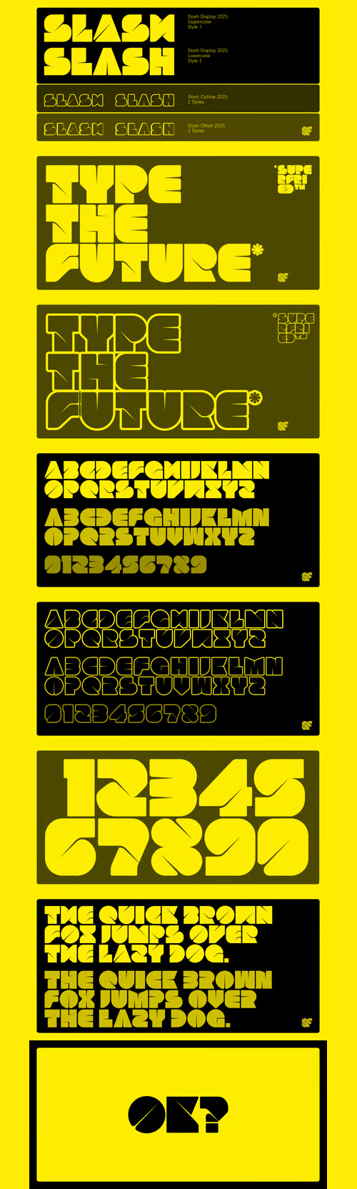

Core Circus - Layered Type Family 2D & 3D Effects
OTF | 20 Fonts | JPEG Preview | 4 Mb RAR | SALE PAGE
Core Circus is a layered type family consisting of seven 3D effect layers, eight 2D effect layers and one shadow effect layer. Uppercase and lowercase letters are separated by such features that counters are opened or closed. Core Circus provides other closed counter styles such as numbers with opentype feature (Stylistic Alternatives). Also available Core Magic (Slab- Serif version of Core Circus). The shape of Core Circus is simple but the combinations of effect fonts are impressive. Core Circus makes your works charming and special with endless combinations (at least 262,551 kinds). This family is really nice for book titles, headlines, logotypes and any artworks.

Neighbor's Blanket Font OTF TTF
“Neighbor’s Blanket” is a cozy, modern retro font that captures the warmth of nostalgia while offering a contemporary touch. It features rounded edges and playful curves, making it perfect for designs that aim to evoke comfort and familiarity. Ideal for branding, invitations, and various creative projects, this font combines a friendly aesthetic with legibility, making it a delightful choice for any design needing a touch of warmth and charm.

Sauber Script $35 OTF
OTF Font | Designer: Michael Hochleitner | SALE PAGE
- After its period of exclusivity expired, the corporate typeface of the Saubermacher recycling company was revised and expanded. Now it is available for everyone! Whether on fresh buttermilk, a Honolulu surfer bar, or a hotel on the Arlberg, this preppy script face is versatile and full of character.

CF - The Ultimate Winter 46 Fonts Collection Vol.2
46 Premium Font Types | 64 TTF | 81 OTF | 18 MB | SALE PAGE
- Because crafting during the colder season is a true gem, we’ve hand-selected some cheerful fonts from our top designers for our second edition of our gorgeous Ultimate Winter Font Collection. With its stunning scripts, elegant sans serif fonts and versatile display fonts, this one-of-a-kind bundle will make a great addition to any craft library!

Culinary Font Family
OTF | 10 Fonts | + JPG Preview | SALE PAGE
- Culinary is a typographic system inspired by the art of cooking. This family comes with 2 subfamilies: one Regular Family of 4 weights plus a Sans Line font and a set of Borders, and one 4-weight Script Family that also includes Sans Line and Borders. Culinary is well-suited for packaging, restaurant and cafe branding, bakeries, logos, magazines, menus, recipe books, invitations and much more. The OpenType features allow access to a wide set of characters, including ligatures, swashes, endings, initial and terminal forms, and lots of alternates.

Linotype Didot Font Family
17xOTF, 6xTTF | 23 Fonts | JPG Preview | 1.5 Mb RAR | SALE PAGE
- The Didot family were active as designers for about 100 years in the 18th and 19th centuries. They were printers, publishers, typeface designers, inventors and intellectuals. Around 1800 the Didot family owned the most important print shop and font foundry in France. Pierre Didot, the printer, published a document with the typefaces of his brother, Firmin Didot, the typeface designer. The strong clear forms of this alphabet display objective, rational characteristics and are representative of the time and philosophy of the Enlightenment. Adrian Frutiger’s Didot is a sensitive interpretation of the French Modern Face Didot. Another model for this design is the Henriade, an historical printing of the original Didot from 1818. The font Didot gives text a classic and elegant feel.

Appetite Pro Font Family
OTF, TTF | 10 Fonts | JPG Preview | 4 Mb RAR | SALE PAGE
- AppetitePro is a total upgrade of the world wide popular display font Appetite (2011). It is based on original lettering and belongs to the upright script like. Appetite Pro consists of 10 weights of the refreshed curves — 5 regular and 5 italic — from Light to Heavy. It’s a multilingual and international font, with a full western latin, cyrilyc (russian, belarusian, ukrainian) and basic Greek support. Appetite Pro font family special designed for the food identity and packaging design projects. Except standard letter cases Appetite Pro includes dingbats set. Due to the 10 weights font palette you can solve a wide variety of professional problems without spending money on extra fonts for titles, sub-titles and main text.


Neo Sans Font Family
OTF | 12 Fonts | + JPG Preview | SALE PAGE
- Neo Sans began as an intriguing assignment from a branding agency. The agency’s client wanted an “ultra modern” type family that was "futuristic without being gimmicky or ephemeral.” When a bureaucratic decision cancelled the project, Monotype staff designer Sebastian Lester decided to finish the design on his own. “I was left with a sketchbook full of ideas,” he said, “and thought it would be a shame not to see what came of them.” Lester decided that the principal ingredient of an “ultra modern” typeface was simplicity of character structure: a carefully drawn, monoline form, open letter shapes and smooth, strong curves. By further amplifying these qualities, he crossed the line from modern to futuristic. Two highly functional and versatile typefaces emerged. These are Neo Sans and Neo Tech, designs Lester describes as “legible without being neutral, nuanced without being fussy, and expressive without being distracting.” Both the Neo Sans and the more minimalist Neo Tech families are available in six weights, ranging from Light to Ultra, with companion italics.

OTF | 2 Fonts | JPG Preview | 5.8 Mb RAR
- Argentina Lilian: "After my font Indie I wanted to create something much more wild. Something that splashed the letters with life. To do this, I knew I'd have to break the barrier between analog and digital, so I took my best brush and started to play. Throughout the years as a type-designer I've met and become fan of many calligraphers. My belief that only a good calligrapher can make good typography (1) has become even stronger. I'm now absolutely sure that only practice improves the skill, especially in this field. So, with this in mind, I started a font which was a challenge for me because sometimes the gap between paper and screen can be gigantic. Skill is another of my attemps to capture the spirit of the pointed brush, its expressiveness, the passions and fears of the artist. This font is about freedom. Freedom everywhere. Movement, velocity, passion. To achieve this, many alternates and ligatures per glyph were designed. Use it on magazines, posters, book covers, music albums, t-shirts, skates, tattoos."

Home Brush Font OTF
OTF | 1 Font | AI, EPS, JPG Preview | 3.5 Mb RAR

OTF | 14 Fonts | JPEG Preview | 4.8 Mb RAR | SALE PAGE
- Core Deco is an Art Deco Fonts Family which consists of various styles, inspired by some art deco posters from late 1930’s to 1950’s. There are two major styles of this type family. One is thin and elegant, and the other has strong contrast. Each style has alternative shape-like 3-D structures, patterns, outlines and so on. Except for Core Deco, others are named Core Deco A,B,C as their styles. Basically every single font of Core Deco family has geometric shape and two width variations of characters, narrow and wide. Despite the different styles, every font goes well together because of their common parts. Though it’s not intended, some similar styles could be layered together. Core Deco family contains complete Latin 1252, Central European 1250 and Turkish 1254 character sets, and also each font includes support for style alternative features. If you are looking for an art-deco style font which is modern and could be used for various artworks, get this family and save your time.

BLAQ Font Family
OTF | 2 Fonts | JPEG Preview | 4.5 Mb RAR | SALE PAGE
- Inspired by Henry W. Troy, BLAQ is a new version of Trojan Text not available as font. Is an ornamental blackletter alphabet. Works great in headlines and other ‘masculine’ like design settings. The Victorian Gothic or Neo-Gothic is an architectural movement that began in the 1740s in England. Its popularity grew rapidly in the early nineteenth century. The revived Gothic style was not limited to architecture.


Eund Font Family - Smoothed Letterforms 18xOTF
OTF | 18 Fonts | JPEG Preview | 2 Mb RAR | SALE PAGE
- A geometric sans serif with minimal contrast. Shallow curves are smoothed out of rectangular letterforms to produce a fresh, legible typeface best suited to information based applications. Details include 9 weights with italics, 500 characters, 5 variations of numerals, stylistic alternatives, manually edited kerning and Opentype features.

OTF | 1 Font | JPG Preview | 1 Mb RAR | SALE PAGE
- Otsuki-Sama is a sophisticated mix between a serif and sans serif font design. Its elegant balance between heavy contours and subtle lines gives it a modern yet very rich look. Applicable for any type of graphic design, especially for headlines, posters and magazines.

Gelato Script - Overflowing with Opentype Godness OTF
OTF | 1 Font | JPEG Preview | 4.4 Mb RAR | SALE PAGE
- Gelato Script is a smooth-flowing typeface with an air of familiarity. Influenced by both formal scripts and mid-Twentieth Century hand lettering. The power of OpenType is used with precision in the Contextual Alternate feature to make sure letters connect seamlessly, t’s cross where they can and swashes don't crash into neighboring glyphs. 781 glyphs make up this font, which is capable of speaking in many different languages. Alternate forms are grouped into stylistic sets to make it easy to change the mood of the text. For example, ss01 makes droopable letters drop below the baseline to break it up a little if required.

Lintel Font Family 16xOTF
OTF | 16 Fonts | JPEG Preview | 5.2 Mb RAR | SALE PAGE
- A modern san serif typeface with a pure clean line form. The idea has been to design a font with a proportioned and balanced structure that is applicable to a wide variety of uses. Details include 8 weights with italics, 500 characters, Cyrillic lettering, 5 variations of numerals, manually edited kerning and Opentype features.


CreativeMarket - La Provence Font 175207
TTF | 1 Font | JPG Preview | 3.6 Mb RAR | [leech=v]SALE PAGE[/leech]
La Provence Font is a handmade calligraphic type.
This font contains uppercase, lowercase and multilingual glyphs.

Krul - Amsterdam's Popular Script Typeface
OTF | 1 Font | JPEG Preview | 4 Mb RAR | SALE PAGE
- ‘Krul’ is a typographic interpretation of the lettering style created by Dutch letter painter Jan Willem Joseph Visser at the end of the 1940s, which decorated the traditional brown bars of Amsterdam. In the beginning, these letters were strongly associated with the pubs connected to the Amstel brewery, given that Visser was the company’s official painter. As the years passed, the style became increasingly popular, and various business owners in Amsterdam and other Dutch and Belgian cities also commissioned its use. In the 1970s and 1980s, Leo Beukeboom, another talented letter painter, continued and expanded this lettering tradition while employed under the Heineken brand. Much of his work can still be found in the Jordaan and De Pijp neighborhoods in Amsterdam.

Abitare Sans Font Family
TTF | 30 Fonts | JPEG Preview | 7,5 Mb RAR | SALE PAGE
Abitare Sans was originally commissioned by the group Rizzoli Corriere della Sera. It’s a typeface of 30 weights designed to be used in Abitare magazine. The request of the president Mario Piazza was a new CP Company with some redesigned glyphs, but the result is a radical evolution of its concept being intended to be used as a font for text far more readable. In Abitare Sans was kept the geometric structure without neglecting the numerous editorials requirements.

Altis - 10 Optically Balanced Weights
OTF | 10 Fonts | JPG Preview | 4.6 Mb RAR | SALE PAGE
- Altis combines geometric regularity and soulfulness into one font family. It resembles the traditional sanserif from the early 20th century, which communicates friendly and reads extremely well. Bring out its optimistic airiness with light styles or exploit the masculine strength of the bolds. Altis has been developed to fit present-day editorial conditions and publishing models. There are ten optically-balanced weights and practical OpenType features, which make the family versatile and operationally spot-on.

MrLucky Font Family 7xOTF
OTF | 7 Fonts | JPEG Preview | 3.2 Mb RAR | SALE PAGE
- Mr Lucky is Mr Happy's slab brother and a hand-drawn narrow typeface designed for one of our books. You can layer different styles over the background style to achieve lots of colorful effects. Use just one style to get a single color letter or set Fill over Background or Stripped Background to get a two color mode. Mr Lucky has upper and lowercase characters with up to three alternate glyphs and special alternate uppercase diacritics. Build in OpenType Contextual Alternates feature will automatically set alternate glyphs depending on frequency of appearance of the same character (even in web font but only in HTML5 browsers). The script doesn’t throw random glyphs. For example in the word “HIPPOPOTAMUS” you will automatically get three different “P” glyphs and two “O” glyphs. It really works great but of course you can always fine tune it by hand.
126,000 Royalty-Free 3D Model
Udemy Türkçe


Top Rated News
- CreativeLive Tutorial Collections
- Fasttracktutorials Course
- Chaos Cosmos Library
- MRMockup - Mockup Bundle
- Finding North Photography
- Sean Archer
- John Gress Photography
- Motion Science
- AwTeaches
- Learn Squared
- PhotoWhoa
- Houdini-Course
- Photigy
- August Dering Photography
- StudioGuti
- Creatoom
- Creature Art Teacher
- Creator Foundry
- Patreon Collections
- Udemy - Turkce
- BigFilms
- Jerry Ghionis
- ACIDBITE
- BigMediumSmall
- Globe Plants
- Unleashed Education
- The School of Photography
- Visual Education
- LeartesStudios - Cosmos
- Fxphd
- All Veer Fancy Collection!
- All OJO Images
- All ZZVe Vectors
- CGTrader 1 CGTrader 2