

Alianza Font Family - Slab, Italic & Script
OTF | 30 Fonts | JPEG Preview | 12 Mb RAR | SALE PAGE
- This is a complex typographic system which includes three different but complementary styles so far: Slab, italic and script, with nine weights each one; plus three sets of ornamental fonts: labels, negative labels and ornaments. The soul of the family is a slab feeling applied judiciously to the italic and script styles to make it coherent with the whole system. Each style has three sets of figures: Proportional lining, tabular lining and old style. You can mix the three styles in a single piece to obtain more expressive results without worring about the uniformity and complementing the design by using the ornamental sets.

Aviano Flare - Subtly Curved Forms
OTF | 6 Fonts | JPEG Preview | 5.1 Mb RAR | SALE PAGE
- The Aviano series returns with a flared semi-serif. Aviano Flare’s subtly curved forms lend refinement and luxurious elegance to your designs. Aviano’s foundational extended classical forms give the face strength and power. Aviano Flare is a versatile new addition to the Aviano titling series. Aviano Flare comes in six different weights and is packed with OpenType features. Want to get rid of the serifs for that logotype or headline? Need swash forms? Art Deco alternates? Aviano Flare includes 74 alternate characters. Two style sets are available, two sets of art deco inspired alternates, small forms, swash, titling and stylistic alternates. Aviano Flare also includes 40 discretionary ligatures for artistic typographic compositions. Please see the informative .pdf brochure to see these features in action.
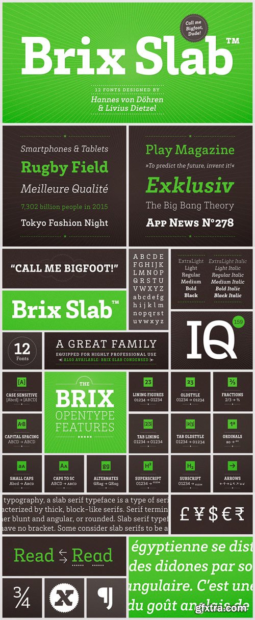
Brix Slab - Highly Readable in Small Sizes
OTF | 12 Fonts | JPEG Preview | 7.2 Mb RAR | SALE PAGE
- Brix Slab and Brix Slab Condensed is an extended family of 24 fonts. It was designed by Hannes von Döhren & Livius Dietzel in 2011. Brix Slab is a robust slab serif family with subtle details. It’s optimized for longer texts and highly readable in small sizes. Brix Slab is intended to be used in applications like magazines, newspapers and digital devices. It also works great as a corporate typeface. With more than 700 glyphs in each font, Brix Slab is equipped for complex, professional typography. As an exclusively OpenType release, these fonts feature small caps, five variations of numerals, arrows and an extended character set to support Central and Eastern European as well as Western European languages.
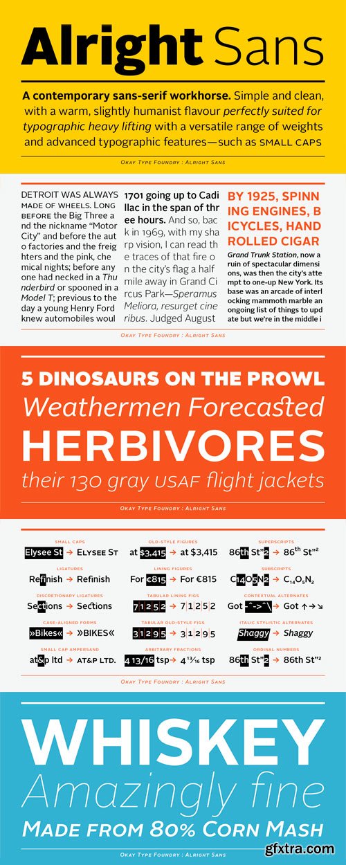
Alright Sans - Inspired by Grotesque & Humanist Styles from Okaytype
OTF | 16 Fonts | JPEG Preview | 2.8 Mb RAR | SALE PAGE
- Alright Sans is a contemporary sans-serif. Inspired by both grotesque and humanist models, it’s clean and prudent with a warm, friendly tone. Alright Sans is a modest design that doesn't feel at all stiff or bland. It has open apertures and roundabout economy that works exceptionally well across media and at reduced sizes. And with shorter-than-normal capitals and a tall x-height, it’s functional without becoming distracting, goofy, or unprofessional. Extra care was taken in creating the OpenType features in Alright Sans. Details were included to help make high-quality typesetting easier, such as case-sensitive punctuation and an optically-correct superscript. A stylistic set in the italics provides alternate two-story forms of the ‘a’ and ‘g’. Even the default numbers are the proportional width old-style forms for a more refined all-around text appearance. There are also lining figures for setting with caps and tabular-width versions for setting tables. Every style of Alright Sans also has a full set of built-in small caps, even the italics. There is also an expanded character set, supporting over a hundred languages. And with weights ranging from extra thin to ultra heavy, Alright Sans proves itself to be a versatile and useful family for a wide range of projects.
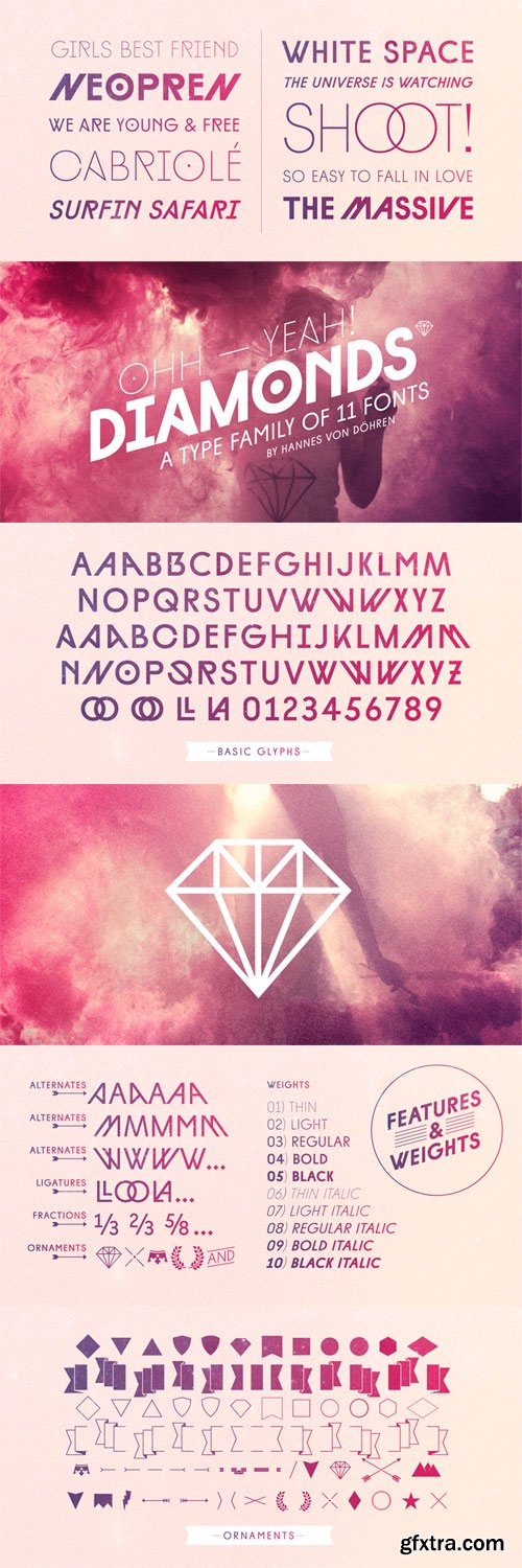
Diamonds - New Geometric Letterforms
OTF | 11 Fonts | JPEG Preview | 7 Mb RAR | SALE PAGE
- The Diamonds type family was designed by Hannes von Döhren in 2012. It is an experimental search for geometric new letterforms, which are still easy to read and generate some unexpected attention. Hannes wanted to create a straight and clear typeface but pull away from the path of classic and well learned letter shapes. The Diamonds type family is equipped for complex, professional typography. The OpenType fonts have an extended character set to support Central and Eastern European as well as Western European languages. Each font includes alternate letters, fractions, scientific superior/inferior figures and a set of arrows and geometric forms.

Gentona - Ranging from Sharp Thin Cuts to Heavy Weights
OTF | 18 Fonts | JPEG Preview | 6.8 Mb RAR | SALE PAGE
- Designed for a wide range of applications, Gentona was intended to support the goals of contemporary design paired with a mostly swiss oriented demand on typography – neutrality. The result is a nine-weight neo-grotesque family ranging from sharp and fine thin cuts to muscle-bound and strong heavy weights. Gentona’s confident and open shapes support legibility especially in small sizes while its alternative shapes and letterforms create flexibility. A wide range of typographic features round up the whole family.

Arquitecta - Humanist Typography as a Rational Project
OTF | 16 Fonts | JPEG Preview | 2 Mb RAR | SALE PAGE
The family contains 8 upright romans and 8 italics with the following features:
- European accents, Old Style Numbers, Numerators & Fractions.
- Ink traps to avoid press impressing spots & hinting optimized.
- Small X-height with accentuated ascenders and descenders.
- Arquitecta. The humanist typography as a rational project. Since the experimentation from the Bauhaus through modern sans history we looked for a new mix to construct a rational geometric typeface with humanist proportions suitable for text layout and continuous reading. Inspired by American & European hand lettering from the first half of the past century, Arquitecta finds his own space as a great alternative for paragraphs in front of classics like Futura, Kabel or Avant Garde.

Benson Script - The Modernist Variety 6xOTF
OTF | 6 Fonts | JPEG Preview | 4.8 Mb RAR | SALE PAGE
- Benson Script is a script that is desperately trying to be anything but a script. With 3 contrast levels, and 2 styles, the six styles of Benson Script are an experiment in the diversity of a single stem width. Modernism’s desire to fit all elements within geometric constraints and adhere to strong verticals has spread throughout type design, but has had little to do with the frills and ornaments of script. Cutting a script down to its bare bones is an offensive idea to many—almost seeming insulting to its genre. Benson Script bridges that genre gap between frill and function. As a matter of genre Benson Script errs on the side of modernism, and adds flair as a last resort.

DIN Next Rounded - Traffic Signs, Wayfinding, Lettering on Drawings
OTF | 4 Fonts | JPEG Previe | 3.9 Mb RAR | SALE PAGE
- The name DIN refers to the Deutsches Institut für Normung (in English, the German Institute for Standardization). The typeface began life as the DIN Institute’s standard no. DIN 1451, published in 1931. It contained several models of standard alphabets for mechanically engraved lettering, hand-lettering, lettering stencils and printing types. These were to be used in the areas of signage, traffic signs, wayfinding, lettering on technical drawings and technical documentation. Rooted in earlier designs for Germany’s railway companies, the alphabets were based on geometric shapes in order to be easily reproducible using compass and ruler. In post-1945 West Germany, the DIN alphabets were widely used, for instance on most road signs. They became available as fonts that were appreciated by designers for their industrial, somewhat quirky and “non-typographic” look and feel. From the 1990s onwards, more refined versions became available for use in book and magazine typography. DIN Next is a typographically corrected and expanded version of this quintessential 20th-century design. DIN Next Rounded is its softer, friendlier version.

Decima Nova Pro 8xOTF
OTF | 8 Fonts | JPEG Preview | 3.4 Mb RAR | SALE PAGE
Decima Nova Pro is a geometric sans serif typeface family, built in eight styles. The typeface is ideal for use in display sizes, but also is quite legible in text and is well suited for editorial and brand design. Features include extended language support, small caps, multiple numeral styles, slashed zero, ligatures. Decima Nova Pro is released as font family in OpenType format with a Latin Western 1252, Eastern European 1250, Baltic 1257, Turkish 1254 and Cyrillic 1251 character set.

 Sweety Strawberry Font TTF | OTF | 259 KB
Dellicious Strawberry Font OTF
OTF TTF | 102 kb
Dellicious Strawberry simplifies elegance into one truly outstanding handwritten font.
Whether you’re looking for fonts for Instagram or calligraphy scripts for DIY projects,
this font will turn any creative idea into a true piece of art!

Strawberry Handwritten OTF 36652
OTF TTF | 122 kb
Strawberry is a distinct, elegant handwritten font hat blends traditional influences into a contemporary aesthetic. Its well balanced Latin details contain distinctive contrasts. Use Strawberry to achieve an exquisite, yet subtle look and maximum versatility.

Goodly is a modern rounded sans serif font family consisting of 6 weights. You can use it to convey the perfect design balance between modern and easygoing. Their round shape can create a friendly impression but they also appear professional. This font suits trendy packaging label designs, unique desired logos and branding, poster designs, fashion, and many more.


The Fonts Collection Bundle, 31 Premium Fonts
This bundle gathers 31 stunning fonts for you to use in your upcoming projects. | 23.1 MB RAR
Agoesa | Barlington | Bestore | Black Dragon | Bright Aurora
Chandler Mountain | Charming Mermaid | Delaras | Estebak
Freshline | Gebrina Script | Helostar | Histeria Dinamond
Juliet | Camelia | Lady Angelina Script | Marchanda | Mingolia Display
Mishega | Mobaster Script | Mostera | Peaky Rangers | Rally | Reading
Retroyal Family | Salenta | Sampreto | Sherlia Script
The Rind | The Roman Historia | Vintage Culture


https://www.myfonts.com/fonts/adam-ladd/zuume-edge/
Zuume Edge is a condensed, display sans serif typeface ideal for eye-catching headlines, branding, packaging, logos, sports, and entertainment, and anywhere else you need maximum impact. The wide weight range offers versatility — the lighter weights bring a sharp, technical feel while the heavier weights pack a visual punch, especially when tightly-spaced and stacked. The notched and extended ink traps add function and visual interest and the included Cut styles have sliced horizontal strokes for even more movement, aggression, and speed. Each style includes matching catchwords, stylistic alternates, and arrow glyphs for added texture to your typography.


https://www.myfonts.com/fonts/my-creative-land/above-the-sky/
Please welcome a new brush written font family Above the Sky which also includes a long requested all-caps marker font, the one you can use to add a “secondary” text to your designs. All fonts make good companions and can be used for all sorts of type-based creations, quotes, branding, merchandise, packaging, invites, greeting cards and so on. You will be over the moon when you find out all Above the Sky possibilities. The brush script has tons and tons of alternates, ligatures, swashes - more than 1200 glyphs are here to serve you well. It can be successfully combined with the Condensed font or/and with the Marker font included in the package. The brush drawn Design Extras font makes the whole thing even better!


https://www.myfonts.com/fonts/my-creative-land/absolute-beauty/
Absolute Beauty is a happy family of a smooth casual monoline signature script and a high contrast elegant didone serif.


CreativeMarket - Modern Avenue - Font Combination 12754529
TTF, OTF | SALE PAGE
Uppercase & lowercase | Numbers and punctuation | Alternates & Ligatures | Multilingual | PUA encoded
- Modern Avenue is an elegant and modern font that combines a serif with a classic script style. Its many alternates characters, including swashes, provide additional beauty and versatility, perfect for any design. The font's elegant and sophisticated look, with its classy characteristic, makes it ideal for high-end projects like luxury branding, packaging and the other various formal forms such as invitations, labels, logos, magazines, books, greeting / wedding cards, packaging, fashion, make up, stationery, novels, labels or any type of advertising purpose. With its perfect balance of modern and classic design, Modern Avenue provides a timeless and refined feel to any design.

Arabic Font - Rubaith
TTF, OTF | 177 KB
Arabic Style Font - Rubaith is a new font from Slidehack.
This will be perfect for your headline font, logo font and other display.
Especially for any Islamic, Arabic, or Middle East cultural event.
Top Rated News
- Sean Archer
- John Gress Photography
- Motion Science
- AwTeaches
- Learn Squared
- PhotoWhoa
- Houdini-Course
- Photigy
- August Dering Photography
- StudioGuti
- Creatoom
- Creature Art Teacher
- Creator Foundry
- Patreon Collections
- Udemy - Turkce
- BigFilms
- Jerry Ghionis
- ACIDBITE
- BigMediumSmall
- Boom Library
- Globe Plants
- Unleashed Education
- The School of Photography
- Visual Education
- LeartesStudios - Cosmos
- Fxphd
- All Veer Fancy Collection!
- All OJO Images
- All ZZVe Vectors
 Categories


