

Kaleko 105 Round 10xOTF
OTF | 10 Fonts | JPEG Preview | 6 Mb RAR | SALE PAGE
- Kaleko 105 Round is a rounded variation of Talbot Type font Kaleko 105. It’s a well-balanced, versatile, modern sans, highly legible as a text font and with a clean, elegant look as a display font at larger sizes. The rounded terminals give it a friendly, approachable look. The Kaleko 105 Round family comprises of five weights and is closely related to Kaleko 205 Round. The most notable differences between the two variations are the single-storey lower case a and g in Kaleko 105 Round, where they are two-storey in Kaleko 205 Round.

Mandevilla Script Font OTF
Mandevilla Script is a perfect crafting font: Sweet, charming and full of love, it will add an authentic flavor to any design!

Mandevilla Font 2xOTF
Mandevilla, a elegant and stylish sans serif font with an italic graces the written word with timeless elegance. Its delicate and graceful evoke a sense of sophistication, It is designed with a touch of modern look and feel, making it ideal for projects that demand a touch of class.

Barber Font Family 8xOTF
OTF | 8 Fonts | JPEG Preview | 4.1 Mb RAR | SALE PAGE
- Barber is a versatile script font family with four weights. While Barber 1 is elegant and neat Barber 4 is cheerful, strong and full of warmth. Barber works great by just typing words but for some extra kick try turning on Contextual Alternates, Swash or Stylistic Alternates in any Opentype savvy program. By opening Glyph palette you'll also find an useful selection of ornaments.

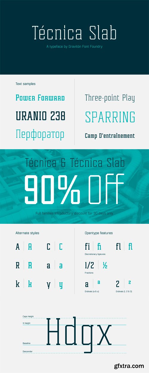
Tecnica Slab Font Family 4xOTF
OTF | 4 Fonts | JPEG Preview | 4.4 Mb RAR | SALE PAGE
- Tecnica Slab font family has been designed for Graviton Font Foundry by Pablo Balcells. It is a modular, geometric, slab serif typeface with a slightly condensed design and subtle rounded angles. It has been conceived to be most suitable for all sized headlines, as well as short and middle length text blocks. The standard styles give texts a classic appearence while alternate styles give texts a playfull one. Tecnica Slab consists of 4 styles, 2 weights plus alternates, each containing small caps and glyph coverage for several languages.


Comalle - A Decorative Swash OTF
OTF | 1 Font | JPEG Preview | 4.3 Mb RAR | SALE PAGE
- Comalle is an organic typeface that rescues some elements of handwritten script, but its stroke does not necessarily answer to a literal calligraphy structure. So Comalle could produce a powerful impact on the page, it was designed with thicker strokes than its counter forms. The objective is that the black of the letter fills the page and causes a fastest visual impact than typographies that balance blacks and whites. One of the most important tasks of the Comalle design was to think of how to handle the unequal percentages of blacks and whites in the typeface. The peculiar thing, is that the precision work of the letter does not make the blacks, but the whites; this is the reason why in one first instance it was very valid to start off designing in a very gross way, nevertheless, the majority energies are put in the details of the design of counter space. From the drained filling concept of forms Comalle was born, a typeface that pretends to enchant with its delicate counter space design and to impact with the heavy outlines which compose its form.


 - 14 Fonts for $325")
Frutiger LT Adobe
TTF-EOT-WOFF-WOFF2 | 14 Fonts | 3.8 Mb RAR | SALE PAGE
- In 1968, Adrian Frutiger was commissioned to develop a signage system suited to the architecture of the new Charles de Gaulle Airport outside Paris. His final design for the client, implemented in 1975, is a simple, clean, robust sans serif type that is highly legible. In 1976, Frutiger completed the family for the Stempel foundry. Despite its original intention as airport signage, Frutiger has a universal quality that makes it appropriate for many applications; a favorite typeface among advertising agencies, it is equally successful in text and display work.

Kyrial Display Pro Font Family
OTF | 12 Fonts | JPEG Preview | 4.4 Mb RAR | SALE PAGE
- Designed in 2011 by Olivier Gourvat, this font family has generous proportions with a range of weights make it a versatile family for print and web design work. Kyrial Display Pro is also a practical typographic choice to express strength, elegance, and conceptual clarity. Kyrial offers lots of OpenType goodness and broad language support.

Geogrotesque Slab Font Family
- Geogrotesque Slab is the ideal companion of the popular Geogrotesque. The challenge was to achieve a fully recognizable font that works as part of the existing family, for that reason the Slab version conveys the same message in a different way. The new font remains clean and tech with a human touch yet provides a new security, confidence and firmness thanks to the serifs. This new addition, combined with Geogrotesque, Geogrotesque Stencil and Geogrotesque Condensed Series provides even more design options and now there’s a Geogrotesque for every need. The type family consist of 14 styles 7 weights (Thin, UltraLight, Light, Regular, Medium, SemiBold and Bold) plus italics. It is available for desktop and WebFont and includes ligatures, tabular figures, fractions, numerators, denominators, superiors and inferiors with support for Central and Eastern European languages.

Geogrotesque Cyrillic Font Family
14 OTF Fonts | RAR 2.93 MB | SALE PAGE
- The original Geogrotesque was first launched in 2008, so this year we are celebrating its 10th anniversary. Besides this, the World Cup it is going to take place in Russia this year. That is why we want to be part of the celebration, releasing the brand new Geogrotesque Cyrillic, adding support to millions of speakers. This new release also includes an expanded version of the existing Latin script, and now you can use Geogrotesque in more than 115 languages from all around the world.

Geogrotesque Sharp Font Family
99 OTF Fonts | 63.1 MB RAR
https://www.myfonts.com/collections/geogrotesque-sharp-font-emtype-foundry
- Geogrotesque Sharp is a superfamily of seven widths and 99 styles, that puts together the work of a decade. Some design aspects has been simplified but without losing its soul, we have removed ink traps and rounded corners. This update lead Geogrotesque to another dimension, becoming more usable and less idiosyncratic. A Variable Font version is included with the family, or as a separate style. Despite being more web oriented, this new format has gained popularity in recent years, so we thought it was the right moment to launch a variable Geogrotesque.

Geogrotesque Extra Compressed
- The popular Geogrotesque family becomes an extended system with the inclusion of three new members to the pack; Geogrotesque Condensed, Geogrotesque Compressed an Geogrotesque Extra Compressed. The condensed series keep the spirit of the original one, and give way to a superfamily up to 56 styles. This new system fluidly varies between widths, ranging from the original width to a 55% of it in the narrower one. As their original partner, the new fonts are great headline families for publications, but will also work in text of intermediate length and point size. The Geogrotesque superfamily offers now one font for each design need. It is available in Open Type format and includes Ligatures, Tabular Figures, Fractions, Numerators, Denominators, Superiors and Inferiors. All of them with support for Central and Eastern European languages. Each type family consists of 14 styles, 7 weights (Thin, UltraLight, Light, Regular, Medium, SemiBold and Bold) plus italics.

Geogrotesque Condensed
- The popular Geogrotesque family becomes an extended system with the inclusion of three new members to the pack; Geogrotesque Condensed, Geogrotesque Compressed an Geogrotesque Extra Compressed. The condensed series keep the spirit of the original one, and give way to a superfamily up to 56 styles. This new system fluidly varies between widths, ranging from the original width to a 55% of it in the narrower one. As their original partner, the new fonts are great headline families for publications, but will also work in text of intermediate length and point size. The Geogrotesque superfamily offers now one font for each design need. It is available in Open Type format and includes Ligatures, Tabular Figures, Fractions, Numerators, Denominators, Superiors and Inferiors. All of them with support for Central and Eastern European languages. Each type family consists of 14 styles, 7 weights (Thin, UltraLight, Light, Regular, Medium, SemiBold and Bold) plus italics.

Geogrotesque Compressed
14 OTF Fonts | Designer: Eduardo Manso | Design Date: May 29, 2015 | Turkish Support | SALE PAGE
![]()
![]()
![]()
![]()
![]()
![]()
![]()
![]()
![]()
![]()
![]()
- The popular Geogrotesque family becomes an extended system with the inclusion of three new members to the pack; Geogrotesque Condensed, Geogrotesque Compressed an Geogrotesque Extra Compressed. The condensed series keep the spirit of the original one, and give way to a superfamily up to 56 styles. This new system fluidly varies between widths, ranging from the original width to a 55% of it in the narrower one. As their original partner, the new fonts are great headline families for publications, but will also work in text of intermediate length and point size. The Geogrotesque superfamily offers now one font for each design need. It is available in Open Type format and includes Ligatures, Tabular Figures, Fractions, Numerators, Denominators, Superiors and Inferiors. All of them with support for Central and Eastern European languages. Each type family consists of 14 styles, 7 weights (Thin, UltraLight, Light, Regular, Medium, SemiBold and Bold) plus italics.

Geogrotesque Font Family 14xOTF
OTF | 14 Fonts | JPEG Preview | 6.4 Mb RAR | SALE PAGE
- Geogrotesque is a semi modular with a subtle rounded finish typeface. All the characters are based in the same formal principle with its corresponding optical adjustments in order to adapt the system to an alphabet for texts. Although the type family has a geometric or “technological” construction, the rounded finish provides it a warm appearance, making the typefaces nicer and nearby. Geogrotesque has been conceived to be used as a display typeface in publications or intermediate length texts, most of all the Thin and Ultralight weights which were meant to be used in big sizes. The type family consists of 14 styles, 7 weights (Thin, UltraLight, Light, Regular, Medium, SemiBold and Bold) plus italics and it’s available in Open Type format.

Semplicita Pro Font Family 10xOTF
OTF | 10 Fonts | JPEG Preview | 5.7 Mb RAR | SALE PAGE
- Semplicita Pro is a new sans serif design that effortlessly straddles the tri-cornered divide between the geometrical, humanist, and gothic sans serifs. We started by reappraising Semplicità, Alessandro Butti’s important 1930 design for Nebiolo. Fueled by Futura, Semplicità gave us the clue to the future: Replace the cool geometric Teutonic soul of Futura with the warm, humanist, calligraphic letterforms that are characteristic not of the Bauhaus but of the Italian Renaissance. With its radically revised formal structure, where only a few characters have a hint of geometric perfection, and the rest are drawn in a calligraphic manner, Semplicità is buzzing with ideas and has served as a gene pool for several new typefaces over the last two decades. Yet Semplicita Pro goes its own way. It isn't a simple revival of Semplicità, which would have looked like a period piece. We wanted to use it to solve a practical puzzle: How to make modernist sans serif letterforms truly readable at small sizes yet persuasive as message-carriers in display. We decided to keep its calligraphic soul and even emphasize it in places, and to relegate to alternatives all the features that seemed to be over-exaggerated, over-decorative, or simply non-functional. The result is an intensely readable sans serif design that, while obviously new and clearly stylish, provides the high comfort factor readers experience when viewing the classic stalwarts of 20th century sans serif design, and gives contemporary designers a widely expressive palette, all within the principle of simplicity leading to better understanding. Semplicita Pro is loaded with OpenType features and over 850 glyphs per font. For more information on the design, complete character sets, technological features, and print tests, consult the accompanying PDF.

Pluto Sans Font Family 16xOTF
OTF | 16 Fonts | JPEG Preview | 4.2 Mb RAR | SALE PAGE
- Pluto Sans - the straight companion of the Pluto Family - was designed by Hannes von Döhren in 2012. This clear Sans Serif family is based on the Pluto architecture and it still has a hint of the friendly feeling the quirky Pluto conveys. With its geometric forms and its large x-height it is perfect for long texts in small sizes and usage in print & on screens. Both Pluto Sans and Pluto have the same range of weights and styles and can perfectly be used together. Pluto Sans is equipped for complex, professional typography. The OpenType fonts have an extended character set to support Central and Eastern European as well as Western European languages. Each font includes alternate letters, fractions, lining-, tabular numbers, scientific superior/inferior figures and a set of arrows.

PF Bulletin Sans Pro Font Family 10xOTF
TTF | 10 Fonts | JPEG Preview | 4.3 Mb RAR | SALE PAGE
- This is a grotesque typeface which was derived from an older more simple version designed back in 2000. Bulletin Sans Pro is distinguished by its selective deep cuts which give this typeface a robust and contemporary look. These cuts become more apparent at larger sizes while they create a more subtle effect at smaller sizes. For intense titles try the black version. When space and legibility for long texts are critical, use the lighter versions. The family consists of 10 fonts—from black to light—including true italics. It supports 20 special OpenType features like small caps, fractions, ordinals, etc. and offers multilingual support for all European languages including Greek and Cyrillic. Finally, every font in this family has been completed with 270 copyright-free symbols, some of which have been proposed by several international organizations for packaging, public areas, environment, transportation, computers, fabric care and urban lifestyle.

Bandera Pro Font Family 12xOTF
OTF | 12 Fonts | JPEG Preview | 4.8 Mb RAR | SALE PAGE
- This square serif typeface is a real workhorse. It is a modern tool for text design: extremely legible, pan-european multilingual (Latin, Greek and Cyrillic), well shaped. Bandera Pro has six weights with original italics, alternatives, small capitals and three sets of digits. It catches attention in headlines of posters and magazines or makes reading comfortable in plain texts. Bandera Pro shares main proportions with sans serif Osnova Pro typefamily so ideally can pair it.

Niveau Grotesk - Geometric Modernism 18xOTF
OTF | 18 Fonts | JPEG Preview | 7.7 Mb RAR | SALE PAGE
- Niveau Grotesk—the companion of Niveau Serif—is a type family of six weights plus matching italics and small caps. It was designed by Hannes von Döhren in 2013. Influenced by classical nineteenth-century faces, the fonts are based on geometric forms. Because of its straight architecture, Niveau Grotesk has a “punch” in big sizes but is very legible in smaller sizes and longer texts—in print or on screen. Niveau Grotesk is equipped for complex, professional typography with alternate letters, arrows, fractions and an extended character set to support Central and Eastern European as well as Western European Languages.


Top Rated News
- Sean Archer
- John Gress Photography
- Motion Science
- AwTeaches
- Learn Squared
- PhotoWhoa
- Houdini-Course
- Photigy
- August Dering Photography
- StudioGuti
- Creatoom
- Creature Art Teacher
- Creator Foundry
- Patreon Collections
- Udemy - Turkce
- BigFilms
- Jerry Ghionis
- ACIDBITE
- BigMediumSmall
- Boom Library
- Globe Plants
- Unleashed Education
- The School of Photography
- Visual Education
- LeartesStudios - Cosmos
- Fxphd
- All Veer Fancy Collection!
- All OJO Images
- All ZZVe Vectors
 Categories


