
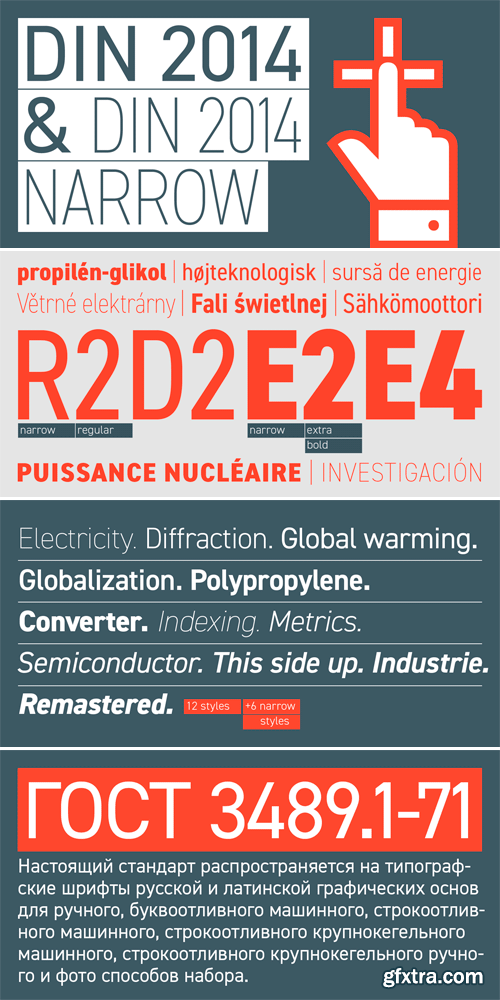
DIN 2014 - Extremely Legible Typeface
TTF | 18 Fonts | JPG Preview | 1.3 Mb RAR | SALE PAGE
- DIN 2014 is a contemporary version of a well-known DIN typeface. The Regular performs well in long text settings, while Light and Bold faces are extremely legible at large sizes. Type family spans 18 faces: 6 Upright with the matching Italics of normal width and 6 Narrow ones. The typeface was designed by Vasily Biryukov and released by Paratype in 2015.

Bringin Script - Bouncy & Smooth
OTF + TTF | JPG Previews | 3.4 Mb RAR | SALE PAGE
- Bringin is informal script lettering font with a bunch of alternative characters to choose. Bringin uses OpenType feature such as swash, ligature and alternates that can be found by using OpenType savvy program such as Adobe Illustrator and Adobe InDesign. Bringin is bouncy and smooth and has a very feel. You have a lot of options to customize it and that makes it perfect for logos, packages and titles.It can be accessed by using OpenType savvy program such as Adobe Illustrator and Adobe InDesign. The Manual that show you how to use OpenType feature was included in the package.
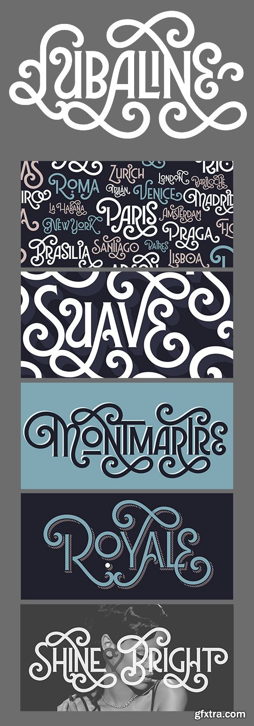
Lubaline Font Family
OTF | 6 Fonts | + JPG Previews | 0.7 MB | SALE PAGE
- SPT Lubaline is a decorative multi-layered all-caps semi-serif typeface family with eclectic Art Deco style, further exaggerated with Shadow, Extras, and swashes aplenty. It is also Maximiliano Sproviero’s humble tribute to the work of Herb Lubalin, a typographic icon who smashed the taboos and sacred rules of type design. Lubaline is ready to perfect your exuberant design briefs, especially those related to branding, editorial, packaging, or anywhere you want to make an eye-grabbing statement.
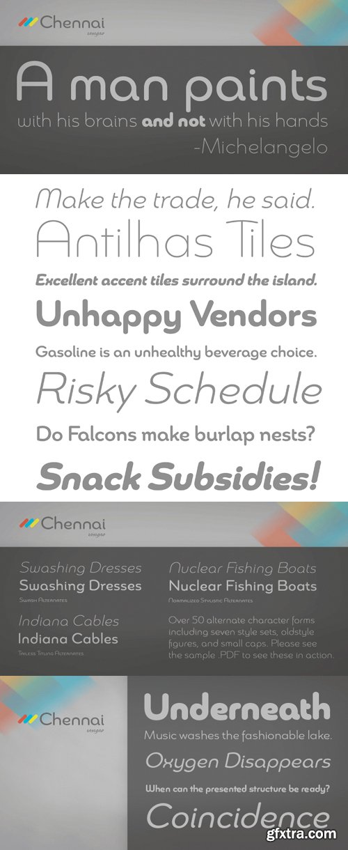
Chennai Font Family
OTF | 12 Fonts | JPEG Preview | 4.7 Mb RAR | SALE PAGE
Chennai contains 12 styles and family package options.
- Updated in 2009, Chennai has new weights and OpenType features. Chennai is a simplified sans-serif with a full complement of OpenType alternates. The typeface is rounded, slightly extended and geometric. Over fifty OpenType alternate characters are available, including swashed lower forms, traditional caps and a traditionally formed lowercase. Chennai also includes seven style sets, oldstyle figures, and small caps. Please see the sample PDF to see these in action. Use Chennai whenever you need a contemporary and versatile sans serif.
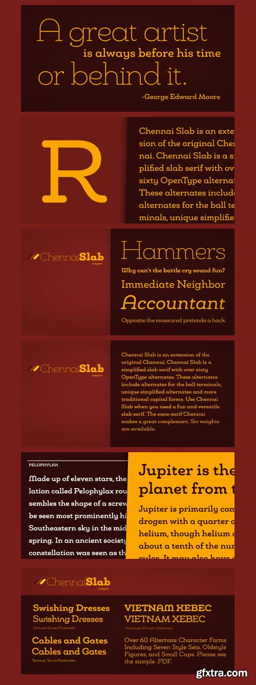
Chennai Slab Font Family
12 OTF and TTF Font Files | 2.3 MB | SALE PAGE
Chennai Slab is a simplified slab serif with over sixty OpenType alternates.
These alternates include alternates for the ball terminals, unique simplified alternates and
more traditional capital forms. Use Chennai Slab when you need a fun and versatile slab serif.

Style Script Font Family
OTF | 8 Fonts | JPEG Preview | 9 Mb RAR | SALE PAGE
- No word describes this font better than STYLE... TypeSetIt has taken things just a step further. It takes the look and simplicity of 1950s and 60s advertising and combines it with up to date design characteristics. With three main styles, Plain, Script and Formal, StylePro transforms the Retro look into a versatile, and powerful font that can be used for nostalgic work, or 21st Century design. Style Script is a beautiful upright script with looks that vary from Casual to Formal in appearance. If you're a professional graphic designer, use Adobe Illustrator®, or InDesign®, to access Style Script Pro’s Opentype features. With over 1275 Glyphs, the OTF programming gives a powerful solution to the needs of design professionals. Special thanks to Maximiliano Sproviero (my good friend) for his keen eye and design suggestions, and a note of appreciation to Mark Simonson for helping with technical issues.


Glober Font Family - 17 Font $493
OTF | 0,8 MB | Sale PaGe
- The Glober font family includes 18 weights - nine uprights with nine italics. It is characterized by excellent legibility in both - web & print design areas, well-finished geometric designs, optimized kerning, excellent web-font performance and legibility etc.Inspired by the classic grotesque typefaces - Glober has his own unique style in expressed perfect softened geometric forms.The font family is most suitable for headlines of all sizes, as well as for text blocks that come in both maximum and minimum variations. Glober font styles are applicable for any type of graphic design in web, print, motion graphics etc and perfect for t-shirts and other items like posters, logos.

Adria Grotesk Font Family
OTF | 14 Fonts | JPEG Preview | 12 Mb RAR | SALE PAGE
- Adria Grotesk is a superfriendly and sunny humanist typeface that comes in 7 carefully crafted weights and charming upright italics. You will find a fine choice of lining, tabular and old style figures, numerators, denominators, tabular figures, fractions, ligatures, some sweet symbols and even alternate arrows.
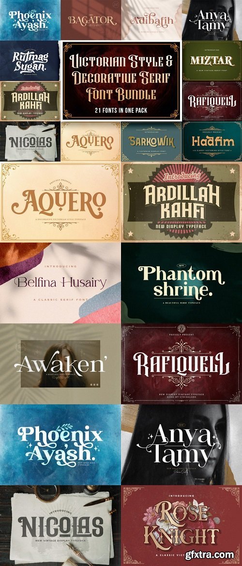
Victorian Style & Decorative Serif Font Bundle, 21 Typefaces
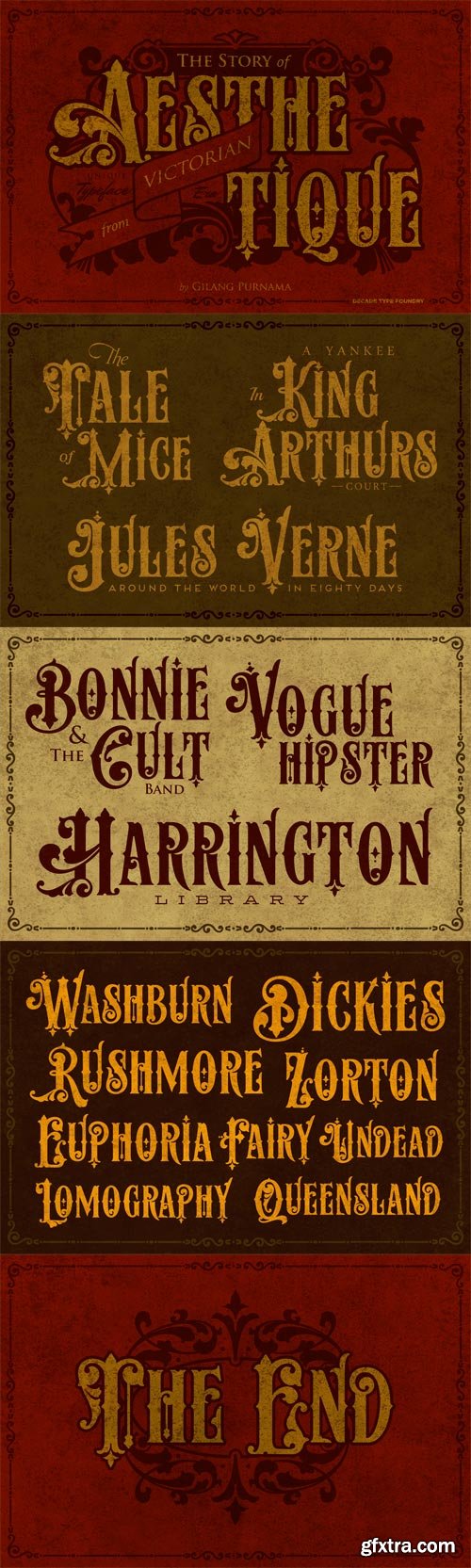
Aesthetique - Victorian Style with Decorative Initials
OTF | JPEG Preview | 6.4 Mb RAR | SALE PAGE
Aesthetique is a typeface of decorative initials that is Victorian in style and
bears a close family resemblance to the many ornamental tuscans cut
throughout the nineteenth century

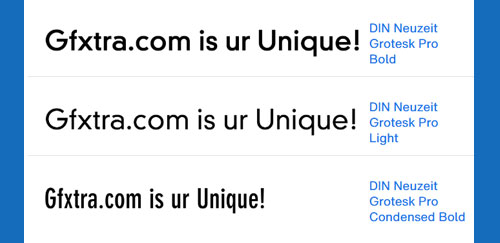
DIN Neuzeit Grotesk Font Family
- The German Standards Committee suggested the ?light Neuzeit-Grotesk’ font in 1970 for use in official signage, traffic directional systems, etc. The typeface had been designed by Wilhelm Pischner and appeared with the font foundry D. Stempel in 1928. The font Neuzeit Grotesk was once the standard in the print industry, as a timeless typeface with no real distinguishing features. Like other typefaces of the 1920s, DIN Neuzeit Grotesk reflects the philosophy of the times.


DIN Next Slab Font Family
- Now even more design possibilities with the popular DIN Next. With its technical and neutral character, DIN Next has earned a permanent place in contemporary typography. Now, DIN Next Slab expands the font family further, offering new design potential.Now comes the next step, DIN Next Slab, also produced under the direction of Akira Kobayashi. On a team with Sandra Winter and Tom Grace, Kobayashi is creating the new font variant based on the optimized shapes of DIN Next. The expansion will make the popular font all the more flexible and versatile. Apart from that, the geometric slab serifs underline the technical and formal nature of the font and emphasize a central design element of DIN Next.However, the team did have some challenges to overcome. While it is relatively easy to imagine DIN Next Light with slab serifs, the amount of available space quickly disappears when it comes to the Black styles. Winter explains that many tests and trials were necessary to find a compromise between space, letters and the serif shapes. Experiments with modified contrast in the weight or only one-sided serifs were quickly abandoned. The central, technical and powerful character of the font changed too much. Nevertheless, it was necessary to simplify slightly the shape of some letters, such as the ‘k’ or ‘x’, for example. These changes, first developed in the Black styles, were applied to all weights in order to lend the font a consistent appearance.Like DIN Next, DIN Next Slab also has seven weights, which cover the range from Ultralight to Black, each with matching italic. There are various character sets in all of the styles and the four middle weights have small capitals available.DIN Next Slab harmonizes perfectly with the styles of DIN Next: the basic letterforms and weights are identical. Both versions of the font can work together perfectly, not just in headlines and body text, but also within a text; they complement each other very well as design variations. With the new DIN Next Slab, Monotype expands the DIN Next super family consistently. With DIN Next Slab, you can underscore the technical and formal nature of the understated font not only in headlines, but in texts, as well. In this way, you have new and diverse potential for application, thanks to the way the different styles of DIN Next combine perfectly.

DIN Next Stencil Font Family
7 TTF True Type Font Files | 3.45 MB | SALE PAGE
- The DIN Next™ Stencil suite of designs is DIN with an attitude. It’s even more industrial strength than the original. DIN Next Stencil’s seven roman weights are perfect for projects that require a mechanized, military, or commercial vibe. If you’re looking to create commanding display typography, be it in advertising, apparel, packaging, posters, signage, wayfinding – or crash dummy name tags, DIN Next Stencil can be the perfect typographic enhancement. Based on Akira Kobayshi’s DIN Next with stenciling by Sabina Chipara?, the wide range of weights and large complement of diacritical and international characters – including those for Cyrillic and Greek – further expand the design’s capabilities. The DIN Next Stencil fonts are powerful tools in their own right – and provide a distinctive supplement to the DIN Next typographic palette.

DIN Next Shapes Font Family
4 OTF Opentype Font Files | 0.4 MB | SALE PAGE
- Sabina Chipara?'s DIN Next Shapes typeface is a twist on the original German industrial classic, taking its skeleton and re-clothing it in dots, hearts, snowflakes and stars. The design offers a more approachable and whimsical tone of voice than the original, while maintaining all the legibility and clarity of form that makes DIN Next such a reliable and versatile design. It works in harmony with DIN Next, and is particularly suited for designers looking to be a little more expressive.
- DIN Next Shapes includes four fonts: Dots, Flakes, Hearts and Stars, and has pan European language support including Greek and Cyrillic. It also has OpenType features including stylistic alternatives, ligatures and fractions.

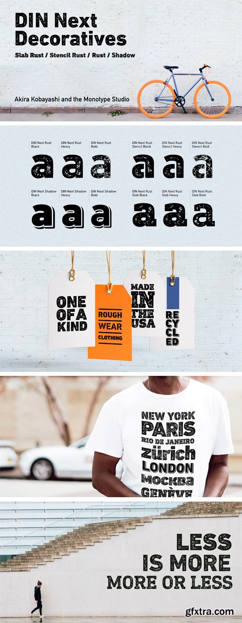
DIN Next Decorative Font Family 12xOTF
12 OTF Fonts | 33.3 MB RAR | SALE PAGE
- This four-piece family is the DIN design, but not as you know it. The famously, crisp, clean and precise typeface has been given a textured update that’s reminiscent of rusted metal, or rubber stamps. Underneath this lies the same sturdy, geometric shapes that have allowed DIN to stand the test of time, but with a new sense of tangibility.


CreativeMarket - Pretty Boy - Decorative Serif 6xOTF 6144510
- Introducing Pretty Boy a decorative serif family. This font consists of five weights and an ornament. It has many alternative options to arrange to get a fabulous and charming typography art. Pretty Boy Ornament works excellent to pair with any fonts too! This decorative serif family is perfect for designs like movie, poster, wedding invitations, and work great for logo, branding, headers, or labels.

Swissra Arabic Typeface Family
- Swissra is an Arabic typeface that was inspired from Swiss graphic design.
- The motivation behind the typeface was to create a neutral and carefully crafted Arabic font family that can be used on many different applications. Swissra also aspires to tribute the experience of Swiss graphic design and pass it on to the Arabic graphic design scene.
- Swissra features sharply cut terminals, which are either horizontal or vertical. It also features closed apretures and a high x-height. It comes with eight weights, that range from thin to black.

DIN 2014 Rounded Font Family
7 OTF Fonts | JPG Previews |
- DIN 2014 Rounded is an extension of the industrial sans serif DIN 2014. It combines the softness and friendliness of the rounded endings with the seriousness and stability of the original typeface. Not a typical childish rounded font. DIN 2014 Rounded works well for medical or architectural topics, headings on the web or in periodicals, brand identity, packaging, and, thanks to the DIN proportions, for signage. DIN 2014 Rounded includes six styles ranging from extra light to extra bold, corresponding to the upright styles of DIN 2014, as well as a variable version. The typeface supports all European languages based on Latin, Cyrillic, and Asian Cyrillic (Tatar, Kazakh, Kyrgyz and other languages). Isabella Chaeva and Alexander Lubovenko worked on the rounded version. The typeface was released by Paratype in 2021.
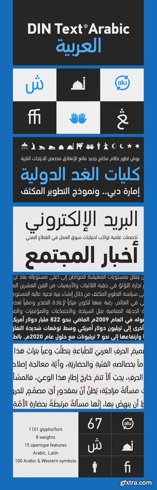
PF DIN Text Arabic Font Family
8 TTF Files | Designers: Panos Vassiliou & Hasan Abu Afash | SALE PAGE
- This Arabic typeface is one of Parachute’s most involved text typefaces. For the first time -back in 2010- a contemporary Arabic equivalent to a comprehensive DIN series of fonts was available. In fact, this set of fonts contains the most complete and powerful array of Arabic features commercially today. It comes in eight weights and includes Latin. Based on the DIN Text Pro superfamily, Parachute® released -in collaboration with designer Hasan Abu Afash- 2 new versions.
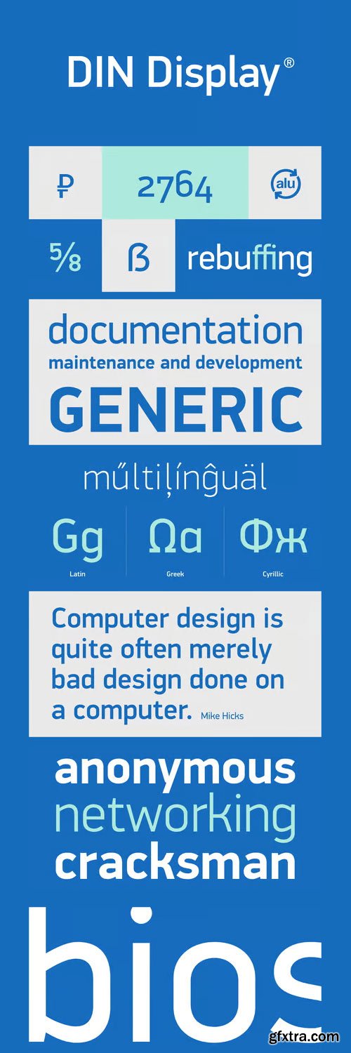
PF Din Display Pro Font Family
TTF | 14 Fonts | JPEG Preview | 6.3 Mb RAR | SALE PAGE
- While DIN Display seems to retain DIN’s basic characteristics, it shines with its sharper corners and contemporary look. Completed in 2002, it was first released and published in Parachute’s award-winning 2003 catalog and immediately was a hit. It has been used successfully in magazines, corporate applications and packaging in fields such as music, fashion, technology, visual arts.

Unicod Sans Font Family
TTF | 18 Fonts | JPEG Preview | 4.8 Mb RAR | SALE PAGE
- This font has been especially designed for Mostardesign Studio by Olivier Gourvat. Created in 2010, this font family has been designed to serve sectors like financial services, modern industries, business and many more activities who needs a modern aspect in their communication. Its square proportions make the design very readable at a wide range of sizes. Shapes give the face a unique futuristic look and is a very practical choice for modern headlines, branding, text and web fonts work. The family contains also an alternative set with simplified letters designed especially for text and a unique stylistic set for titles and branding. UNicod Sans is available in 5 weights with corresponding italics and 2 styles.

Uni Sans Font Family 14xOTF
Designer: Svetoslav Simov | 14 OTF Fonts | Turkish Support | Uni Sans Font Family
Uni Sans is a custom sans font which is applicable for any type of
graphic design - web, print, motion graphics etc and perfect for t-shirts and other items.
![]()
![]()
![]()
![]()
![]()
![]()
![]()
![]()
![]()
![]()
![]()
![]()


Sheila – Classic Font
Regular | Italic | Reverse Italic | TTF & OTF | 134 K RAR
Top Rated News
- Sean Archer
- John Gress Photography
- Motion Science
- AwTeaches
- Learn Squared
- PhotoWhoa
- Houdini-Course
- Photigy
- August Dering Photography
- StudioGuti
- Creatoom
- Creature Art Teacher
- Creator Foundry
- Patreon Collections
- Udemy - Turkce
- BigFilms
- Jerry Ghionis
- ACIDBITE
- BigMediumSmall
- Boom Library
- Globe Plants
- Unleashed Education
- The School of Photography
- Visual Education
- LeartesStudios - Cosmos
- Fxphd
- All Veer Fancy Collection!
- All OJO Images
- All ZZVe Vectors
 Categories


