

Demi Lovato - 45 Unique Fonts Pack OTF & TTF
45 Fonts | TTF | OTF | 1.6 MB


150+ Awesome Fonts
150+ Fonts | TTF | OTF | Web Fonts | 12 MB
Grunge Fonts,Handwritten Fonts,Script Fonts,Serif Fonts,Sans Serif Fonts
- Awesome Grunge Fonts
- Awesome Handwritten Fonts
- Awesome Script Fonts
- Awesome Serif Fonts
- Awesome Sans Serif Fonts

10 Best Alternatives to Popular Fonts
50 TTF | 38 OTF | 15 MB

- It's official, after months of hand crafting each of these typefaces I've bundled them up and slapped a sweet price tag on em! If you love hand lettering, this Font Bundle is for you! Perfect for creating logos, typography, and prints with that hand-drawn aesthetic, the Hand Crafted Font Bundle is filled with everything you need to do get the job done!
BUNDLE FONTS:
- Billow Font + Extras : Extras include 15 Catchwords & Vector Ink Splatters
- Hemingwar Font Family (3 Weights)
- Adrift Font Family (4 Weights)
- Flycatcher Font Family (2 Weights)
- Milk Stout Font Family (2 Weights)
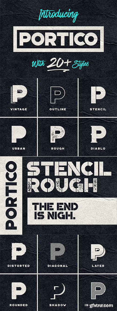
CM - Portico Typeface - A Devilish Style 380581
27 OTF | 3.8 MB RAR | SALE PAGE
Portico is a display typeface with a ton of styles.
It includes uppercase multilingual letters, numbers and punctuation.
Designer is tried to make the family as versatile as possible.
The rounded and in-diagonal versions are great for more personable applications,
the urban and rough versions are great for all grunge designs, the layered and
vintage versions have a very retro-ish theme to them and work in 2 colors.
The stencil version works well for posters and apocalypse themed stuff and
the diablo style is just...evil.

CM - Layerform Font Bundle 81934
- Introducing the first Font Bundle from Layerform.com. This is as Juicy as they come, with 3 delicious fonts to choose from. There are two handsketched fonts and a beautiful distressed sans serif font in this bundle, at the bargain price of $18, 25% OFF!
In this Bundle you will receive:
BREEZY: https://creativemarket.com/Layerform/74652-Breezy-Handsketched-Font
MADELINE: https://creativemarket.com/Layerform/69011-Madeline-Handsketched-Font
POINTBREAK: https://creativemarket.com/Layerform/74215-Pointbreak-Sans

CM - Visby CF Geometric Sans 10xOTF 184499
10 OTF| 2.19 MB RAR | SALE PAGE
- Friendly and charismatic in lowercase; sophisticated and authoritative in uppercase. Visby is a geometric font inspired by the stark beauty and crisp air of the Arctic North. Hard lines and sharp corners mesh with smooth, rounded letterforms, while humanist nuances add warmth.
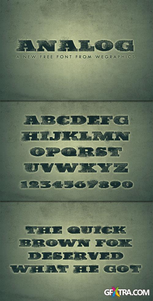
WeGraphics - Analog - A Grunge Font for Posters OTF
Analog is a grunge font that features bitmap dot patterns.
This font is excellent for posters, album covers, or websites that need a touch of grunge appeal.
TTF | 156 Kb
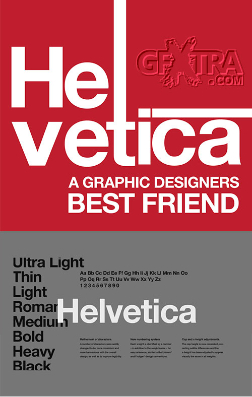
Helvetica Fonts Pack
96 TTF | 100 OTF | 6.37 MB RAR
NEUE 1-2-3 | COMPRESSED | NOW | ROUNDED | LITE | THIN
![Handmade Fonts Special Bundle [31 Fonts]](/uploads/posts/2021-04/1617670683_wedsvr.jpg "Handmade Fonts Special Bundle [31 Fonts]")
CM - Handmade Fonts Special Bundle [31 Fonts] 040421
31 Font Families | 36 TTF | 48 OTF | 5.86 MB
Ageless-1854777 | Ageless-1854777 | Azelia-935932 Bastille-Day-458746 | Battle-Day-458696
Bottle-458836 | Boutique-735743 | Butterfly-642237 | Cabbage | Dughter
Glitter-769548 | Glittering-867097 | Glorious | Guanabana | Jordan-River-1959712
Lazortha-1997624 | Magdalen | Magdaylen-612575 | Majesty-King-691833 | Margarita-718930
Markisha | Marthilla-2062061 | Mighty-458759 | Mom-Love-458679 | Monica-Family-584926
Robusta | Salwa-Baru | Scooter-198401 | Simbad | Songstar-458719 | Zinnia


A Type Noir Collection by Typocalypse
20 OTF Files | 1.07 MB RAR
- One of the newest bundles on MyFonts, A Type Noir Collection is a bundle of 20 fonts that will take you back in time to an era of neon lights and marquee letters. This bundle—an elegant nod to the 20th century movie industry—is full of display fonts that would make even Charlie Chaplin swoon.
- Influenced by the hand-painted signs on cinema facades of the early cinema days, this collection is made of fonts from the Lichtspielhaus, Lichtspielhaus Handmade, and Lichtspielhaus Slab families and includes tons of alternate features.

CF - Funny Seasonal Font Bundle - 20 Fonts
OTF | TTF | 20 Fonts | 1.71 MB RAR | SALE PAGE
Baby-Magpies-7303234 | Ben-Kidoz-5469862 | Cute-Lime-4666853 | Dr-Bones-17925369
Foolish-Hand-9237256 | Good-Summer-4221881 | Gracelyn-Hand-11901101 | Hayven-3993812
Happy-Dinosaur-5002267 | Kiddie-Love-7903096 | Kids-Touch-10819617 | Molusca-1880467
Locked-Monster-10457716 | Pumpkinos-5137058 | Pumpkinos-bonus-5137058
Seventeen-Winter-6444277 | Snow-Fox-20731710 | Spring-Butter-8783378
Thiny-bunny-9600198 | Trick-or-Bite-15975639 | Wolvins-1440361

Fonts Cocktail Bundle - 20 Fonts
Classy-Script-43293486 | CurvyScript-Regular | Early-Christmas-42626705
Elegant-Halloween-42464520 | Fantasy-46731529 | Hazy-Curves-43040711
Hi-Christmas-43923889 | Lazy-Bubbles-41996688 | Longito-46918141
Lovely-Mess-42139664 | Messy-Bubbly-42025372 | Messy-Hand-44374064
Playful-Christmas-44179253 | Primo-41743039 | Simplicity-47511388
Spiralled-44223514 | Tall-Caps-45109491
You can use it for almost anything like blog headers, posters, wedding elements,
t-shirts, clothing, book covers, business cards, greeting cards,
branding, invitations, magazines, quotes, and more.

CF - Welcome Fonts Bundle - 20 Fonts
Chestnut-47048772 | Doodly-44736439 | Elegante-Fd-43920081 | Faust-47933738
Flower-Power-Fd-45871729 | Funky-Fresh-47096648 | Gambit-Fd-Neue-43920456
Jaden-44180683 | Makers-Marker-44570062 | Mercury-44536353 | Nilad-45886379
Pink-Fight-45111689 | Pista-43921743 | Porky-44338960 | Snowflakes-45113689
Spirited-44345926 | Sprightly-Fd-46034913 | Sulat-Rizal-22553355
Sweet-Bella-47547659 | Tangerine-46575481
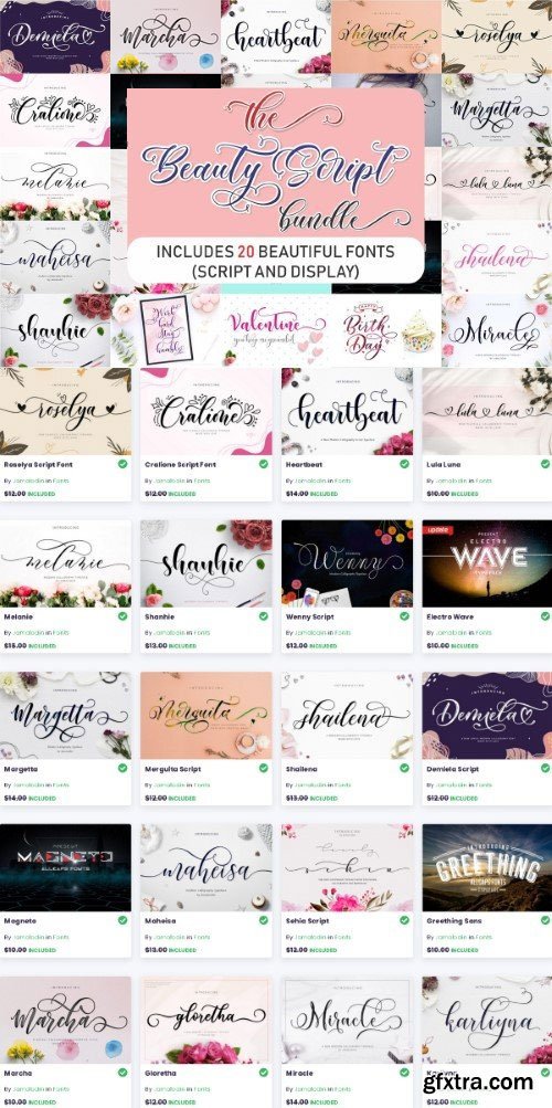
CM - The Beauty Script Bundle - 20 fonts
20 fonts | OTF, TTF | 3 MB RAR
Cralione-Script-11623987 | Demiela-Script-13155257 | Electro-Wave | Gloretha-2125377
Greething | Heartbeat-5524335 | Karliyna-2125461 | Lula-Luna-18417456
Magneto | Maheisa-Script | Marcha-37882488 | Margetta-5524031 | Melanie-5524071
Merguita-Script-14745579 | Miracle-5523840 | Roselya-Script-16921452 | Sehia-Script
Shailena-Script | Shanhie | Wenny-script
- The Beauty Script Bundle Includes 20 Beautiful Fonts (Script and Display). You’ll find a unique combination of modern and classic fun styles to create the perfect lettering. Give your designs a romantic and playful feel because each font has its own magical touch. You can use it for almost anything like blog headers, posters, wedding elements, t-shirts, clothing, book covers, business cards, greeting cards, branding, invitations, magazines, quotes and much more.

For Funsy Font Bundle - 20 Fonts
44 TTF | 44 OTF | 2.98 MB
Aloof 3d | Candydance | Monkey Mail | Coddington | Hilation | Monkey Lumps
Monkey Mail | Nugacious | Octologist | Octopus Cakes | Outrage | Playdate
Simbirsk | Stay Woke | Figment | Frankie | Honeyletter | Little Fishmonger
Overthink | Pipsqueak | Yodabizy | Zooping
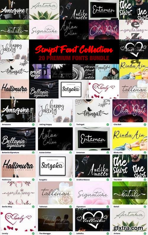
CM - Script Font Collection - 20 Premium Fonts Bundle140620
20 OTF | 2.74 MB
Amazone | Andika-Macco | Antara | Autan-Enllan | Batali | Bellania-Signature
Cila-Bali | Entaman | Gorila-Woy | Hallimura | Joking-Happy | Lallaiku
Lovely | Rindu-Ain | Signature | Surgaku | Tallenan | Teringat
The-Manggo | The-Shirt
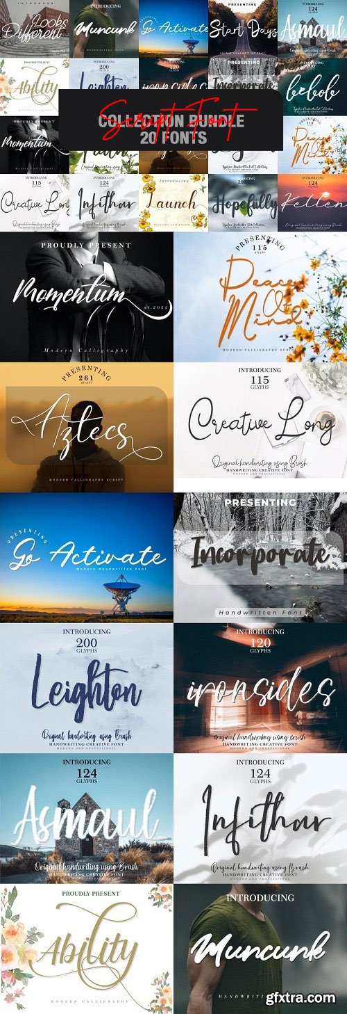
CM - Script Font Collection Bundle - 20 Fonts
This bundle gathers 20 stunning fonts for you to use in your upcoming projects.
Ability-27030719 | Asmaul-32487402 | Aztecs-27775834 | Bebob-41418055
Creative-Long-47162385 | Faith-33343101 | Go-Activate-28601100 | Hopefully-37270043
Incorporate-29243447 | Infithar-32886457 | Ironsides-32094234
Kellen-34798812 | Launch-26677431 | Legend-38040032
Leighton-31606025 | Looks-Different-25822880 | Momentum-27354481
Muncuk-28207262 | Peace-Of-Mind-42265313 | Start-Days-28937884


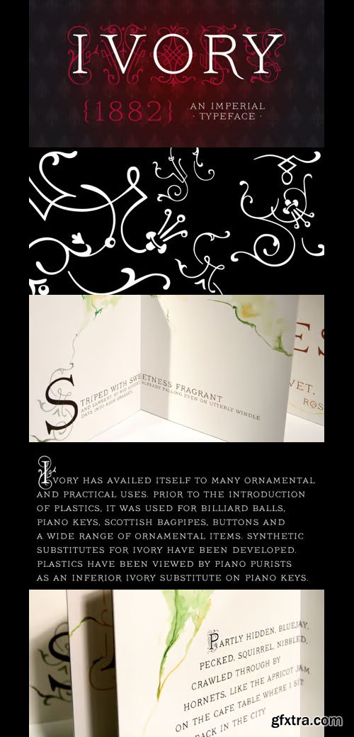
Ivory Font Family
OTF | 3 Fonts | JPEG Preview | 4.2 Mb RAR | Ivory Font Family
- Ivory is inspired by a beautiful typeface used in an illustrated compendium about pomology from 1882. We separated the elegant “Swashes” from the letters – use it together with “NoSwashes” to get two-colored initials. Please note that the kerning of NoSwashes works only together with Swashes. To achieve the two tone effect shown in the samples, you need to use an application that supports layers. For example, Adobe Illustrator, Adobe InDesign, Adobe PhotoShop, CorelDRAW, and Quark. Some of the preview images where made by Arina Karen Renata Palilingan.


Weingut Font Family
4 OTF | 0.3 MB | Sale Page
- Blossoms, leaves, buds and tendrils create fragile objects of words and letters.Weingut Script Flourish is a decorative display font with high contrasts, perfectly drawn to the tiniest details. The font is trimmed to fairly large font sizes and is highly suitable for chapter titles or book jackets as well as Headlines, Invitations and wine labels :), although also impressing with an astounding legibility in small typesettings. Inspired by the hand drawn Blätterschrift from the 19th century Mettenleiter’s Schriftenmagazin, its basic structure is related to the English Script. The creative process started in summer 2009 and after 600 hours of work, over a 2 year period, Weingut now unfolds to reveal all its charms.Design with bicoloured capitals:In Weingut Script and Weingut Flourish, leaves and letters are available separately. You can stack them and apply different colours to the foreground and background.Decoration and patterns:Weingut Swashes and Ornaments offers extra decorative elements in a separate font. Leaves, flourishes and borders available on their own or merged to ornaments.The Weingut Family – noticable bouquet, beautiful structure with full fruit and a long finish.Please make sure to use an application that supports the layering of text (two-coloured capitals) and OpenType features (contextual alternates). Be aware if you intend to combine Weingut Script Flourish and Weingut Flourish that these two do not go together. The floral outlines differ slightly and inaccurate overlaps will be the end result.
Top Rated News
- MRMockup - Mockup Bundle
- Finding North Photography
- Sean Archer
- John Gress Photography
- Motion Science
- AwTeaches
- Learn Squared
- PhotoWhoa
- Houdini-Course
- Photigy
- August Dering Photography
- StudioGuti
- Creatoom
- Creature Art Teacher
- Creator Foundry
- Patreon Collections
- Udemy - Turkce
- BigFilms
- Jerry Ghionis
- ACIDBITE
- BigMediumSmall
- Boom Library
- Globe Plants
- Unleashed Education
- The School of Photography
- Visual Education
- LeartesStudios - Cosmos
- Fxphd
- All Veer Fancy Collection!
- All OJO Images
- All ZZVe Vectors
 Categories


