Compatibility: Figma
Overview
- Most Design System Kit you'll find on the internet contains a shitload of premade components. We don't believe that's what you need.
- Pre-made components are often a pain to work with, and rarely fit the exact requests of your client. Pre-made components don't make sense. We propose the following.
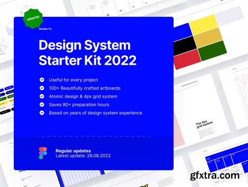
- We noticed every project starts with 80 hours of Design System Preparation work. This is: defining typography, defining whitespace, defining a color overview, defining the grid, setting up basic atoms such as buttons and forms, and so on.
- Why? Because that will result in a more consistent design, a better-looking design, and happier developers & clients.
- The interesting thing: these little details in your design system rarely change throughout different designs. So why not start with a starter kit that contains this?
- We took the time to create a starter kit, which you can use every time you start a project. It's beautifully designed and creates an amazing starting point for any project. But most importantly, we noticed developers love to work with this file, it speeds up their workflow, and the stuff they build will look a lot more like what you designed.
- After 10+ years of design experience and over 4+ years of working with design systems (yes, that's since the very start of the design system concept), we combined all the things we learned in this single file. Ready for you to pick up, and start working with.
- Hope you love working with this as much as I do.
Pages in the Figma file:
1. Design System Setup: What a design system is, and how the file is set up.
The Atoms
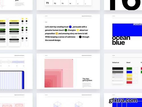
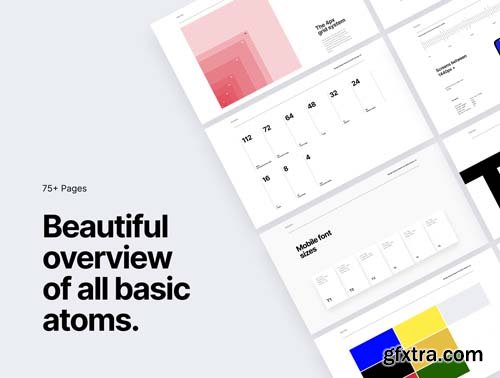
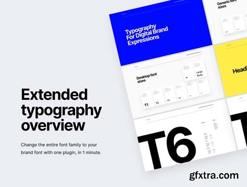
2. Typography: Fifteen well-designed artboards provide an overview of typography for desktop, tablet, and mobile screen sizes.
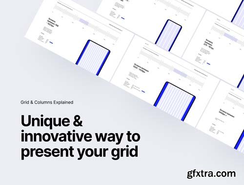
3. The Grid: Eight artboards explaining the grid for this design system. Defined for 6 different screen sizes.
4. Colors: An pretty overview of the colors used in this design system. Easy to change.
5. Whitespace: Thee slides explain the use of whitespace with an overview of allowed whitespace.
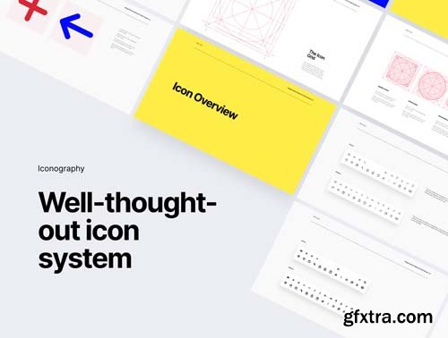
6. Icons: A set of 13 common icons.
7. Interactive: Buttons, Fields, and Dropdowns, set up according to the latest Figma features.
8. Photography: An example of how we prefer to set up a photography direction in Figma.
Molecules:
9. Molecules: An overview of the molecules used in this file.
Organisms:
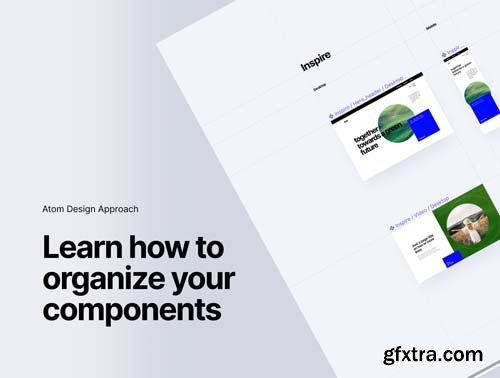
10. Organisms: An overview of the organisms, combined with a clean and neat layout for organizing all your organisms, according to a smart naming system. This part if pretty unique and will be something you won't find out there in other kits.
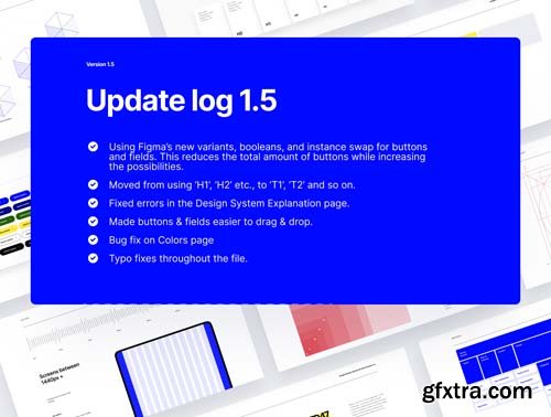
Update version 1.5
- Using Figma’s new variants, booleans, and instance swap for buttons and fields. This reduces the total amount of buttons while increasing the possibilities.
- Moved from using ‘H1’, ‘H2’ etc., to ‘T1’, ‘T2’ and so on.
- Fixed errors in the Design System Explanation page.
- Made buttons & fields easier to drag & drop.
- Bug fix on Colors page
- Typo fixes throughout the file.
Highlights
- Saves you 80+ hours
- Fits every project
- Beautifully crafted
- 100+ Artboards
- Atomic design and 4pt grid system
- Unique one of a kind kit
Top Rated News
- Finding North Photography
- Sean Archer
- John Gress Photography
- Motion Science
- AwTeaches
- Learn Squared
- PhotoWhoa
- Houdini-Course
- Photigy
- August Dering Photography
- StudioGuti
- Creatoom
- Creature Art Teacher
- Creator Foundry
- Patreon Collections
- Udemy - Turkce
- BigFilms
- Jerry Ghionis
- ACIDBITE
- BigMediumSmall
- Boom Library
- Globe Plants
- Unleashed Education
- The School of Photography
- Visual Education
- LeartesStudios - Cosmos
- Fxphd
- All Veer Fancy Collection!
- All OJO Images
- All ZZVe Vectors


 Categories


