
Choosing colours can be a challenge whether you are illustrating, designing patterns, icons or branding for print projects.
Not understanding the print process can cause stress, waste time and cost you money. If you want your work to look professional, you need the right tools and a proven system.
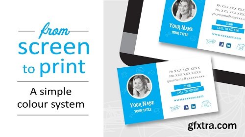
If you are new to the print process and not sure how to match screen colours with print colours, this class is for you.
In this class you will learn:
How to avoid 3 common mistakes
Get results by using a Professional Colour Toolkit
How to colour by numbers
How to test your colours
Tips to make coloring fun
How to colour match your printed card
How to colour match your website
NB. Tools used in this class include Affinity Designer and a Pantone color matching system. This class can be adapted to other software programs such as Adobe Illustrator, Adobe Indesign which use Pantone color swatches.


Top Rated News
- Sean Archer
- John Gress Photography
- Motion Science
- AwTeaches
- Learn Squared
- PhotoWhoa
- Houdini-Course
- Photigy
- August Dering Photography
- StudioGuti
- Creatoom
- Creature Art Teacher
- Creator Foundry
- Patreon Collections
- Udemy - Turkce
- BigFilms
- Jerry Ghionis
- ACIDBITE
- BigMediumSmall
- Boom Library
- Globe Plants
- Unleashed Education
- The School of Photography
- Visual Education
- LeartesStudios - Cosmos
- Fxphd
- All Veer Fancy Collection!
- All OJO Images
- All ZZVe Vectors
 Categories


