
https://commercialtype.com/catalog/druk/druk_text_wide
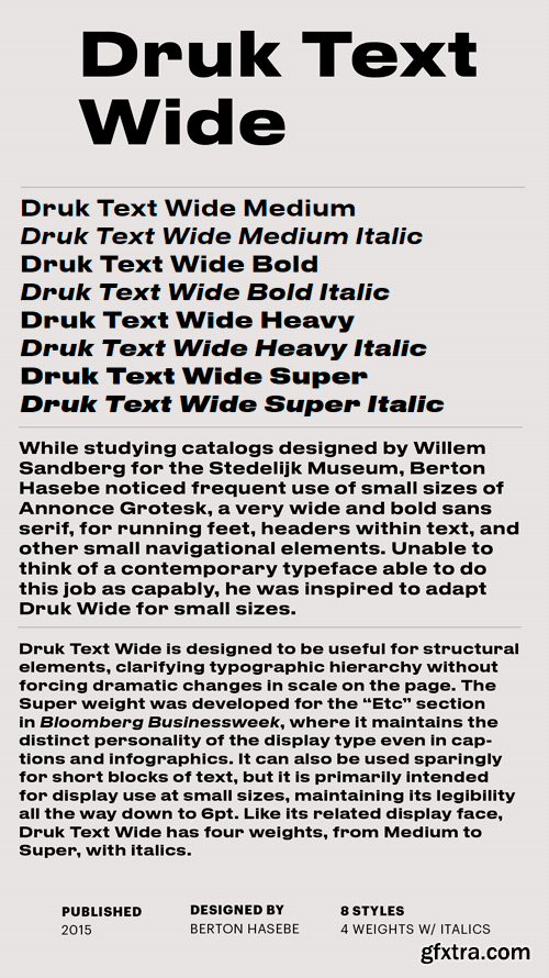
While studying catalogs designed by Willem Sandberg for the Stedelijk Museum, Berton Hasebe noticed frequent use of small sizes of Annonce Grotesk, a very wide and bold sans serif, for running feet, headers within text, and other small navigational elements. Unable to think of a contemporary typeface able to do this job as capably, he was inspired to adapt Druk Wide for small sizes. Druk Text Wide is designed to be useful for structural elements, clarifying typographic hierarchy without forcing dramatic changes in scale on the page. It can also be used sparingly for short blocks of text, but it is primarily intended for display use at small sizes, maintaining its legibility all the way down to 6pt.


Top Rated News
- Sean Archer
- John Gress Photography
- Motion Science
- AwTeaches
- Learn Squared
- PhotoWhoa
- Houdini-Course
- Photigy
- August Dering Photography
- StudioGuti
- Creatoom
- Creature Art Teacher
- Creator Foundry
- Patreon Collections
- Udemy - Turkce
- BigFilms
- Jerry Ghionis
- ACIDBITE
- BigMediumSmall
- Boom Library
- Globe Plants
- Unleashed Education
- The School of Photography
- Visual Education
- LeartesStudios - Cosmos
- Fxphd
- All Veer Fancy Collection!
- All OJO Images
- All ZZVe Vectors
 Categories


