
Categories: GFXTRA Special » Special Fonts
Rail Font Family $720 | 20 x TTF
http://www.myfonts.com/fonts/marin-santic/rail/
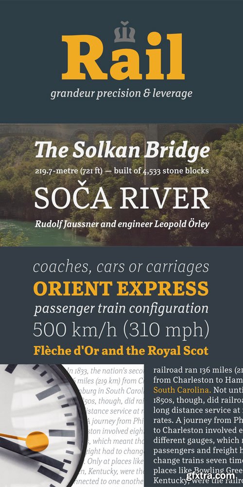
Rail is the best conveyance mechanism for your written communication. Precision, innovation and experience are the main foundation for this grandeur slab serif. It’s designed to provide great comfort and reduce any possible friction for your eyes. It’s highly recommended for complex typography projects like magazines and annual reports as well as for signs, headers and other inscriptions. The precise construction of this slab serif signals the greater effectiveness of the letters that are coupled together in a beautiful harmony. Its construction is very legible, pleasant and familiar. The typeface’s x-height is approximately 68% of its capitals. Rail italic is constructed at 11° angle. It is developed to provide real italic construction but enhanced with mechanical appearance. This makes the whole typeface very special and recognizable.


Related Posts
Top Rated News
- Sean Archer
- John Gress Photography
- Motion Science
- AwTeaches
- Learn Squared
- PhotoWhoa
- Houdini-Course
- Photigy
- August Dering Photography
- StudioGuti
- Creatoom
- Creature Art Teacher
- Creator Foundry
- Patreon Collections
- Udemy - Turkce
- BigFilms
- Jerry Ghionis
- ACIDBITE
- BigMediumSmall
- Boom Library
- Globe Plants
- Unleashed Education
- The School of Photography
- Visual Education
- LeartesStudios - Cosmos
- Fxphd
- All Veer Fancy Collection!
- All OJO Images
- All ZZVe Vectors
 Categories


