
https://playtype.com/typefaces/berlingske-sans-display/
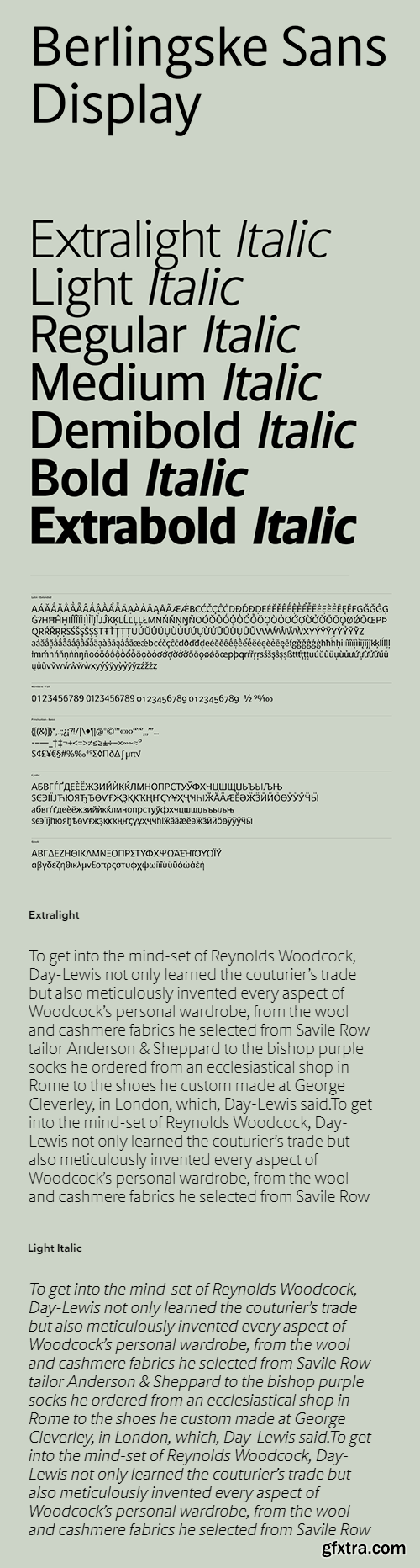
Selected design modifications in the Berlingske Sans have been used to create this strong sans display, which also works extremely well for body text. Some of the terminals have been slightly cut, creating a more square feel in the design. The tall x-height and condensed design, together with the cut terminals, build a solid and steady sans that is less spiky compared to the original Berlingske Sans. The amount of alternates and stylistic sets offer a wide variation of styles, all built into one single font. For a more slender look choose a stylistic set with longer strokes on selected glyphs, or for a softer, curved expression go for the slightly bent strokes on Kk, Rr and Qq. All alternates apply to small caps, ensuring complete consistency.


Top Rated News
- MRMockup - Mockup Bundle
- Finding North Photography
- Sean Archer
- John Gress Photography
- Motion Science
- AwTeaches
- Learn Squared
- PhotoWhoa
- Houdini-Course
- Photigy
- August Dering Photography
- StudioGuti
- Creatoom
- Creature Art Teacher
- Creator Foundry
- Patreon Collections
- Udemy - Turkce
- BigFilms
- Jerry Ghionis
- ACIDBITE
- BigMediumSmall
- Boom Library
- Globe Plants
- Unleashed Education
- The School of Photography
- Visual Education
- LeartesStudios - Cosmos
- Fxphd
- All Veer Fancy Collection!
- All OJO Images
- All ZZVe Vectors
 Categories


