
Match Type Family
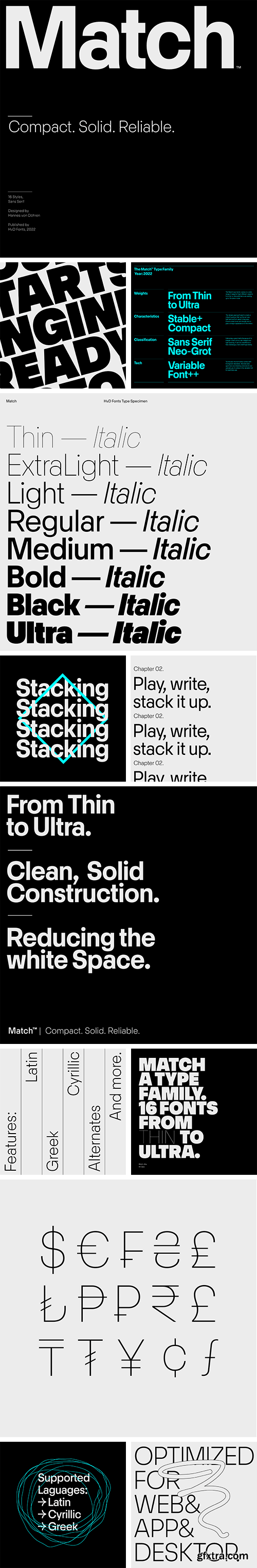
The Match family has been developed on a grid and the constructed design has a reduced and precise appearance. The shapes are optically corrected and follow micro-typographic rules. You will notice that the stroke endings are all either vertical or horizontal – this lets the typeface appear organized. The curves are drawn with a higher curve tension than other conventional geometric typefaces, in order to achieve a super compact look making words look like logos. These tricks lead to the appearance of smaller white spaces and more compact words. To take this step even further, we analyzed different letterforms and explored how far we could go in minimizing white space between characters – While keeping the overall elegance. A key to the new appearance is the balance between black and white shapes.


Top Rated News
- MRMockup - Mockup Bundle
- Finding North Photography
- Sean Archer
- John Gress Photography
- Motion Science
- AwTeaches
- Learn Squared
- PhotoWhoa
- Houdini-Course
- Photigy
- August Dering Photography
- StudioGuti
- Creatoom
- Creature Art Teacher
- Creator Foundry
- Patreon Collections
- Udemy - Turkce
- BigFilms
- Jerry Ghionis
- ACIDBITE
- BigMediumSmall
- Boom Library
- Globe Plants
- Unleashed Education
- The School of Photography
- Visual Education
- LeartesStudios - Cosmos
- Fxphd
- All Veer Fancy Collection!
- All OJO Images
- All ZZVe Vectors
 Categories


