
Categories: GFXTRA Special » Special Fonts
Nomada Didone Font Family
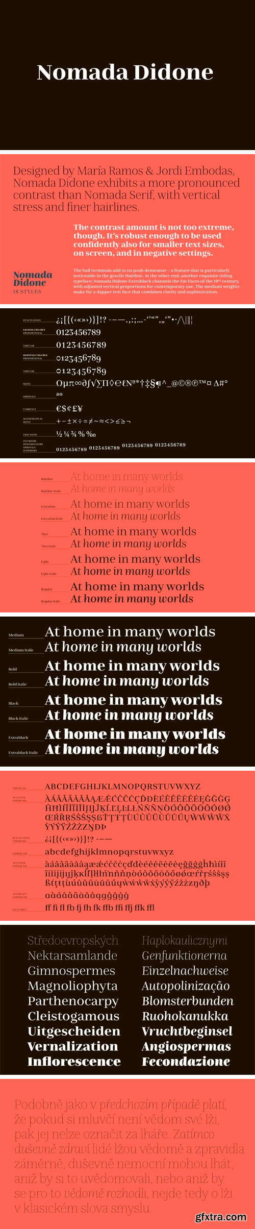
Designed by Maria Ramos and Jordi Embodas, Nomada Didone exhibits a more pronounced contrast than Nomada Serif, with vertical stress and finer hairlines. The contrast amount is not too extreme, though. It’s robust enough to be used confidently also for smaller text sizes, on screen, and in negative settings. The ball terminals add to its posh demeanor – a feature that is particularly noticeable in the gracile Hairline.
At the other end, another exquisite titling typeface: Nomada Didone Extrablack channels the Fat Faces of the 19th century, with adjusted vertical proportions for contemporary use. The medium weights make for a dapper text face that combines clarity and sophistication.


Top Rated News
- Sean Archer
- John Gress Photography
- Motion Science
- AwTeaches
- Learn Squared
- PhotoWhoa
- Houdini-Course
- Photigy
- August Dering Photography
- StudioGuti
- Creatoom
- Creature Art Teacher
- Creator Foundry
- Patreon Collections
- Udemy - Turkce
- BigFilms
- Jerry Ghionis
- ACIDBITE
- BigMediumSmall
- Boom Library
- Globe Plants
- Unleashed Education
- The School of Photography
- Visual Education
- LeartesStudios - Cosmos
- Fxphd
- All Veer Fancy Collection!
- All OJO Images
- All ZZVe Vectors
 Categories


