
https://frerejones.com/families/exchange
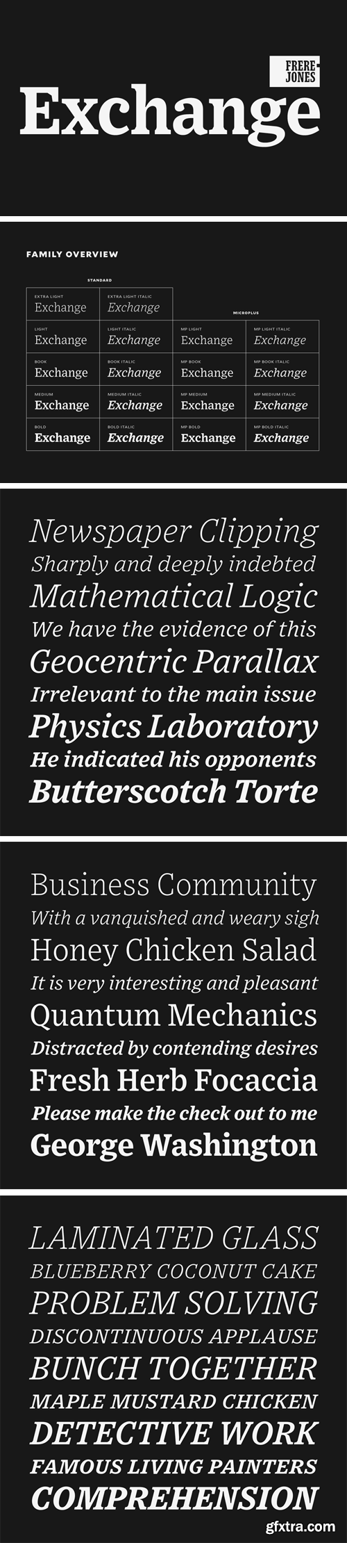
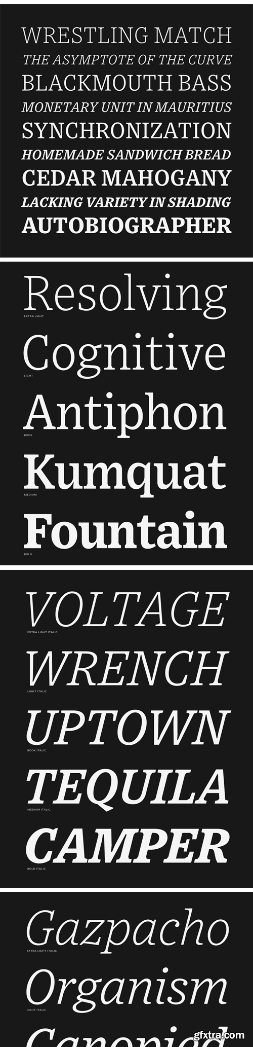
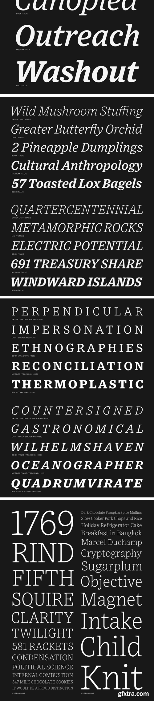
Originally designed for newspaper text, Exchange strives for clarity and efficient copyfit across multiple platforms. Its strategy relies on an unorthodox collection of historical references, from nineteenth-century Britain to Depression-era America.
The strategy for word shape coherence comes from the early “Ionic” style of slab serifs, while Bell Gothic offers a lesson in reinforcing the individual identities of letters. Sure-footed sobriety, inherited from Victorian text faces, runs throughout. The deep notches and amplified details make Exchange a kind of cousin to Retina, bringing the same defensive strategy to more traditional text settings.
Exchange’s compact proportion, prompted by narrow newspaper columns, is also well-suited to mobile screens. The newly added MicroPlus styles expand Exchange’s capability into digital media — websites, video, and a host of new applications. We have also revisited the family for this retail release, expanding the range of weights and bringing its character sets up to our newest standards.


Top Rated News
- MRMockup - Mockup Bundle
- Finding North Photography
- Sean Archer
- John Gress Photography
- Motion Science
- AwTeaches
- Learn Squared
- PhotoWhoa
- Houdini-Course
- Photigy
- August Dering Photography
- StudioGuti
- Creatoom
- Creature Art Teacher
- Creator Foundry
- Patreon Collections
- Udemy - Turkce
- BigFilms
- Jerry Ghionis
- ACIDBITE
- BigMediumSmall
- Boom Library
- Globe Plants
- Unleashed Education
- The School of Photography
- Visual Education
- LeartesStudios - Cosmos
- Fxphd
- All Veer Fancy Collection!
- All OJO Images
- All ZZVe Vectors
 Categories


