
https://adeletypefoundry.eu/typecatalogue/apocalypse
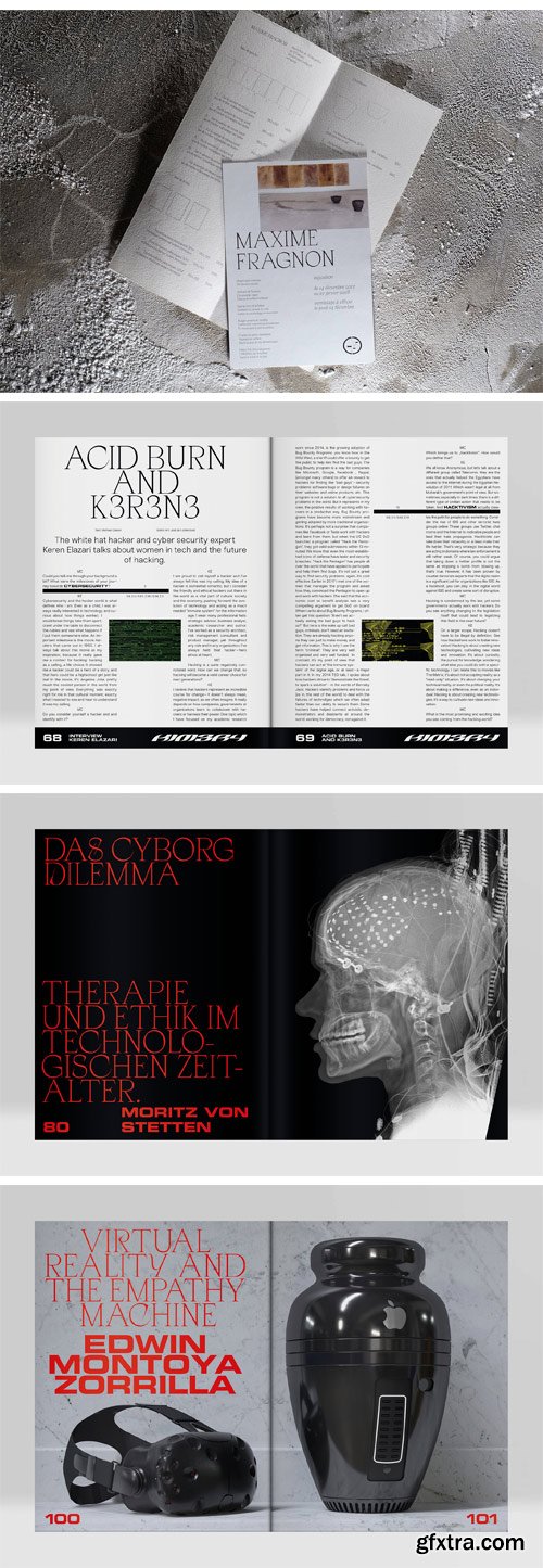
Apoc, the battle between Light and Dark. “As I stood upon the sand of the sea…” Apoc is a typeface family revolving around 6 fonts. The design process started with the finding of a lettrage made for a book cover about the book of Revelations. It had clear historic links to Humanistic letter shape and proportions but somehow there was something refreshingly new in the way the counter-forms seem to be displayed. We build from there.
Meant first as a custom-experimental project, it soon became a full-time commitment as we grew more and more fascinated by the kind of shapes we could design based on the few characters we had originally (“APOCALYPSE”, uppercases only). Filling the design process with the corkiness only handwriting can bring and test proofing the fonts for what was, originally, a tool meant for a display usage we were intrigued by the optical grey obtained when it was used on plain text. Apoc stranglely brings up the page’s lightness forward and we could not be more happy with the result. Enlightening layouts, letting the light come through. Apoc Revelations is thin and sharp with aggressive serifs, almost as if they were cut by a knife. It does wonders when displayed in headlines and brings the lightness of your layouts up when used in plain text in smaller sizes. Though we would recommend you to use the Light version for that as the serifs have been designed in a more squarred/angled way, which will keep some stability in this experimentally shaped font. The Dark version has been balanced with an extended x-height and squarred serifs, egyptian like with a twist, to match with the Light version. A balance between light and dark within layouts. Alternates and ligatures are floating around this sharp tool allowing more experimentation with both headlines and text layouts. This font-family will work greatly with covers and text layouts, whether they be books, magazines, music albums or plain visually appealing headlines on websites. It will do marvels if you want to balance your layout’s optical grey and play with the light and dark sides of your designs. Developed for Latin European Languages.
Top Rated News
- MRMockup - Mockup Bundle
- Finding North Photography
- Sean Archer
- John Gress Photography
- Motion Science
- AwTeaches
- Learn Squared
- PhotoWhoa
- Houdini-Course
- Photigy
- August Dering Photography
- StudioGuti
- Creatoom
- Creature Art Teacher
- Creator Foundry
- Patreon Collections
- Udemy - Turkce
- BigFilms
- Jerry Ghionis
- ACIDBITE
- BigMediumSmall
- Boom Library
- Globe Plants
- Unleashed Education
- The School of Photography
- Visual Education
- LeartesStudios - Cosmos
- Fxphd
- All Veer Fancy Collection!
- All OJO Images
- All ZZVe Vectors


 Categories


