
https://commercialtype.com/catalog/guardian/guardian_agate_sans
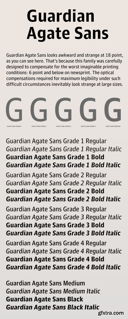
Compensating for the worst possible printing conditions, Guardian Agate Sans is designed for maximum legibility at 6 point and below on newsprint.
The family features four subtly different weights, or “grades”, allowing users to find the perfect weight for a particular situation, from 1, the lightest, to 4, the heaviest. The Medium weight can be used for reversing out of a dark background, subheads, and other cases where an additional level of typographic hierarchy is needed.
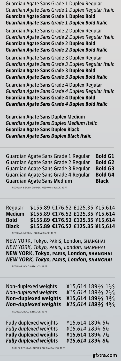
Guardian Agate Sans features two kinds of bolds. The standard Bolds are wider than the Regulars, as requested by The Guardian to make sport scores a bit more readable at 4.5pt. The Duplex Bolds set at exactly the same widths as the Regulars, useful for things like classified ads and stock listings where line length is at a premium. All numerals are tabular across all styles, so they can be freely mixed in tables of figures no matter which version is used.


Top Rated News
- Sean Archer
- John Gress Photography
- Motion Science
- AwTeaches
- Learn Squared
- PhotoWhoa
- Houdini-Course
- Photigy
- August Dering Photography
- StudioGuti
- Creatoom
- Creature Art Teacher
- Creator Foundry
- Patreon Collections
- Udemy - Turkce
- BigFilms
- Jerry Ghionis
- ACIDBITE
- BigMediumSmall
- Boom Library
- Globe Plants
- Unleashed Education
- The School of Photography
- Visual Education
- LeartesStudios - Cosmos
- Fxphd
- All Veer Fancy Collection!
- All OJO Images
- All ZZVe Vectors
 Categories


