Palomar - A Refreshingly Different
Condensed Font $230
6 OTF Fonts | Publisher: Jonahfonts | SALE PAGE

RNS Susana - New Hand Lettered Brush Font
OTF Font File | Designer: Yorlmar Campos | TURKISH SUPPORT | SALE PAGE
![]()
![]()
![]()
![]()
![]()
![]()
![]()
![]()
![]()
![]()
![]()
RNS Susana is a hand lettered brush font, with a great groovy touch. The font has a set of alternates used on contextual substitution to give it a more organic look. The design was set with a marker brush pen, making emphasis on showing the imperfections to reach its expressive personality.

Chika Tattoo - Best for all Tattooartists $59
12 OTF Font Files | Publisher: Otto Maurer | SALE PAGE
![]()
![]()
![]()
![]()
![]()
![]()
![]()
This Font is the Sisterfont of Chinotattoo. The different is the thorn in every letter! Chika Tattoo is best for all Tattooartists and Tattoofans.You can use it to make Tattooflashs for your Tattoostudio. Chika Tattoo is a typical Tattoostyle Font. The Chinostyle comes from the Gangs of the USA (with latin roots) They often have Chist-Symbols.


Churchward Lorina - Geometric Sans Serif $85
4 OTF Fonts | Designer: Joseph Churchward | TURKISH SUPPORT | SALE PAGE
![]()
![]()
![]()
![]()
![]()
![]()
![]()
![]()
![]()
![]()
Churchward Lorina is a four weight typeface family originally designed in 1996 by New Zealand type designer Joseph Churchward. A personable geometric sans serif, it possesses some of Churchward’s trademark quirkiness but reamins highly legible and readable on screen as well as in print. The family includes Light, Regular, Bold and Black.

NotaBene - A New, Squarish,
Narrow, Technical Font $129
14 OTF Fonts | Designer: Gert Wiescher | TURKISH SUPPORT | SALE PAGE
![]()
![]()
![]()
![]()
![]()
![]()
![]()
![]()
![]()
![]()
![]()
“NOTABENE” is a new, squarish, narrow, technical font– designed by Gert Wiescher in 2015 – has 7 weights with corresponding oblique cuts. “NOTABENE” is well suited for advertising, logo, billboards, small text, signage, branding, packaging, editorial, posters, web and screen design. “NOTABENE” is an OpenType family for professional typography with an extended character set of over 700 glyphs and extensive kerning. It supports more than 40 Central- and Eastern-European as well as many Western languages. Ligatures, different figures, fractions, currency symbols and small caps can be found in all cuts. “NOTABENE” is a sister-font to NOTA. The two fonts can be easily mixed.
King's Caslon Font Family $400
6 Fonts | TTF/OTF | SALE PAGE


Billabong Font Family - 4 Fonts $122
4 Fonts | OTF/TTF | RAR 0.5 MB | SALE PAGE
- Billabong has its origins in the handlettered 40s and 50s script headings that seem to have endured especially in signage when style doesn't matter too much.
- Unlike today’s scripts Billabong is tightly spaced and Opentype font features allow for a myriad of ligatures to improve fit and evenness of color.
- Users can select their choice of strokes, ornaments and ending flourishes for added emphasis and style.

Merry Christmas by Aring Typeface 2xOTF $79
A decorative Christmas and New Year's Eve typeface.
OTF/TTF | 2 Fonts | +Previews | 3.6 Mb RAR | SALE PAGE
- Merry Christmas is a decorative Christmas and New Year’s Eve typeface. It includes a full-color typeface for Adobe Photoshop and Adobe Illustrator. The font is built with advanced OpenType functionality and has a guaranteed top-notch quality, containing stylistic and contextual alternates, ligatures, and more features; all to give you full control and customizability. It has extensive lingual support, covering all Latin-based languages, from Northern Europe to South Africa, from America to South-East Asia. It contains all characters and symbols you'll ever need, including all punctuation and numbers.

Mr De Haviland Font for $45
OTF/TTF | 1 Font | Preview | 1.2 Mb RAR | Mr De Haviland Font
- The Charles Bluemlein Script Collection is an intriguing reminder of the heady days of hand lettering and calligraphy in the United States. From the early 1930s through World War II, there were about 200 professional hand letterers working in New York City alone. This occupation saw its demise with the advent of photo lettering, and after digital typography, became virtually extinct. The odd way in which the Bluemlein scripts were assembled and created - by collecting different signatures and then building complete alphabets from them - is a fascinating calligraphic adventure. Because the set of constructed designs looked nothing like the original signatures, fictitious names were assigned to the new script typefaces. The typeface styles were then showcased in Higgins Ink catalogs. Alejandro Paul and Sudtipos bring the Bluemlein scripts back to life in a set of expanded digital versions, reflecting the demands of today’s designer. Extreme care has been taken to render the original scripts authentically, keeping the fictitious names originally assigned to them by Bluemlein.


La Maga Font Type
OTF/TTF | 1 Font | +Preview | 2.9 Mb RAR
La Maga Font Type is a decorative typeface and used for short texts.
His base is in the Modern fonts with delicate organic curves to make reference to the nature.
It's great for titles and logos!

FF Mark Font Family 20xOTF $988
OTF | 20 Fonts | +Preview | 3 Mb RAR | SALE PAGE
- German type designers Hannes von Döhren, Christoph Koeberlin and the FontFont Type Department created this sans FontFont in 2013. The family contains 10 weights from Hairline to Black and is ideally suited for film and TV, advertising and packaging, editorial and publishing, logo, branding, music and nightlife, software and gaming, sports as well as web and screen design. FF Mark provides advanced typographical support with features such as ligatures, alternate characters, case-sensitive forms, fractions, super- and subscript characters, and stylistic alternates. It comes with a complete range of figure set options – oldstyle and lining figures, each in tabular and proportional widths.

Brutal Type Font Family - 8 Fonts for $150
OTF | 8 Fonts | +Preview | 4.5 Mb RAR | SALE PAGE
- Brutal Type — is a new sans serif typeface with a distinct manly character. It’s based on the shapes of DIN font, however radically reconsidered. Despite the apparent simplicity and obviousness of forms, the Brutal Type design is original and fresh. This font is universal and familiar to all, emotional and catchy at the same time.


Kandel 205 Font Family - 6 Fonts for $69
OTF | 6 Fonts | +Preview | 5.5 Mb RAR | SALE PAGE
- Kandel 205 is a geometric, tri-line, display and headline font available in a family of three weights. Its bold, graphic styling gives it great stand-out qualities and a highly individual look. It’s particularly well suited to bringing energy to designs, or for designs with a sporting theme.

Jubilat Font Family - 12 Fonts for $132
OTF | 12 Fonts | +Preview | 5.5 Mb RAR | SALE PAGE
- Jubilat explores the history of the slab serif in six weights, with generous curves and efficient spacing in both dimensions. Its large lowercase and high contrast make it suitable for headlines, decks, and sidebars. Jubilat is our charter OpenType family, and employs three stylistic sets for hybrid, antique, and geometric alphabets. It also includes alternates, ligatures, case-appropriate punctuation, loose fractions, and broad language support. Developed with input from publication designers on four continents, Jubilat has also been field-tested in diverse circumstances, from dailies on newsprint in the Middle East to high-gloss fashion bibles in the subtropics.
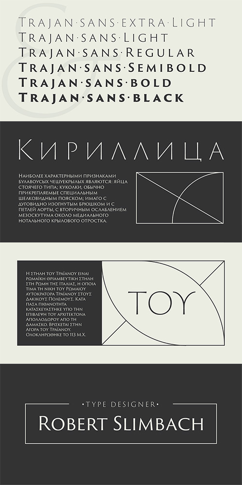
Trajan Sans Pro Font Family - 6 Fonts for $175
OTF + TTF | 6 Fonts | +Previews | 3.5 Mb RAR | SALE PAGE
- Conceived alongside his recent extension of Carol Twombly's Trajan family, Adobe Principal designer Robert Slimbach set out to create a distinctly modern sans-serif display type family that retains the elegance and versatility of the original design. The new san-serif variation exhibits less stroke contrast than its seriffed counterpart, with stylized flared stroke endings that suggest v-shaped terminals cut in stone. While there are several fine san-serif typefaces on the market that are inspired by the monumental capitals of ancient Rome, Trajan Sans is unique in its fidelity to the form of the highly-regarded letters inscribed at the base of the Trajan column. The family is offered in six weights ranging from Light to Extra Bold, with language coverage for Pan-European Latin, Cyrillic and Greek. Trajan Sans can be used to convey a sense of permanence, elegance, and modernity in a variety of display titles and signage.
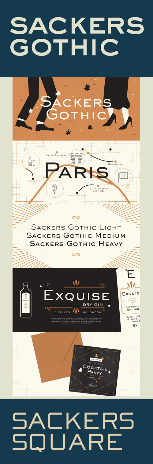
Sackers Gothic Font Family - 4 Fonts for $116
OTF | 4 Fonts | +Preview | Light/Medium/Heavy/Square | SALE1 + SALE2
- Sackers Gothic is part of the larger Sackers series, a collection of fonts drawn from templates for producing engraved stationery and social cards by Gary Sackers, a Charlotte, North Carolina intaglio printer. Many typefaces were made from similar sources, including Monotype’s Engravers series, as well as Jim Spiece’s ITC Blair, and Mark van Bronkhorst’s Sweet Sans. Sackers’ typefaces, which were initially made into photo-set type, were digitized by Compugraphic and released in the late 1980s. Sackers Gothic has since become a popular choice for conveying sincere and plainspoken language on dust jackets, posters, and of course, in stationery. The face pairs well with display faces of a disparate nature, and serves as a ready foil for anything requiring an air of typographic sophistication.
- Sackers Roman is an engraver, all-capitals family for invitations and stationery. The letters have strong contrast between thin and thick strokes.


Dead Stock Font
OTF | TTF Webfont | 1 Font | 3.3 Mb RAR | SALE PAGE
- Hammon Loman is a meat inspector, kicked out of the USDA. Clive Bradford is a butcher who's run out of luck. They were trying to clean up their acts when they got dragged into the dirty world of unlicensed meat processing. Now, they've got one shot: Get the goods on the bad guys... or join the Dead Stock.

Filmotype Zephyr Font for $29
OTF | 1 Font | +Preview | 4.3 Mb RAR | SALE PAGE
- Filmotype Zephyr combines the elegant script capital forms with a classic condensed italic to create a smart and stylish typeface. Originally released in the early 1950s, Filmotype Zephyr has been meticulously redrawn from the original font filmstrips and has been enhanced to include a full international character compliment, automatic fractionals, ordinals, and a host of alternate characters in dynamic OpenType format.

Aleandra Script Font $20
OTF + TTF | 1 Font | +Preview | 3.4 Mb RAR | SALE PAGE
- Aleandra Script is a typeface that experiences adopting two building models: the typographic (with repetition of shapes) and the script (with the freedom of writing). The models are presented in a subtle, unobtrusive way and mainly without conflicts. The essence of each personality is present, coexisting harmoniously and enjoying the same stylistic space. It was designed as a display typeface that contains 408 glyphs in total and 211 alternative characters to improve your design. It is suitable for logo, packaging, headline, poster, t-shirt, etc. After careful evaluation of the connections between characters, intelligent standards have been established for use of the OpenType feature, that used together with the ‘stylistic alternates, stylistic sets, and swash’ feature, offers a gentle and friendly pace.

FM Thank You Font for $20
OTF | 1 Font | +Preview | 8.8 Mb RAR | SALE PAGE
FM Thank You consists of 26 ‘thank you’ hand letterings - all custom made and handwritten.
Now you have 26 unique ways to say ‘thank you’, adding a personal touch to your message.

EB Bellissimo Display Font Family - 3 Fonts for $30
OTF | 3 Fonts | +Preview | 4.8 Mb RAR | SALE PAGE
- Bellissimo Display boasts an impressive range of handsome all caps ligatures that would make even Herb Lubalin jealous. Despite its iconic features, Bellissimo works surprisingly well as a text face as well. Small capitals, alternate glyphs and both lower and upper case figures are intrinsic in the design.
126,000 Royalty-Free 3D Model
Udemy Türkçe


Top Rated News
- CreativeLive Tutorial Collections
- Fasttracktutorials Course
- Chaos Cosmos Library
- MRMockup - Mockup Bundle
- Finding North Photography
- Sean Archer
- John Gress Photography
- Motion Science
- AwTeaches
- Learn Squared
- PhotoWhoa
- Houdini-Course
- Photigy
- August Dering Photography
- StudioGuti
- Creatoom
- Creature Art Teacher
- Creator Foundry
- Patreon Collections
- Udemy - Turkce
- BigFilms
- Jerry Ghionis
- ACIDBITE
- BigMediumSmall
- Globe Plants
- Unleashed Education
- The School of Photography
- Visual Education
- LeartesStudios - Cosmos
- Fxphd
- All Veer Fancy Collection!
- All OJO Images
- All ZZVe Vectors
- CGTrader 1 CGTrader 2