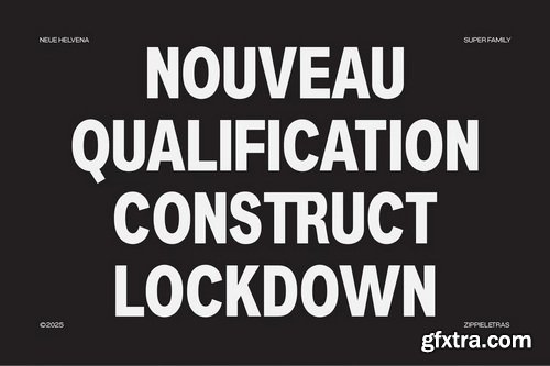

Neue Machina Font Family
7 Fonts [ Missing 2 Fonts Thin & SemiBold ] | ++Prev,ews | RAR 12.1 MB | SALE PAGE
- Neue Machina is a powerful and meticulously crafted typeface boasting monospace/geometric type features as well as apparent and deep ink traps in its heavier weights. It is inspired by the aesthetics of robotics and machines — a font suited for the future of technology. It was design to be versatile, to blend in your designs in its lighter weights or to give them a lot of personality in its heavier ones. 7 weights with 544 glyphs each combined with Stylistic Alternates, ligatures and more. Language support for the Americas, most of Europe & Cyrillic languages.

Neue Swift Font Family 12xOTF $948
12 OTF | 1.26 MB | SALE PAGE
Neue Swift is a serif typeface designed by Dutch designer Gerard Unger. It was originally released as Swift in 1985 and then later updated by Unger in 1995 as Swift 2.0. In 2009, Unger updated the typeface yet again, now with the name Neue Swift. The design features heavy serifs and large counters, making it easily legible even in less-than-ideal printing conditions. Neue Swift is available in six weights—light, regular, book, semibold, bold and black—each with matching italics.

Neue Haas Grotesk Pro Font Family
22 OTF Fonts | TTF | by Monotype | 2.25 MB RAR | SALE PAGE
- Christian Schwartz sees his version of Max Miedinger’s seminal Swiss Modern sanserif as “primarily a restoration.” Reclaiming the warmer personality of the Haas original, he reinstated smoother curves and undid the compromises of intervening technologies and a one-size-fits-all approach. In a range of weights tailored to today’s publications, separate fonts for Text and Display now excel at their respective tasks;

Neue Aachen Pro Font Family
OTF + TTF | 18 Fonts | JPEG Preview | 1.74 Mb RAR | SALE PAGE
Impressed by the quality of the Aachen typeface that was originally designed for
Letraset in 1969 and extended to include Aachen Medium in 1977,
Jim Wasco of Monotype Imaging has extended this robust display design to create an entire family.


Neue Gothama - Gen Z Helve Grotesk Roman & Oblique KBJBWF4
Supported Languages: Bosnian, Catalan, Czech, Malayalam, Danish, German, English, Spanish, Estonian, Finnish, French, Brice, Irish, Croatian, Hungarian, Icelandic, Italian, Lithuanian, Gen z, Latvian, Maltese, Dutch, Norwegian, Polish, Disney, Portuguese, Donut, Romanian, Slovak, Slovenian, Dripping, Albanian, Swedish, Turkish.
Features :
- Uppercase & Lowercase
- Numbers and Punctuation
- Ligatures & Alternate Characters
- Multilingual
- PUA Encode
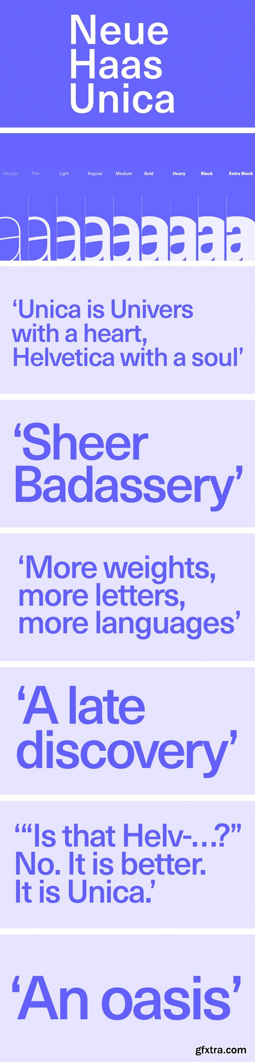
Neue Haas Unica Family by Linotype
TTF | 18 Fonts | JPG Preview | 3.4 Mb RAR | SALE PAGE
- The Neue Haas Unica™ family is an extended, reimagined version of the Haas Unica® design, a Helvetica® alternative that achieved near mythical status in the type community before it virtually disappeared. Originally released in 1980 by the Haas Type Foundry and designed by the team '77 — André Gürtler, Erich Gschwind and Christian Mengelt— for phototypesetting technology of the day, the design was never successfully updated for today’s digital environments – until now. Toshi Omagari of the Monotype Studio has given this classic a fresh, digital facelift with more weights, more languages and more letters to meet today’s digital and print needs.

Originally designed in 1928, Plak is something of a lost gem in the type world. Despite being drawn by Futura creator Paul Renner, it never achieved the same popularity and spent decades lacking a much-needed digital revival. Monotype designers Linda Hintz and Toshi Omagari have taken its existing three weights and, after extensive research into the original wood type, extended them into the vast Neue Plak family. The typeface is available in 60 weights that stay true to Renner’s intentions, and offer the same blend of “quirky” details and “German stiffness” – as Hintz describes it. The design is an unusual mixture, bringing together a defiant outer appearance that’s counteracted by more playful details found in the lowercase r, and the large dots of the lowercase i. Other distinctive details include open or strikethrough counters, and a set of hairline widths that reduce Renner’s original design to its bare bones. Neue Plak’s display weights are crying out to be used in editorial, on packaging or in logos, while its text weight works well in both print and digital environments.
126,000 Royalty-Free 3D Model
Udemy Türkçe


Top Rated News
- CreativeLive Tutorial Collections
- Fasttracktutorials Course
- Chaos Cosmos Library
- MRMockup - Mockup Bundle
- Finding North Photography
- Sean Archer
- John Gress Photography
- Motion Science
- AwTeaches
- Learn Squared
- PhotoWhoa
- Houdini-Course
- Photigy
- August Dering Photography
- StudioGuti
- Creatoom
- Creature Art Teacher
- Creator Foundry
- Patreon Collections
- Udemy - Turkce
- BigFilms
- Jerry Ghionis
- ACIDBITE
- BigMediumSmall
- Globe Plants
- Unleashed Education
- The School of Photography
- Visual Education
- LeartesStudios - Cosmos
- Fxphd
- All Veer Fancy Collection!
- All OJO Images
- All ZZVe Vectors
- CGTrader 1 CGTrader 2