https://fortfoundry.com/fonts/shuttleblock
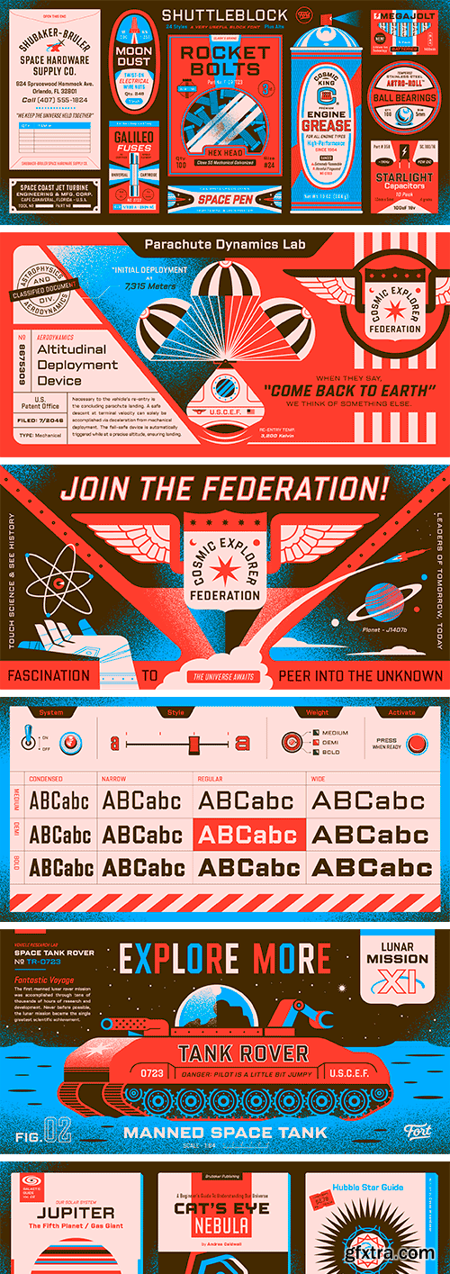
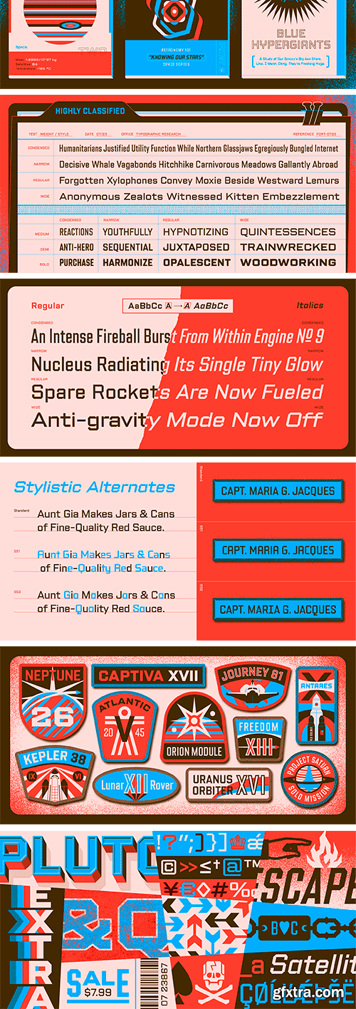
Shuttleblock began as an internal set of letters developed and utilized for Brittany Reagan and Clark Orr’s darkly distinctive Hellcats brand. Fort came alongside Clark to help build out the family in an array of weights and widths. Originally inspired by the block letters found on space initiatives from the last century, Shuttleblock works to balance a refined and classic feel with its sturdy, simple forms. The weights and overall style felt like they asked for a less-is-more approach as they adapt to different design contexts. Shuttleblock comes in 4 widths, each with 3 weights, and is full of helpful alternates, custom designed symbols, and more.
https://www.myfonts.com/collections/love-and-peace-font-fenotype
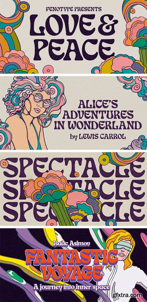
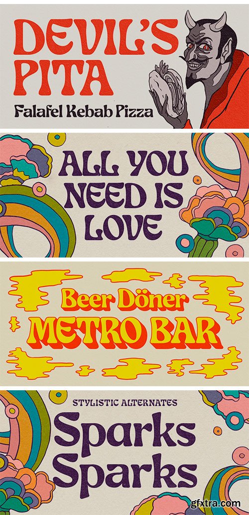
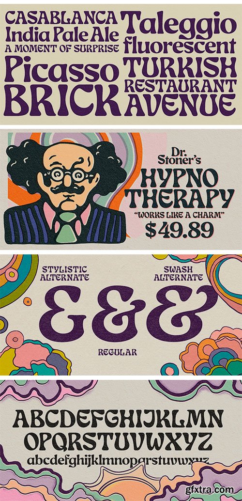
What's so funny 'bout peace love & understanding? Nothing really. Love and Peace is an Art Nouveau style typeface inspired by Eckmann-Schrift by Otto Eckmann in 1900. Love and Peace is filled with ethereal elegance and it's great for posters, magazines and psychedelic LP covers. Love and Peace is equipped with few Contextual Alternates and Standard Ligatures to prevent characters from colliding. In addition it has Stylistic Alternates for lowercase a, k, r and s, and Swash Alternates for ampersand and dollar sign.


https://www.myfonts.com/collections/creative-thinking-font-java-pep
Proudly present a new font that fresh from the oven Creative Thinking font, an elegant font family that has 4 weight styles regular, italic, bold, and bold-italic. It's so perfect to combining and mixing the weight styles to make outstanding and beautiful design project. Don't worry this font already with multilingual support more than 30 languages.

https://fortfoundry.com/fonts/grandway
Grandway began as a humble set of quirky capitals that Seth Nickerson created for an ice cream sandwich trailer. Over the years, it has grown and matured out of the practical design needs surrounding it, evolving into two families: a workhorse geometric sans and a “not-so-workhorse” geometric sans sharing the same DNA. Like a good ice cream sandwich, this collection is much more than the sum of its parts—bringing together two complementary flavors into one delightful package. Grandway mixes practicality with grandeur with the goal of keeping loads of character and warmth in spite of its rigid geometric construction. Grandway Display is the more playful counterpart, taking things in a decidedly more Bauhaus-inspired direction. With rounded, tubular characters and powerful sets of stylistic alternates, the personality can dramatically change with each use. The Grandway Collection encompasses these in a fully-baked, dual-family, 601-character extravaganza complete with italics, a wide range of weights, and plenty of other typographic niceties.


https://www.myfonts.com/collections/campeche-font-latinotype
Campeche is an expressive yet functional typeface family. Seeking to express its beauty, it twists the conventions of classic typography when necessary. Cempeche finds its inspiration in the grotesque typefaces of the late 19th century coupled with a typical Latin American playful sense that gives it a modern freshness. The initial form arises from the idea of expanding Seriguela, evolving along the way, becoming its own system with a unique personality. Campeche is designed for today's requirements. It is available in two styles and three widths, from condensed to extended, with 9 weights each, totaling 54 fonts, in addition to the variable version. Campeche is a comprehensive typographic system that provides versatility for almost any use. It can be used for packaging, editorial, branding... etc. The mix of widths and between the normal and display versions can generate complex graphic parts or systems with different levels of hierarchy, without losing unity.
https://type-department.com/collections/sans-serif-fonts/products/robit/
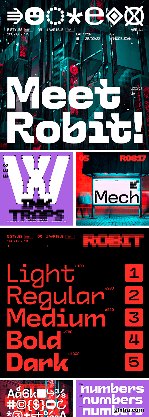
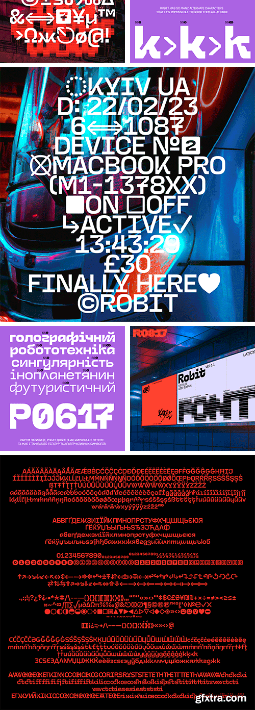
ROBIT is a tech brutal typeface with huge ink traps and humanistic shapes. Drawing inspiration from sci-fi visual culture, futurism, and industrial design, ROBIT consists of 5 styles with variable font technology, providing users with plenty of opportunities for experimentation. Locked in its open-type features you can find stylistic alternates to play around as well as a very, very large number of unusual ligatures, arrows, icons, and more. Equipped with Extended Latin and Cyrillic support.
https://www.myfonts.com/collections/seibi-ai-font-nihon-literal
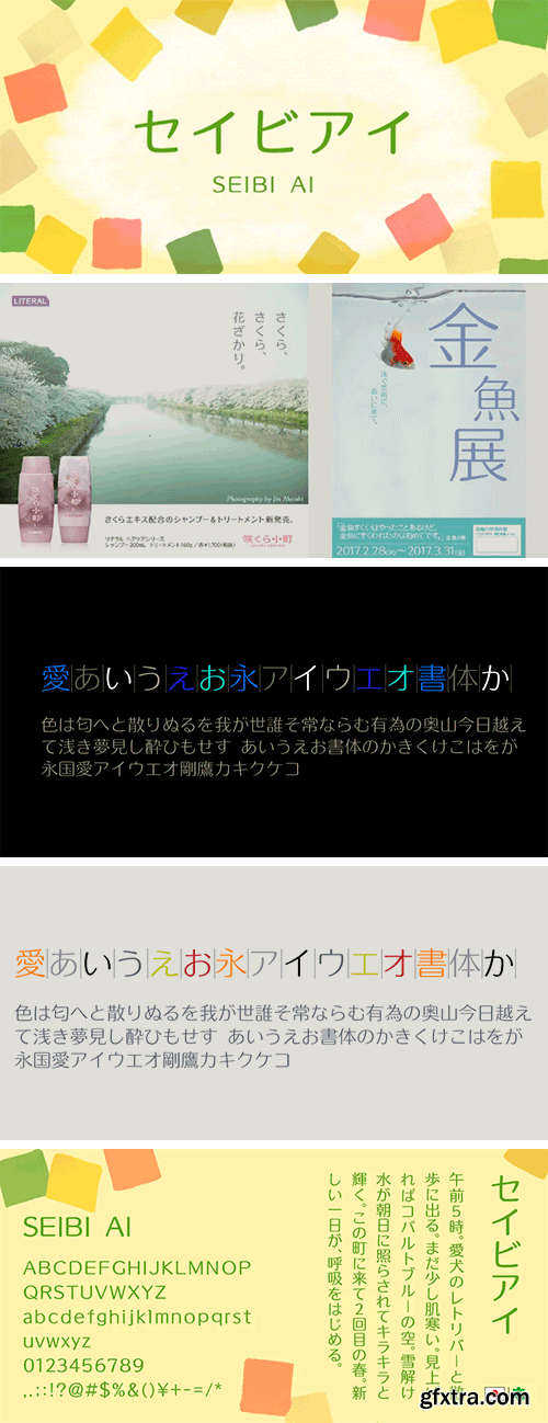
This typeface combines the rhythmic movement of Mincho and the simplicity of Gothic, with a rounded finish for a touch of elegance and style.

https://creativemarket.com/upupcreative/4392687-Flatline-Sans-Complete-16-fonts
Flatline is an elegant, modern sans serif font family. Meticulously drawn with high contrast between thick and thin strokes with the goal of making even the simplest sans serif letters look sensual, elegant, and warm. It’s perfect for headlines, editorial uses, and advertising projects. Makes beautiful luxe logos and wedding invitations, too. Flatline includes sixteen styles (eight weights each in both roman and italic), each of which includes nearly 500 glyphs. OpenType features include standard and discretionary ligatures, a small number of character variants, three figure sets, four ampersand styles, and multilingual support (including multiple currency symbols).

https://www.lo-ol.design/catalog/medley
The Medley adventure started during an exploration of the Toulouse Scriptorium online archives. One piece struck us for its elegant, almost decorative, strokes. However, the typeface then became a true ‘medley’, drawing influence from uncial, Carolingian minuscule, and a more traditional approach of brush lettering.

https://www.myfonts.com/collections/zawya-pro-font-protype
The family has 24 weights, ranging from Thin to Black in Normal, Condensed and Wide styles. It is ideally suited for advertising and packaging, editorial and publishing, logo, branding and creative industries, poster, and billboards, small text, wayfinding, and signage as well as web and screen design. Zawya Pro provides advanced support with features such as case-sensitive forms, fractions, super- and subscript characters, and stylistic alternates. It comes with a complete range of letters for Arabic and English with Arabic and Latin digits. As well as Latin-based languages, the typeface family also partly supports the Arabic, Urdu and Persian and more than 30 writing systems such as ( Afrikaans - Albanian - Catalan - Croatian - Czech - Danish - Dutch - English - Estonian - Finnish - French - German - Hungarian - Icelandic - Italian - Latvian Lithuanian - Maltese - Norwegian - Polish - Portuguese - Romanian - Slovak - Slovenian - Spanish - Swedish - Turkish Zulu - العربية Arabic - Urdu الفارسية - الأوردو Persian). In includes OpenType features for Arabic and English: Stylistic set 01 and 02 Numerator & denominator Fractions Ordinals Superscript standard ligatures discretionary ligatures Case Sensitive.

https://type-department.com/collections/serif-fonts/products/parable/
Parable is a thick, inky display font that wears its influences on its sleeves – the Art Nouveau stylings of ‘60s and ‘70s album covers, and the philosophy of fonts like Cooper Black and Arnold Bocklin. Parable is to have fun with and embrace the beauty of words and letters.
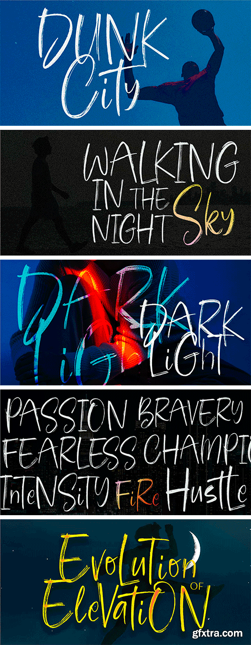
https://www.myfonts.com/collections/dunk-city-font-epiclinez
Bring the street to your design projects with this cool brush typeface. Dunk City is a hand brush font that's perfect for poster, branding, and packaging. With a graffiti-style calligraphy feel, its letters feature a unique style to your designs. The subtle imperfections are designed to make the typeface more lively: it's the key to opening a whole new world of brushwork.

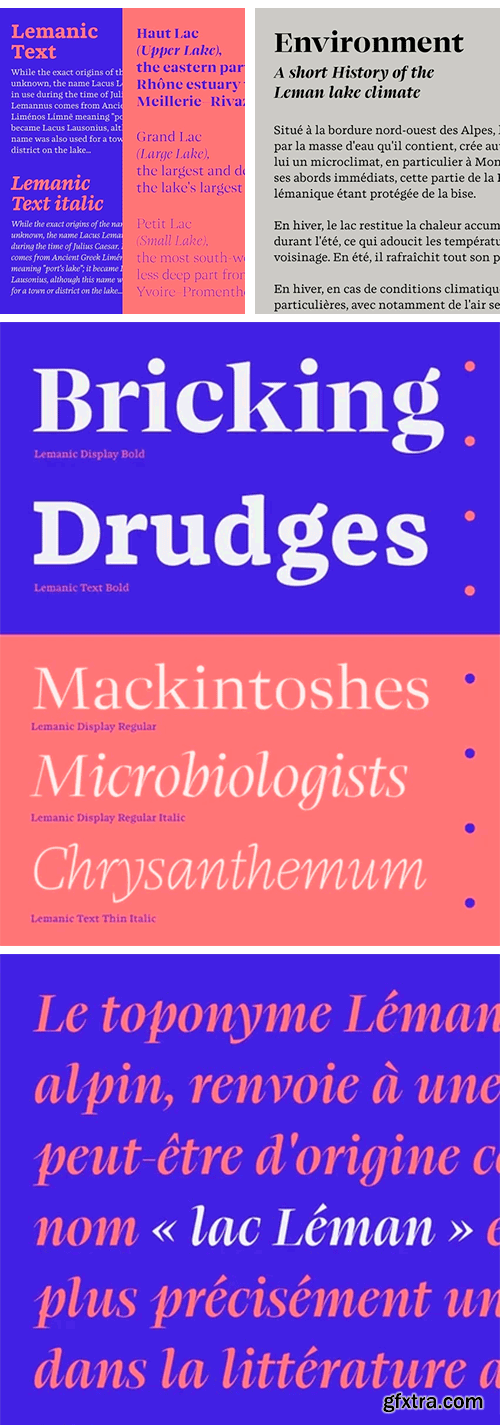
https://www.lo-ol.design/catalog/lemanic/
The Lemanic family started in 2013, with the idea of merging the ideas of Pierre-Simon Fournier with the classic Romain du Roi typeface. Over time, the project grew into a dual family—divided between a robust, almost slab, ‘text’ version, and a sharper, more elegant display version whose appearance is more appropriate for titles.

https://www.myfonts.com/collections/the-outlander-font-daily-studio
The Outlander - Design by Daily Studio. This ttypeface can make your design look strong. Simple accessible on any of yor projects. Is great for headers, logos, and quotes. Comes with a full uppercase, lowercase, punctuation, and standard multilingual support. With 255 glyphs and in OTF format.

https://www.renebieder.com/fonts/quaria-text
https://www.renebieder.com/fonts/quaria-display
How do you combine the elegance of a serif typeface with the sturdiness of a sans serif? Finding my own answer took me three years. Quaria’s DNA combines opposites, drawing from the rich pool of typographic elements from the last 200 years without dedicating itself to a specific era. It is an elegant and powerful modern hybrid made for modern typesetting.

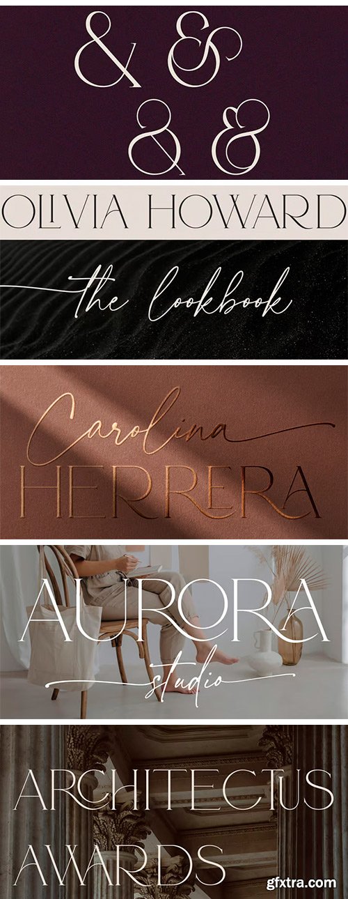
https://www.myfonts.com/collections/adorn-story-font-peach-creme
Meet our new ah-mazing font duo-Adorn Story. You would fell in love, if you are looking for beautiful, refined serif paired with the voguish script. Serif font is rich with 60 ligatures, script font has beginning uppercase, beginning and ending lowercase swashes.
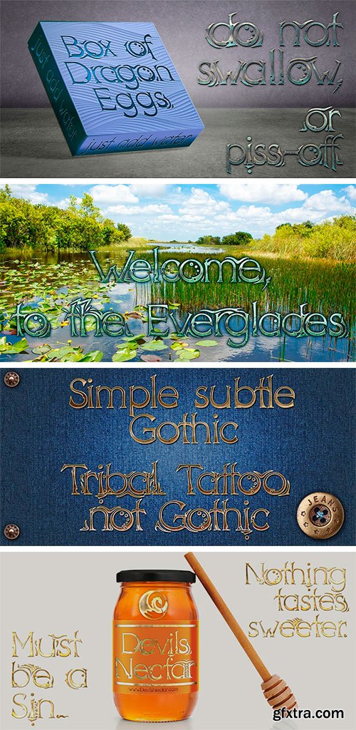
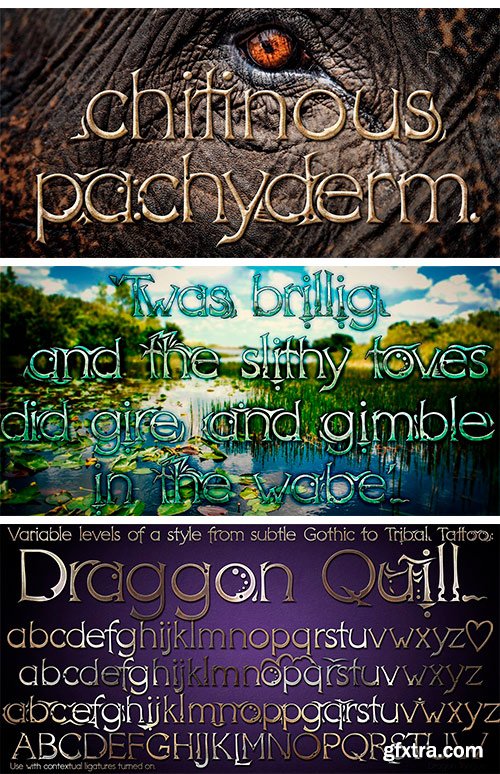
https://www.myfonts.com/collections/dt-dragon-quill-font-dragon-tongue-foundry
The Dragon Quill family is the 3rd reincarnation of earlier (yet to be released) dragon fonts. A simple 'Dragon Round' grew to become 'Dragon Flare', then evolved to become 'Dragon Quill'. Within the Dragon Quill family, 1 'Subtle Goth' is the most basic, followed by 2 'Goth' and 3 'Gothic'. 4 'Tribal Tattoo' is the most complex font in the family, adding hooks, spikes, holes and extra shapes around and between letters. Because of the complexity of level 4 'Tribal Tattoo', occasionally inserting letters into existing text may cause some unusual effects between the letters. If you find this distracting, a workaround can be to convert it into one of the other fonts (like Subtle Goth), while editing, then to turn it back into 'Tribal Tattoo' when finished.

https://www.boldmonday.com/typeface/rigby/
A refreshingly uncomplicated, unique sans-serif? Let us introduce you to Rigby. While other typefaces outdo each other in terms of number of styles, weights, widths, axes, and interesting features, Rigby by Pieter van Rosmalen will impress you only by the latter. It is a small family consisting of four styles only – two weights plus corresponding italics (obliques). A classic type family set-up sometimes referred to RIBBI: Regular, Italic, Bold, Bold Italic. This makes using Rigby fantastically easy.


https://www.futurefonts.xyz/martin-pysny/henk-work
Henk began during my studies at the Type Media masters course at KABK as my final project. Henk has been planned as a family of at least 6 styles with two different personalities. Henk Out and Henk Work. Henk Work is a smart and hardworking gentleman typeface designed for the writing of the long legal texts which often contain a lot of abbreviations and numbers in them.

https://www.boldmonday.com/typeface/puffin/
You may recall a charming bold and round display sans called Pinup by Pieter van Rosmalen among the first batch of Bold Monday releases. Informal and of friendly nature, but consisting of one style only. More than 10 years later it grew into two comprehensive type series – one very practical and still fun, one very fun and still quite practical: Puffin and Puffin Arcade. The extended “normal” family consists of Puffin, Puffin Display and Puffin Display Soft, each available in seven weights plus italics. The plain version of Puffin is the most tamed member. A versatile humanist sans with generous spacing and pronouncedly oblique italics (15°) that is well-suited for on-screen reading and user interface design. Capital I, lowercase l and the numeral 1 have unique forms so they are not easily confused.

https://www.paratype.com/fonts/ib/kharms-display
Kharms is a charming and eccentric serif typeface. It was inspired by the title lettering in a series of soviet book covers from the first half of XX century. Strong and rough serifs in Cyrillic Б and T with tense counters set the style of Kharms. The concept of making something both savage and elegant has defined the name of the typeface. Daniil Kharms is a great absurdist poet. His surname is consonant with the English word "harm" and the French word "charme" (charm). This contradiction is perfectly consistent with the character of the typeface. Kharms character is in its details: beak-shaped serifs, elongated and sharp legs in R K Ж Я, additional sharpness due to the triangular shapes of the letters Л, Д, M, dynamic tilt of counter in round letters and the letter И with reverse contrast, as a tribute to the literary background of the typeface. A modern approach to these details makes the typeface relevant and expressive. Designed by Ilya Buravchikov.

https://www.youworkforthem.com/font/T13029/face-front
Face Front, True Believers, this is the one you’ve been waiting For! Earth’s Mightiest super team of upper and lowercase letters was Assembled for the pages of Marvel Comics' The Avengers.

https://parachutefonts.com/typeface/Grand-Gothik
Grand Gothik is a postmodern, multiscript, multifaceted and variable type system which pays homage to the development of grotesque/gothic typefaces over the years. Taking late 19th and early 20th century European and American grotesques as a starting point, it traces this typeface genre up to mid-century movie theater marquees, new wave cinematography, American highway signage and telephone directories, adding some historical references for good measure. Originally designed in 2017 as a bespoke typeface for a bilingual, black and white magazine on surfers, waves and landscapes, it was later reimagined and redesigned leading to the release of its commercial version. The name reflects Grand Gothik’s versatility as a fully functional variable font and its depiction of a vast array of gothic styles found in American and European grotesques. Designed with 3 stylistic alternates, each variation of Grand Gothik depicts a specific period and style: from the less calculated appearance of late 19th century grotesques all the way to their gracefully-shaped contemporary counterparts. The Grand Gothik type system comes with a wide range of styles/weights and supports an extended array of languages and scripts such as Latin, Greek and Cyrillic. Keeping up with the ever-evolving virtual and digital landscape, Grand Gothik comes with an extended character set of weather icons, numeral symbols, wayfinding arrows, movie rating stars and emojis. Also, a Bitcoin symbol was designed as part of its character set in its newly introduced unicode position, rendering Grand Gothik a truly functional modern typeface.

https://www.futurefonts.xyz/cinketype/margaret-neue
This typeface was inspired by Zoltán Nagy's Margaret from the 1960's Hungary. This was one of the award winning designs in the 1966 International Type Face Design Competition sponsored by Visual Graphics Corporation, with judges including Paul Rand and Herb Lubalin. My plan is to expand the original design with a matching cursive style (which Nagy started, but never finished), a lighter weight, small capitals, oldstyle figures and optical sizes, which would also simulate the effects of phototypesetting. These were the letter shapes that first inspired me to start type design.

