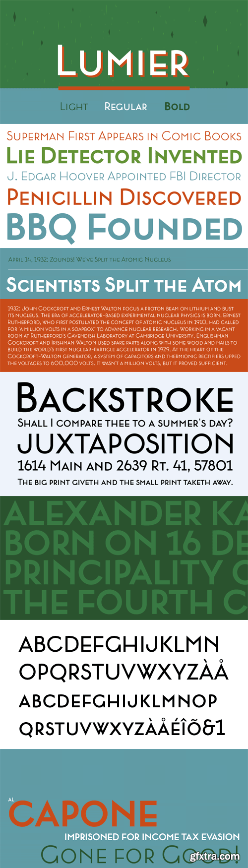
Inspired by art deco posters from the period between WWI and WWII, Lumier comes in 3 weights with the proportions of a modern sans families.
OTF | 3 Fonts | JPEG Preview | 4.6 Mb RAR
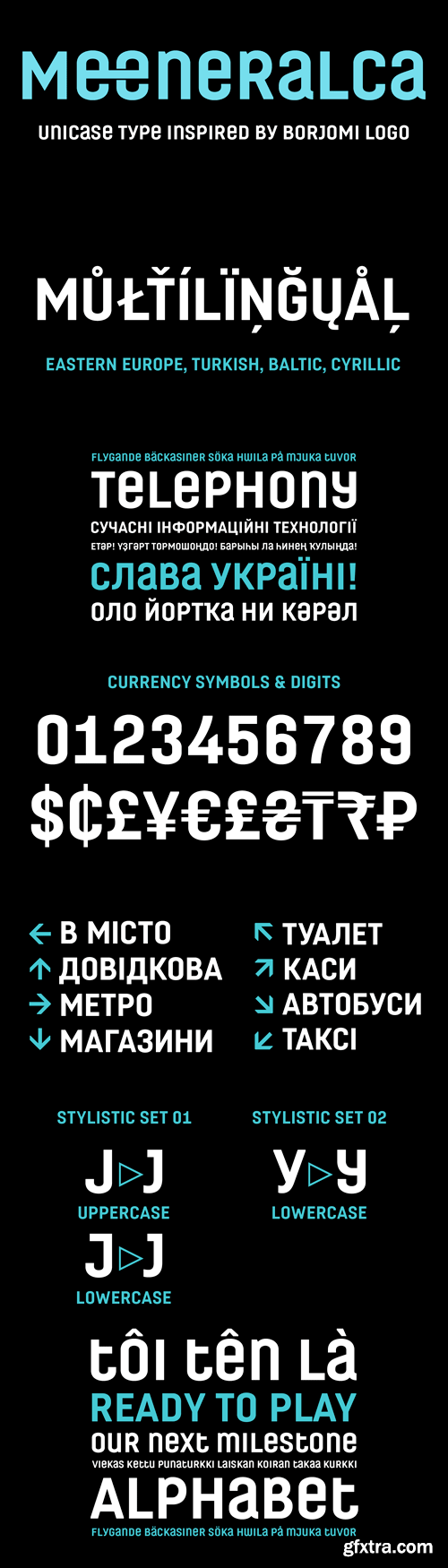
The design of type Meeneralca 4F was inspired by the logo of the mineral water Borjomi from Georgia. The word “Meeneralca” is the short (slang) version for “mineral water”.
OTF | 1 Font | JPEG Preview | 4.5 Mb RAR
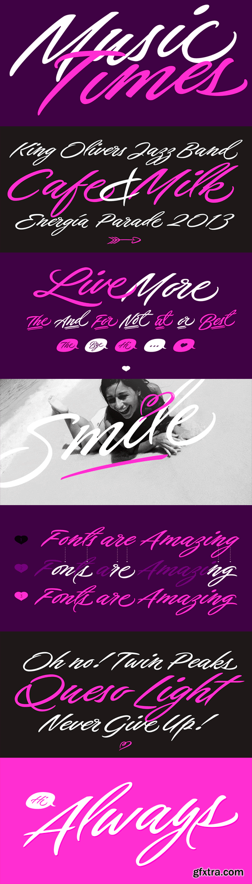
After Bird Script's ballet, Sproviero comes with these fast strokes, resulting in a font full of life and a youthful spirit— hence its name: Live. “Brush lettering is to me the most beautiful way to express your feelings at the moment of writing” [...] “The way ink stands and sometimes bleeds on the paper makes the brush my favourite tool”. The aim of Live was again to see how far calligraphy & lettering could dive into the world of type-design. The font is perfect for logos, posters, magazines, perfumes and all pieces of design related to music, and the feminin world. You can also have a lot of fun with Live More, which contains a set of pre-designed catch words and lovely ornaments.
OTF | 3 Fonts | JPEG Preview | 5.7 Mb RAR
25 EPS | + HQ JPEG Preview | 220 Mb RAR
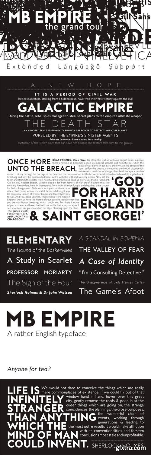
MB Empire is a font that like MB vintage has its roots in early 20th century design, It has a distinctly english feel with its style references to the classic Gill Sans. It has a very traditional look whilst still maintaining its own modernist individuality. It comes in six weights with italics and has extended language support. With many opentype features including oldstlye & lining figures, automatic fractions and more its a font family that will work for almost any application.
OTF | 12 Fonts | JPEG Preview | 4.5 Mb RAR
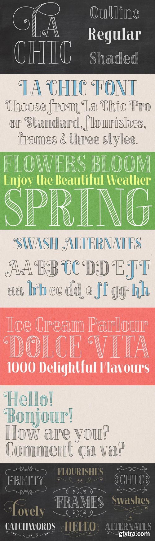
The La Chic family comes loaded with an extended character set of 575 glyphs covering a range of languages and alternate versions of letterforms for display use. La Chic’s Ligature feature comes with the standard fi and fl ligatures, as well as ff, ffi and ffl ligatures. La Chic Pro’s Stylistic Alternates feature adds a little more flair to the mix with mildly flourished Capitals, scripted so that when typeset in all caps, only the first Capital will be flourished to preserve readability and avoid unsightly collisions. La Chic Pro’s Stylistic Alternates feature also includes automatic Initial & Final lowercase letterforms that will automatically swap to avoid any letter collisions as you type. La Chic’s Swash Alternates feature takes the flair even further with elegantly flourishing Capitals, also scripted so that when typeset in all caps, only the first Capital will be flourished to preserve readability and avoid unsightly collisions. The complete lowercase is also substituted for a flourishing lowercase set. By enabling BOTH the Stylistic Alternates and Swashes features, automatic Initial & Final lowercase letterforms that will automatically swap to avoid any letter collisions as you type including the flourishing swashes lowercase. But there’s still more style and flair yet. All features have Special Titling Swap-Out Ligatures for the following words “and”, “of”, “at”, “from”, “by”, “and the” when typed in Parenthesis (whether typeset in Capitals or lowercase). All features also include a small batch of Special Long Flourish characters enabled by typing an underscore after each letter (IE: H_, L_, t_ ,and w_). And there’s STILL MORE. 51 additional letters not blended into any of the Opentype features are accessible by way of a Glyph map in compatible programs and/or system options to customize your La Chic designs even further.
OTF | 12 Fonts | JPEG Preview | 4.5 Mb RAR
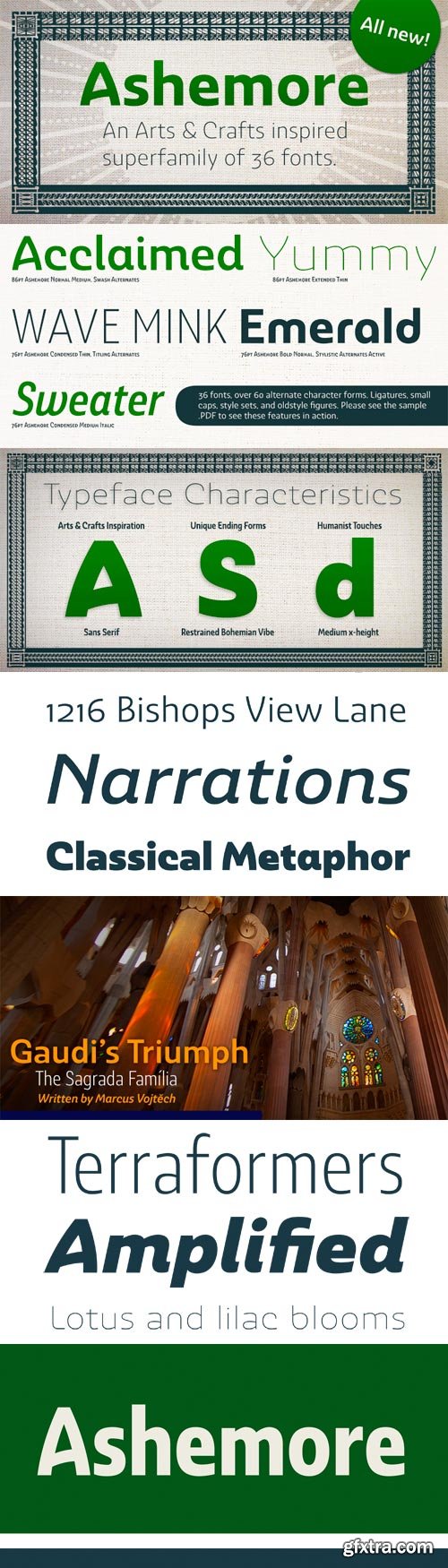
Ashemore developed as a result of my visits to Barcelona, Spain and to Germany, followed soon after by a visit to Asheville, North Carolina. Blending the styles of art and architecture from these three areas may seem initially to result in an unusual formula, but the distinct and flamboyant style of Art Nouveau and the Arts and Crafts style combined with the more strict rules of a sans serif transfer well into a beautiful and very usable blend of these individually eccentric forms. The resulting font retains the Art Nouveau and Craftsman style flavors, which shine through the typeface despite its geometric base. One of the font’s defining characteristics is the unique terminators of its C, G and S. This face’s texture and rhythm also moves well in longer texts. These and other features give Ashemore a restrained bohemian vibe that seems particularly appropriate for a coffee house or an art gallery. The Ashemore family has a full range of six weights from thin to black and includes condensed and extended options for a total of 36 fonts. The typeface also includes some unique OpenType alternates that make the superfamily even more versatile. Ashemore is equipped for complex professional typography, including alternates, small caps and many alternate characters. The face also has a number of numeral sets, including tabular figures, fractions, old-style, lining figures and superiors and inferiors. OpenType-capable applications such as Quark or the Adobe Suite can take full advantage of automatic ligatures and alternates. You can find these features demonstrated in the .pdf brochure. Ashemore also includes the glyphs to support a wide range of languages, including Central, Eastern and Western European languages. In all, Ashemore supports over 40 languages that use the extended Latin script, making the new addition a great choice for multi-lingual publications and packaging. Ashemore was designed by Jeremy Dooley with production assistance from Lucas Azevedo and Marcelo Magalhaes. Kerning assistance from iKern.
OTF | 36 Fonts | JPEG Preview | 7 Mb RAR

25 IHQ JPEG | up to ~ 9000 x 6000 | 300 dpi | 210 Mb RAR
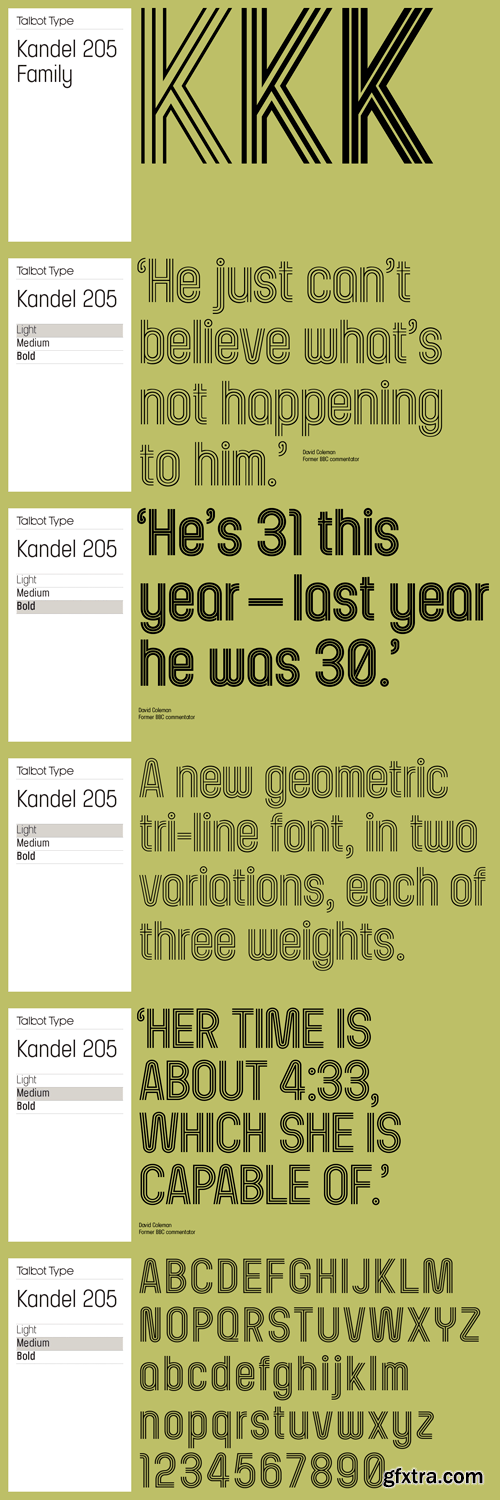
Kandel 205 is a geometric, tri-line, display and headline font available in a family of three weights. Its bold, graphic styling gives it great stand-out qualities and a highly individual look. It’s particularly well suited to bringing energy to designs, or for designs with a sporting theme.
OTF | 6 Fonts | JPEG Preview | 5.5 Mb RAR
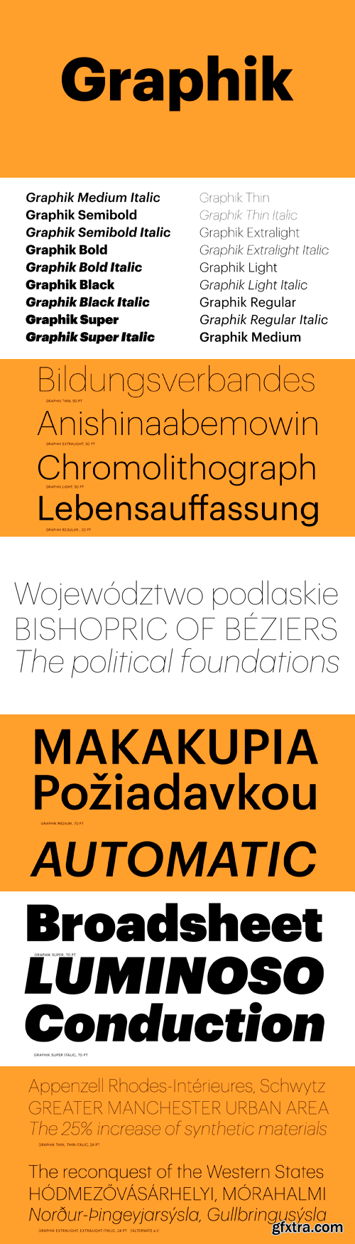
The dominant trend of the mid twentieth century simple sans serifs still reverberates in visual culture. Graphik proves that it is still possible to create something refreshing inspired by this era. Taking cues from the less-known anonymous grotesques and geometric sans serifs, Graphik is perfectly suited for graphic and publication design. Originally designed for Schwartz’s own corporate identity, it was later finished for Conde Nast Portfolio and then expanded for Wallpaper* and later T, the New York Times Style Magazine.
OTF | 18 Fonts | JPEG Preview | 10.9 Mb RAR

25 UHQ JPEG | up to ~ 9000 x 6000 | 300 dpi | 335 Mb RAR
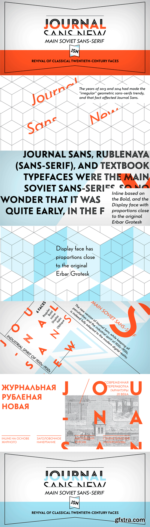
The Journal Sans typeface was developed in the Type Design Department of SPA of Printing Machinery in Moscow in 1940–1956 by the group of designers under Anatoly Schukin. It was based on Erbar Grotesk by Jacob Erbar and Metro Sans by William A. Dwiggins, the geometric sans-serifs of the 1920s with the pronounced industrial spirit. Journal Sans, Rublenaya (Sans-Serif), and Textbook typefaces were the main Soviet sans-serifs. So no wonder that it was digitized quite early, in the first half of 1990s. Until recently, Journal Sans consisted of three faces and retained all the problems of early digitization, such as inaccurate curves or side-bearings copied straight from metal-type version. The years of 2013 and 2014 made «irregular» geometric sans-serifs trendy, and that fact affected Journal Sans. In the old version curves were corrected and the character set was expanded by Olexa Volochay. In the new release, besides minor improvements, a substantial work has been carried out to make the old typeface work better in digital typography and contemporary design practice. Maria Selezeneva significantly worked over the design of some glyphs, expanded the character set, added some alternatives, completely changed the side-bearings and kerning. Also, the Journal Sans New has several new faces, such as true italic (the older font had slanted version for the italic), an Inline face based on the Bold, and the Display face with proportions close to the original Erbar Grotesk. The new version of Journal Sans, while keeping all peculiarities and the industrial spirit of 1920s-1950s, is indeed fully adapted to the modern digital reality. It can be useful either for bringing historical spirit into design or for modern and trendy typography, both in print and on screen. Designed by Maria Selezeneva with the participation of Alexandra Korolkova. Released by ParaType in 2014.
OTF | 6 Fonts | JPEG Preview | 5 Mb RAR

25 UHQ JPEG | up to ~ 9000 x 6000 | 300 dpi | 267 Mb RAR

25 UHQ JPEG | up to ~ 9000 x 6000 | 300 dpi | 372 Mb RAR

25 UHQ JPEG | up to ~ 9200 x 6100 | 300 dpi | 288 Mb RAR
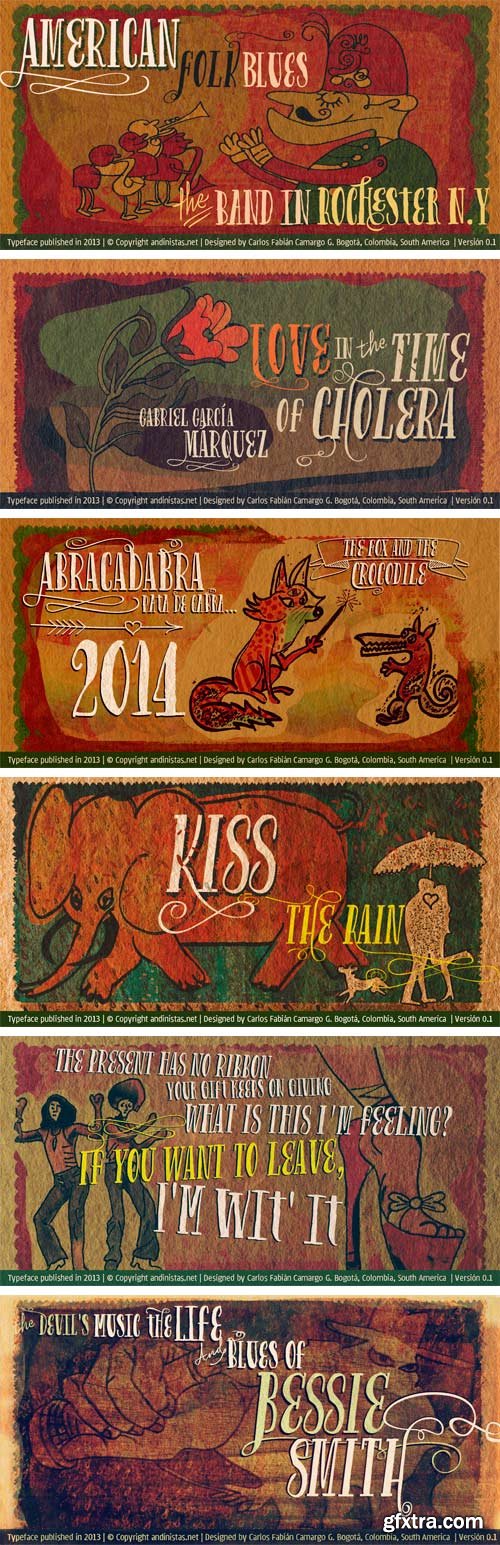
Gluten is an experimental font family designed by Carlos Fabian Camargo. It includes irregular shadows to communicate craftsmanship. Its multiple upper cases with condensed width and naive lines are notable for their expressive drawing with a high amount of contrast between thick and thin strokes.
OTF | 7 Fonts | JPEG Preview | 5 Mb RAR


Ethnocentric, a robot-friendly futurefont originally created in 1999 has been rebuilt and expanded: more languages, more symbols, no more ugly Q, greatly improved M and W, fractions, ordinals, new kerning, new accents, better proportions, six weights + italics, even more futuristic.
OTF | 12 Fonts | JPEG Preview | 4 Mb RAR
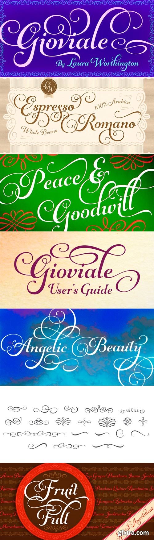
Graphic designers with a lust for lettering are constantly seeking scripts balanced neatly on the sweet spot suited for exuberant editorial work and messages of cheer. Neither frivolous nor strict. My typeface, Gioviale, satisfies that need. Your work may call for a script that is handsome without being overly formal, that is merry, playful, and, like a good Italian pastry dough, hasn't been overly handled until it is left stiff and flat. Use Gioviale to create something tasty, al dente, a touch ornate yet fluent and full of life. Its versatility is exemplified in its greater readability at small sizes compared to other scripts, as well as the included alternates and swashes. Scripts with a hand-lettered look often take on one of two personalities. Some are formal, with heavy flourishes that threaten to sacrifice readability. They are regal, make a statement, yet are so meticulously constructed that they seem chiseled in stone and inflexible. But, oh how exquisitely beautiful they can be. What’s the usual alternative? Italic text faces. Though modern and readable, with the little twist that italics carry, they can have a manufactured appearance, a mass-market profile that robs your work of the personable quirkiness of the handmade and unique. But, still, they cast a respectable, clean, and professional profile. What inhabits the space between these, an uncompromising tool that, in your hands, conveys conviviality, grace, and spunk? Gioviale glides in to fill that formerly scanty typographical niche, a hybrid of an italic text face and a script, flowing with flair and elegance, and, somehow, carrying just a hint of tailored and clean, structured underpinnings. It reveals that elegance needn't be serious, just the result of serious craftsmanship. Indeed, Gioviale was inspired by a simple and spontaneous burst of joy in my own craft. Conceptually, my process was reflected precisely in the outcome, perhaps because it mirrors my own personality in so many ways. Despite the due diligence required, this typeface came more easily and naturally to me than virtually any other I've created. The heart of it burst onto the page breathtakingly fast compared to my other typefaces. I wanted the look of a roman italic without pausing to build a roman counterpart (perhaps I'll design one in the future). I looked to the Italian Didones, popularized by Didot and known for their very high contrast thin thins and thick thicks. True to its nature, Gioviale is a less serious interpretation of the Didones, and its uppercase letters are a departure from classic precursors. Gioviale includes a User’s Guide, 1008 glyphs, an entire alternate set of swash caps, 20 ornaments, 20 discretionary ligatures, and an unusually high number of swashes (300), which include a standard uppercase set for more traditional text settings, and a swash uppercase set which are even more flourished. Why not? To joy!
OTF | 2 Fonts | JPEG Preview | 5.1 Mb RAR
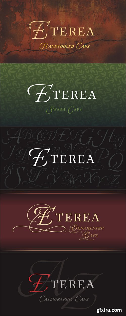
Eterea is a formal font inspired in the monumental inscriptions of classic Rome, but not strictly sticking to the ancient roman typographic characteristics. Its unique look is the result of mixing diverse typographic styles, but mostly having traces from the 16th century transitional style. It bears a big difference of proportion between upper and lower case, additionally to the upper case having much more ornamental traces. Eterea has four different flavors of capitals which change very slightly in the cursive versions. In the italic versions, the lower case (actually small capitals) changes substantially its characters to make its reading more flowing and is not simply an inclined version of the letters. Eterea is a very expressive font, ideal for tittles and short texts of sober and elegant appearance.
OTF | 12 Fonts | JPEG Preview | 4.5 Mb RAR
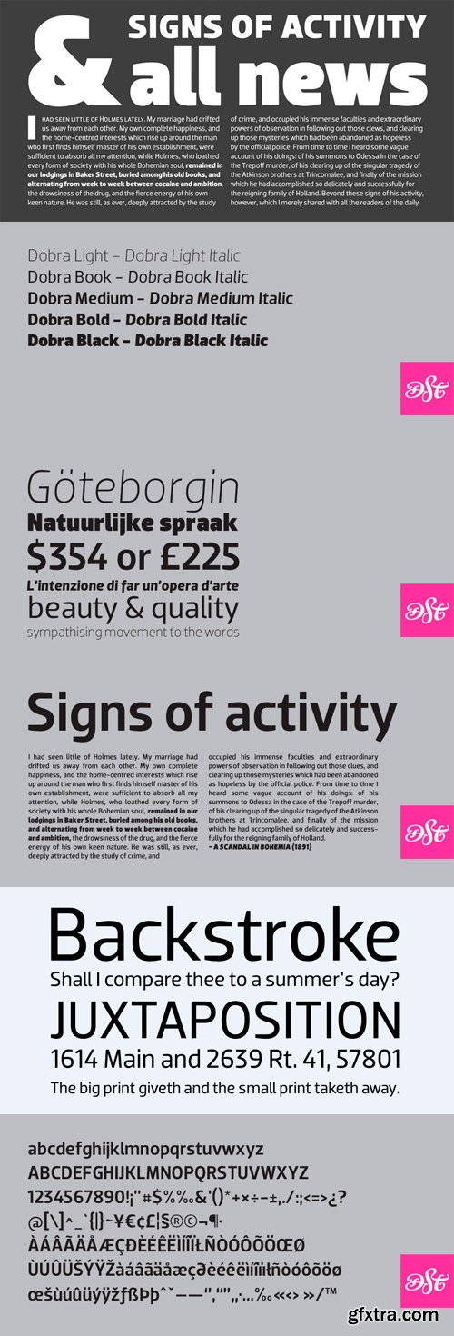
Dobra is a redesign of the previous released Dione. Dobra is a very geometric and robust sans typeface, specially suited for magazines and newspapers, but it works great as a corporate typeface.
TTF | 10 Fonts | JPEG Preview | 4.7 Mb RAR
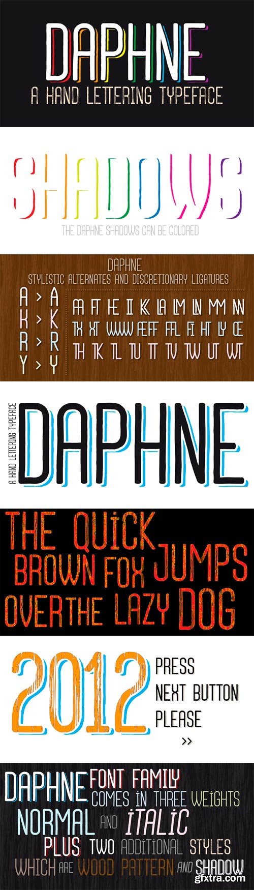
In the beginning, this font had been designed for an affiche work as wood pattern which includes one font and medium weight. The stylish design of this font had been inclined us to create more weights and more styles. Daphne Font Family comes in three weights; normal and italic. Plus two additional styles which are wood pattern and shadow. You can get great wood pattern results with Daphne Font Family; also with colored shadows, you can get gorgeous results in poster works and t-shirt prints. Even in very small type sizes, it can be legible.
OTF | 12 Fonts | JPEG Preview | 4.2 Mb RAR

The Eagle series realizes the ideas behind Morris Fuller Benton’s famous titling, Eagle Bold, the symbol of American recovery, drawn in 1933 for the National Recovery Association. Font Bureau Eagle was started in 1989 for Publish. David Berlow designed a lowercase, finished the character set, and in 1990 added Eagle Book for setting text. In 1994, Jonathan Corum added Eagle Light and Eagle Black to form a full series.
TTF | 4 Fonts | JPEG Preview | 5.1 Mb RAR
