Centim is contemporary sans with sharp top endings of stems that give a bit technical charm to typeface. With a squarish look, it can be used widely in all modern publications or become a part of an corporate identity. In smaller sizes, Centim offers good readability due to its simple and good balanced lines. Centim is available in Regular and Bold weights, as an ideal high-contrasted combination where all characteristics of the typeface are purely effective. Centim is the archaic Serbian word for Centimeter, a word that was mostly used in tailoring during XIX and XX century.
TTF | 2 Fonts | JPEG Preview | 4.9 Mb RAR

Mr Lucky is Mr Happy's slab brother and a hand-drawn narrow typeface designed for one of our books. You can layer different styles over the background style to achieve lots of colorful effects. Use just one style to get a single color letter or set Fill over Background or Stripped Background to get a two color mode. Mr Lucky has upper and lowercase characters with up to three alternate glyphs and special alternate uppercase diacritics. Build in OpenType Contextual Alternates feature will automatically set alternate glyphs depending on frequency of appearance of the same character (even in web font but only in HTML5 browsers). The script doesn’t throw random glyphs. For example in the word “HIPPOPOTAMUS” you will automatically get three different “P” glyphs and two “O” glyphs. It really works great but of course you can always fine tune it by hand.
OTF | 7 Fonts | JPEG Preview | 5.9 Mb RAR

25 EPS | + HQ JPEG Preview | 254 Mb RAR
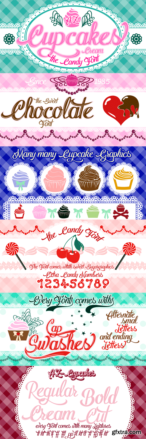
AZ Cupcakes is a special Font for Cupcakes bakery Designs and for all Fans of Cupcakes. It comes in Creamy Design an with many sweet and sugar Graphics.
OTF | 5 Fonts | JPEG Preview | 4.7 Mb RAR
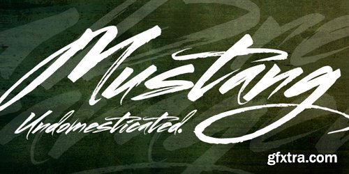
Mustang is a powerfully expressive brush font that combines an edgy urban aesthetic with a smooth feminine flow. Some have suggested that Mustang is romantic. Some say it has something to do with speed or freedom. While precisely what Mustang expresses is up to debate, there’s no doubt that it’s expressing it with intensity. The style was born in my high school years, when I would wreck my notebooks with multiple layers of graffiti tags which would start in the margins and then creep in to cover the entire page. I developed a sensibility towards a very fast, expressive use of my hand, which later easily and naturally translated into brush. I used this style typographically on several projects throughout the years, and even turned it into a signature illustration style. Mustang is the second font, after Streetbrush, to use this brushwork as its inspiration. Mustang will be especially evocative at large sizes, where the details and sharpness of the shapes really come to life. It also holds together well for use as body copy, but may lose some of its aesthetic integrity at really small sizes.
OTF | 1 Font | JPEG Preview | 1.3 Mb RAR
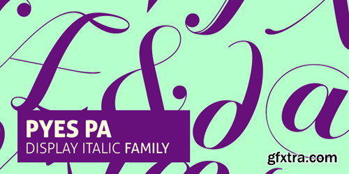
Hailing its roots from the much-prized Modern Didot and Bodoni families of the late 19th century, Pyes Pa re-introduces the intuition of calligraphic script while utilizing the contrast available to contemporary digital fonts to produce a highly refined alternative for those of us who are bloody serious about our Bodoni Poster Italics. Pyes Pa features automatic OpenType ligatures and contextual alternatives.
OTF | 3 Fonts | JPEG Preview | 1.5 Mb RAR

Being inspired by early Czech type design, Maiola is clearly a contemporary typeface, that is mindful of its historical heritage, implementing old-style features and calligraphic reminiscence, more frankly so in the Italic. Nevertheless, through its personality, it attempts to create a welcoming tension on the page, without shouting too loudly at the reader. It handles its expressive tendencies with care and in doing so increases its usability, with legibility being of great importance. Subtle irregularities of the letterforms enhance furthermore the dynamic spirit and liveliness of the typeface. With the advent of Opentype, allowing for bigger character-sets and better language support, as a natural consequence, Maiola Multiscript covers Latin A, Cyrillic and Greek. Although basically independent from each other, they are, however, designed in the same spirit as the Latin, and harmonize well in multilingual text settings. The update to this beautiful font family includes the addition of over 240 glyphs featuring new ornaments, stylistic alternates, ligatures, superior letters, fractions and more. Furthermore, several glyphs were significantly improved and the kerning was fine tuned for better performance. Originally released in 2005, Maiola was an immediate success. It won the renowned TDC competition in 2004 where it was also recognized as a “judge’s choice”, was part of the touring exhibition e-a-t, and was selected in the Creative Review design competition in 2005.
OTF | 6 Fonts | JPEG Preview | 5.5 Mb RAR

Arbotek has the original skeleton that the author used for the development of his typeface Arboria, a real ‘architect typography’, with a basic and radical approach to pure geometric forms. The three basic styles - Thin, Light and Light Rounded - try to approach the cartographic technique annotations and their output on plotters. The voluptuous style, Ultra, keeps the same structure of the Light versions, but develops as a historic Art Deco variant of this 20s and 30s graphic style.
OTF | 4 Fonts | JPEG Preview | 4.9 Mb RAR

Etelka was designed in summer 2005 for purposes of corporate style, product package design and electronic publishing. The number of printed materials coming with products has been significantly reduced in past years, while every installation CD carries a huge documentation, mostly in PDF format. It requires an extremely legible screen typeface which is readable even in long lines. There is absolutely no need of narrowed, economizing design, because the length of electronic brochures is virtually unlimited. Etelka is excellent also for printed technical manuals, containing Cyrillics and useful ideograms and signs. Its design idea is wide, open rounded square outline taken from old glass monitor shape. It has cool industrial feeling with all diagonals slightly softened. It is suitable not only for product manuals, boxes or electronic books, but also for all kinds of visual communication, especially corporate identity and orientation systems in architecture. The Monospace fonts are useful supplement for corporate style based on this family, for technical paragraphs in educational texts and office applications, where its light weight saves your toner cartridges.
OTF | 34 Fonts | JPEG Preview | 4.3 Mb RAR
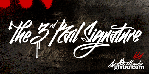
Graffiti Classic is a graffiti font that blends the improvisational urban quality of graffiti with the smoothness and regularity of a typeface. Growing up in Brooklyn, graffiti appeared to me as an explosion of expression and color in a sea of concrete. Inspired, I became a graffiti artist and practiced in both notebooks and subway tunnels. While I moved on to somewhat more traditional art forms in future years, with Graffiti Classic I pay homage to my artistic roots in a calligraphy marker/tag font. Like my other fonts, the entire Graffiti Classic font is spaced letter to individual letter so that the spacing will work smoothly, in spite of the expressiveness and irregularity of the forms. The Graffiti Classic family also includes an ornaments font, “Taglets,” which has clouds, underlines, arrows, crowns, halos and more to add flavor to your designs.
OTF | 2 Fonts | JPEG Preview | 3.3 Mb RAR

25 UHQ JPEG | up to ~ 8700 x 5700 | 300 dpi | 221 Mb RAR

Pacific Northwest is a fun, handwritten font by Cultivated Mind. Pacific Northwest has been carefully hand painted and comes in two styles (Regular/Rough). This font works perfectly with the Pacific Northwest hand painted labels.
OTF + TTF | 3 Fonts | JPEG Preview | 4.4 Mb RAR

25 UHQ JPEG | up to ~ 8500 x 5700 | 300 dpi | 234 Mb RAR


