
https://www.stormtype.com/families/tyfa-antikva/
This Antikva and Italic are well-known perhaps to all Czech graphic artists and typographers ever since their release. Although this type face in some details is under the sway of the period of its rise, its importance is timeless, in contradistinction to other famous types dating from the turn of the sixties which were found, after some time, to be trite. The italics live their own life, only their upper-case letters have the same expression as the basic design. Thin and fragile, they work excellently, emphasizing certain parts in the text by their perfect contrast of expression. When seen from a distance they are a little bit darker than the Roman face. Tyfa Roman was released in 1960 by Grafotechna in Prague for hot setting. Later on, Berthold produced letter matrices for Staromat devices, used for manual photosetting of display alphabets. In the eighties it was available on dry transfers of Transotype and today it is offered also by ITC. The meticulously executed original designs dating from late 50s are arranged into a set of signs on a cardboard of about B2 in size. The yellowed paper reveals retouches by white paint on the ink. Blue lines mark the baseline, the capital line, the ascender and descender lines and the central verticals of the letters. With regard to the format of the flat scanner, the designs had to be reduced, with the use of a camera, to the format A4, i.e. to the upper-case letter height of about 30 mm. These were then scanned and read as a bitmap template to the FontStudio program. The newly created bold weights derive from Tyfa's only drawings of the bold letters "a", "n", "p", the darkness of which was increased further, to enhance their emphasizing function. We have used electronic interpolation to produce the medium weights. Josef Tyfa himself recommends to choose a somewhat darker design than the basic one for printing of books. The text designs have hairstrokes thickened by one third; the contrast between thin and thick strokes has been modified, in order to improve legibility, in sizes under 12 points.

https://www.stormtype.com/families/rondka/
Rondka is a sentimental reminder for those who have forgotten what is a pen with a rounded, flat nib. Inspired by a brochure of letter patterns for teachers and clerks, published between the world wars. It is most appropriate for books of folk songs. Swashed upper-case elements are deliberately mixed among plain shapes to resemble certain amateurish feel. When adding lines to your page, have the ends rounded.

https://www.stormtype.com/families/splendid-quartett/
The traditional division of a type-face family into four designs pertains to every body type. However, jobbing typography calls for a richer tonal scale. Its purpose is to decorate, to represent and to please. Splendid Quartet is an example of a combination of heterogeneous sources of inspiration into a single harmonious formation. An American-style script is accompanied by a subtle English-type Roman type face with a bold design. The whole is reinforced with a Germanic Grotesk. The designs as such do not surpass the significance of their models, but the real charm of this family consists in the sensitive interplay of perfect, even though antagonistic shapes. Pure elegance, refinement and gracefulness radiate from this quartet of type faces. The basic design is a paraphrase of Didot, but it is also inspired by Modern, a type face of English provenance. The details of the serifs, however, are not rounded, but left in a coarser, more interesting engraved form. Splendid Script functions in this case as italics, having the same x-height of lower-case letters as the basic design. The script was freely transcribed from the pattern-book of the New York Type Foundry from 1882, paying regard to numerous other sources of that period. This resulted in a blend of balanced typographical flavours, as if a connoisseur smoker had blended together some fine tobacco. It is by far the most fitting material for graphic design of festive printed materials and an ideal supplement to engravings and etchings.

https://www.stormtype.com/families/tenebra/
Tenebra is an example of a combination of the Baroque inscriptional majuscule with decorative calligraphic elements and alchemistic symbols. The widespread forms of the letters allows for the use of the old Germän manner öf writing öf the „ümläüt“ when, in place of two dots above the letter, there is a reduced E. In our case it is inserted in the open letters. This concerns only the decorative upper-case letters in the position of the lower case. The upper-case letters of the basic design are a monumental alphabet without any embellishments, having a classic, two-dotted „Umlaut“. Tenebra Shaded and Old Face decorate, but do not refine.

https://www.stormtype.com/families/lexon/
Is a typical newspaper, dictionary and magazine type face. It is also very suitable for children's books and posters. The large x-height, condensed shapes and darker colour of the basic design guarantee its legibility already in small sizes and even in morning twilight. The line is bitten into the surface by the marked "slippers"of the letters. The lower- case letters have flattened upper and lower limbs, just like in letterpress. Their bellies are quite round and their knees are lightened by slight incisions. The type face is rather archaic in expression and its italics are dynamically flamboyant. The "juicy" design of the alphabet is achieved by strengthening the elements of variety, sometimes even in exaggerated form. When reading newspapers, we are interested in the surface of things, in their, as far as possible, unbiased description. We forage for arid facts which do not require our spiritual or emotional participation. That is why the type face must be neither dull nor expressive, but absolutely huckstering. For – seen from the other side – if we are publishers, we sell information, or else merchandise just like any other. The type face is its packaging, its outer form which here has all manner of functions except for the aesthetic one. The apparent proportional disharmony between the upper-case and lower-case letters is a question of habit. The view that the upper-case and lower-case letters must have the same width proportions is prejudice. On the contrary – the history of type faces enlightens us on the fact that the two alphabets did not have much in common. To prove this it is sufficient to look briefly at their forms – we will find out that only 8 out of 26 pairs of letters resemble each other and, moreover, the ones which do are less frequent in the text. The bold design does not need serifs, because the upright finial of the wide stroke already sits well on the surface. Moreover, the sans-serif bold design better sets off the basic, more picturesque design. Both sets of italics have non-aligning figures, so that in a small number of designs we have everything that is required of a dependable type face which is not exactly intended for the setting of poetry. The design called "Headline" has sharp edges in place of hidden serifs and is darker, which predetermines it for use in headlines. The complementary SC & OSF will be welcomed when we design headings, by-lines and captions to illustrations. An original newspaper type face must also create an impression of uninterchangeability of the typographical appearance of the periodical, but not to the detriment of legibility and technical reliability, even when printing on bad quality paper. Under such conditions there is nothing worse than a banal type face of fragile strokes. A newspaper type face should be original and uninterchangeable in order that the subscribers might feel a certain "snugness" in the pages. An original type face also extricates the printed matter from the omnipresent graphic anonymity and endows it with a more intimate character.

https://www.stormtype.com/families/stencilul/
In Bucharest in 2007 I've seen an unusual stencil typeface which stands out by his horizontal double strikethrough. The sprayed paint then makes rounded and blurred edges. Stencil can be used on posters and fancy occasions.

https://www.youworkforthem.com/font/T7916/antipasto-pro
Antipasto is a geometric sans serif font designed by Cosimo Lorenzo Pancini. The original family of three weights has been revised and expanded in 2017 with Antipasto Pro that now includes Cyrillic and greek characters, open type features (small caps and old style numerals) and six new weights from the hairline to the extrabold.


https://www.stormtype.com/families/ideal-gothic/
At the turn of the 20th century monolinear alphabets were often despised for their dullness. Typographers, therefore, took great pains to breathe some kind of individuality into the monotonous sans-serif scheme. They started with subtle differentiation in the thickness of vertical and horizontal strokes and finished by improving details. By this they arrived at a more decorative appearance of the type face which thus became more regardful of the eye of the bourgeoisie. Ideal Gothic is no exception. It is characterized by a correct stiffness which will improve the morals of every idea printed by this type face. The awkward curves of the italics are a little suggestive of late 19th century cast-iron garden furniture. The so-called “hidden” and, furthermore, curved serifs complete the inconspicuous charm of this type face. All its above-mentioned features, however, suddenly turn into advantages when we need to design a brochure, calendar or an annual report, or whenever illustrations dominate. It is not by accident that the basic design of Ideal Gothic has such a light tonal value – it competes neither with fine pencil sketches, nor with sentimental landscapes. It is also very suitable for maps, pub inscriptions, magazines and corporate identity.
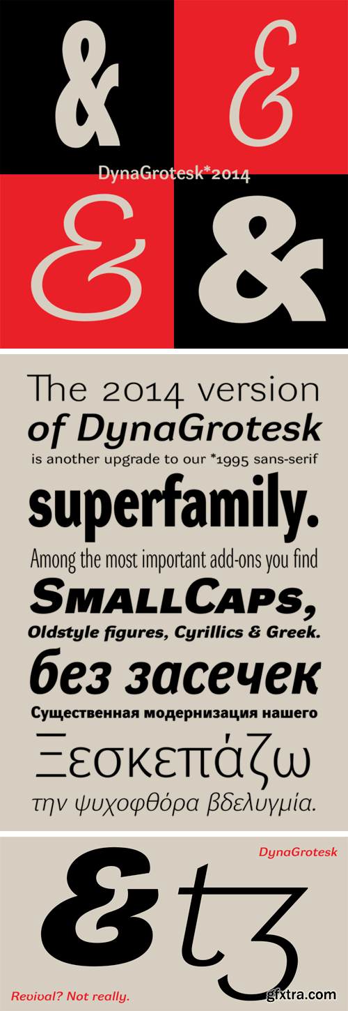
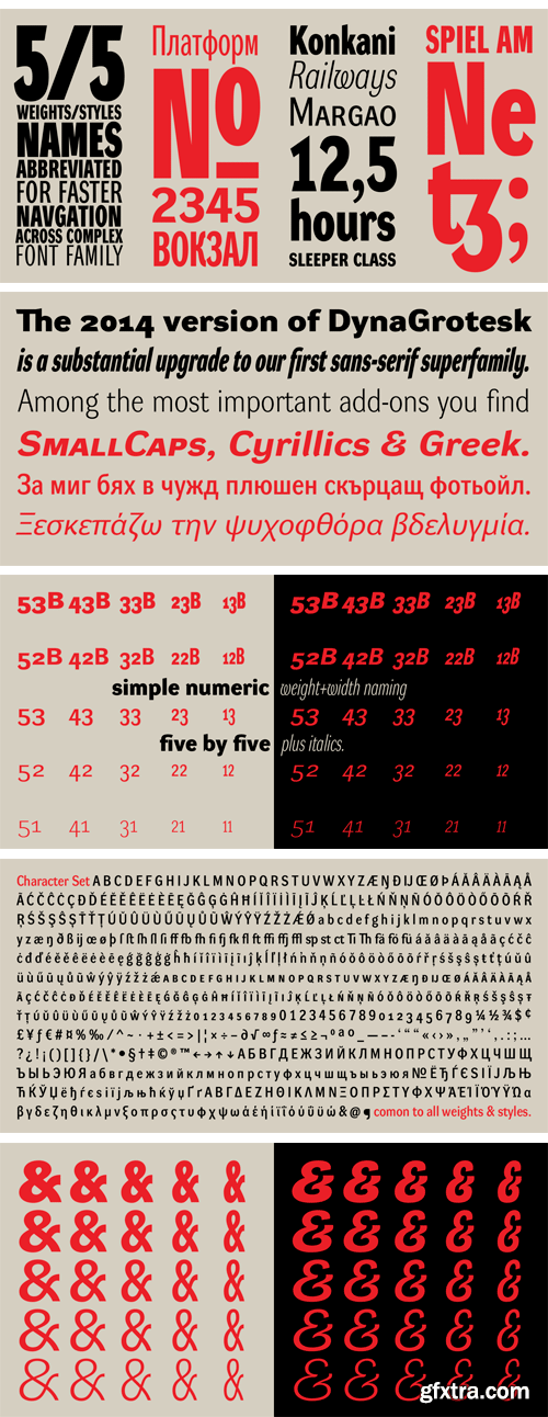
https://www.stormtype.com/families/dyna-grotesk/
DynaGrotesk may look like a revival of an old typeface family, but it is not. It uses many historical reminiscences, sharp edges and richly curved italic shapes. The bigger the size, the more evident and pronounced are the spicy details. In smaller and even smallest sizes it’s appearance is qieter, hence very welll suited even for long portions of text. All 50 styles contain common OTF features like Small Caps, 3 sorts if figures, ligatures, Cyrillics, Greek etc. Perfect for branding, lettering, as well as cultural posters and catalogs. The 2009 version of DynaGrotesk is a substantial upgrade to our first sans-serif superfamily. Among the most important add-ons you find SmallCaps, Cyrillics & Greek. DynaGrotesk was first published in 1995. Since then it is widely used in all areas of graphic industry from small publishing to international corporate identity. The warm character of DynaGrotesk derives from early sans-serif type faces, those which appeared before Helvetica. The complete installation of all designs of DynaGrotesk Pro is a professional designer's choice.
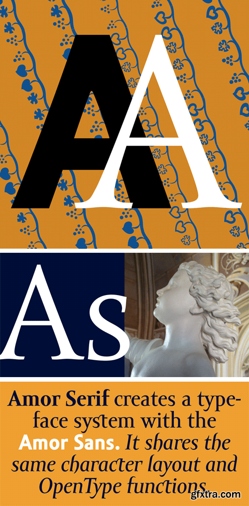
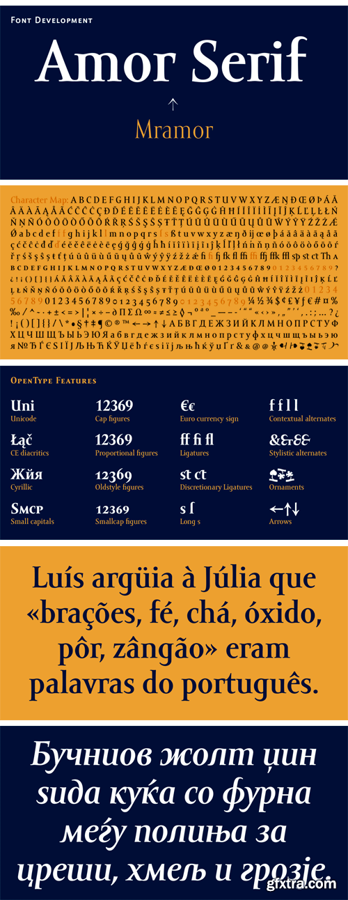
https://www.stormtype.com/families/amor-serif/
Monumental inscriptional majuscule originally carved in stone, sometimes called "Roman Capital", is a craddle of upper-case part of latin alphabet. Its narrowed form, derived from handwritten original used between first to third century A. C., served as inspiration to typeface Mramor, which I have drawn with ink on paper in 1988 under Jan Solpera's leadership. After composing negative letters on a strip of film there was possible to use Mramor through first phototypesetting devices. In 1994 with the help of Macintosh IIvi I have made also lower-case letters and bolds, and issued this typeface as 14-font family. After some years of using Mramor for various purposes, I realized a need of modernization and humanizing its very fragile appearance, as well as removing of numerous decorative useless parts. Besides that, type design made a huge technical progress in past few years, so I was able to finish the remaining cca 9600 glyphs contained in the present font system names Amor Sans & Serif Pro. It is already usual to combine sans- and serif fonts within one family, in order to distinguish historical part from contemporary, a plain chapter from a special one, or, in quotations, to divide speaking persons. Sans-serif typeface don't arise by simple removing serifs, it has to be drawn completely separeately, when ocassionally many declined forms may be made, considered to the serifed original. Neverteless, both parts of this type system appear consistent as for proportional, aesthetic and emotional atmosphere. Usage of type is often closely linked to its original inspiration, in this particular case with architecture and figurative sculpture. An inner "order" was also text setting in smaller sizes. A smooth scale of weights enriches the possibilities in designing of magazines, brochures, exposition catalogues and corporate indentity. Economizing, but opened shape of characters is well legible and antique hint comes into play after longer reading.

CM 1459318 - Watercolor Sea Backgrounds
28 different seascape backgrounds of high quality.This pack includes 5 sea sunset backgrounds,5 sunny sky sea backgrounds,8 sea sunrise backgrounds and 10 foggy sky sea backgrounds. Can be used for textiles, interior designs, covers, book designs, websites, posters, postcards, notebooks, wedding invitations, birthday cards, scrapbook paper, party decorations, invitation cards and more creative designs.


CM 1480199 - Corporate Flyer Templates 6PSD - #24
The pack contains 6 Adobe Photoshop PSD Corporate Flyer Templates / Magazine Ads.
General information:
• Business flyer templates in clean corporate style.
• All elements can be easily changed and amended to suit your needs.
• All design layers are separated, grouped and properly named
• FREE Fonts and Icons used in the project
Features:
• 6 Clean flyer/ad designs
• Print ready -You can also save it to RGB i.e.: for online advertisement.
• Clean and organised PSD files
• A4 with bleeds
• Resolution: 300dpi / CMYK / Print Ready
• Fully editable (all text and styles/colours are customisable)
• All layer labelled, well organised
• Unlimited colour options
• Photos NOT included in the PSDs but links to images used included into help file
CM 1458138 - Line Icons – Miscellaneous Icons
A useful collection of '60 Miscellaneous Line Icons' suitable for web, print, symbols, infographics and apps. This set includes icons for weather, e-commerce, navigation, UI, UX, finance, retail and many more!
Features:
• 60 unique Icons (120 in total, 60x Outlined, 60x Live )
• Expand to any size
• Master: AI, PDF, SVG, EPS and PNG Files
• Individual: AI, PDF, SVG, EPS and PNG Files
• Ai file which can be edited (Colours, sizes, ect)
• Transparent individual files
• All same line width and style
• Outlined & live stroke


CM 1458930 - PSD - Interior Brochures / Catalogs
This is 24 page Minimal Brochure / Catalogs Template for designers working on interior design catalogues, product catalogues, product/graphic design portfolios and agency based projects. Just drop in your own pictures and texts, and it’s ready for print. Or use it as a professional online PDF or email attachment. This Brochure can serve multiple purposes. Use it to present your photos, products, services – or anything else you can think of, where images would be front and center. Everything you see is editable right in Adobe Photoshop. All colors can easily be changed in one location. All texts are set with free fonts, and download links are provided.
Files Included :
• A4 (210 x 297 mm)
• PDF Preview Page
• Font Included (free font)
• Read Me
Features :
• 24 pp Document
• Multipurpose
• Simple and Minimal Layout
• Clean Layout
• Compatible with Adobe Photoshop CS3/CS4/CS5/CS6/CC
• Images, Text and Background on separate layers
• Easy Change Photo with Smart Object
• Everything you see can be edited
• CMYK Color Profile
• 300 DPI
• PDF Preview
• Help File
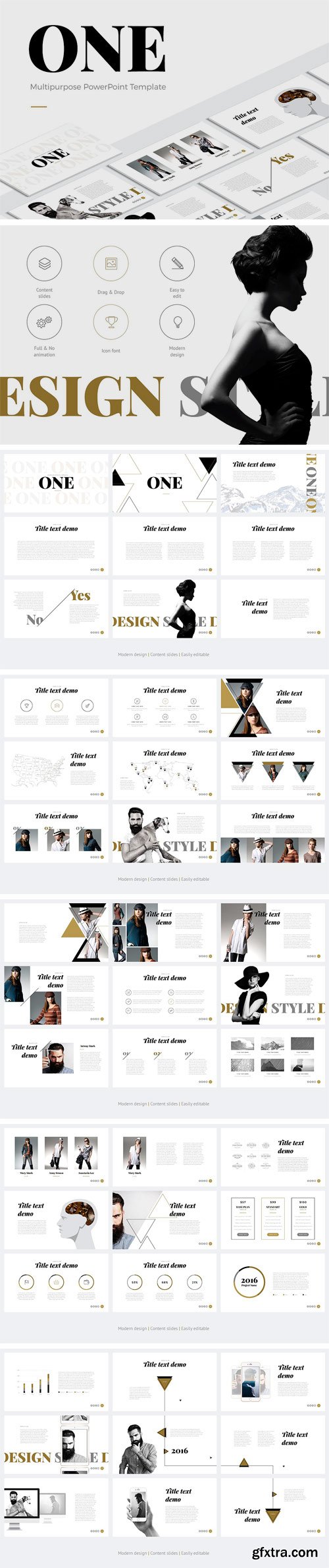
CM 1459781 - ONE Modern PowerPoint Template
What do you get? PowerPoint version (.PPTX), all animation (demo video), no animation, 46 unique content slides, 16 premade color, 16:9 HD, free font, photos are not included. Easy customization: My main task is to make presentations easily editable for users. Even if you have no special skills in design you’ll be able to create beautiful, original and modern presentation. There is no need to use any additional software.
• Easily editable objects. All infographic elements are made using built-in tools. This will allow you to change color, size and shape of any object without losing quality and without using Photoshop and Illustrator in just 2 clicks.
• Drag & drop. It’s very easy to add your own images or photos to slides. Just drag the image directly from the folder to the field.
• Free fonts. I use non-standard fonts in this presentation. You can download it for free and use while editing the presentation. Fonts’ links are in the instruction attached to the presentation.
• Edit charts and graphs using tables. You can change charts and graphs in this presentation using tables. Select the chart you need, edit data in the table. Chart image will be changed on the basis of your data.
• Unique content slides. This presentation "ONE" contains 46 unique content slides. Of course, I can write that there are about "100500 slides", but it’s not true :) . Usually it’s counted by summarizing all slides in all formats and color schemes. Every slide in presentation is unique with its content and infographics. I use content slides, because it makes the process of customization mush easier. Using “light table” mode you can see how all the slides exactly will look in finished form. Moreover, it will allow you to structure slides by its content. Master slides are used to configure unchanging information (logo, social networks links and slide number) or to create technical fields.

CM 1458601 - Digital Floristry - Vintage Romance
At Create the Cut we are so passionate about bringing you innovative and fresh ideas and so are very proud to present to you a brand new style of clip art. We want our designers to have the latest design resources and so we continue to try and push the boundary of what is the norm. These designs have been created by taking real photographs of leaves and flowers. We took photos of the flowers and leaves at many different angles so that they would work well in an arrangement. After choosing co-ordinating elements each piece was carefully extracted from it's background and edited with many filters and textures making each element unique. This "Vintage Romance" set contains 8 individual pieces as well as a large floral arrangement. This clip art works just as ordinary clip art and the individual elements can be arranged to how you would like. Great for adding to invitations, blogs, websites or logo designs etc.
What You Get:
• 8 x individual clip art pieces in JPEG and transparent PNG format.
• 1 x floral arrangement in JPEG and transparent PNG format.
• Plus Bonus - 4 Preview Menus (shown above) 6" x 6" in JPEG format
• No Credit Commercial License for the whole Vintage Romance set.

http://black-foundry.com/vesterbro/
Named after the city district located where the old Western Gate of Copenhagen used to be, Vesterbro is an attractive new serif face from Black[Foundry]. It is the brainchild of Jérémie Hornus, who developed the type family in collaboration with Alisa Nowak and Ilya Naumoff. The core design of the Vesterbro family is the Poster weight. The imaginative high-contrast typeface combines characteristics from Scottish and Garalde models. Vesterbro Poster is warmer than most Didot-inspired display faces. It has friendly, organic shapes, with a generous x-height and short serifs. Its tilted axis and supple curves lend Vesterbro Poster an inviting, jovial personality; just look at that radiant smile on the lowercase ‘e,’ or how the ampersand licks the next word. Surprised at how well this typographic mashup works, the team derived a text version with the same properties. The Regular weight has more pronounced serifs and a fairly low contrast, giving it a calm yet confident look on the page. Leaf terminals on letters like ‘a,’ ‘c,’ and ‘f’ add an elegant calligraphic touch. As the weight increases, the typeface gains impact without losing its supple charm. Thanks to the multinational team at Black[Foundry], the Greek and Cyrillic alphabets were added early in the development of Vesterbro. The comprehensive character set includes several types of numerals, an extensive ligature set, and a full complement of arrows. Pleasantly readable in text sizes and attention-grabbing when used big, Vesterbro is a versatile type family for global communication that can be applied to any design project, from editorial design and graphic identities to advertising, branding and packaging.
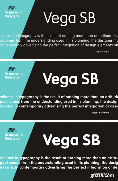
https://www.myfonts.com/fonts/efscangraphic/vega-sb/
Since the release of these fonts most typefaces in the Scangraphic Type Collection appear in two versions. One is designed specifically for headline typesetting (SH: Scangraphic Headline Types) and one specifically for text typesetting (SB Scangraphic Bodytypes). The most obvious differentiation can be found in the spacing. That of the Bodytypes is adjusted for readability. That of the Headline Types is decidedly more narrow in order to do justice to the requirements of headline typesetting. The kerning tables, as well, have been individualized for each of these type varieties. In addition to the adjustment of spacing, there are also adjustments in the design. For the Bodytypes, fine spaces were created which prevented the smear effect on acute angles in small typesizes. For a number of Bodytypes, hairlines and serifs were thickened or the whole typeface was adjusted to meet the optical requirements for setting type in small sizes. For the German lower-case diacritical marks, all Headline Types complements contain alternative integrated accents which allow the compact setting of lower-case headlines.

https://www.myfonts.com/fonts/fontfont/falafel/
Danish type designer Per Jørgensen created this script FontFont in 2002. The font is ideally suited for advertising and packaging, festive occasions, film and tv as well as software and gaming. FF Falafel provides advanced typographical support with features such as ligatures and alternate characters. It comes with tabular lining and tabular oldstyle figures.


CM 1458557 - BUNDLE Samsung Galaxy S8 App & Skin
Professional premade scenes, great for your web design showcase, product, presentations, advertising and much more.
• Realistic Looking Template Files.
• Smart Objects.
• High Resolution.
• Photoshop Version: CS5 or Higher.
• Organized Layers
• Print quality 4500x3000 600 dpi.
• Professional Perspectives, Reflections, Clean Look.
• Reflections and Shadow on Separated Layers.
• Well organized layers and folders.
• Fully layered, Easy to use.
• Help file included + video tutorial.


CM 1439169 - 30 Space Nebula Galaxy Textures
A great set of 30 Space Nebula Galaxy Textures! A new trend you must try! These beautiful textures are ideal as backgrounds for T-Shirts, Packaging, Business Cards, Wedding Invitations, Cards, Design projects, Websites, crafts and so much more!

CM 1458583 - Surfboard Longboard Mockup Set
Surfboard longboard template - layered, editable psd file prepared to showcase your custom design, by simply editinng the smart object and color layers.
• files works only in Photoshop (min. PS CS4);
• pack includes 1 .psd file, file specs: 4000x4000 px, 300dpi;
• changeable colors, gradients (full range) and design (via smart objects);
• backgrounds: custom, neutral and white (check preview);
• Amazon ready: white background is always included;
• well organized layers as in all of other Creatsy mockups.


CM 1480526 - Exotic Birds - Seamless Pattern
This Print comes in a seamlessly large repeat pattern in PSD format with transparent background and separate files with motifs in transparent background and separate layers which gives you a wide range of choices in it usage on a variety of products such as :
• Home Linens
• Printed Scarves
• Personal Stationeries
• Invitations
• Wallpapers
• Textiles
• Packaging
• Accessories
• Paper bags -Clothing & jewellery
Download Files include :
• PSD File with Prints in transparent background and in layers.
• PSD file with motifs in separate layers and transparent background.
• A JPG folder with the Print pattern.
• A PNG File with transparent Print Pattern.
