
CM 1500088 - Resume/CV Minimal Bundle
3 Top Selling Resume CV Templates. All artwork and text are FULLY CUSTOMIZABLE; easily edit the typography, wording, colors and layout in Photoshop, Illustrator, Indesign & Ms Word.
Files Included Within This Bundle :
• 3 Resume Design in ai, psd, indesign, doc & docx format.
• 3 Cover Letter Design in ai, psd, indesign, doc & docx format.
Features of Resume Templates:
• A4 (ISO International) paper size.
• Print-ready (3 mm bleed included)
• Main 2 Page (Resume + Cover letter)
• Professional and clean structured files
• Well organized layers and layer groups
• Very easy to use and customize in PSD, AI, Indesign & Word
• Well documented help file for easy customization.
• Free Fonts Used
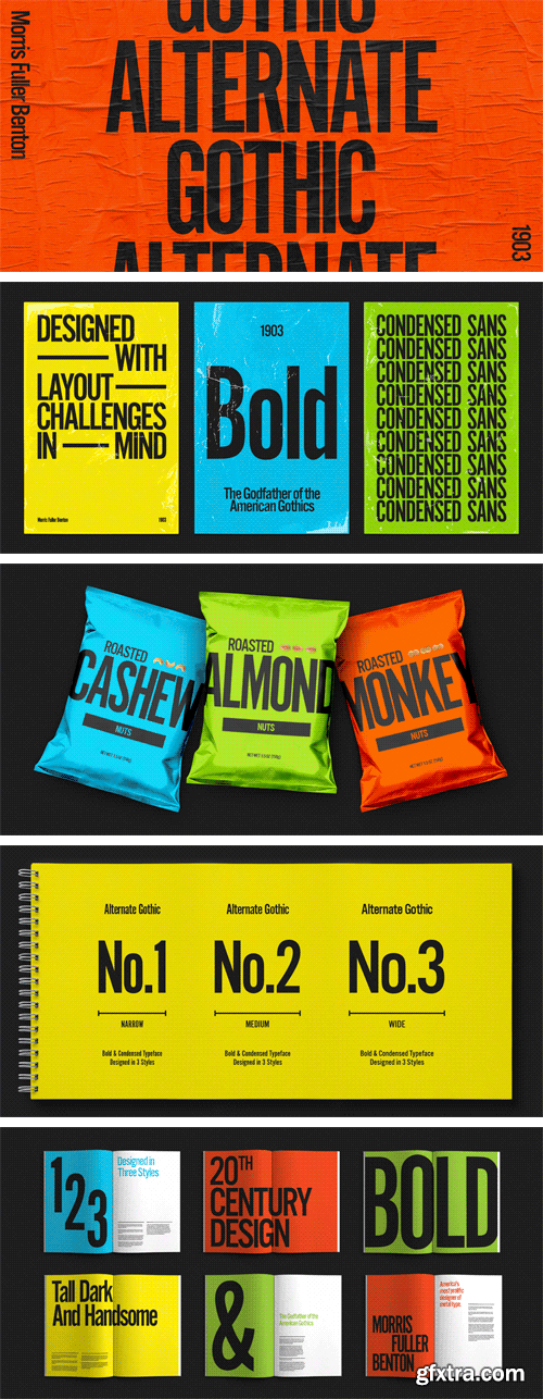
https://www.myfonts.com/fonts/linotype/alternate-gothic-lt/
Alternate Gothic was designed by Morris Fuller Benton for American Typefounders Company in 1903. All three weights of Alternate Gothic are bold and narrow. In fact, this face is essentially a condensed version of Benton’s other well-known sans serif types, Franklin Gothic and News Gothic. In the early twentieth century, the modern concept of type “families” had not yet been formed — and though Benton designed these sans serifs to harmonize with each other, the foundry gave them different names. Robust, dark, and coolly competent, Alternate Gothic is a good choice when strong typographic statements must fit into tight spaces. As a modern usage, it is currently the font of YouTube’s homepage logo.

https://www.myfonts.com/fonts/fontfont/ff-brokenscript/
Dutch type designer Just van Rossum created this blackletter FontFont in 1991. The family contains 2 weights: Bold and Condensed and is ideally suited for advertising and packaging, festive occasions, editorial and publishing, logo, branding and creative industries as well as poster and billboards. FF Brokenscript provides advanced typographical support with features such as ligatures, alternate characters, case-sensitive forms, and stylistic alternates. It comes with proportional oldstyle figures. This FontFont is a member of the FF Brokenscript super family, which also includes FF Brokenscript Rough.

https://www.a2-type.co.uk/grot10
A contemporary take on the renowned ‘Grot Series’ from Stephenson Blake’s type foundry in Sheffield, England. The original cut of Grot No.10 was used as a principal source of inspiration for the design, from which we also added our own italic style.


http://www.fontsmith.com/fonts/fs-truman
Like Truman Burbank, the star of The Truman Show, FS Truman was born for TV. You’ll know it from Sky One’s on-screen trails and announcements, but it’s just as at home in other media. Its starting point was the skeleton of a highly legible, space-saving, corporate font with some of FS Dillon’s geometric discipline built in. Its distinctive tone of voice and “ownability” are in its boxy but friendly shapes, and characters with hybrid features. FS Truman’s weights and widths were honed to work at TV screen resolutions. A face for TV it may have been, but this is a font that works on every level, on screen, in print, in headlines, in listings, in longer text, in tight corners and open spaces.

https://www.typotheque.com/fonts/diurnal
Diurnal, is a Sans serif companion to Nocturno typeface, providing superb legibility at all sizes. Diurnal belongs to that group of rare humanist sans serifs designed for long, continuous reading, following the lead of Hans Eduard Meier’s Syntax (1969), or more recently Evert Bloemsma’s Legato (2004). Diurnal’s generous x-height and unapologetically calligraphic rhythm emphasise the sense of horizontality, leading readers’ eyes along for an immersive experience.

https://www.myfonts.com/fonts/wiescherdesign/eleganza/
Eleganza is my most elegant typeface. At least that is what I think! I use it for business cards and everything that has to be elegant with that extra touch.The font comes in pairs for the price of one. The “plus” version being the one with less embellishments.


http://www.myfonts.com/fonts/type-type/tt-norms/
Working on TT Norms font family, we've aimed to create a modern geometric grotesk with the widest implementation range, a reliable workhorse. This concept is reflected in the name of the font family TT Norms (Norm – from English norm, standard). The basis for TT Norms is the classic type character proportions. We've been especially careful working on geometry of each glyph, both from the point of view of visual correctness and forms continuity. The main version of TT Norms is of a neutral nature, which becomes more humanistic when stylistic alternates are on. Nine weights and nine corresponding true italics, a large number of ligatures, and broad support of OpenType features (ordn, case, frac, sinf, sups, dnom, numr, tnum, pnum, liga, salt) allow to easily adapt the font family for different purposes. TT Norms works equally well in large text arrays and in small headings, and it is “the one” universal geometric grotesk.

CM 1528069 - Anydore
The Anydore font is an elegant and strong handwritten script, Open Type and PUA Encoded. It comes packed with lots of alternate characters (Stylistic Set 1-18) that allow you to come up with unique designs each time you use it.

https://www.fontspring.com/fonts/fontsite/compressa
Compressa is a display sans font family. This typeface has six styles and was published by FontSite Inc.

CM 1527034 - Just Darling Hand-Lettered Font Trio
Just Darling was lovingly hand-lettered on an iPad, and offers a bit of variety. Just Darling is perfect for invitations, monograms, & cute feminine branding.

CM 1522497 - Ravello
This "Ravello Font" is well suited for various design projects, such as logos, advertising, quotes, packaging design and others.


CM 1501131 - Sweet 16 | Sixteen Minimal Logos
• Sweet16 contains 16 minimal logos in Adobe Illustrator vector format and Adobe Photoshop format.
• Free for Commercial use fonts (listed in RTF)
• This product was created for Adobe Illustrator and Adobe Photoshop. Unfortunately, if you don't have Illustrator and Photoshop CS6 or newer, you WON'T be able to edit the files.
CM 1500089 - Isolated Food Items Vol.3
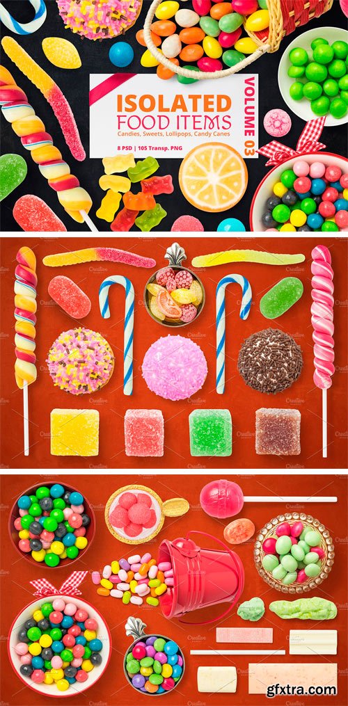
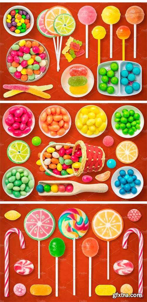
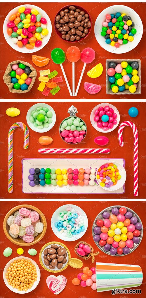
Contain PSD and PNG files with gummy worm, colorful jelly candies, turkish delight, cookies, lollipops, candy canes, candy bowls, gummy bears, candy bag, chewing gum, drops, etc. All images are with a transparent background, converted to smart objects, with transparent shadow on a separate layer (top view). Is all you need to create beautiful presentations, hero images, headers, flyers, banners, mockups, great for blogs and websites, restaurant and food identity. Present your projects in an interesting and attractive way to your clients. Check other volumes for more food items.
8 PSD files:
• Size 3000x2000px 300ppi
• Contain isolated food images on categories
• Each PSD is Layered and Grouped
• Each Group contain the food image and the shadow both converted to Smart Object and linked together
• Smart objects are resized down at 50%, so you can scale up to x2 of objects size
• The Shadow is transparent so you can place it on any background and you can also hide it or reduce opacity to fit your design
• Adobe Photoshop CS2 or Higher
105 PNG Files:
• Saved at 300ppi with transparent background and no shadow
• Each PNG is named just like in PSD and saved in a group with the the same name like the PSD file


CM 1501008 - Boutique Social Media Pack
Boutique Social Media Pack is an elegant, vibrant and stylish social media pack, perfect for fashion bloggers, beauty bloggers, lifestyle bloggers, fashion businesses, beauticians, and stylists. Promote your business, thoughts, sale on Facebook, Instagram, Pinterest and Twitter or add the images to your blog posts.
Features:
• 4 fully editable PSD files with 20 groups in each PSD
• 20 horizontal posts for Facebook /1200 x 630 px/
• 20 horizontal posts for Twitter /1024 x 512 px/
• 20 vertical posts for Pinterest /600 x 900 px/
• 20 square posts for Instagram /1200 x 1200 px/
• Free for Commercial Use Fonts
• Free for Commercial Use Images
• Customizable Fonts, Colors and Images
• Knowledge of Photoshop CS6 or above is needed /Clipping masks, Layer masks etc. are used/
• Bonus: 12 Gold foil brush strokes and patterns in high-res transparent PNG format
6 albums: Facebook, Instagram, Pinterest, Twitter, Goldfoil, Help
• Facebook: facebook.psd and 20 post JPGs
• Instagram: instagram.psd and 20 post JPGs
• Pinterest: pinterest.psd and 20 post JPGs
• Twitter: twitter.psd and 20 post JPGs
• Goldfoil: 12 high-res PNGs
• Help: Fonts album, Photos album, Font links in rtf, Photo links in rtf, How to Edit video link in rtf, Plus some social media image tips.

CM 1458835 - Long Cycling Jersey Mock-up
Replace invaluable time and expensive photosessions with product mock-ups to get what you need in minutes. Our mock-ups are great selling tools.
What’s included in the package?
• 4.psd files (Photoshop)
• User Manual
About
• You can choose color and edit design on editable elements (smart objects, color pickers)
• You can change all design parts (front, back, sleeves, colar, mesh)
• You can stay with white background, change color or tun it off
• Invaluable for to design or to showcase your project to the Client
• Realistic effect thanks to unique technology of blending and great shadows effects
• Well organized layers
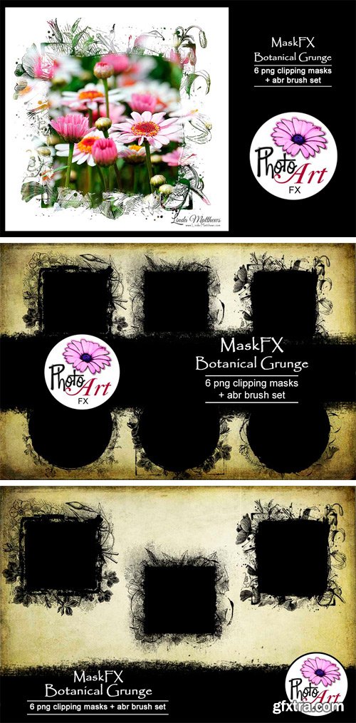
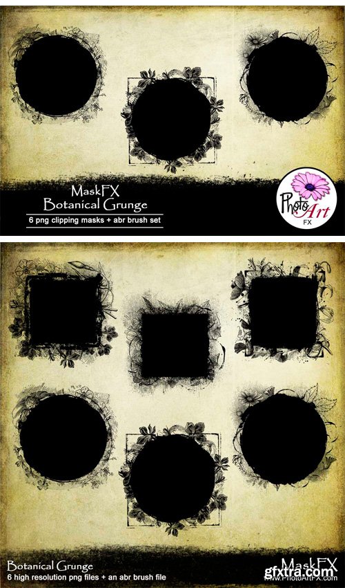
CM 1499782 - MaskFX: Botanical Grunge
This MaskFX set includes 6 high resolution transparent png clipping mask files + an abr brush set, 3600px x 3600px (12″x12″) @ 300ppi. These clipping masks are perfect for adding decorative mask effects to all your PhotoArt and other types of digital projects using Photoshop, Photoshop Elements, or similar types of photo editing software.


https://commercialtype.com/catalog/chiswick_grotesque
Industrial in style, while retaining the essential character of the other families in the Chiswick collection, Chiswick Grotesque is a letterform from the nineteenth century’s bustling metropolises. Its boldness and crude, no-nonsense style suggest a form as suited to architecture as to print.


https://www.optimo.ch/typefaces_Stanley.html
‘Stanley’ is a new typeface from Ludovic Balland, inspired by ‘Times New Roman’, one of the most classic typefaces of the 20th century. Stanley Morison, after criticizing the British newspaper ‘The Times’ of being typographically outdated was then commissioned to create a new font. In 1932 the typeface was released under the name ‘Times New Roman’ and would become a superlative typeface due to its refined aesthetic and legibility qualities. Sharing comparable qualities with its inspirational precursor, ‘Stanley’ offers excellent legibility and incredible sharpness at very small sizes. The drawing of the typeface is characterized by wide and sharp counter forms as well as short ascenders and descenders, generating neat text arrangements. The very graphic shape of the serifs benefit from a maximum of contrast. With five cuts, ‘Stanley’ fulfills versatile needs from footnotes to headlines. The particular drawing of the capitals gives a unique tone to text and can be used to create an additional typographic hierarchy. Freilager Zeitung by Ludovic Balland displaying a beta version of Stanley for the body text.

https://www.stormtype.com/families/mediaeval/
Mediæval has a robust skeleton covered in soft flesh and its italics still show the Renaissance dynamics. It is suitable for the setting of long texts, since it does not contain any sharp points, hairstrokes or other disruptive elements. Its moderate weight encompasses elements of variety and its shading seems to follow a half-moon rolling in the direction of reading. This rhythm considerably speeds up the perception of the text.

https://www.stormtype.com/families/pentagraf/
The five-pointed star gave vertical proportions to this typeface. The cap-height, x-height, ascenders and angles of all important diagonals have been taken from the pentagram. Other elements and details are geometrically constructed, too. This typeface is especially suited for any kind of hermetic and occult literature and poetry, where symbols play an important role. Its appearance is surprisingly clean and neutral enough to be comfortable for long reading, naturally of any kind of text. Pentagraf is already proven as a workhorse in art catalogues, where its humble letterforms don't disturb art reproductions.

https://www.stormtype.com/families/lido-stf/
Lido is suitable for all periodicals wishing to abandon inconspicuously the hideous system typefaces with their even more hideous accents and to change over to the contemporary level of graphic design. It is also most convenient for everyday work in text editors and office applications. It has a fairly large x-height of lower case letters, shortened serifs and simplified endings of rounded strokes. This is typical of the typefaces designed for use in small sizes. Our typeface, however, can sustain enlargement even to the size appropriate for a poster, an information table or a billboard, as it is not trite and at the same time is moderate in expression.

https://www.stormtype.com/families/libcziowes/
The spectacular Libceves gravestone dating from 1591 is completely – from top to bottom, from one side to the other – covered with lettering. It attests to the fact that in Bohemia, thirty years after Garamond's death, inscriptions were cut in popular type faces which were quite different from the Renaissance Roman type face. I was interested in the type face and I tried to digitalize it, expecting similarly poor results as if I had tried to cut a computer font. In spite of the fact that I did not succeed in capturing the vivacity of the model, an interesting display type face arose which, hopefully, may distract and please its users.


https://www.stormtype.com/families/ozdoby/
Symbol fonts useful for magazines, invitations, posters or guidebooks. The set includes heraldic figures, leaves, decorative endings, various skull forms, weather signs, borders and many more.

