
https://www.myfonts.com/fonts/louise-fili/montecatini/
Montecatini takes its cues from the elegant Stile Liberty travel posters of Italy in the early 1900s. The font features distinctive ligatures typical of the time when Art Nouveau emerged as a worldwide phenomenon. Everything looks better in Montecatini, from book jackets to monograms to packaging and logos—and the wide selection of ligatures make copyfitting a delight.

https://www.myfonts.com/fonts/rmu/deutschmeister/
This crisp and constructed Ludwig Wagner, Leipzig, blackletter font in textura style had been originally designed by Berthold Wolpe. Freshly redrawn and redesigned, it adds now to the treasure trove of historic typefaces. This font contains a bunch of useful ligatures, and by typing ‘N’, ‘r’ and period plus activating the discretionary ligatures you get an oldstyle numbersign. As usual in my blackletter fonts, the # key is occupied by the ‘round’ s.

https://www.myfonts.com/fonts/adobe/fairfield/
Fairfield is a fifty-year-old typeface that has had a recent facelift. Rudolph Ruzicka, artist and book illustrator, designed light and medium weights of Fairfield for Linotype in 1940 and 1949, respectively. For Fairfield’s 1991 release as an electronic typeface, designer Alex Kaczun added bold and heavy weights. With its straight, unbracketed serifs and abrupt contrast between thin and thick strokes, Fairfield harks back to the modern typefaces of Bodoni and Didot, but has a distinctly twentieth-century look. Fairfield is a fine text face, both for books and shorter texts. Kaczun added small capitals and old style figures, swash capitals, and a set of “caption” typefaces (sloped roman style) that were inspired by Matthew Carter's extensions to Oldstyle 7 for National Geographic magazine.

https://www.myfonts.com/fonts/casvandegoor/phi-roman/
Phi is a simple geometric sans, inspired by the Golden Ratio. It is rock solid, versatile, legible and excellent for both text and display usage.

https://www.myfonts.com/fonts/fonted-house/canoe/
Canoe is a fun, all-caps font with a delightfully hand-written feel. It comes “water ready” to be used in the wild on the web, save the dates, and other design projects that need a homemade touch. Its characters are wiry and tall with crossbars that hit at varying heights. Canoe also includes 1st, 2nd, 3rd ordinal capabilities as well as fractions.

CM 1501295 - Westdjava Typefaca
Westdjava is a retro, bold, classic and vintage script font. Westdjava Script features more then 100 alternate characters. Great for various purposes.such as logos, t-shirt, letterhead, posters, Wedding invitation, badges etc. Westdjava comes with uppercase, lowercase, numerals, punctuation, multilingual characters.
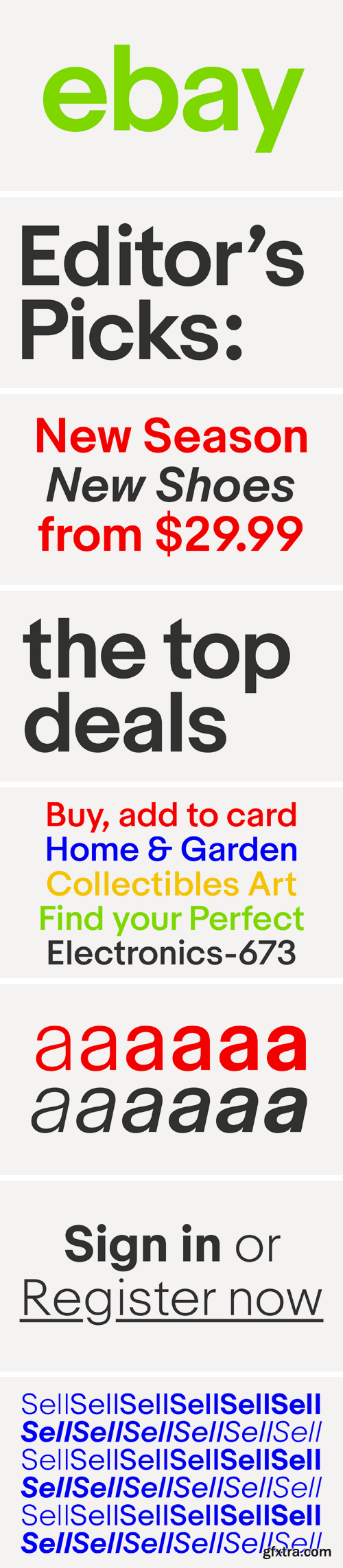
https://www.swisstypefaces.com/news/2017/6/1/ebay-typeface/
We worked with the eBay brand team and the New York based design agency Form&. Market Sans’ style came from the Capital typeface, a font from our Lab department. eBay bought the exclusive rights for developing a complete font family and taking it out of the market. This typeface was a fusion between the neo-grotesque style of the Suisse Int’l and the geometric shapes of the Euclid Flex typeface. Market Sans is a brand-new family including six weights with italics.

CM 1527279 - Refresh Font (LIMITED EDITION)+Bonus
Introducing Refresh (LIMITED EDITION) A cool & refreshing font The perfect choice for this summer!! Refresh is a light and modern handwriting font with lots of soul. its A fun summer font Perfect for Your logo designs, branding , handwritten quotations, product packaging, merchandise & social media and more:)

https://www.youworkforthem.com/font/T7924/jean-paul-f
A typographic treasure, originated in the Biedermeier epoch at the beginning of the 19th century, had been brought back to life. With its charming touch it makes a wonderful font for reprints and historically relevant projects.This font contains a bunch of useful ligatures, and by typing 'N', 'r' and period plus activating the discretionary ligatures you get an old style number sign. As usual in my blackletter fonts, the # key is occupied by the 'round' s.
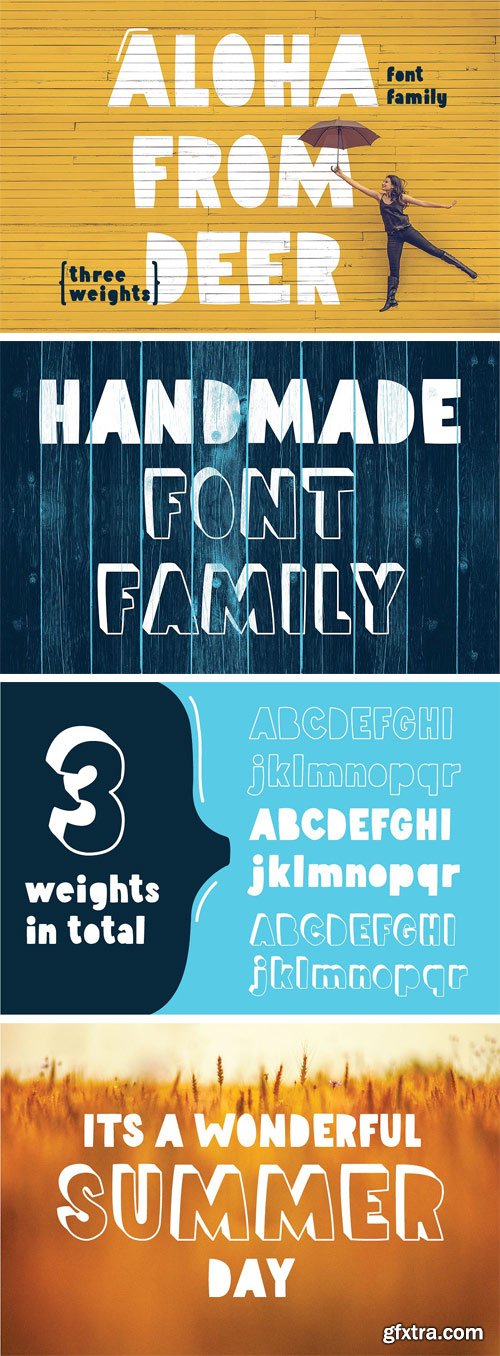
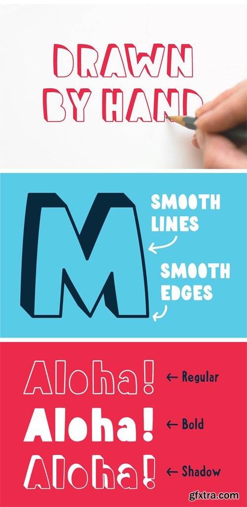
CM 1522804 - Aloha From Deer - Summer Font Family
Let say "aloha" to upcoming summer... It's a friendly and welcoming typeface arriving in three different weights. Created to be positive and easy going. :) Font has been sketched by hand and post processed in adobe illustrator. So, there are no rough lines or edges. Simply size this font as you want - it will stay smooth and precise as you see now.
CM 1525612 - Geometric Logo Generator - "B"
I am happy to introduce to you the second modern logo generator. It consists of 30 different minimal designs inspired by the letter "B". The graphics can be used as logos for your company, as graphical elements to support the branding, or as cool modern looking iconography for printing. They are pixel perfect, and super easy to customize. An additional bonus to this pack are the 9 ready made logo templates that you can modify to your company's needs. They were created using free Google fonts, and font pairing was a very important thing to consider when designing them. All you have to do is install the fonts (that are also provided in this pack) and simply open the file, re-write your company's name, and you're done! You made yourself a brand new modern looking logo.
Included in this pack:
• 30 Pixel Perfect Logo Designs;
• 9 Ready Made Logo Layouts;
• Google Fonts, so that you don't have to search for them;
• Available Files: AI (CS5+), PSD, EPS, PNG;
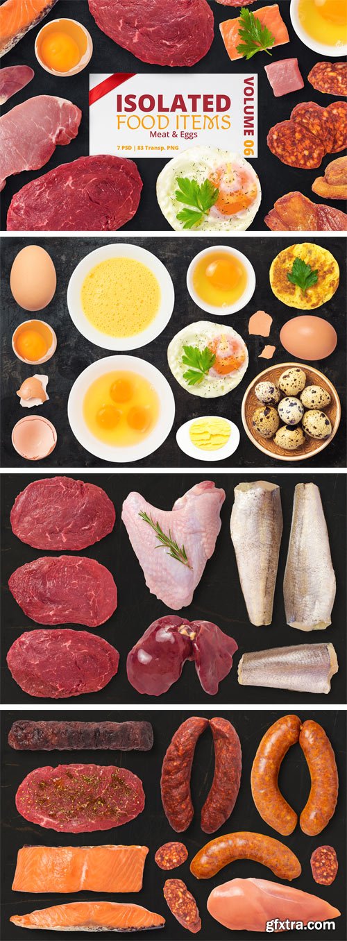
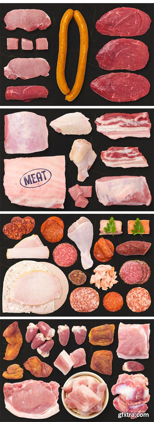
CM 1500125 - Isolated Food Items Vol.6
Contain PSD and PNG files with fish, chicken liver, turkey wing, beef meat, pork meat, sausages, slices of sausage and salami, raw chicken breast, seasoned meat, salmon, grilled minced meat roll, ham, meatball, chicken heart, pork cracklings, eggs, egg shells, fried egg, boiled egg, raw egg, scrambled eggs, quail eggs, mixed raw eggs, etc. All images are with a transparent background, converted to smart objects, with transparent shadow on a separate layer (top view). Is all you need to create beautiful presentations, hero images, headers, flyers, banners, mockups, great for blogs and websites, restaurant and food identity. Present your projects in an interesting and attractive way to your clients. Check other volumes for more food items.
7 PSD files:
• Size 3000x2000px 300ppi
• Contain isolated food images on categories
• Each PSD is Layered and Grouped
• Each Group contain the food image and the shadow both converted to Smart Object and linked together
• Smart objects are resized down at 50%, so you can scale up to x2 of objects size
• The Shadow is transparent so you can place it on any background and you can also hide it or reduce opacity to fit your design
• Adobe Photoshop CS2 or Higher
83 PNG Files:
• Saved at 300ppi with transparent background and no shadow
• Each PNG is named just like in PSD and saved in a group with the same name like the PSD file
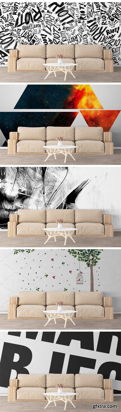
CM 1501438 - Wall Mockup - Sticker Mockup Vol 461
This wall mockup allows you to quickly display your designs and layouts into a digital photo realistic showcase. Please note that you must have basic photoshop knowledge to use this project.
Files Included:
• 1 PSD File with resolution 3840x2160
• 1 PDF Help File with description layers and quick guide
Main Features
• Easy editable with smart objects
• 1 view
• Help File Included
Tutorials included:
• How to place your wall stickers
• How to place your wall artworks
• How to change the color of the wall


CM 1527073 - Grain & Film Lightroom Presets
If you like live photos similar to photos from a film camera - then these presets are for you! Grain makes photos more atmospheric, cozy and now such processing of photos in a trend! This set includes 13 color presets, and you get a bonus of 3 black and white presets. Create pictures that will be remembered for life with the help of these presets!
CM 1528075 - Ramadan Icon Bundle
Eid Mubarak!! Ramadan Icons - A set of 30 unique Vector Icons in 13 different styles! Celebrate this Ramadan with a set of 390 Vector Icons! What's Included: mecca, shahada (faith), charity, moon, crescent, lamp, crescent + hands, star + hands, taqiya (prayer cap), desert, tomb, quran, moon + mosque, festival flag, read quran, arab, moon + stars, lantern, gift, accept gift, ramadan gift, aladdin lamp, muslim man praying, mosque, salat (prayer), decoration, camel, mosque + hands, carpet, mosque location.

https://www.myfonts.com/fonts/canadatype/vintage-deco/
One of the most enjoyable activities at Typecon conferences is Paul Shaw’s lettering/type walk. Wherever the conference happens to be, and even if you’ve been to that city a hundred times and know it intimately, going on that walk with Paul & friends gives you a brand new, local-history-rich perspective. If you’ve never been to a Typecon conference, you owe it to yourself to go at least once just to have that fun experience.
Typecon 2016 was in Seattle, and the usual eye-opening walking adventure with Paul led us to the old sky-high vertical sign of the Vintage Hotel at Spring Street and 5th Avenue. Wide, breezy, unique caps with sharp cuts and wide semi-rounds. Letters of unknown origin, though brimming with that casual west coast chic. You could almost smell the hot rod fuel and optimism there. The late 1950s idea of futuristic. Almost like Bank Gothic or Microgramma gone totally deco. Hard not to get ideas when you see this stuff. The seed for Vintage Deco was planted, and the rest is now history.
The Vintage Deco family comes in five weights, from Light to Bold. The multi-script glyph set is quite extended. Each of the fonts contains 635 glyphs, Pan European language support, many stylistic alternates, and five types of figures. This is the kind of family that makes graphic designers seek out a project just to use the fonts in there.


https://www.myfonts.com/fonts/canadatype/basilio/
In the late 1930s, old Egyptiennes (or Italiennes) returned to the collective consciousness of European printers and type houses — perhaps because political news were front a centre, especially in France where Le Figaro newspaper was seeing record circulation numbers. In 1939 both Monotype and Lettergieterij Amsterdam thought of the same idea: Make a new typeface similar to the reverse stress slab shapes that make up the titles of newspapers like Le Figaro and Le Frondeur.
Both foundries intended to call their new type Figaro. Monotype finished theirs first, so they ended up with the name, and their type was already published when Stefan Schlesinger finished his take for the Amsterdam foundry. Schlesinger’s type was renamed Hidalgo (Spanish for a lower nobleman, ‘son of something’) and published in 1940 as ‘a very happy variation on an old motif’. Although it wasn’t a commercial success at the time, it was well received and considered subtler and more refined than the similar types available, Figaro and Playbill. In the Second World War, the Germans banned the use of the type, and Hidalgo never really recovered.
Upon closer inspection, Schlesinger’s work on Hidalgo was much more Euro-sophisticated and ahead of its time than the too-wooden cut of Figaro and the thick tightness of Playbill. It has a modern high contrast, a squarer skeleton, contour cuts that work similarly outside and inside, and airy and minimal solutions to the more complicated shapes like G, K, M, N, Q and W. It is also much more aware of, and more accommodating to, the picket-fence effect the thick top slabs create in setting.
Basilio (named after the signing teacher in Mozart’s Figaro) is the digital revival and major expansion of Hidalgo. With nearly 600 glyphs, it boasts Pan-European language support (most Latin languages, as well as Cyrillic and Greek), and a few OpenType tricks that gel it all together to make a very useful design tool.
Stefan Schlesigner was born in Vienna in 1896. He moved to the Netherlands in 1925, where he worked for Van Houten’s chocolate, Metz department store, printing firm Trio and many other clients. He died in the gas chambers of Auschwitz in 1944. Digital revivals and expansions of two of his other designs, Minuet and Serena, have also been published by Canada Type.


https://commercialtype.com/catalog/chiswick_sans/chiswick_sans
Chiswick Sans demonstrates that the past can offer inspiration for new typefaces which are not slavishly historical. The high contrast sans serif offers a letterform that shares the unadorned simplicity of a low contrast sans, but also shares the beauty of a serif letter.


https://www.myfonts.com/fonts/canadatype/vip/
VIP is a humanist sans serif uppercase and figures combined with a freshly redrawn revival of the classic Constanze initials originally designed by Joachim Romann for Stempel in 1956. As well as a vehicle to revive the Constanze initials, VIP was inspired by modern typography found in many artful books, on many product packages, and on the windows and literature of high-end restaurants, jewelry stores, haute couture fashion sellers, architecture firms and trendy brand name establishments. If you've walked through the soho or downtown of any major metropolitan, you've seen them: Widely tracked words or lines starting with a script majuscule and going on with clean and comfortable sans serif caps. If classy modern combination typography is your thing, you will find much pleasure in using VIP. VIP was updated with expanded language support in 2012. It now supports a very wide range of codepages, including Cyrillic, Greek, Central and Eastern European, Turkish, Baltic, Vietnamese, and of course Celtic/Welsh.

https://www.myfonts.com/fonts/paragraph/tertre/
Tertre is a display/short text typeface with a wide range of applications from signage or posters to menus and pricelists; branding, packaging or publishing. It is named after Place du Tertre, a square located at the top of Montmartre—a hill overlooking Paris, made famous by the artists of the 19th and 20th Century. Like in Galette, the letters have no overhangs and the stroke thickness of capitals and lower case letters is identical, making hinting or anti-aliasing more uniform at any point size and zoom combination.

https://www.myfonts.com/fonts/lanston/ltc-jefferson-gothic/


CM 1525640 - Limber Script & Mockups
Hello! Presenting a calligraphic handcrafted font named "Limber". It has 26 alternate glyphs, 12 ligatures and multilingual support. Also you will get 4 high quality renders of modern interior mockups in layered psd format.

https://vllg.com/luxtypo/fabriga/
Fabriga speaks a familiar language in a distinctive voice. All emblematic decisions were informed by ideas around clarity and tone. Fabriga’s structure and warmth is influenced by how it’s character set is approached as an ensemble while still exploring individual ‘creative’ opportunities as they posed themselves throughout the process.
