
https://www.stormtype.com/families/mramor-pro
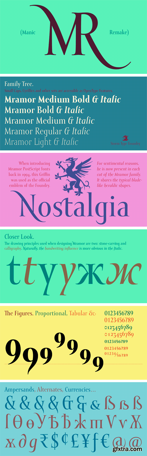
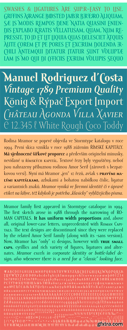
Mramor family first appeared in Stormtype catalogue in 1994. The first sketch arose in 1988 through the narrowing of Roman capitals. It has uniform width proportions and, above all, original lower-case letters, unprecedented with Roman Capitals. The text designs are discontinued since they were replaced by the related Amor Serif family (along with its -sans version). Now, Mramor has “only” 10 designs, however with true small caps, cyrillics and rich variety of figures, ligatures and alternates. Mramor excels in corporate identity or bottle-label design, also whenever there is a need for a “classic” looking face.
https://www.stormtype.com/families/hercules/
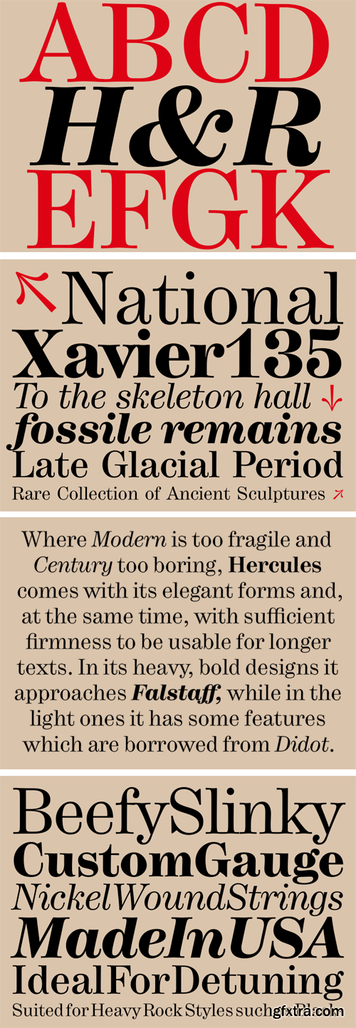
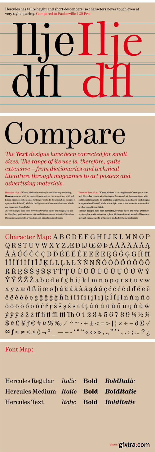
Where Modern is too fragile and Century too boring, Hercules comes with its elegant forms and, at the same time, with sufficient firmness to be usable for longer texts. In its heavy, bold designs it approaches Falstaff, while in the light ones it has some features which are taken over from Didot or from Modern. The text designs have been corrected for small sizes. The range of its use is, therefore, quite extensive – from dictionaries and technical literature through magazines to art posters and advertising materials.
https://www.stormtype.com/families/jannon/
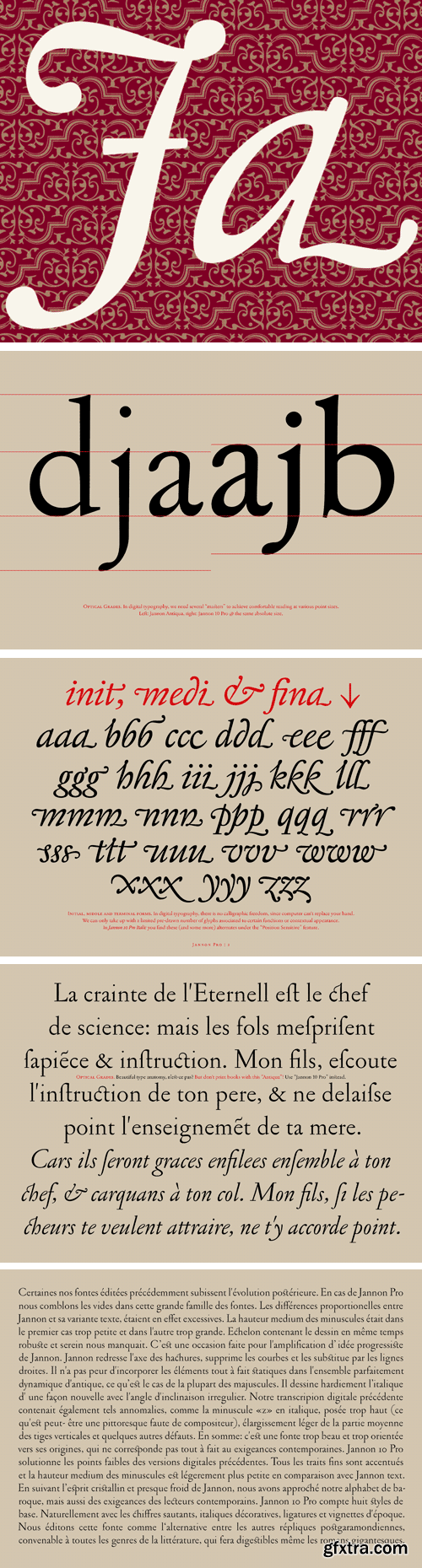
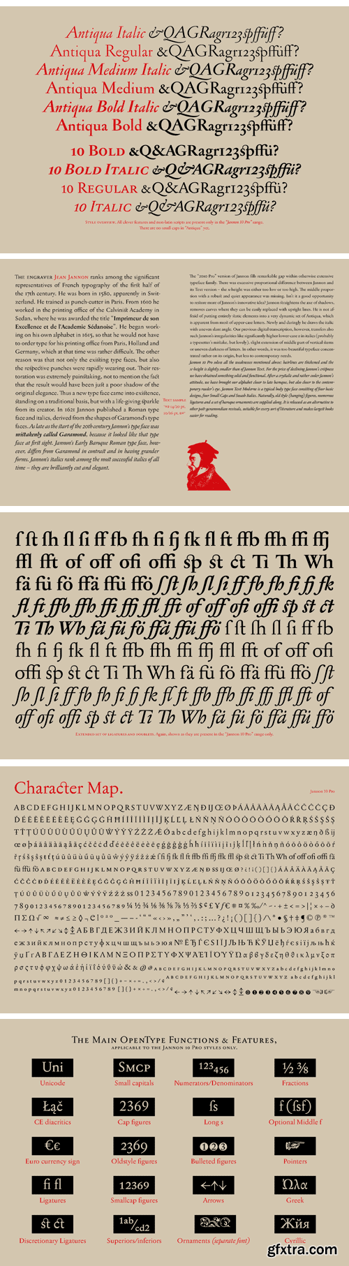
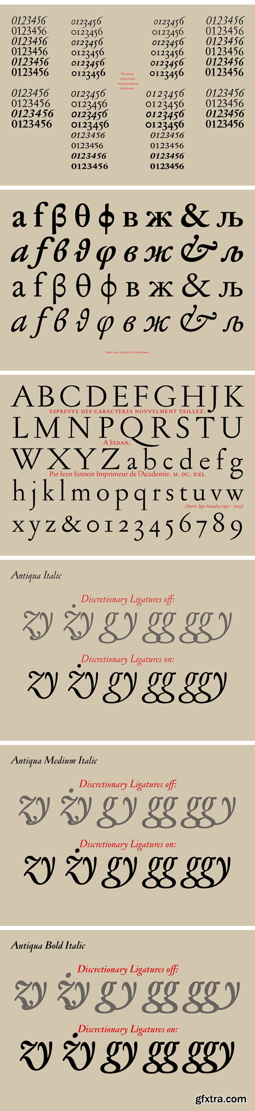
The engraver Jean Jannon ranks among the significant representatives of French typography of the first half of the 17th century. From 1610 he worked in the printing office of the Calvinist Academy in Sedan, where he was awarded the title "Imprimeur de son Excellence et de l'Academie Sédanoise". He began working on his own alphabet in 1615, so that he would not have to order type for his printing office from Paris, Holland and Germany, which at that time was rather difficult. The other reason was that not only the existing type faces, but also the respective punches were rapidly wearing out. Their restoration was extremely painstaking, not to mention the fact that the result would have been just a poor shadow of the original elegance. Thus a new type face came into existence, standing on a traditional basis, but with a life-giving sparkle from its creator. In 1621 Jannon published a Roman type face and italics, derived from the shapes of Garamond's type faces. As late as the start of the 20th century Jannon's type face was mistakenly called Garamond, because it looked like that type face at first sight. Jannon's Early Baroque Roman type face, however, differs from Garamond in contrast and in having grander forms. Jannon's italics rank among the most successful italics of all time – they are brilliantly cut and elegant.
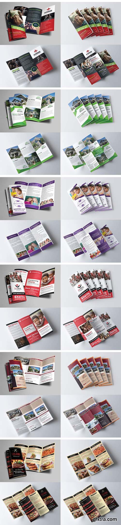
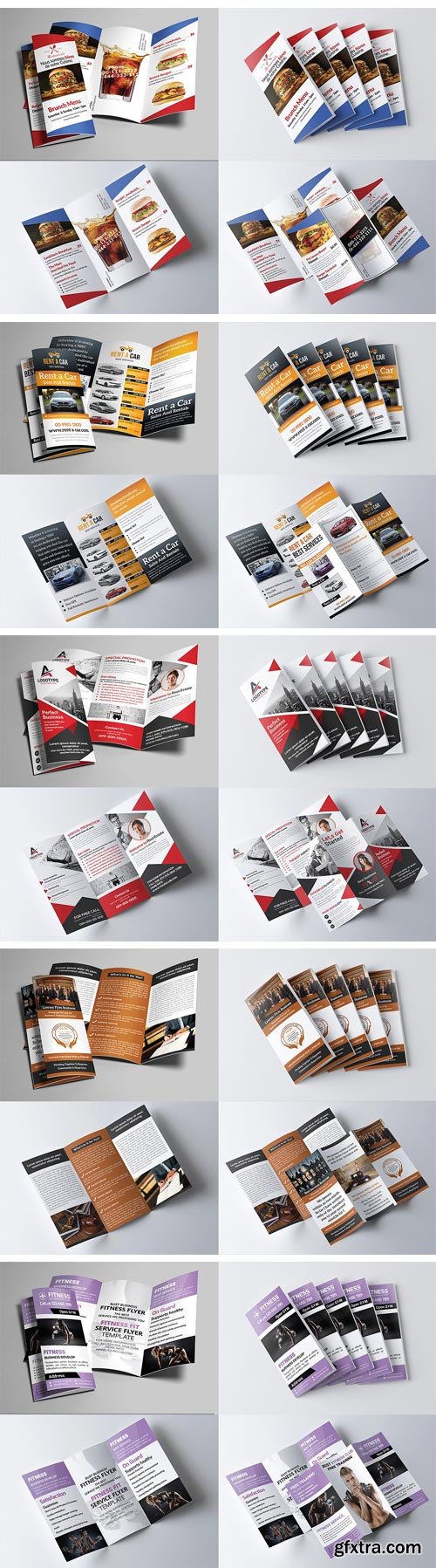
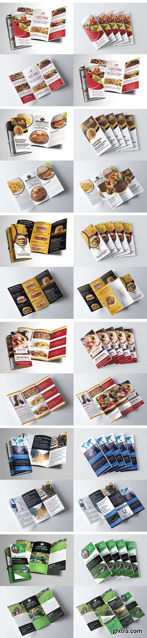
CM 1360988 - 30-Trifold Brochure Bundle
This Trifold Brochure Bundle is made in photoshop the files included are help file and photoshop psd’s. All psd’s are very well organized proper name groups and proper name layers. Very easy to edit very easy to insert images very easy to change text. Image placeholders are smartObjects to make easy for you to add image. And edit file.
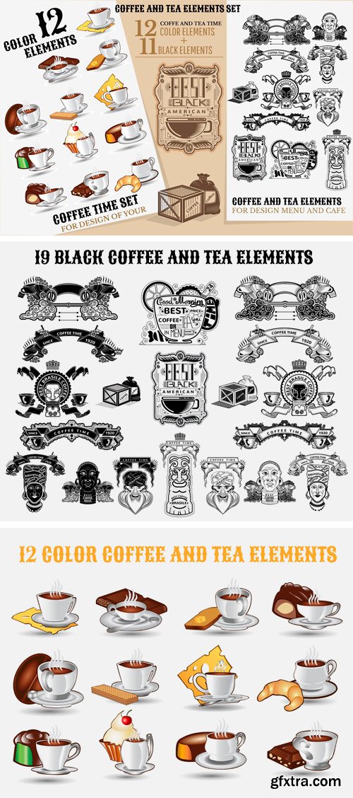
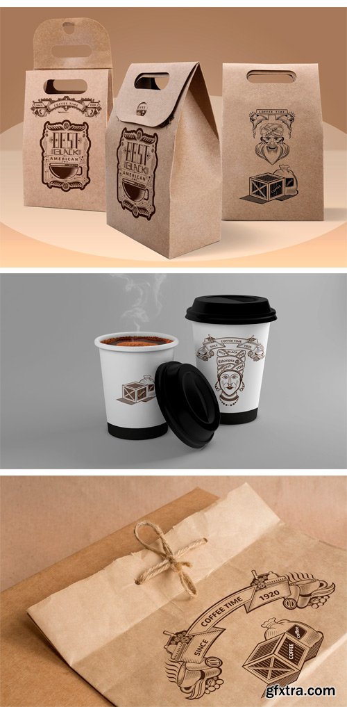
CM 1361525 - COFFEE AND TEA ELEMENTS SET
This great SET for your COFFEE AND TEA ELEMENTS SET design, cafe, menu, advertising, signboards, business cards, labels and any more. Zip contains: AI ( Made in CC save in CS required), EPS, JPEG files, PDF, PNG, SVG.
• 31 vector elements
• 23 unique vector objects and elements:
• 11 Black coffee and tea elements
• 12 Color coffee and tea elements
Fully editable text. Just double click to edit. All fonts used are available for free download. Names of free fonts and links on google fonts into zip file FONT.txt
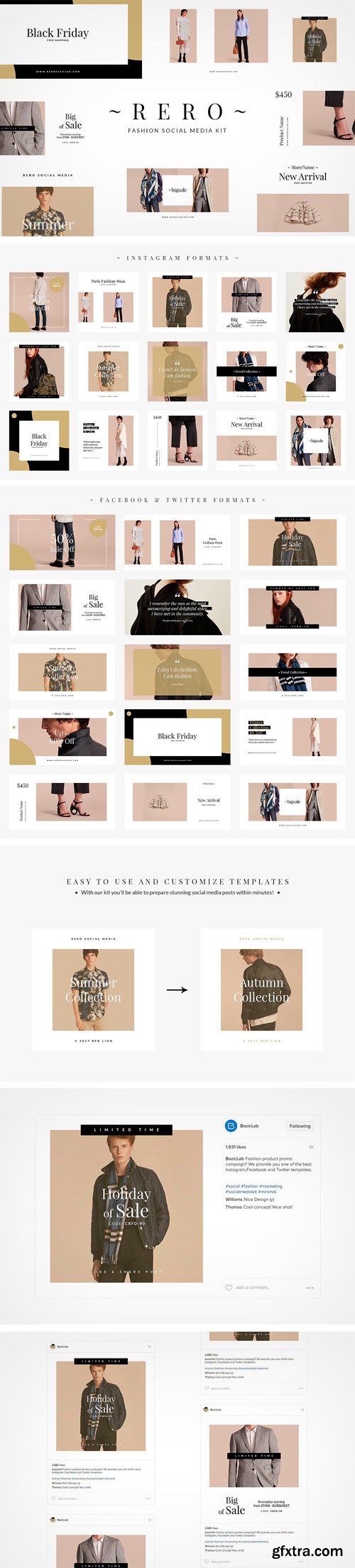
CM 1379492 - Rero Fashion Social Media Kit
Fashion product promo campaign? We provide you one of the best Instagram, Facebook and Twitter templates. this templates give you a new way to make your product looks more class on Instagram, Facebook and Twitter. So what are you waiting PSD files beautiful and organization in terms of design and also of their appearance in your account. All main elements are easily editable and customizable.
Features:
• 15 editable separate Adobe Photoshop files
• Compatible with Adobe Photoshop CS3+ / CC
• Square format
• Fully editable (colors, images, text & backgrounds)
• Only free fonts used (download links included in the .PDF file)
• Images can be easily replaced via Smart Objects
• All photographs & textures are included
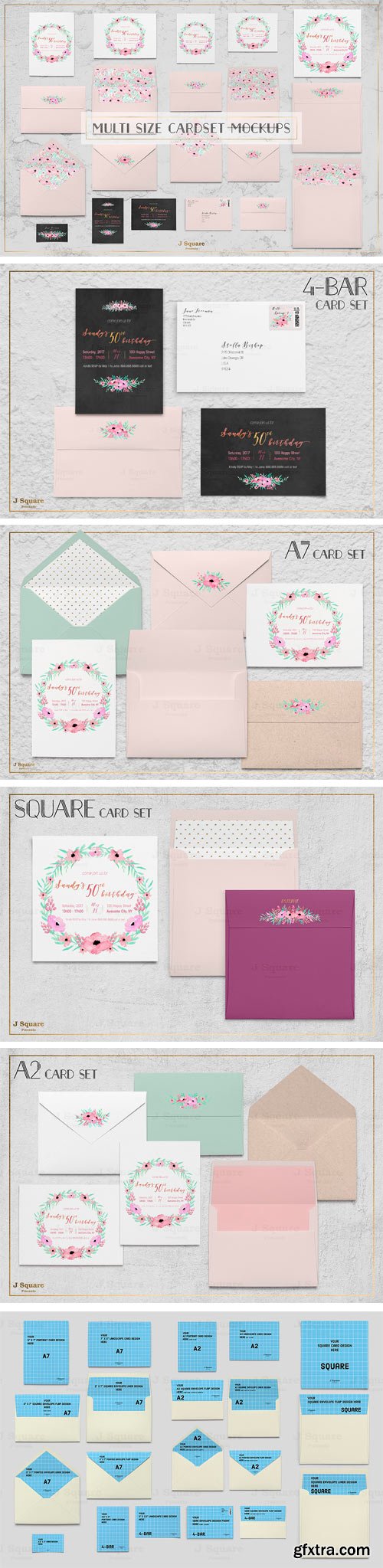
CM 1381965 - Multi Size Card Set Mock Ups
1 Photoshop file, as shown in image 6 (CS3 and up required):
• A7 portrait card (5" x 7")
• A7 landscape card
• A7 square envelope back view with editable flap
• A7 square envelope back view opened with removable liner
• A7 pointed envelope back view with editable flap
• A7 pointed envelope back view opened with removable liner
• A2 portrait card (4.25" x 5.5")
• A2 landscape card
• A2 square envelope back view with editable flap
• A2 square envelope back view opened with removable liner
• A2 pointed envelope back view with editable flap
• A2 pointed envelope back view opened with removable liner
• 4-bar portrait card
• 4-bar landscape card
• 4-bar square envelope back view with editable flap
• 4-bar square envelope front view with editable and removable postage
• Square card
• Square envelope back view with editable flap
• Square envelope back view opened with removable liner
• 3.5" x 2" landscape card
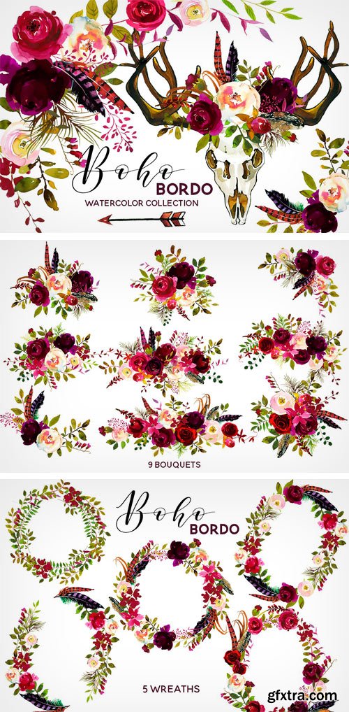
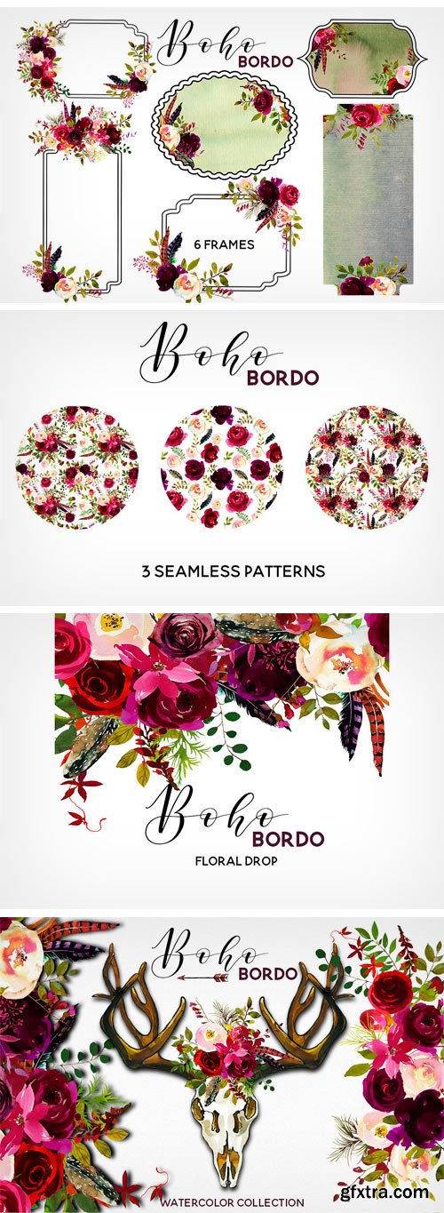

CM 1341159 - Boho Bordo Watercolor Flowers
Boho bordo watercolor floral collection includes over 80 PNG images. Great for wedding, baby shower invitation cards, greeting cards, printables, wall art, logo, web and blog designs, invitations and many more. All are PNG files (transaprent background) and high resolution - 300dpi.
You receive:
• 9 pre designed floral bouquets 14' (35cm) wide and smaller.
• 5 wreaths - 12' (30cm) wide.
• 1 floral drop - 12'(30cm) wide.
• 55 separate flowers and leaves - 6x6'(15x15cm) and smaller.
• 6 embellished frames
• 55 separate flowers and leaves - 6x6'(15x15cm) and smaller.
• 1 deer scull - 12'(30cm) wide
• deer antlers - 12'(30cm) wide
• 4 feathers and 2 arrow1 - 9'(22 cm) wide
• 4 watercolor spotches - 6'(15cm)wide
• 3 seamless patterns -5000x5000 pixels.
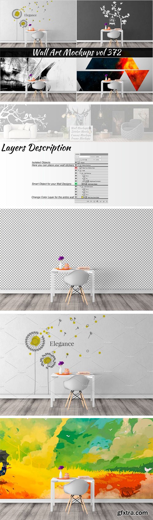
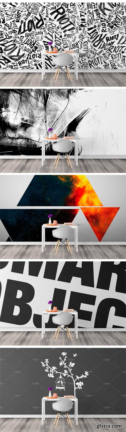
CM 1381780 - Wall Mockup - Sticker Mockup Vol 372
This wall mockup allows you to quickly display your designs and layouts into a digital photo realistic showcase. Please note that you must have basic photoshop knowledge to use this project.
Files Included:
• 1 PSD File with resolution 3840x2160
• 1 PDF Help File with description layers and quick guide
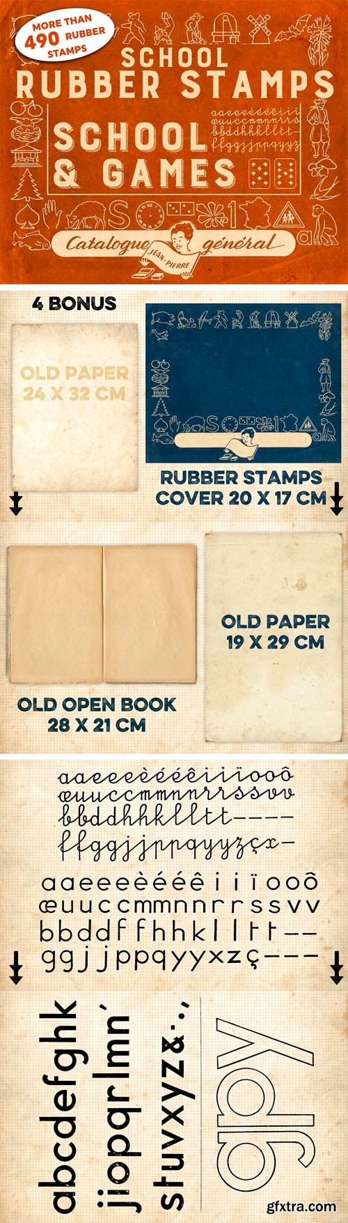
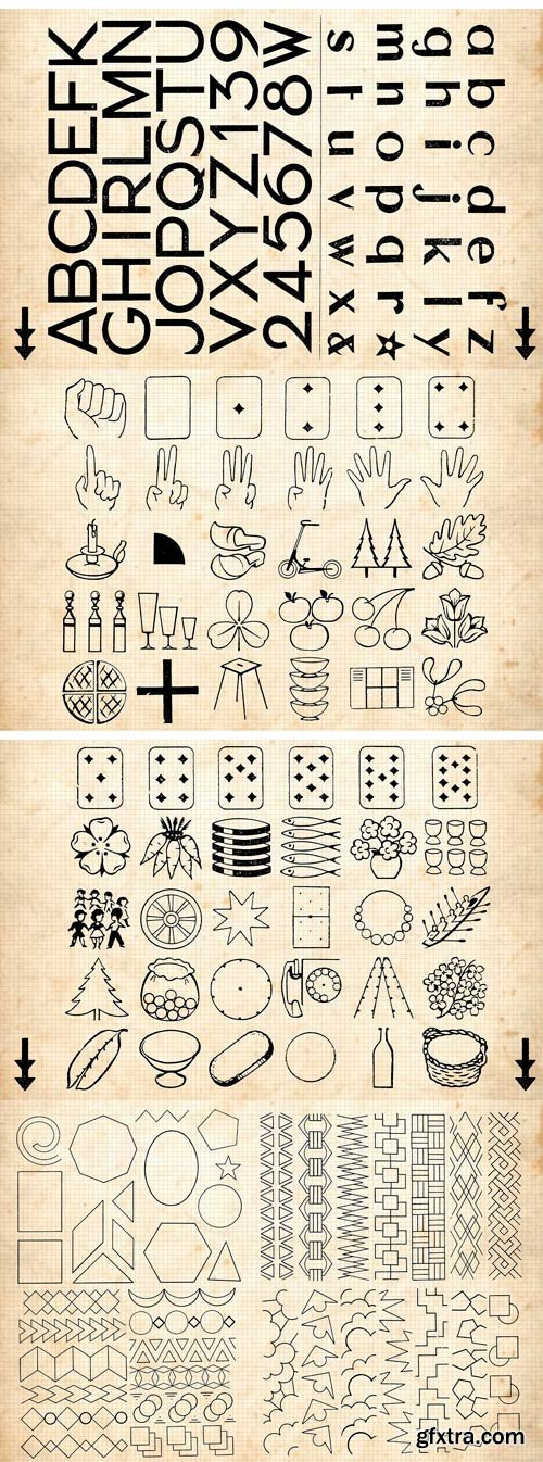
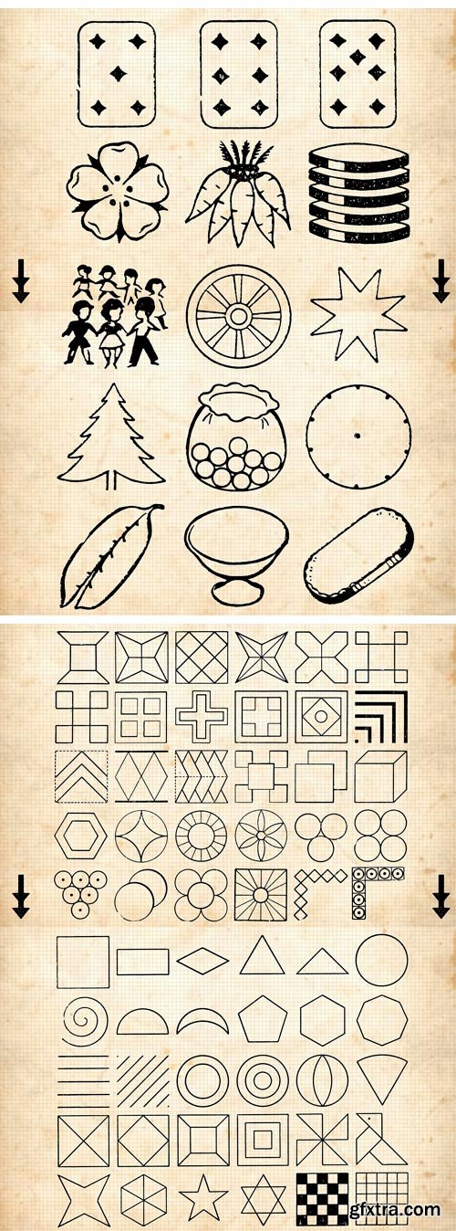
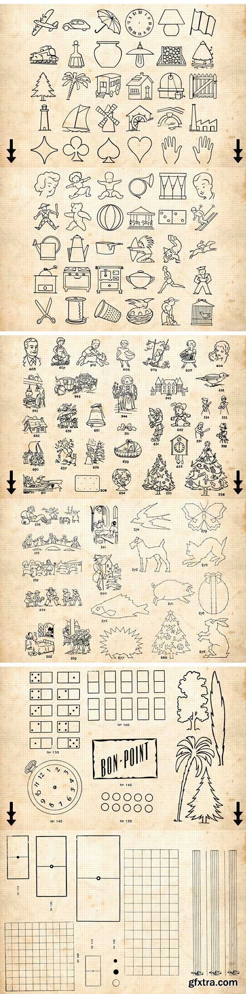
CM 1331597 - RUBBER STAMPS: SCHOOL+GAMES +4 BONUS
SCHOOL RUBBER STAMPS : SCHOOL AND GAMES / MADE IN FRANCE! This series of images comes from old French catalog of rubber stamps.
• The files are in TIFF. These are images in BITMAP mode at high resolution of 1200 dpi.
• To test the use of an image before buying this volume, you can download a sample at: http://www.benjamin-babron.com/00-DIVERS/RUBBER_STAMPS_SCHOOL_AND_GAMES_TEST.zip
• Depending on your needs, changing the color mode, resolution, every little bit image can be used in a larger format.
• Each volume comes with a few totally free bonuses, such as texture paper or old book.
CM 1379354 - 50 Payment Method Line Inverted Icon
Suitable for: Mobile Apps, Websites, Print, Presentation, Illustration, Templates. Features:
• Ready to use for all devices and platforms
• 6 Different formats: AI, CDR, EPS, JPG, PNG, SVG
• Designed using unigrid system
• Each Payment Methods icon is designed for maximum usability
• 100% vector icons – Easy to edit and scale
• 20 PNG Sizes
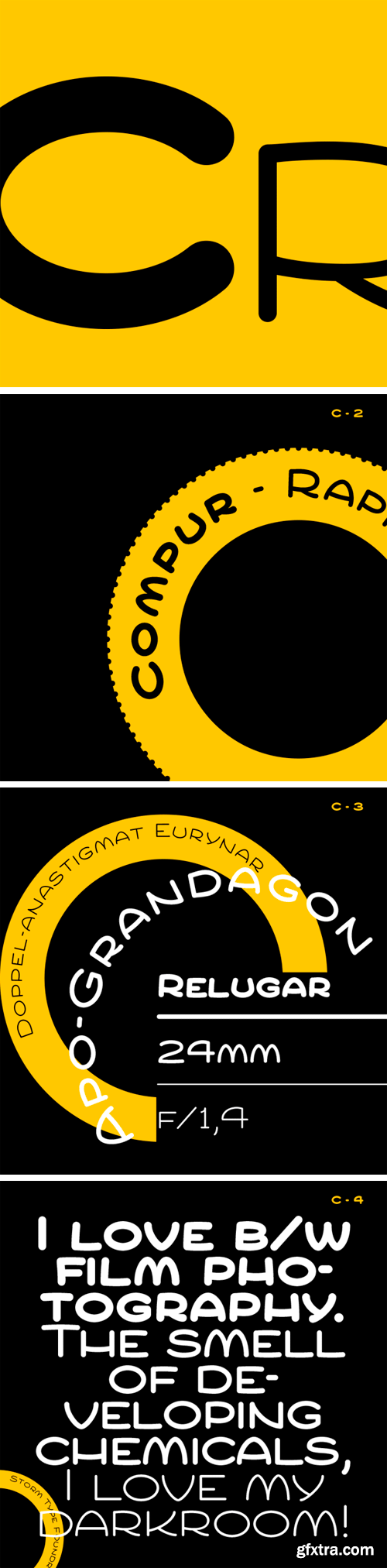
https://www.stormtype.com/families/cuper/
Compur is the name of the most famous photographic shutter of all time. This is a reconstruction of a type face which served for describing various devices, using the technique of monolinear engraving. With its soft forms, stringency of signs and period accent it ranks among the display alphabets offering the widest use in magazines, on posters and – for description of devices. It comes right in small sizes and in inscriptions arranged in a circle.
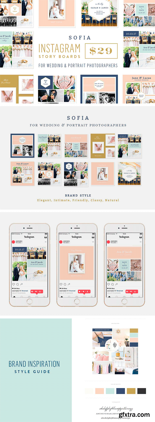
CM 1361265 - Instagram Story Boards - Sofia
10 Instagram Story Boards for Wedding & Portrait Photographers.
• Great to give your clients for their Save the Dates
• For your Instagram and Blog Posts for Wedding & Engagement Sessions
Photoshop files for you to edit and add your photos and change colors and fonts to fit your brand.
CM 1359864 - 250+ Bundle Icon set
250+ Bundle icon set with 2 styles (outline, glyph and filled outline). Include the source file (PNG, AI, EPS and SVG format).
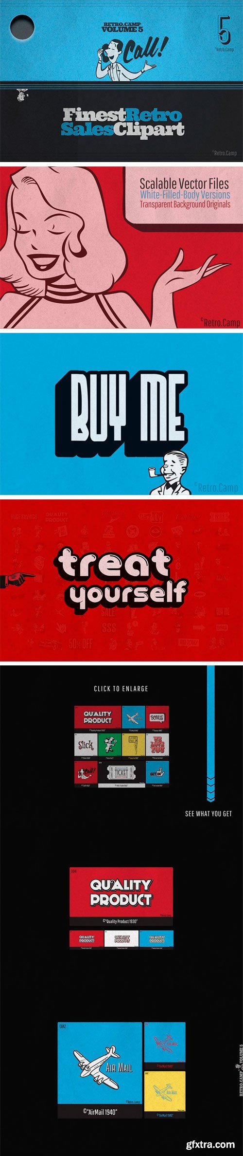
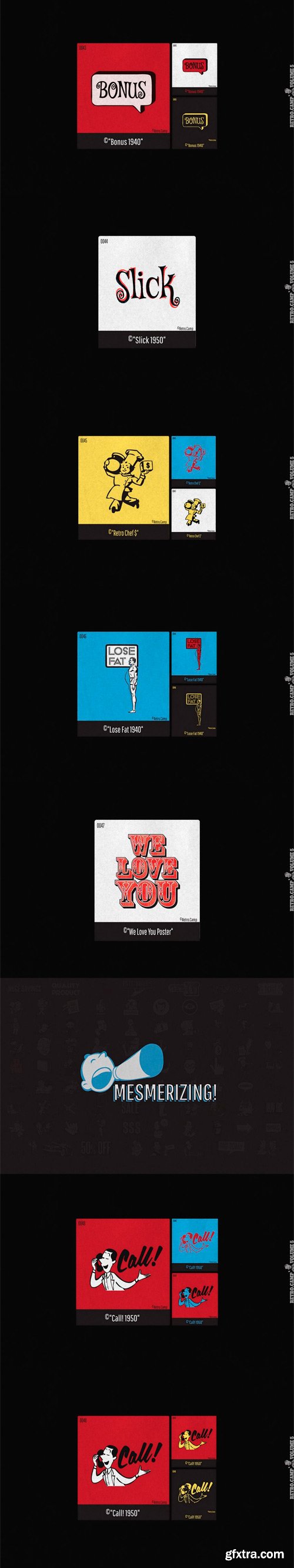
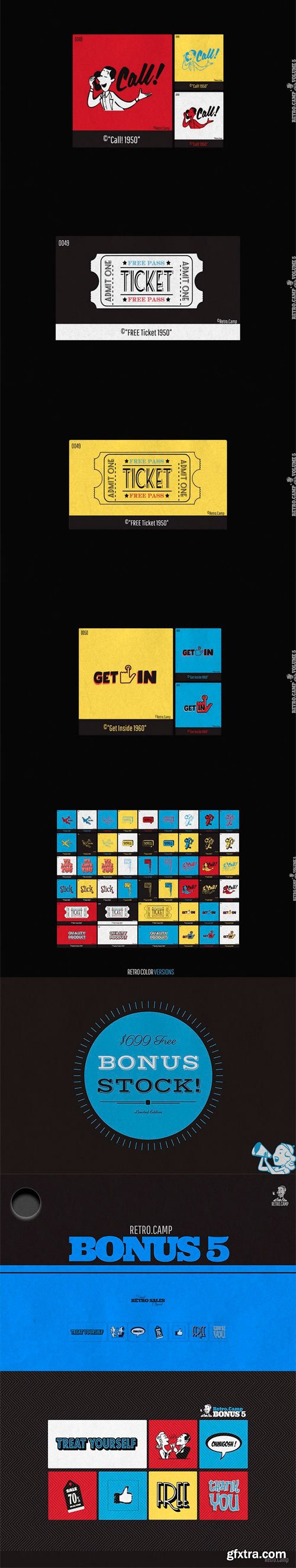
CM 1382237 - Retro.Camp BUNDLE - Volume 5
• Finest Retro Sales Clipart since 1940
• Call To Action (CTA) Design Elements
• Branding and Conversion Graphics
• Advertisement + Marketing Stock Illustrations
• Retro Ads Typography
• NO PHOTOSHOP / ILLUSTRATOR NEEDED - Ready To Use
• High Definition PNG Files
• Optimized SVG VECTOR
• EPS 10 Vector Files
• EDITABLE with ANY Vector Program
• White-Body EXCLUSIVE Versions
• Look Amazing On ANY BACKGROUND
• Original Transparent Versions
• RETRO COLOR Versions
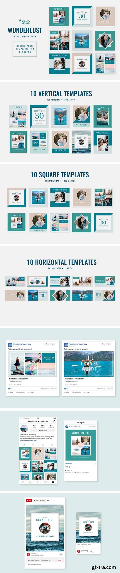
CM 1361688 - WUNDERLUST | Social Media Pack
WUNDERLUST | A Social Media Pack for Bloggers
Includes:
• 10 Square Templates Ideal for Instagram (1200x1200)
• 10 Vertical Templates Ideal for Pinterest (1200x1500)
• 10 Horizontal Templates Ideal for Facebook (1200x627)
• Customizable Color Palette
• Free Font Used
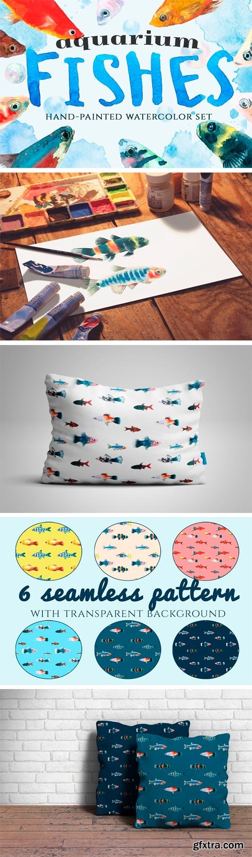
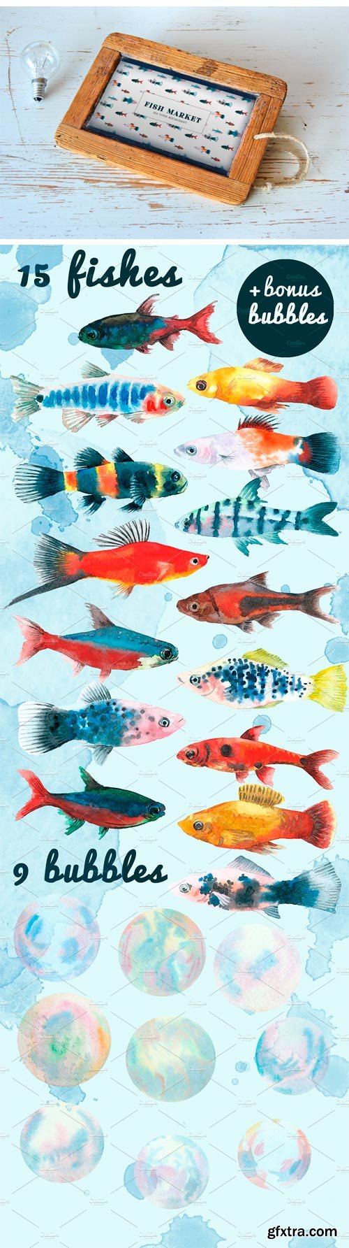
CM 1380758 - Aquarium Fishes
This is a lovely hand-drawn watercolor collection of aquarium fishes. This illustrations are perfect for scapbooking, designing cards, invitations, party decorations, children clothes, pillows, textile design and so many other things.
This set contains:
• 15 fishes
• 9 bubbles
• 6 seamless pattern
All in PNG format with transparent background -6 colorful seamless pattern in JPEG
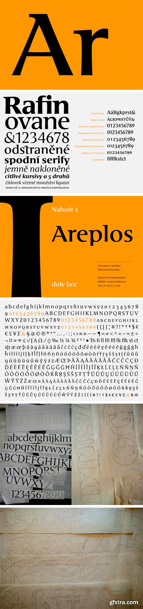
https://www.stormtype.com/families/areplos/
To design a text typeface „at the top with, at the bottom without” serifs was an idea which crossed my mind at the end of the sixties. I started from the fact that what one reads in the Latin alphabet is mainly the upper half of the letters, where good distinguishableness of the individual signs, and therefore, also good legibility, is aided by serifs. The first tests of the design, by which I checked up whether the basic principle could be used also for the then current technology of setting – for double-sign matrices –, were carried out in 1970. During the first half of the seventies I created first the basic design, then also the slanted Roman and the medium types. These drawings were not very successful. My greatest concern during this initial phase was the upper case A. I had to design it in such a way that the basic principle should be adhered to and the new alphabet, at the same time, should not look too complicated. The necessary prerequisite for a design of a new alphabet for double-sign matrices, i.e. to draw each letter of all the three fonts to the same width, did not agree with this typeface. What came to the greatest harm were the two styles used for emphasis: the italics even more than the medium type. That is why I fundamentally remodelled the basic design in 1980. In the course of this work I tried to forget about the previous technological limitations and to respect only the requirements then placed on typefaces intended for photosetting. As a matter of fact, this was not very difficult; this typeface was from the very beginning conceived in such a way as to have a large x-height of lower-case letters and upper serifs that could be joined without any problems in condensed setting. I gave much more thought to the proportional relations of the individual letters, the continuity of their outer and inner silhouettes, than to the requirements of their production. The greatest number of problems arose in the colour balancing of the individual signs, as it was necessary to achieve that the upper half of each letter should have a visual counterbalance in its lower, simpler half. Specifically, this meant to find the correct shape and degree of thickening of the lower parts of the letters. These had to counterbalance the upper parts of the letters emphasized by serifs, yet they should not look too romantic or decorative, for otherwise the typeface might lose its sober character. Also the shape, length and thickness of the upper serifs had to be resolved differently than in the previous design. In the seventies and at the beginning of the eighties a typeface conceived in this way, let alone one intended for setting of common texts in magazines and books, was to all intents and purposes an experiment with an uncertain end. At this time, before typographic postmodernism, it was not the custom to abandon in such typefaces the clear-cut formal categories, let alone to attempt to combine the serif and sans serif principles in a single design. I had already designed the basic, starting, alphabets of lower case and upper case letters with the intention to derive further styles from them, differing in colour and proportions. These fonts were not to serve merely for emphasis in the context of the basic design, but were to function, especially the bold versions, also as independent display alphabets. At this stage of my work it was, for a change, the upper case L that presented the greatest problem. Its lower left part had to counterbalance the symmetrical two-sided serif in the upper half of the letter.
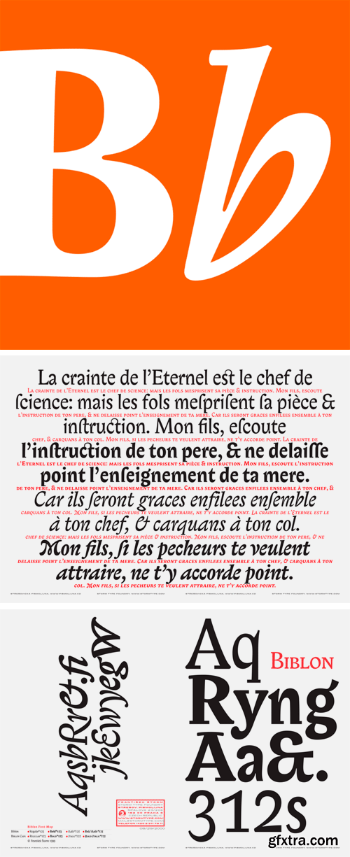
https://www.stormtype.com/families/biblon-pro
Next generation of award-winning typeface (Excellence in Typography by TDC in 2000, Bukva-Raz! in 2002) Biblon. This 6-font family contains all styles as published by us and by ITC in 2000, plus many more in the 2006 version: new, interpolated Medium colour is a useful contribution for display purposes, numerous glyphs were newly created, old ones redrawn, more swashes of Italics added, 27 new ligatures, and 12 new OpenType Features enable real professional work. Among significant changes you can see slightly taller Small Caps, better kerning, etc... In our modern times people print ever more futile ideas and intersperse them with many blank pages. There is no need to economize on paper and to look out for optically narrowed type faces. An opposite situation is in every biblical society where the editors must cram a text containing some 2000 pages into a single volume. That is where there is a need for type faces which are economizing, legible and spiritually cultivated. The new Biblon type face, therefore, does not need to rely on a wide range of sizes; it is sufficient if it looks well from approximately five to eighteen points. Its elegance decreases commensurately with its increasing size. In poster sizes the speculative construction of the letter form is already revealed – the points of gravity of the strokes are shifted as much as possible in the horizontal directions and the crotches – the spaces between the rounded stroke and the shaft – are emphasized. In small-size letters we hardly notice that almost all horizontal serifs (if they have not disappeared entirely) have been pushed inside the letter form so that they should not hamper the adjacent letters. To quieten the lines, the accents have been miniaturized as well. The figures have uniform width and avow the lower case principle. The italics of Biblon have been stylized more daringly, with the use of long-forsaken Rococo elements. The slanted designs of the small capitals have upper case letters slightly submerged under the capital line, in order to enhance the decorative character of titles and headings. Biblon has a large x-height of lower-case letters and one can get used to its compressed proportions. Many condensed type faces leave a feeling of distress after longer reading. Here, however, this has been sophisticatedly eliminated. We have availed ourselves in this type face design also of several optical tricks dating from fairly recent period, but our main source of inspiration was the daringness of type designers of the 18th century. Underneath the contemporary-looking design of Biblon one can conjecture a Baroque play with the shifting of shadows, intentional overstatement or absolute simplification of forms. Even though Biblon probably will not be used for its purpose in the near future, it represents a very sound body type.
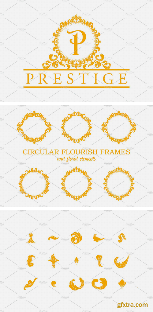
CM 1340404 - Circular Flourish Frames
Set of 6 Elegant Circular Classic Decorative Floral Ornamental Vintage Swirl Acanthus Frame.
Files Included:
• 1 EPS file (vector of circular frames and floral elements)
• 1 PSD files (Layered of circular frames and floral elements)
• 7 Transparent PNG files (High Res of 6 circular decorative frames)
• 7 JPG files (High Res of 6 circular decorative frames)
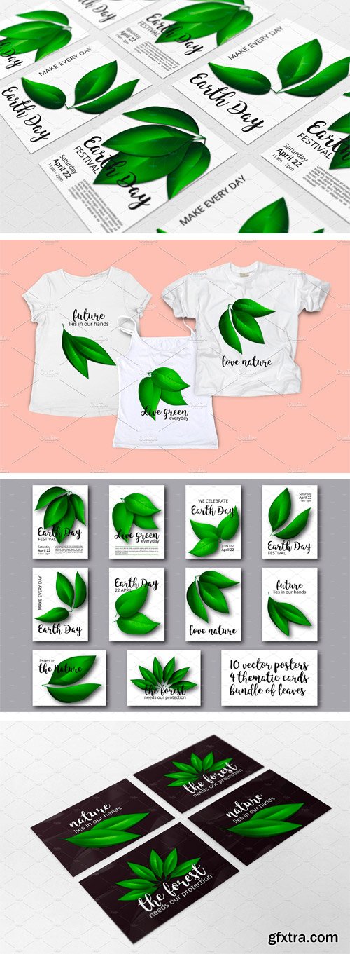
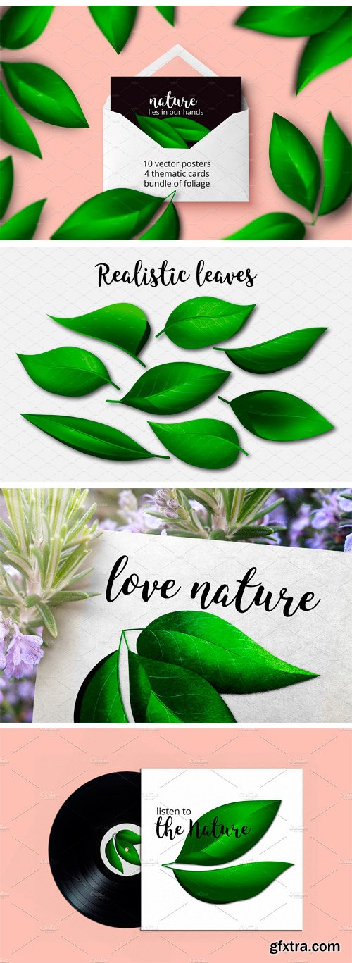
CM 1382028 - EARTH DAY Foliage Vector Set
Minimalism and little text make the posters universal and easy editable. The illustration and quotes can be applied as prints on T-shirts, cups, paper bags, tags etc. Alternatively, based on them you can prepare your own design. The bundle is great for environmental and ecological themes in general, since the quotes call for respecting nature, saving the forest, thinking about our future and living green.
What is included:
• 10 ready to print posters on white background in the standard medium poster size – 18“ x 24” (46 cm x 61 cm) in the following formats: 10 separate AI files (high resolution, RGB color mode); 10 separate very high quality JPG files, 300 ppi; 10 separate PNG files, 300 ppi, transparent background;
• 4 posters with sample text just as an example of possible composition each one in a separate AI file (high resolution, RGB color mode);
• 4 ready to print thematic cards with various nature quotes: 4 separate AI files (high resolution, RGB color mode); 4 separate very high quality JPG files, 300 ppi;
• 1 set of realistic vector leaves: in AI file (high resolution, RGB color mode).
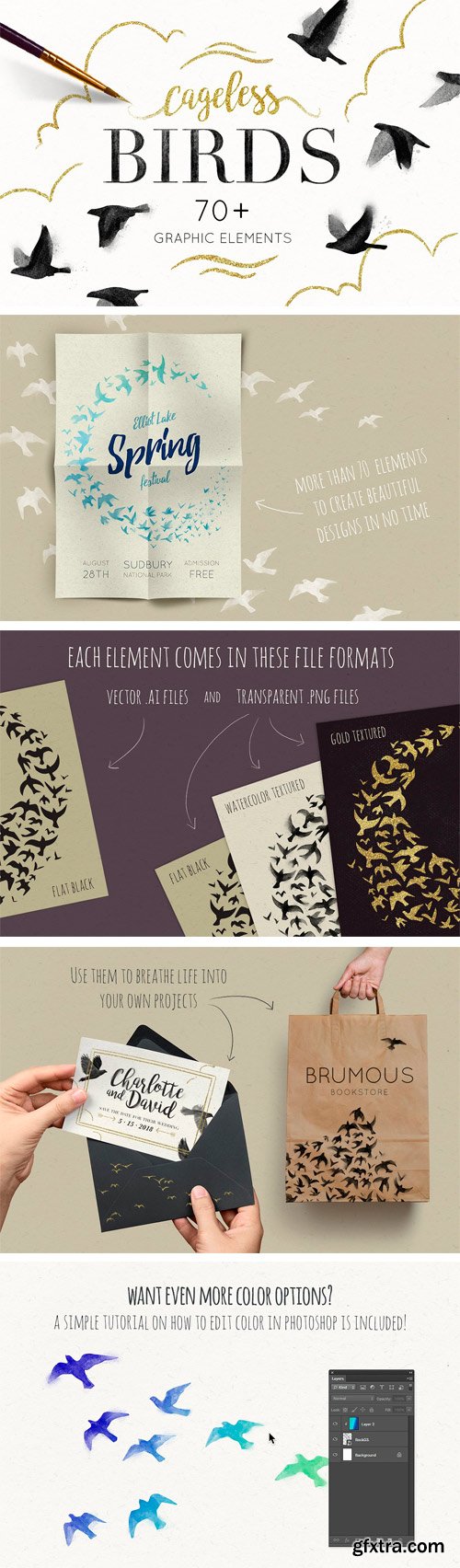
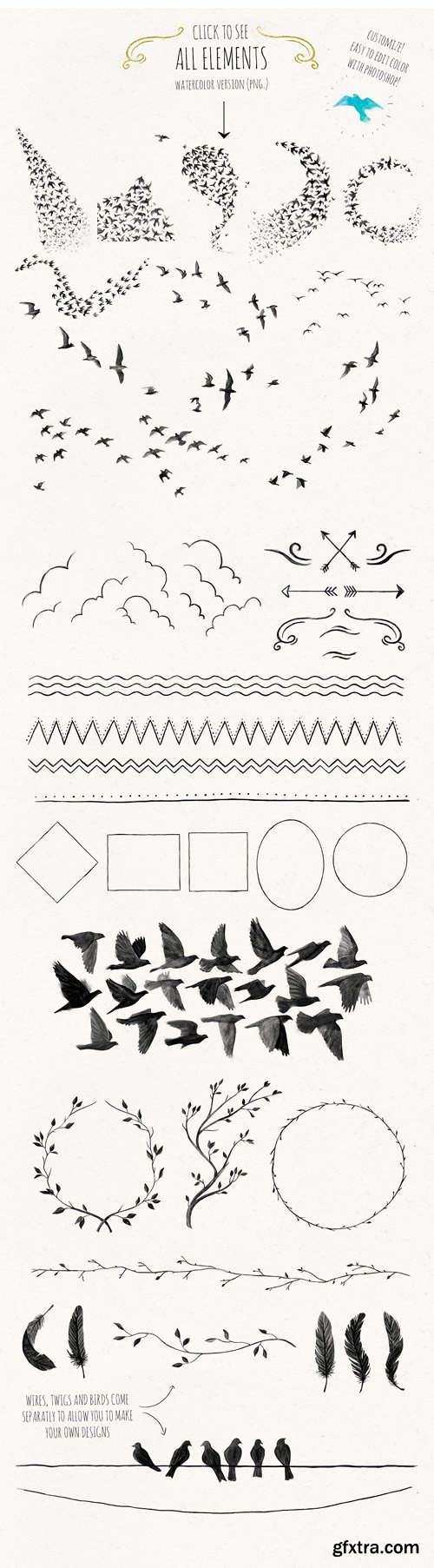
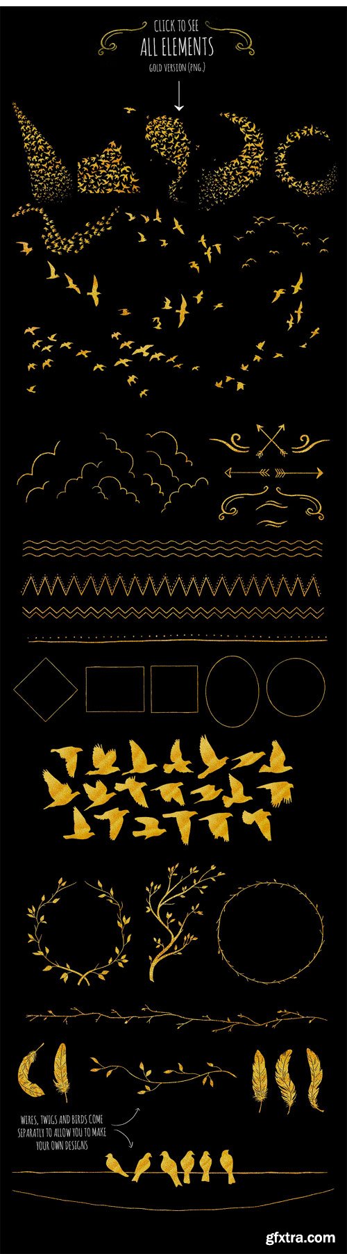
CM 1327103 - Cageless Birds
Celebrate spring with style! Cageless Birds is a pack of more than 70 graphic elements in both .png (watercolor-textured, gold-textured and flat black) and .ai (flat black) for you to design with.
What's inside the pack?
• 14 flocks of birds ;
• 26 single birds ;
• 5 detailed feathers ;
• 27 frames, clouds and decorative doodles to enhance your designs ;
• 6 twigs, branches, wreaths and wires to put your birds on ;
Bonus: A simple photoshop (both CS and elements) tutorial on how to edit the graphic's color.
Files included
• A vector file .ai containing all the elements in a flat silhouette editable to your taste. Works great in Illustrator CS2+ ;
• 70 watercolor-textured .png (300dpi) graphic elements, each of them on an individual transparent .png ;
• 70 gold-textured .png (300dpi) graphic elements, each of them on an individual transparent .png ;
• 70 dark, flat .png (300dpi) graphic elements, each of them on an individual transparent .png.
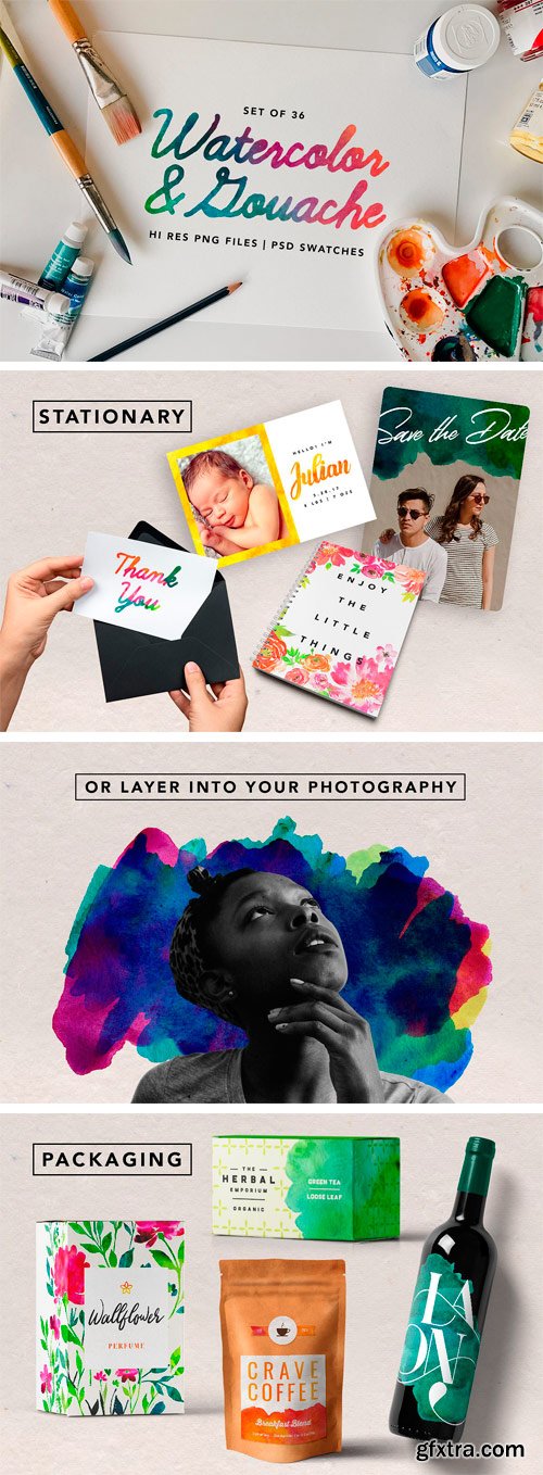
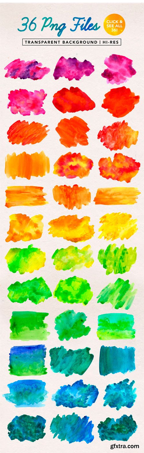
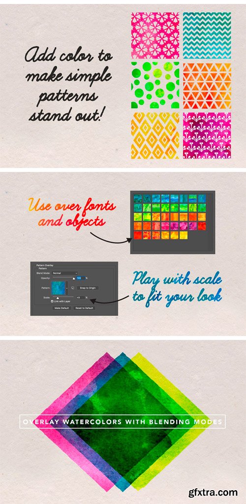
CM 1354848 - Watercolor & Gouache Textures
Add a handmade feel to your work with this watercolor and gouache pack. Each piece was painted with love, scanned, and cleaned up to work for all of your design needs. No need to spend time creating your own. This set provides a variety of washes from flat to gradient colors. Use these watercolor for everything from typography, patterns, wedding invitations, packaging and more!
Here's what's included:
• 36 PNGs with transparent background | 500 dpi
• 36 PSD pattern swatches (.abr format)
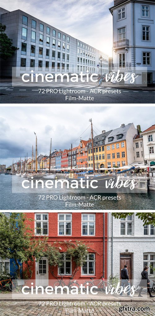
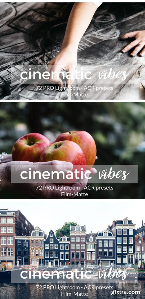
CM 1380759 - Cinematic Vibes Lightroom Presets
The Cinematic Vibes collection is a professionally done bundle of Adobe Lightroom and Adobe Camera Raw presets created to emulate the cinematic style. They give to the images a combination of color saturation, depth, brightness and high sharpness, giving your photographs a professional look. These presets work great with landscapes, urban, travel photography and lifestyles. You can easily adjust the presets to your own style. The effect of the presets may vary depending on the particular characteristics of the original photo. This pack contains a total of 72 Lightroom and 61 Adobe Camera Raw presets.
Top Rated News
- Sean Archer
- AwTeaches
- Learn Squared
- PhotoWhoa
- Houdini-Course
- Photigy
- August Dering Photography
- StudioGuti
- Creatoom
- Creature Art Teacher
- Creator Foundry
- Patreon Collections
- Udemy - Turkce
- BigFilms
- Jerry Ghionis
- ACIDBITE
- BigMediumSmall
- Boom Library
- Globe Plants
- Unleashed Education
- The School of Photography
- Visual Education
- LeartesStudios - Cosmos
- All Veer Fancy Collection!
- All OJO Images
- All ZZVe Vectors
