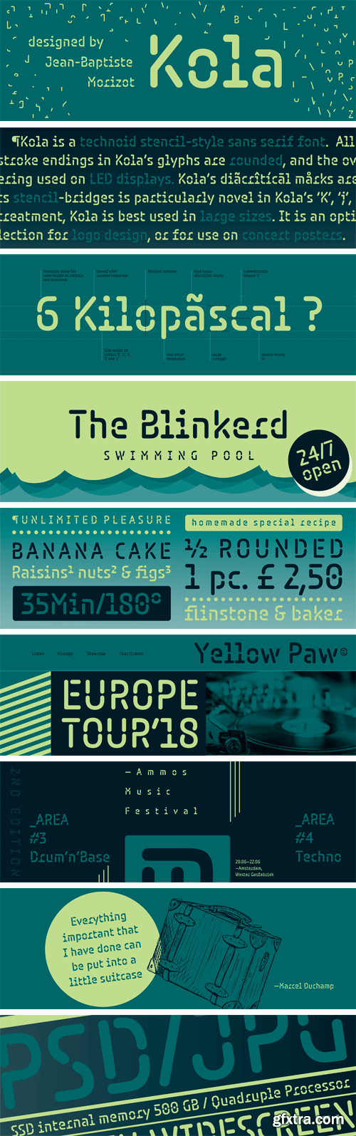
Kola Font
Kola is a technoid stencil-style sans serif font. All of the stroke endings in Kola’s glyphs are rounded, and the overall effect of Paris-based type designer Jean-Baptiste Morizot’s stencilling is a bit reminiscent of the kind of lettering used on LED displays. Kola’s lowercase letters have a large x-height, and the ascenders rise up to the same height as the tops of the font’s capital letters and numbers. Despite the x-height being tall, Kola’s diacritical marks are still huge.

Rowan Font Family
Rowan is a family of serif fonts intended for setting long passages of text for immersive reading. It can be used in both normal text sizes, and really small sizes, too. This is due to its particularly chunky serifs and stroke-endings. The family features five different weights, ranging from Light through Bold. Even in the Light weight, Rowan’s unique serif and stroke-ending-structure give the text a degree of visible stroke contrast. Each weight has an upright and an italic font on offer. The default numerals in each font are oldstyle figures; however, lining figures are also available via an OpenType feature.
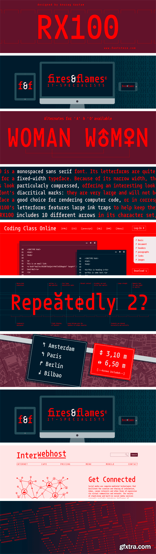
RX100 Font
RX100 is a monospaced sans serif font. Its letterforms are quite condensed, even for a fixed-width typeface. Because of its narrow width, the capital letters look particularly compressed, offering an interesting look in mixed-case text. RX100’s ascenders are quite tall; they really reach over top of the capitals. The same is true for the font’s diacritical marks: they are very large and will not be overlooked in a text – nor is one diacritical mark likely to be confused for another.
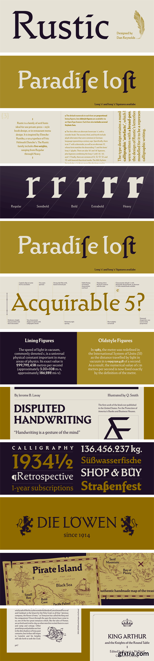
Rustic Font Family
Rustic is a family of serif fonts ideal for use private-press—style book design, or in restaurant menu design. It is inspired by Ehmcke-Rustika, a 1914 typeface of Fritz Helmuth Ehmcke’s. The Rustic family includes five weights, ranging from Regular through Heavy. The default numerals in each font are proportional lining figures, but oldstyle figures are available via an OpenType feature. Each font also includes several Stylistic Sets. The first offers an alternate lowercase ‘e’, with a rounder beak.
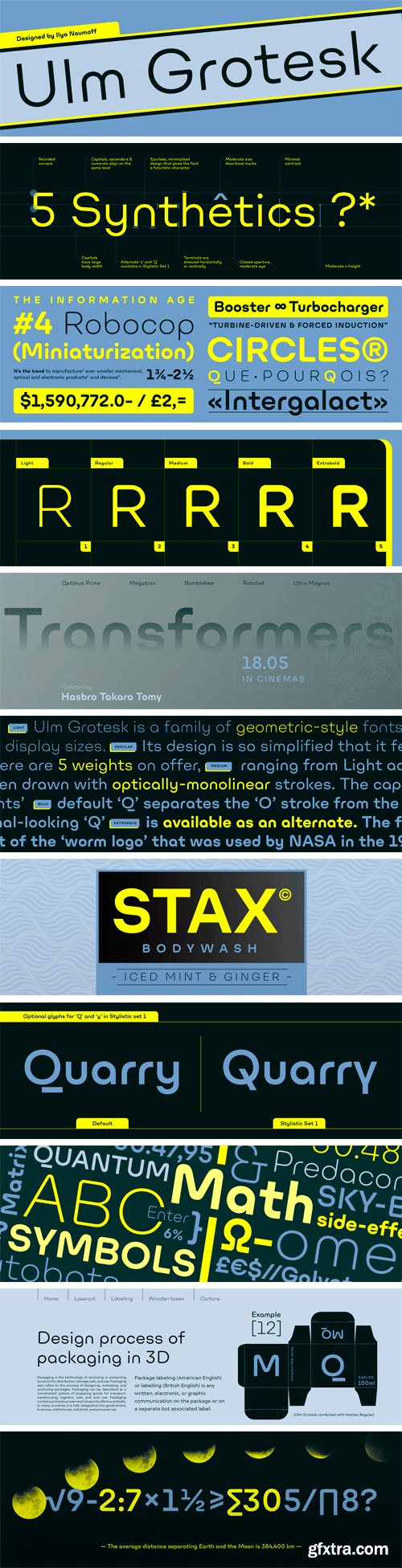
Ulm Grotesk Font Family
Ulm Grotesk is a family of geometric-style fonts for use at display sizes. Its design is so simplified that it feels quite futuristic. There are five weights on offer, ranging from Light to Extra Bold. The characters have been drawn with optically-monolinear strokes. The capital letters contain quite a lot of character; some of them are markant, too.
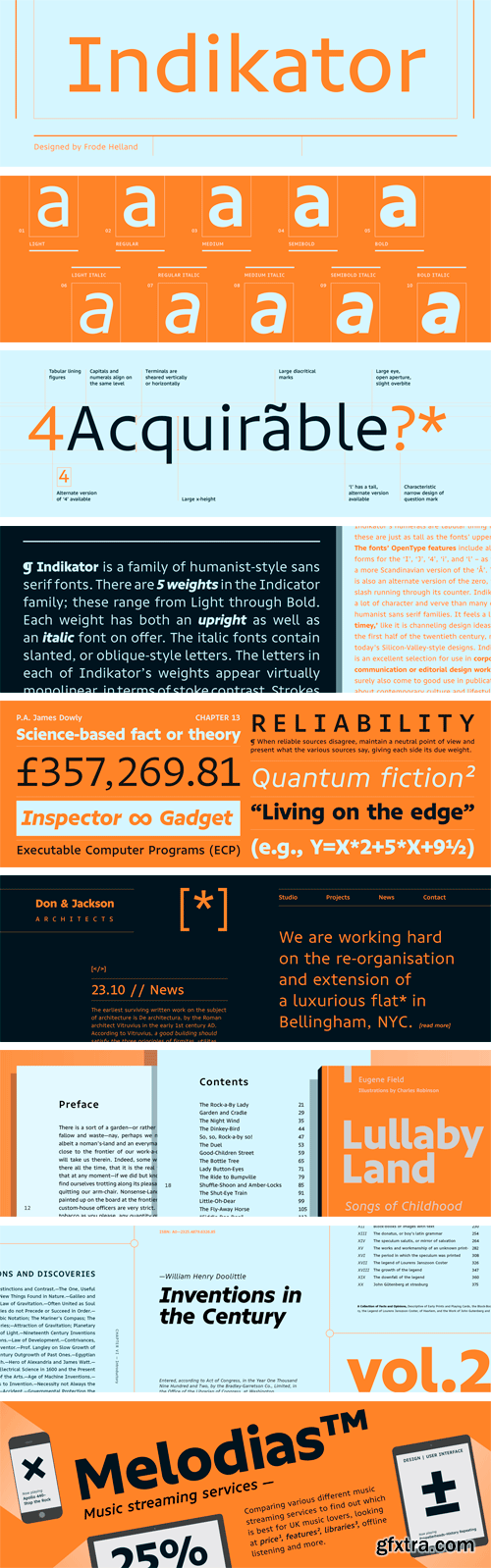
Indikator Font Family
Indikator is a family of humanist-style sans serif fonts. There are five weights in the Indicator family; these range from Light through Bold. Each weight has both an upright as well as an italic font on offer. The italic fonts contain slanted, or oblique-style letters. The letters in each of Indikator’s weights appear virtually monolinear, in terms of stoke contrast. Strokes end in either horizontal or vertical cuts, rather than in diagonals.
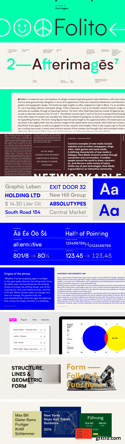
Folito Font Family
Folito is a modernist sans serif typeface. Its design combines typically grotesk-style letterforms, with some characters that are quite geometrically-designed. In terms of its appearance, Folito was inspired by Modernism and Industrial-Era graphic and typographic design. The family has five weights on offer, ranging from Light to Black. It is an excellent choice for use in branding, editorial, and poster design. Folito’s lowercase ‘a’ and ‘g’ are double-storied; however, single-storied alternates are available, through an OpenType feature.
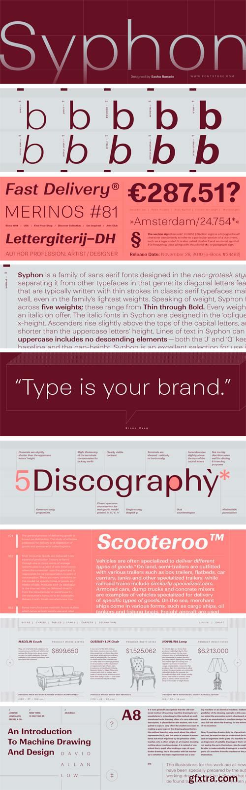
Syphon Font Family
Syphon is a family of sans serif fonts designed in the neo-grotesk style. It also includes a little kick, separating it from other typefaces in that genre: its diagonal letters feature stark contrast. The diagonals that are typically written with thin strokes in classic serif typefaces maintain thin strokes in Syphon as well, even in the family’s lightest weights. Speaking of weight, Syphon features ten font styles spread across five weights; these range from Thin through Bold.
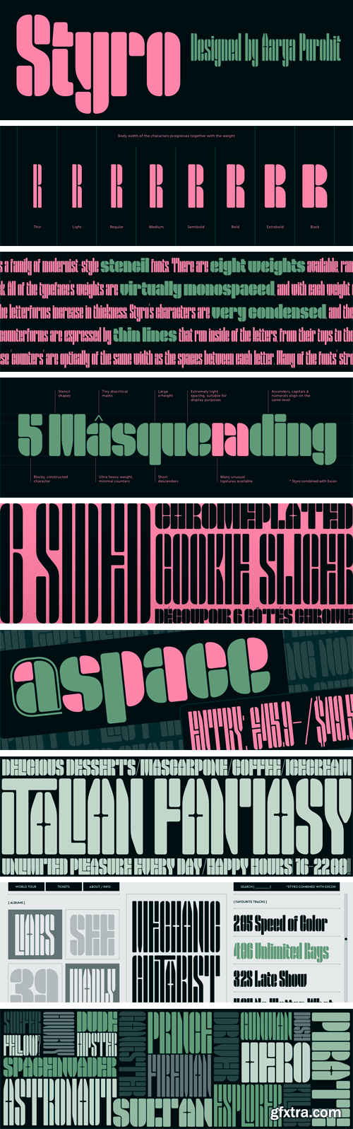
Styro Font Family
Styro is a family of modernist-style stencil fonts. There are eight weights available, ranging in color from Thin through Black. All of the typeface’s weights are virtually monospaced, and with each weight of the family, the outside ‘strokes’ building up the letterforms increase in thickness. Styro’s characters are very condensed, and their design employs a reductionist formal vocabulary. For example, the counterforms are expressed by thin lines that run inside of the letters, from their tops to their bottoms.
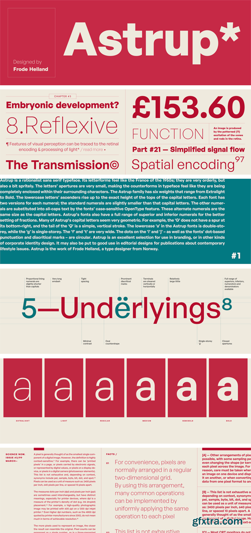
Astrup Font Family
Astrup is a rationalist sans serif typeface. Its letterforms feel like the France of the 1950s; they are very orderly, but also a bit spritely. The letters’ apertures are very small, making the counterforms in typeface feel like they are being completely enclosed within their surrounding characters. The Astrup family has six weights that range from Extralight to Bold. The lowercase letters’ ascenders rise up to the exact height of the tops of the capital letters.
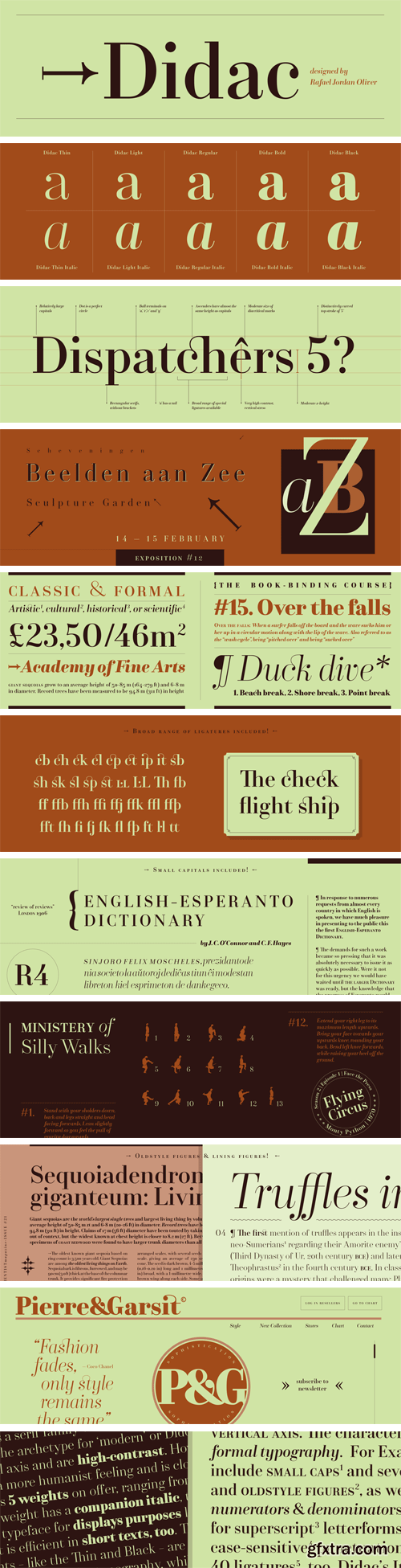
Didac Font Family
Didac is a serif family whose letters follow the archetype for ‘modern’ or Didone-style serif faces. They feature a vertical axis and are high-contrast. However, Didac’s structure has a different ductus than some of the most-common moderns; it has a more humanist feeling and is closer to transitional typefaces like Baskerville than one might expect. The family has five weights on offer, ranging from Light through Black. Each weight has a companion italic, too. Didac is a typeface for displays purposes like headlines, but it is efficient in short texts, too. The more extreme weights – like the Thin and Black – are especially suited for headlines and display typography, while the Regular and Italic styles are more likely to hold up well in book and magazine typesetting.
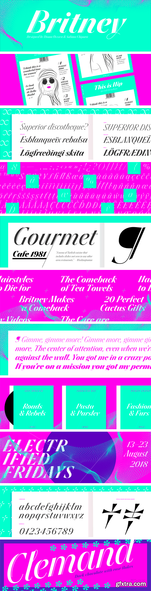
Britney Font Family
This is a quirky display family with very high contrast and double strokes on the stems. It lives on the border between sans serif, cursive, and script typeface. The shapes are loosely based on experiments we made with the pointed brush, but we kept the Britney very clean and crisp as opposed to giving it a handwriting feel. Unlike other typefaces inspired by the pointed pen, capital letters have been kept rather simple, without loops or flourishes. That way, the used can even use words in all-caps if wanted.
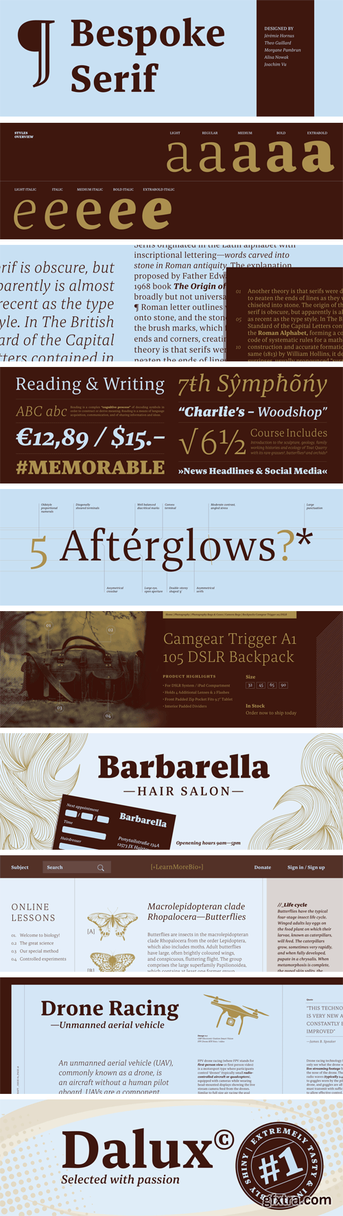
Bespoke Serif Font Family
Bespoke Serif is family of serif fonts intended for use in text sizes: this is a typeface designed for reading. The serifs at the end of the letterforms’ strokes are wedge-shaped. The letterforms themselves feature large and open counterforms, which help maximise the typeface’s legibility. The family includes five weights, ranging from Light through Bold.
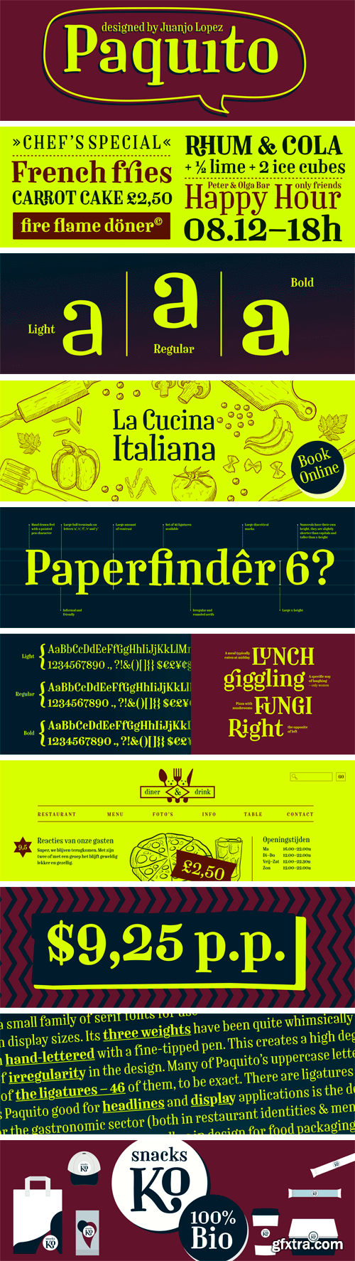
Paquito Font Family
Paquito is a small family of serif fonts for use in display sizes. Its three weights have been quite whimsically drawn by type designer Juanjo Lopez. The letterforms are condensed in width, and they all look as if they had been hand-lettered with a fine-tipped pen. This creates a high degree of irregularity in the design. Many of Paquito’s uppercase letters are top-heavy; for example, the upper counter of the ‘R’ is much larger than its lower one. The numerals are neither lining figures nor oldstyle figures; instead, their tops fall somewhere between the x-height and cap-height, and they feature some descending elements, too.
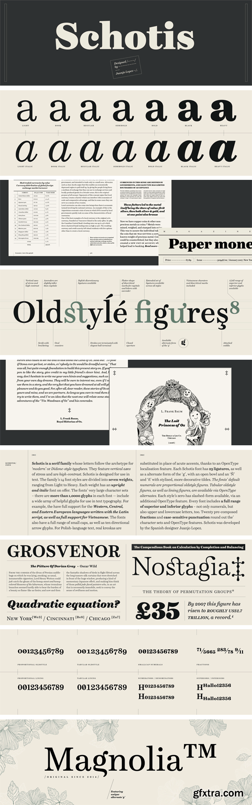
Schotis Font Family
Schotis is a serif family whose letters follow the archetype for ‘modern’ or Didone-style typefaces. They feature vertical axes of stress and are high-contrast. Schotis is designed for use in text. The family’s 14 font styles are divided into seven weights, ranging from Light to Black. Each weight has an upright and italic font on offer. The fonts’ very large character sets – there are more than 1,0000 glyphs in each font — include a wide array of helpful glyphs for use in text typography.
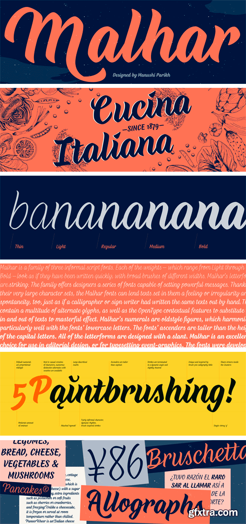
Malhar Font Family
Malhar is a family of three informal script fonts. Each of the weights – which range from Light through Bold – look as if they have been written quickly, with broad brushes of different widths. Malhar’s letterforms are striking. The family offers designers a series of fonts capable of setting powerful messages. Thanks to their very large character sets, the Malhar fonts can lend texts set in them a feeling or irregularity and spontaneity, too, just as if a calligrapher or sign writer had written the same texts out by hand.
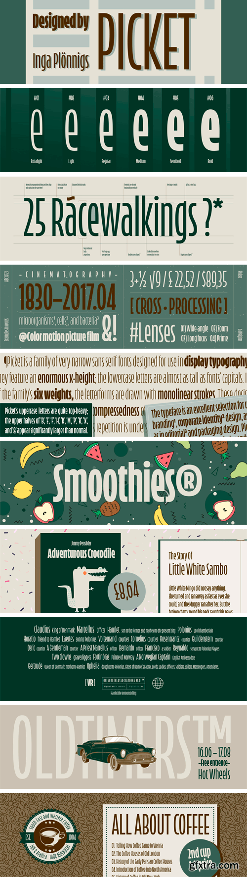
Picket Font Family
Picket is a family of very narrow sans serif fonts designed for use in display typography. They feature an enormous x-height; the lowercase letters are almost as tall as fonts’ capitals. In each of the family’s six weights, the letterforms are drawn with monolinear strokes. These decisions, combined with the general compressedness of the typeface, create a strong vertical-stroke rhythm. Indeed, this verticality and its repetition is underscored by the family’s name: Picket (as in a ‘picket fence’).

Striper Font
Striper is a decorative sans serif font. In almost every letter or numeral in the font whose form contains a straight line (a horizontal, vertical, or diagonal stroke), that line has been replaced with a zebra-striped pattern. This whimsical effect adds levity and ornament to any texts set with the font. Because of the size of the stripes in Striper’s patterns, the Striper font is best used in large sizes.
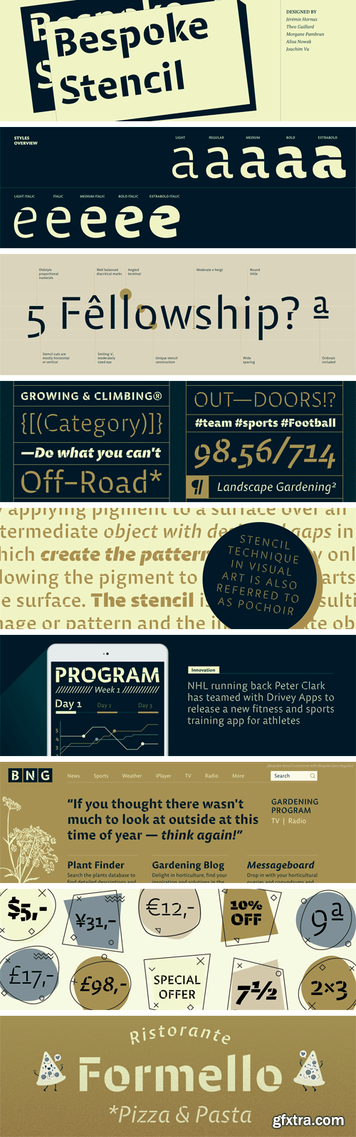
Bespoke Stencil Font Family
Bespoke Stencil is family of humanist sans serif fonts that look like stencil letters. Each stroke in the fonts’ letterforms breaks at the place where a writer might pause, if they were written with a broad pen. The underlying structure is similar to the Bespoke Sans fonts. The typeface’s design features large, open counterforms; these hep maximise legibility. The Bespoke Stencil family includes five weights that range from Light through Bold.
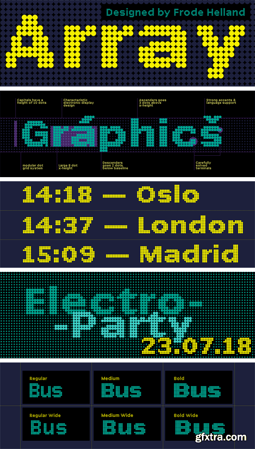
Array Font Family
Array is a small family of electronic display style fonts. All of the design’s letterforms are made up of dots on a grid. The capital letters in each of the fonts are 10 dots tall. Lowercase letters like the “a”, which does not have an ascender or descender, are eight dots tall. Ascending lowercase letters are one dot taller than the capitals, so the “b” and “d” are 11 dots high. Descending letters like the “j” and the “g” have two dots that drop below the baseline. There are some characters, such as the Euro currency symbol, which dip below the baseline in order to accommodate all of the necessary “parts” on the Array grid, too.
https://fontbundles.net/craftsupplyco/122755-bondie-condensed-sans-serif
Bondie - Condensed Sans Serif is an Elegant Condensed sans serif with solid font files. it is based on the compact solid font, by combining a variety of styles. Suitable for Logo, greeting cards, quotes, posters, branding, name card, stationary, design title, blog header, art quote, typography.
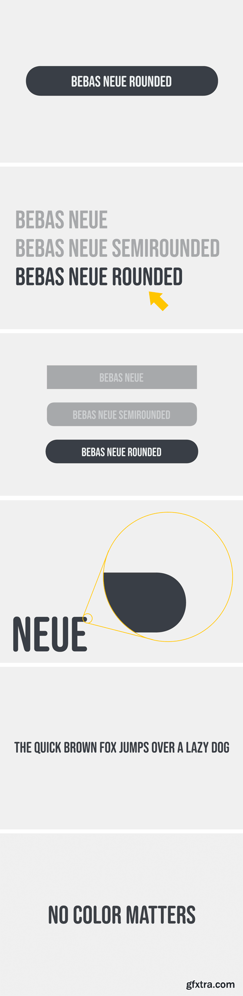
Bebas Neue Rounded Font
Bebas Neue Rounded is the Bebas Neue with rounded corners and terminals. As you know, Bebas Neue is the most widely used free font on the market. This rounded version is a new style where the basic theory and proportion are same as Bebas Neue, but with a rounded shape that gives a warm, soft and natural impression.
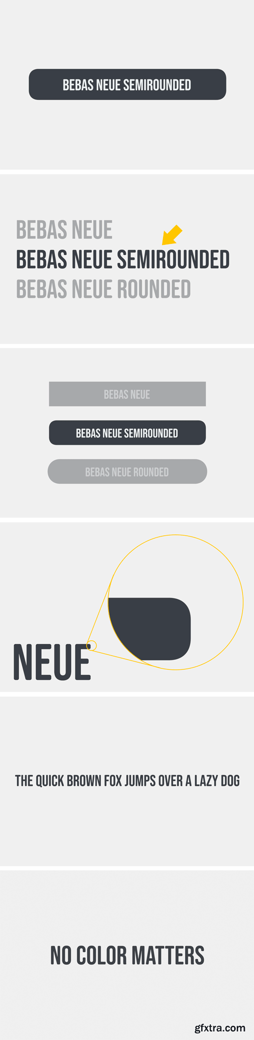
Bebas Neue SemiRounded Font
Bebas Neue SemiRounded is Bebas Neue with rounded corners. As you know, Bebas Neue is the most widely used free font recently. The basic theory and proportion are same as Bebas Neue but rounded shape gives a warm, soft and natural impression.
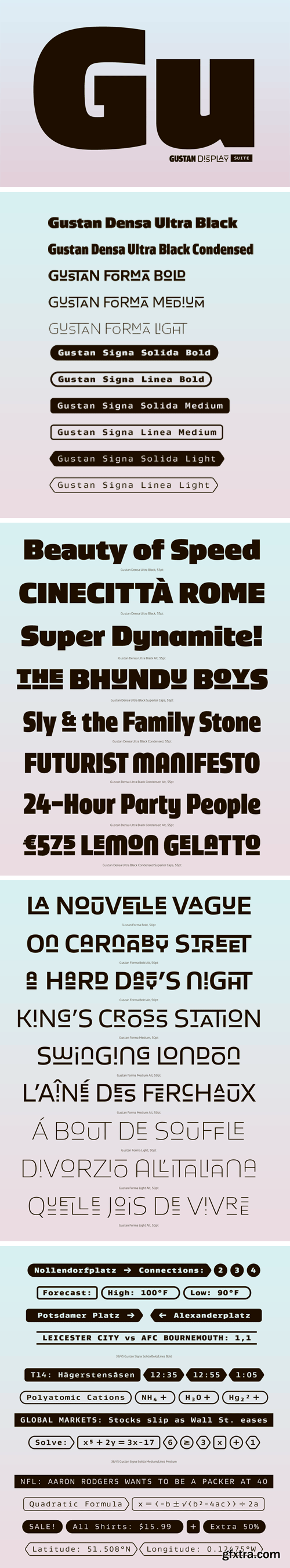
Gustan Display Suite
Fonts within the Gustan Display Suite are an extension of the original Gustan Family. They work alone, as a suite or with the original Gustanfamily. Gustan Densa follows as the next step in the natural weight progression of the original family with Open Type features that aid in even-colored settings as well as alternates for more dynamism.
