https://www.myfonts.com/fonts/andrey-kudryavtsev/sommelier/
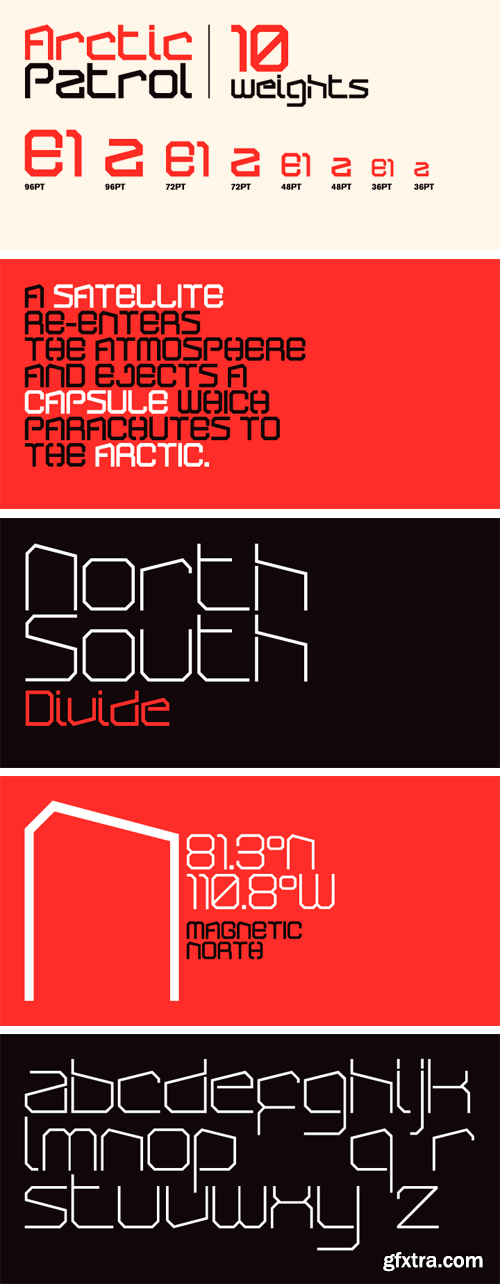
https://www.myfonts.com/fonts/northernblock/arctic-patrol/
ArcticPatrol is a modern angular font influenced by military related computer games. Examples include: Ghost Recon and Medal of Honor.

https://www.myfonts.com/fonts/polenimschaufenster/pis-creatinin-pro/
PiS Creatinin pro is based on a vintage ABC learning game for kids found in my grandparents attic. The narrow and high hand-drawn letters combine delicacy and chunkyness in a wonderful way, so it can be used both in huge display sizes and in small text sizes. PiS Creatinin pro - Makes you want to go back to school and learn the alphabet all over again!
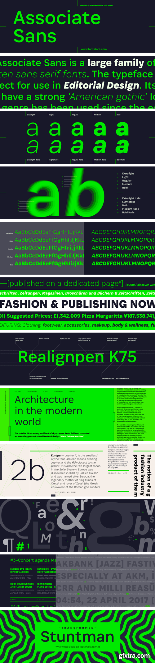
Associate Sans Font Family
Associate Sans is a large family of ten sans serif fonts. The typeface is perfect for use in Editorial Design. Its letters have a strong ‘American gothic’ look. This genre has been used since the early 20th-century for the design of publications, corporate identities, and even the small print in newspapers and magazines.
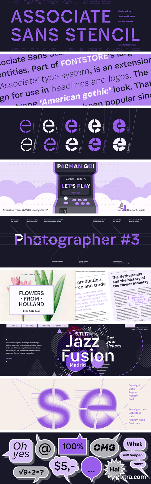
Associate Sans Stencil Font Family
Associate Sans Stencil is a family of ten sans serif fonts with a stencil optic. Part of FontStore’s larger ‘Associate’ type system, Associate Sans Stencil is an extension of the Associate Sans design for use in headlines and logos. The letterforms in both Associate Sans and Associate Sans Stencil have a strong ‘American gothic’ look. That genre of typefaces has been popular since the early 20th-century, especially for designing publications and corporate identities.
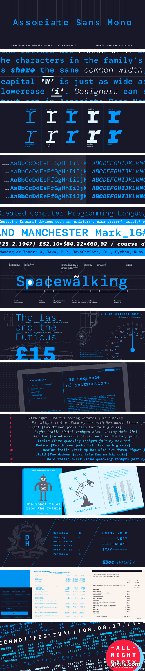
Associate Sans Mono Font Family
Associate Sans Mono is a family of ten sans serif fonts, in which all of the letters are monospaced. Each of the characters in the family’s fonts share the same common width; the capital ‘W’ is just as wide as the lowercase ‘i’. Indeed, the same character width is used for all of the glyphs in each of the family’s ten fonts. Designer can swap out text set in Associate Sans Mono’s ExtraLight weight for letters from the Bold Italic font, without text-length or line-wrap being affected at all.
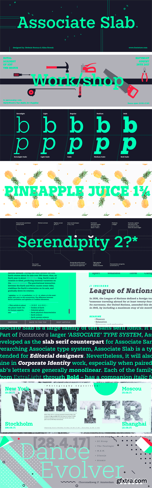
Associate Slab Font Family
Associate Slab is a large family of ten sans serif fonts. Part of FontStore’s larger ‘Associate’ type system, Associate Slab was developed as the slab serif counterpart for Associate Sans. Nevertheless, its fonts could be used entirely on their own, too. Like its relatives in the overarching Associate type system, Associate Slab is a typeface intended for Editorial designers.
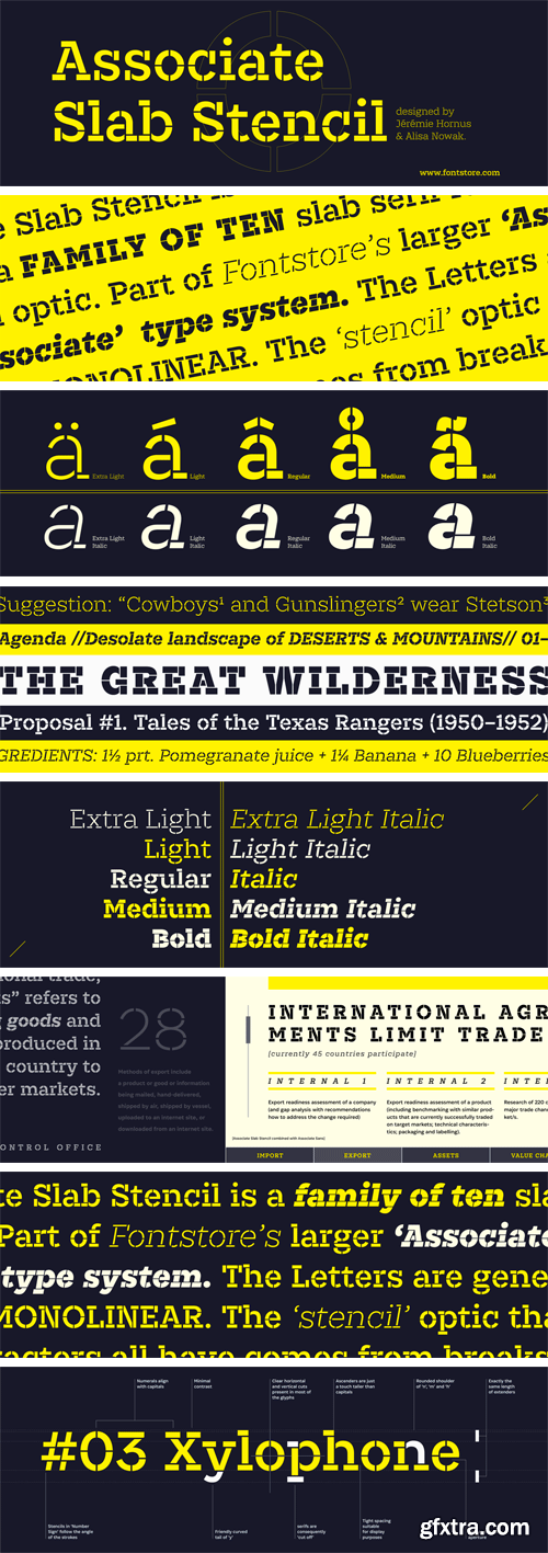
Associate Slab Stencil Font Family
Associate Slab Stencil is a family of ten slab serif fonts with a stencil optic. Part of FontStore’s larger ‘Associate’ type system, Associate Slab Stencil is an extension of the Associate Slab design for use in headlines and logos. The Associate Slab Stencil letters are generally monolinear. The ‘stencil’ optic that the characters all have comes from breaks, or ‘bridges,’ applied to parts of each letter.

Matteo Font Family
Matteo is a family of geometric sans serif fonts. Designer Diana Ovezea has given the family an Italian name so that users might call fast cars to mind when they see it. The family includes 14 styles; there are seven weights, ranging from Thin to Bold. Each of these includes a companion italic. Matteo’s italics have an extreme angle (15º), which is quite unusual for a sans serif design. These italics are oblique in form, with a single-storey ‘a’ in place of the upright’s double-storey ‘a’.
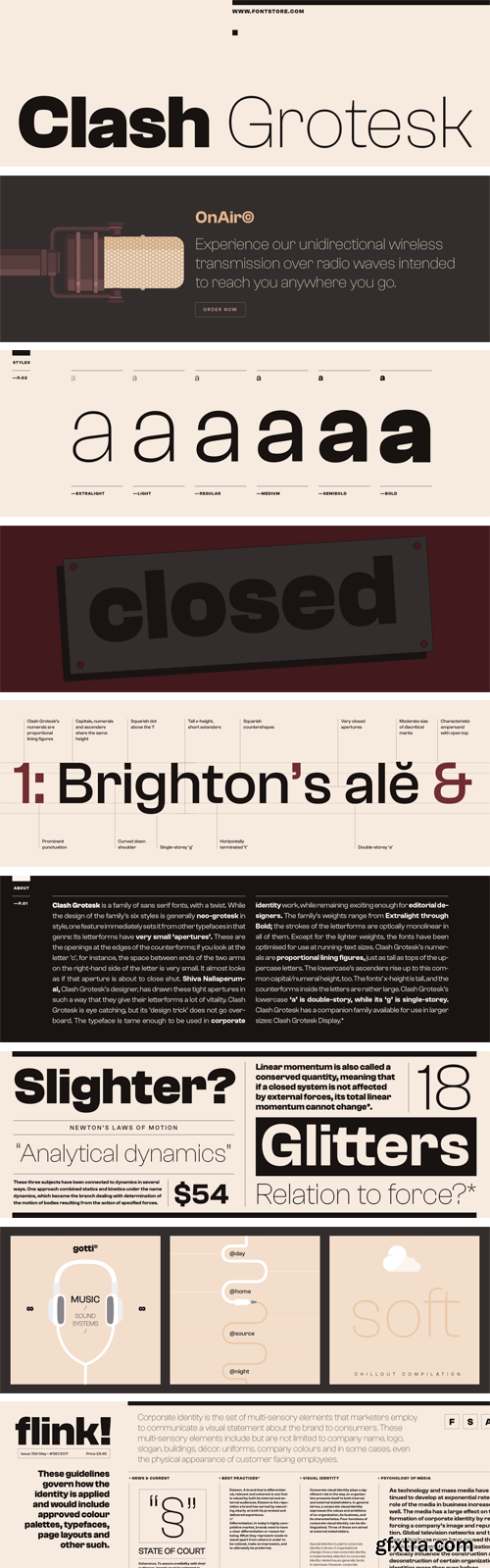
Clash Grotesk Font Family
Clash Grotesk is a family of sans serif fonts, with a twist. While the design of the family’s six styles is generally neo-grotesk in style, one feature immediately sets it from other typefaces in that genre: Its letterforms have very small ‘apertures’. These are the openings at the edges of the counterforms; if you look at the letter ‘c’, for instance, the space between ends of the two arms on the right-hand side of the letter is very small. It almost looks as if that aperture is about to close shut. Clash Grotesk is eye catching, but its ‘design trick’ does not go overboard.
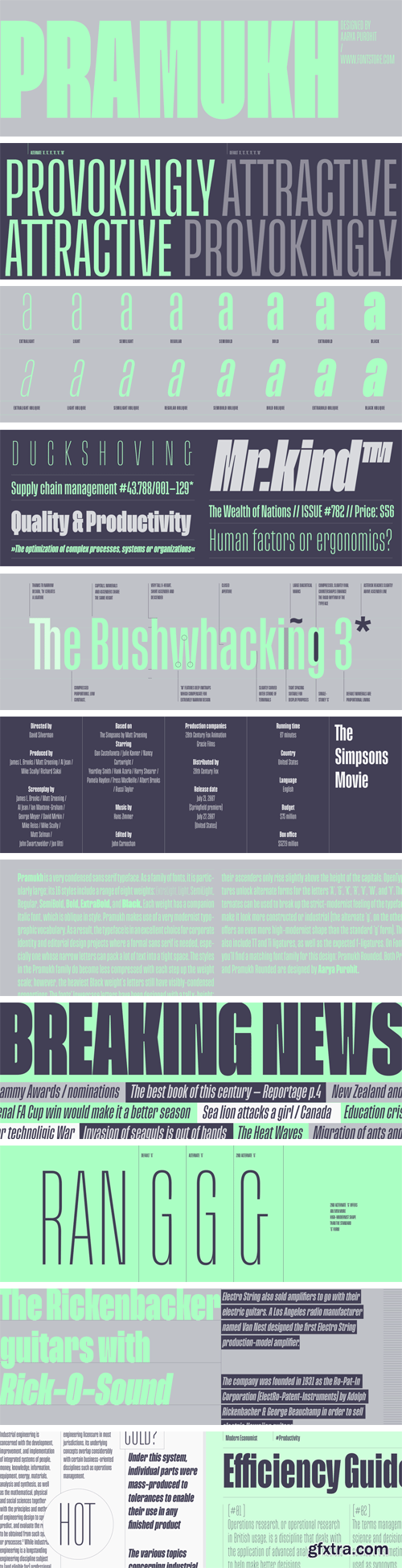
Pramukh Font Family
Pramukh is a very condensed sans serif typeface. As a family of fonts, it is particularly large; its 16 styles include a range of eight weights: ExtraLight, Light, SemiLight, Regular, SemiBold, Bold, ExtraBold, and Black. Each weight has a companion italic font, which is oblique in style. Pramukh makes use of a very modernist typographic vocabulary. As a result, the typeface is in an excellent choice for corporate identity and editorial design projects where a formal sans serif is needed, especially one whose narrow letters can pack a lot of text into a tight space.
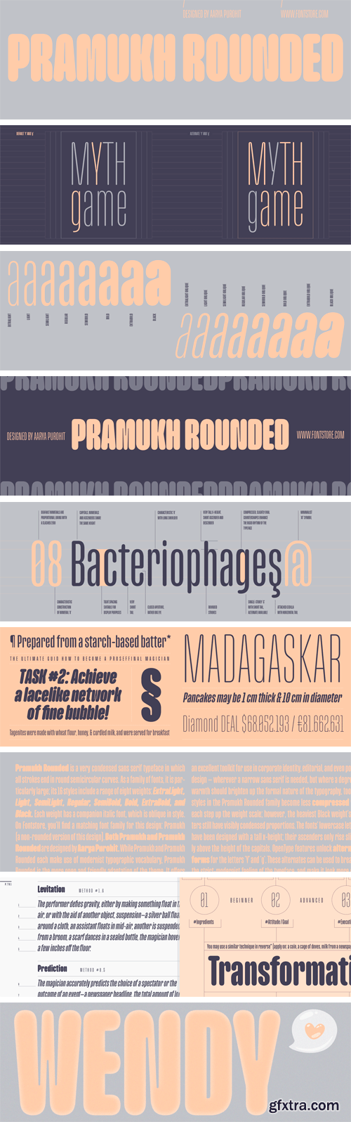
Pramukh Rounded Font Family
Pramukh Rounded is a very condensed sans serif typeface in which all strokes end in round semicircular curves. As a family of fonts, it is particularly large; its 16 styles include a range of eight weights: ExtraLight, Light, SemiLight, Regular, SemiBold, Bold, ExtraBold, and Black. Each weight has a companion italic font, which is oblique in style. On Fontstore, you’ll find a matching font family for this design: Pramukh (a non-rounded version of this design). Both Pramukh and Pramukh Rounded are designed by Aarya Purohit and ITF.
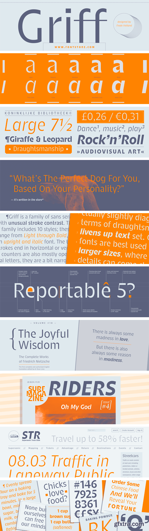
Griff Font Family
Griff is a family of sans serif typefaces with unusual stroke contrast. The ‘middle’ parts of many of the fonts’ letterforms are drawn with much thinner strokes than those found in the rest of typeface. The Griff family includes 10 styles; these are five weights that range from Light through Bold, each with an upright and italic font. The typeface is a bit humanist in style; its strokes end in horizontal or vertical cuts, rather than in diagonals. The letterforms’ counters are also mostly open. The fonts’ x-height is tall, and the lowercase letters’ ascenders rise slightly above the height of the capitals.

Cabinet Grotesque Font Family
Cabinet Grotesque is a family of contemporary fonts. In terms of design, Cabinet Grotesque is a sans; however, its letters feature of kind of stroke-contrast that set them apart from other sans serifs. The family includes eight styles, which range in weight from Thin through Extrabold – even the Thin weight maintains the family’s stroke-contrast model. As Cabinet Grotesque’s fonts get heavier, the stroke-contrast becomes most-prominent in the letterforms’ stroke connections. These get quite a ‘pinched’ look.
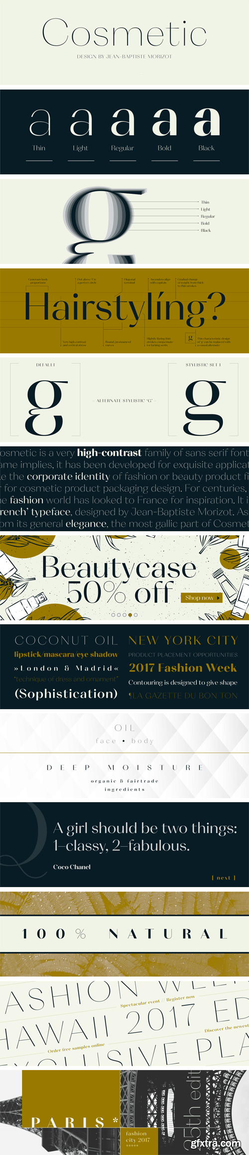
Cosmetic Font Family
Cosmetic is a very high-contrast family of sans serif fonts. As its name implies, it has been developed for exquisite applications, like the corporate identity of fashion or beauty product firms, or for cosmetic product packaging design. For centuries, the fashion world has looked to France for inspiration.
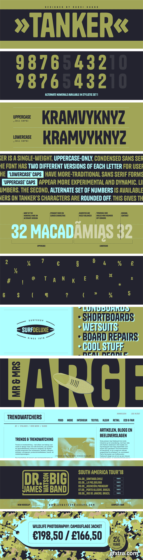
Tanker Font
Tanker is a single-weight, uppercase-only, condensed sans serif. The ‘caps’ saved onto the font’s lowercase keys are of a different design that those you’ll get when you press the uppercase keys. So the font has two different versions of each letter for users to choose from, really.
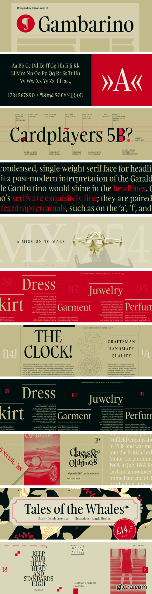
Gambarino Font
Gambarino is a condensed, single-weight serif face for headlines. The font is designed by Théo Guillard. Stylistically, you could call it a post-modern interpretation of the Garalde genre.
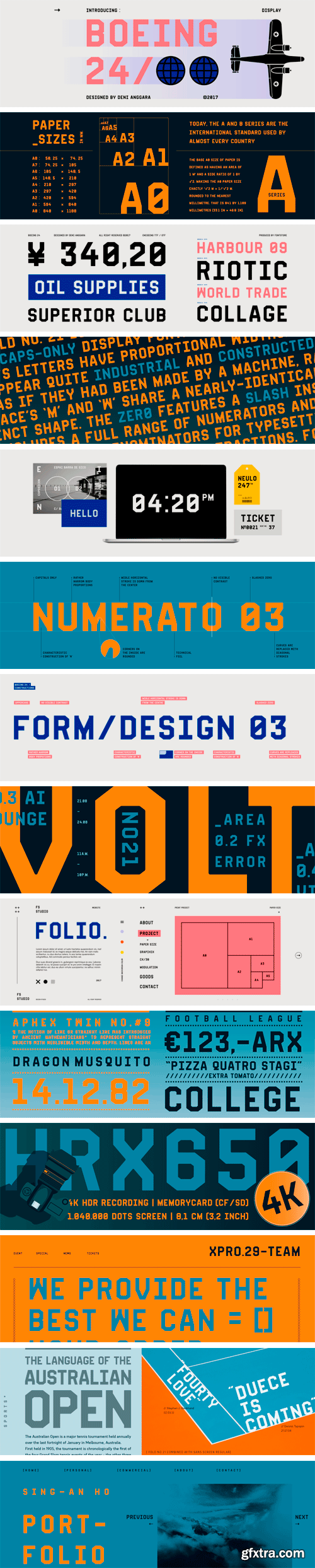
Boeing 24 Font
Boeing 24 is a caps-only display font. Its letterforms are sans serif, and they look like they come from a monospaced font. However, Boeing 24’s monospaced-appearance is just a strong look ; in actuality, its letters have proportional widths. These appear quite industrial and constructed, too – almost as if they had been made by a machine, rather than by Deni Anggara, the Bandung/Indonesia-based type designer behind Boeing 24.
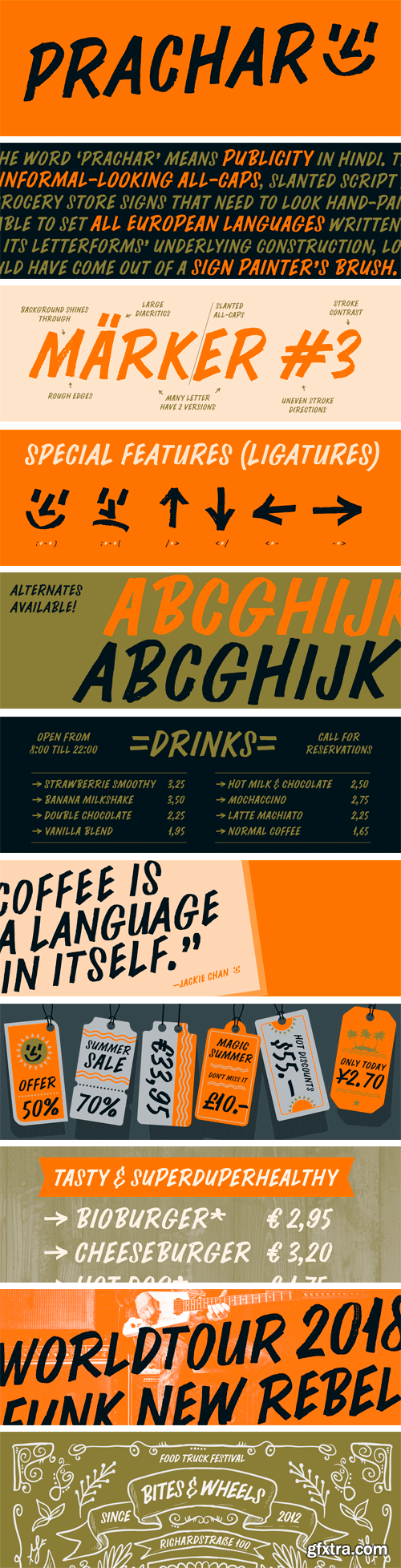
Prachar Font
The word ‘Prachar’ means publicity in Hindi. This informal-looking all-caps, slanted script face is exactly the kind of font you could use to create shop or grocery store signs that need to look hand-painted. Each letter in the font has visible stroke contrast and rough edges. Prachar was designed by Black Foundry in Paris/France, and includes a character set large enough to be able to set all European languages written with the Latin script.

Bookmark Font Family
Bookmark is a family of display serif fonts for use in editorial design. The typeface includes four weights: Light, Regular, Medium, and Bold. Each weight features a high degree of stroke contrast. The letters’ angle of stress is vertical, and they are all drawn so that they are slightly condensed.
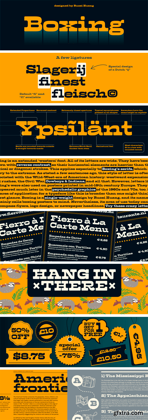
Boxing Font
Boxing is an extended ‘western’ font. All of its letters are wide. They have been drawn with reverse contrast, so their horizontal elements are heavier than the vertical or diagonal strokes. This applies especially to Boxing’s serifs, which are heavy to the extreme. As stated a few sentences ago, this style of letter is often associated with the Wild-West-era of American history: westward expansion, gold rushes, the Civil War, Cowboys & Indians, and all that.
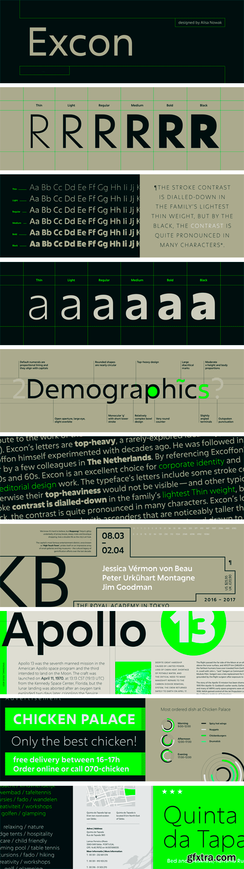
Excon Font Family
Alisa Nowak’s Excon is a versatile six-weight family of sans serif fonts; it is also a tribute to the work of the master French designer Roger Excoffon (1910–1983). Excon’s letters are top-heavy, a rarely-explored idea in type design Excoffon himself experimented with decades ago. He was followed in this later by a few colleagues in The Netherlands. By referencing Excoffon’s style, Excon’s design drinks from the fountain of French-style sans serifs from the 1950s and 60s.
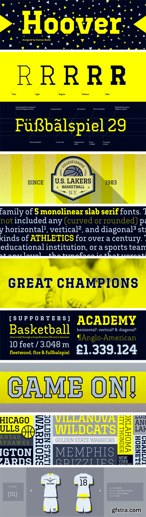
Hoover Font Family
Hoover is a family of five monolinear slab serif fonts. Their most striking feature is that their letterforms do not included any curved or rounded parts at all. Elements of the roman alphabet that are usually round have instead been built-up here out of a combination of horizontal, vertical, and diagonal strokes. This style immediately calls Anglo-American ‘collegiate’ graphics to mind. Letters like those in the Hoover fonts have also been used, generally speaking, to promote many kinds of athletics for over a century.
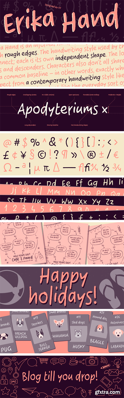
Erika Hand Font Family
Erika Hand is an informal handwriting font with rough edges. The handwriting style used by the Indian Type Foundry to design the font was very casual. The letters do not connect; each is its own independent shape. The lowercase has a tall x-height, and the capitals are rather short, looking almost like small caps.
