https://thehungryjpeg.com/product/3459218-one-piece-typeface/
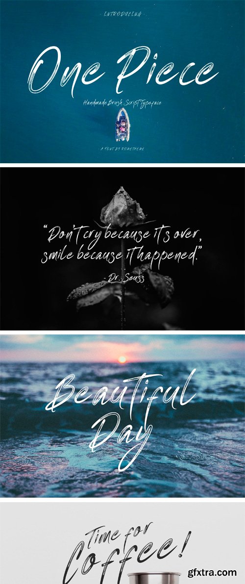
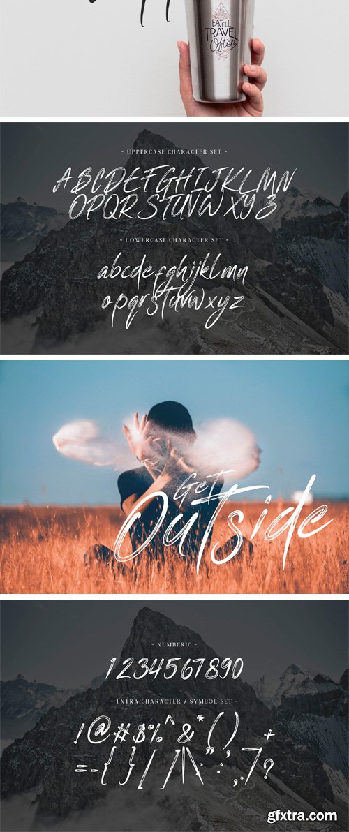
One Piece is a brush script typeface. It has a elegant, classy look, catchy, readable and cool. This font is perfect for giving your branding projects, font for fashion, apparel projects, and goth vibe, but also works great for other projects like posters, packaging, advertising, headlines, social media, branding, signage and anything where you want that urban look and feel.

https://thehungryjpeg.com/product/3493639-forever-grateful-font-and-doodles/
Forever Grateful is a playful, hand-drawn script. It comes with a set of autumn themed doodles that can be accessed with upper and lowercase letters using Forever Grateful Doodles. English language only.
https://creativemarket.com/masinong/1611200-brillyo-Script
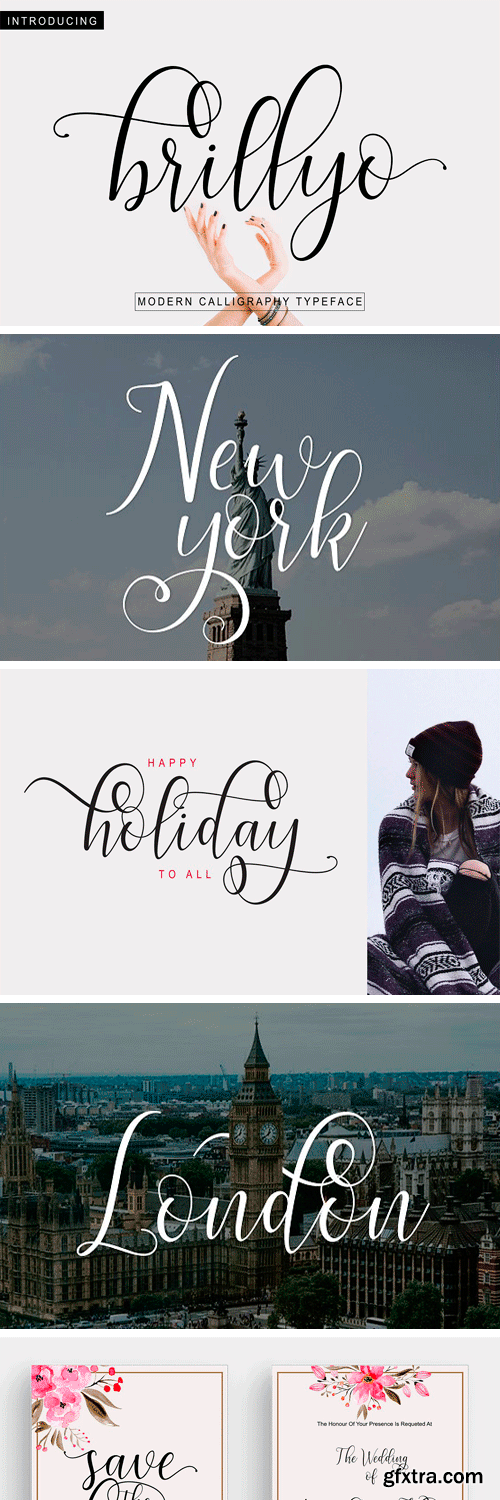
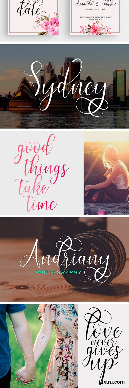
Brillyo Font Family modern script with a handmade calligraphy style, decorative characters and a dancing baseline! So beautiful on invitation like greeting cards, branding materials, business cards, quotes, posters, and more!

https://www.myfonts.com/fonts/typodermic/jillsville/
Jillsville is a sweet, delicate slab-serif typeface with attractive curls. Mathematical symbols, fractions, numeric ordinals and monetary symbols are in good supply. Cyrillic, Greek and almost all Latin-based languages are supported. Jillsville is available in seven weights and italics.
https://creativemarket.com/denilchan/2220703-Steamed-Hams-Font
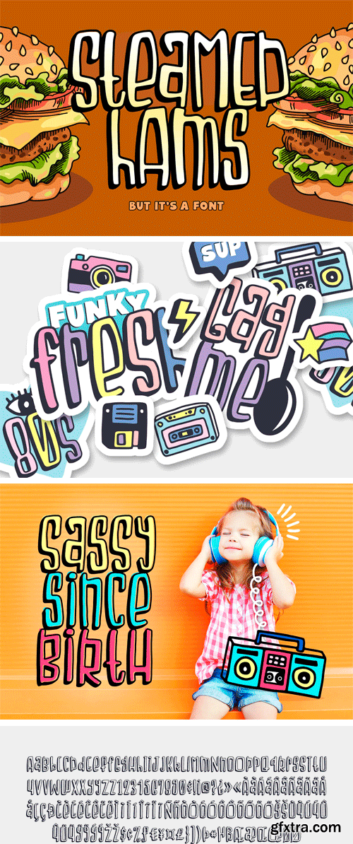
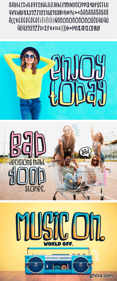
Packed with personality, Steamed Hams (but it's a font) is every bit as fun and ridiculous as its namesake. With a bit of a retro feel, Steamed Hams comes with two versions that can be layered together or used separately. BONUS: Also included is a set of fun doodles!

https://creativemarket.com/denilchan/2735015-Cottage-Farmhouse-Font-Doodles
Cottage & Farmhouse is a charming, sweet, and simple sans that comes with an alternate version and a bunch of fun doodles. This set is perfect for a small business logo or country inspired typography.
Champions Font Family
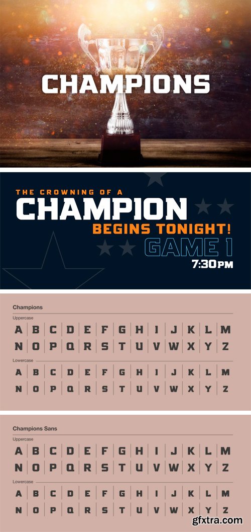
This best-selling typeface has been completely rebuilt, from the ground up. Now featuring special characters, alternate glyphs and a sans serif version. This is the font champions are made of.

Rogeu - Brush Typeface
Rogeu Brush is a handmade bold and confident brush font. It contains uppercase and lowercase letters, numbers, symbols, includes language support. Great for posters, badges, prints, apparel, package and much more.
https://www.myfonts.com/fonts/emigre/vista-sans-narrow-ot/

Rock N Roll - Textured Brush Font
Rock N Roll is a brush textured, all-caps typeface. Suitable for branding, apparel, prints, business cards, quotes, logos, posters, photography, and much more.

Lerotica Font Family
This is a font without serifs with round and semi finished condensed, drawn on a grid of 100 x 100 pt. and a ratio of 8/10, emerged inspired by the work of a new logo for the watch brand "eroticlock", hence its nombre.Estoy finishing the details of the complete family with various weights: Extra Light, Light, Normal, Medium, Bold Demi, Bold and Extra Bold.

Chapter Font Family
Chapter is an aggressive serif typeface with extended sharp serifs and distinct contrasts. Available in 3 weights: Light, Regular and Bold.
![Gotham Family [Updated] - Extended Latin, Greek, Cyrillic](https://www.gfxtra31.com/uploads/posts/2018-10/1538561010_gotham.png)
Gotham Family [Updated] - Extended Latin, Greek, Cyrillic
+ ScreenSmart & Office Version
Ours is the first century in which most mass-produced letters can correctly be called “typography.” Technically speaking, typography is the product of type, the individual, recombinable characters in a typeface that are designed for printing words on paper. A century ago, a book’s pages contained typography, but its cover, spine, and illustrations featured lettering, each of the product of an artist working by hand in a different medium. Because letters made by hand had no obligation to resemble the look of printing types, different media evolved their own aesthetics: lithographed posters, engraved banknotes, and neon signs once enjoyed unique alphabetic styles.
https://creativemarket.com/Makeitrock/2753824-Fabinache
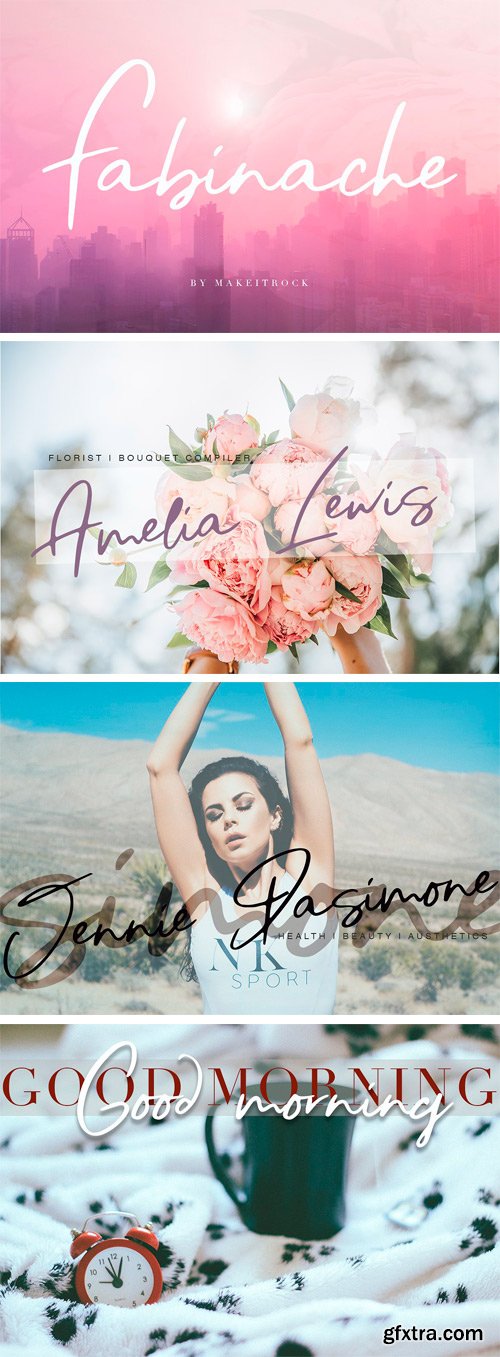
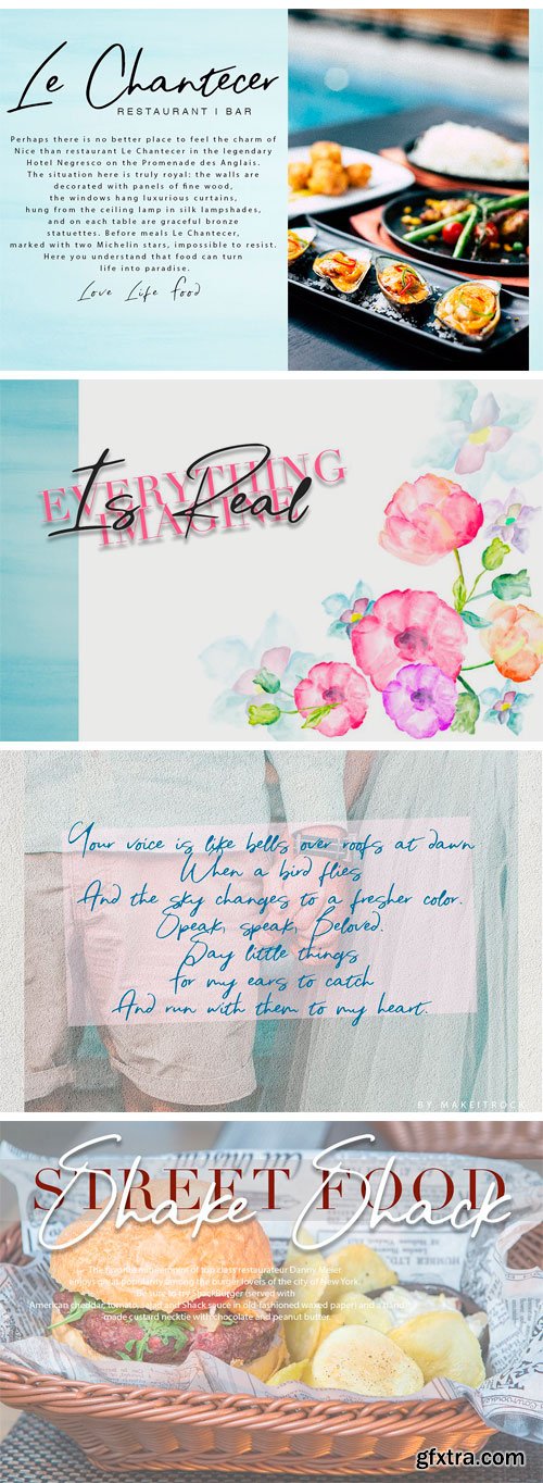
This handwritten script has been attentively written, with gentle curves to produce a font thats completely distinctive and original. Perfect for adding a elegant and unique touch to your lettering projects and branding.

Atrament Font
Another beautiful script design by German type designer Ralph M. Unger. Atramant is casual and easy, ideal for any setting in larger sizes. Still, due to its excellent legibility, it can also be used for short text blocks in smaller sizes. Atrament was originally designed for the URW++ FontForum.

Millicious Font Duo
Hi friends:) This is my first font duo, where this font contains beautiful script handwriting fonts, and one is a modern sans serif font.

Xreles Font Family
Xreles designed by Stawix Ruecha. It was joined in TypoLyrics Exhibition and Publication 2013 in Bangkok.
Builder Font Family
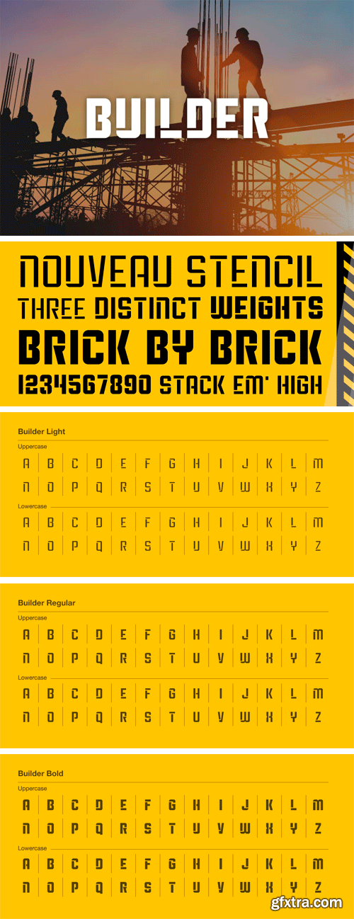
A nouveau stencil built to fit together and stack like a solid, well crafted lego set. Package comes in three weights, light,regular, and bold.

P22 Late November Pro Font Family
Late November is a transitional Antiqua-inspired type design. From the designer: "I started working with the design one dark, late November night, two years ago. After two years of work, I felt I had to draw the line and consider it finished." Designed by Torleiv Sverdrup.

https://www.myfonts.com/fonts/font-fabric/singel/
Singel is a neoclassical serif with semi-condensed proportions. As a contemporary interpretation, this typeface combines the rationalist modulated stroke with an elegant silhouette and crisp serifs. The altogether splendid appearance of Singel, completed with a full set of Small Capitals and true form of italics makes it perfect for any luxurious and graceful design.
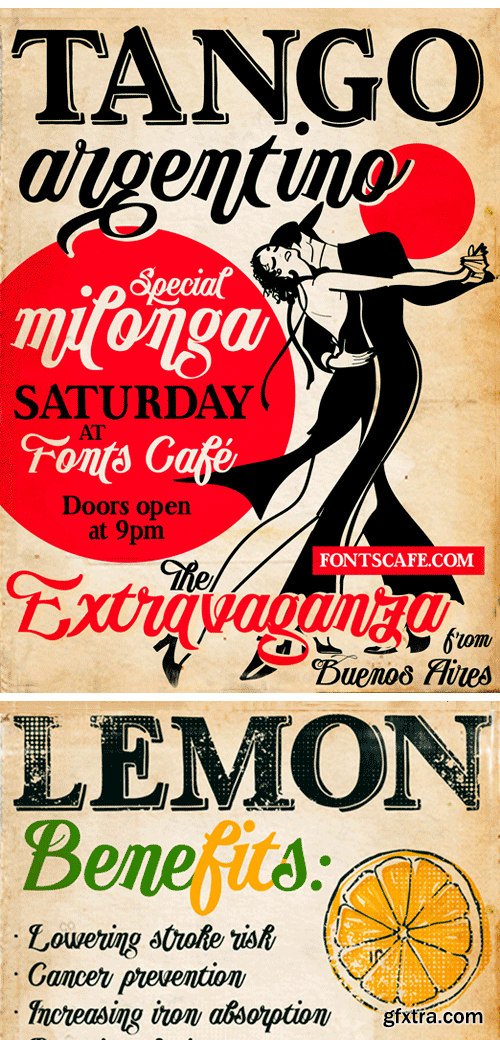
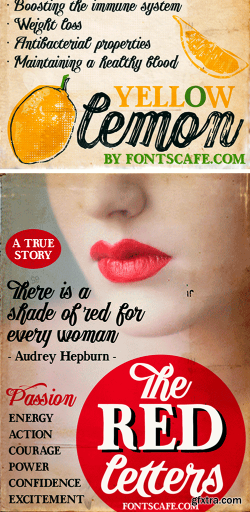
https://www.myfonts.com/fonts/fontscafe/publishing-script/
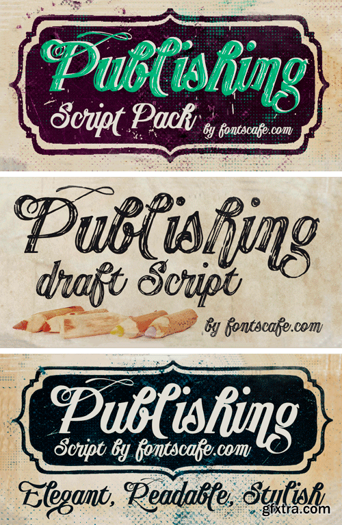
“Publishing script pack” combines the sensuality and elegance of Tango Argentino, evocative of special moments, of the new avant-garde font “Publishing Script” with the wildness and daring of “Publishing Draft Script”.

Quase Superfamily - 39 Fonts
Quase is a very free interpretation of the types found in the “Specimen of Printing Types” by William Caslon from 1785. We didn’t want to follow any of the models introduced in the Specimens, but rather gather a series of typographic aspects that we found useful and interesting from the several sizes and styles available and then give them consistency and new proportions so they could fit our very own purpose.


