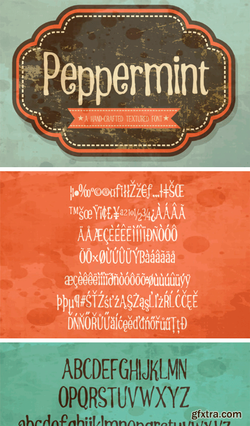
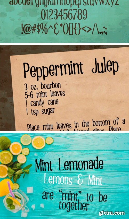
Creativefabrica - Peppermint
This hand-crafted font has a bit of texture throughout but it still remains a great font for using on craft and cutting machines.
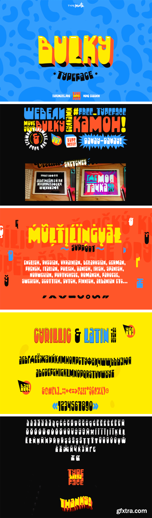
Creativefabrica - Bulky 648392
The Bulky is a cheerful hand drawn typeface. It has a super friendly feel with a huge contrast. It looks pretty cool in headlines, logos, posters, music covers, and much more! Cool fun fact – the word “Bulky” in Russian is pronounced exactly like the word “Булки” which means as “buns”!
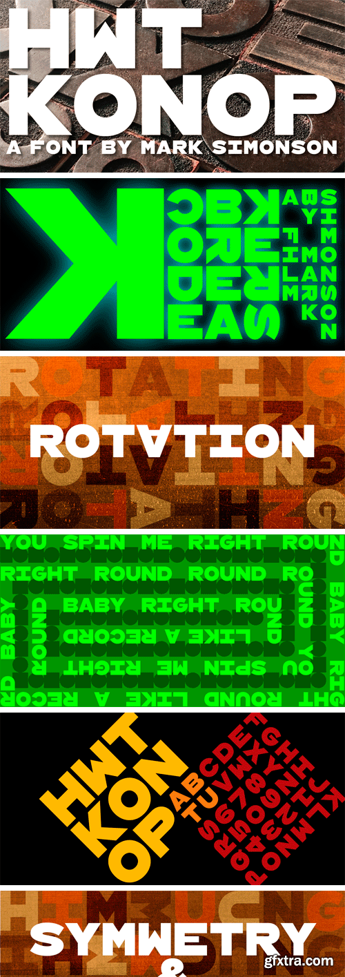
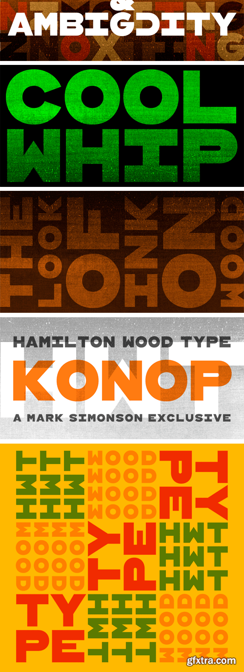
HWT Konop Font Family
HWT Konop is a monospaced (fixed-width) typeface that is also square! Designed by Mark Simonson (Proxima Nova) as square characters that can be arranged vertically or horizontally and in any orientation. To a traditional letterpress job printer, a font like this wouldn’t make much sense. But to a modern letterpress printer it is an unusual and creative design toolkit.
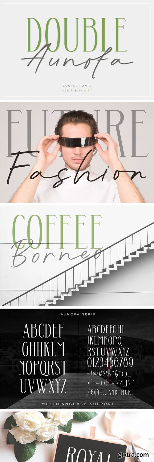
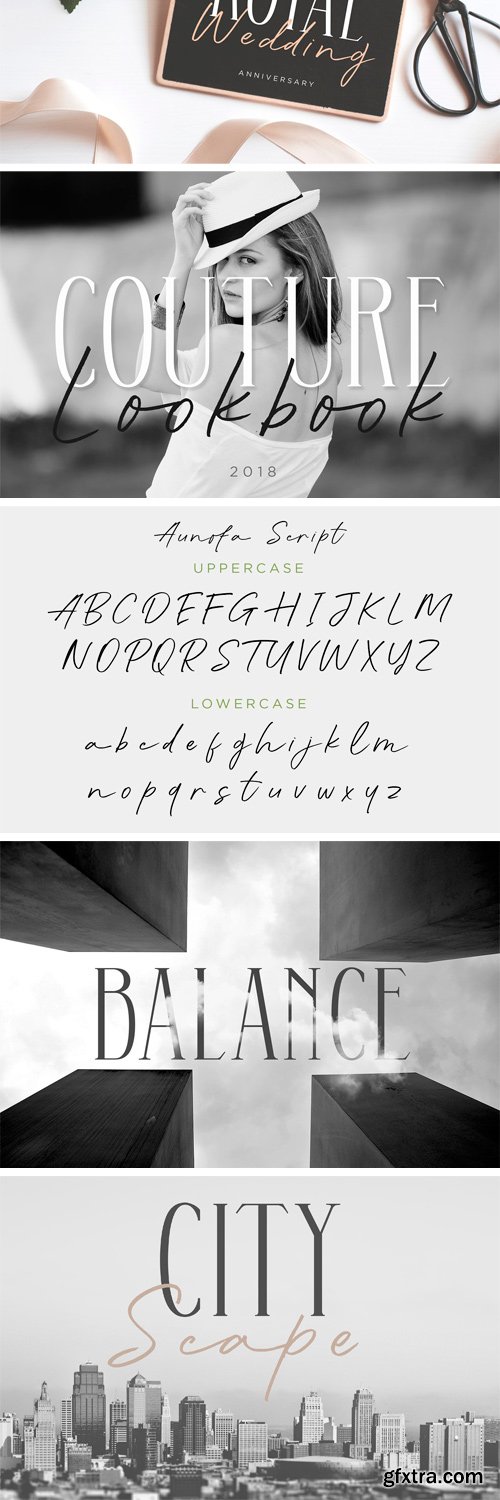
https://creativemarket.com/konstantinestudio/2813541-Double-Aunofa-Couple-Font
Double Aunofa, a couple of beautiful fonts with the approach to luxury branding and classy feels. Comes in clean tall serif and handwritten script style. Perfectly fit for your simple branding, logo, classy visual identity, you name it.
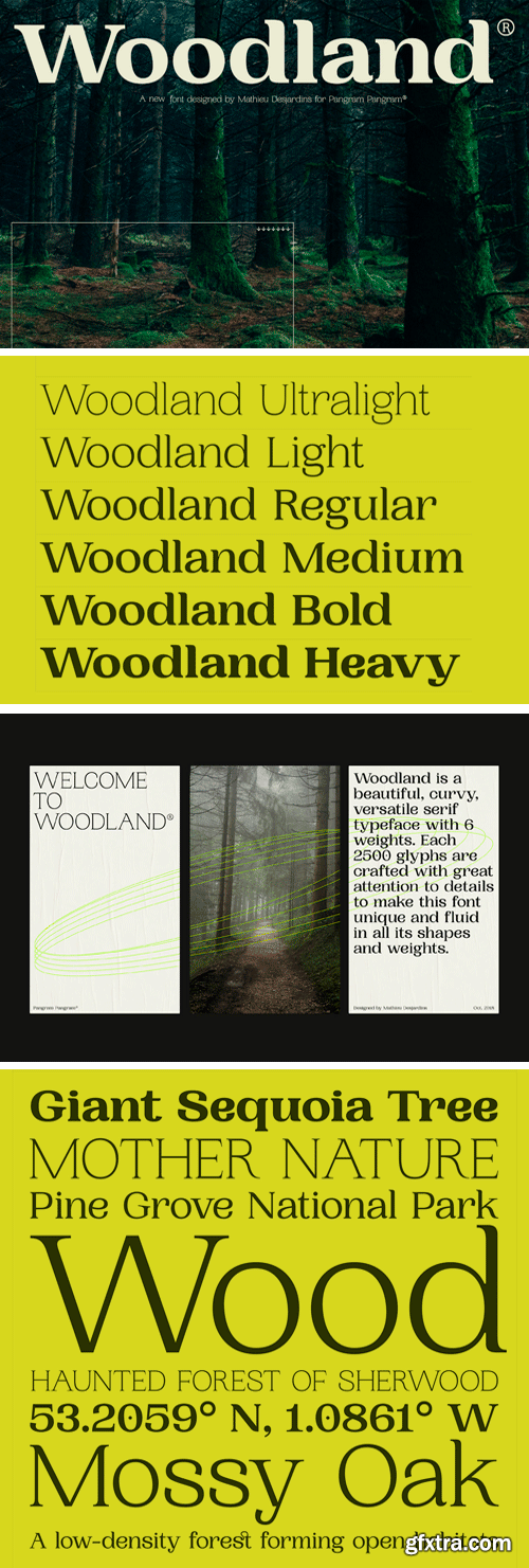
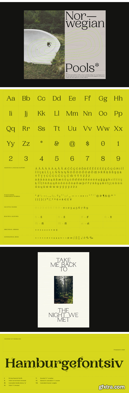
Woodland Font Family
Woodland is a beautiful, curvy, versatile serif typeface with 6 weights. Each 2500 glyphs are crafted with great attention to details to make this font unique and fluid in all its shapes and weights.
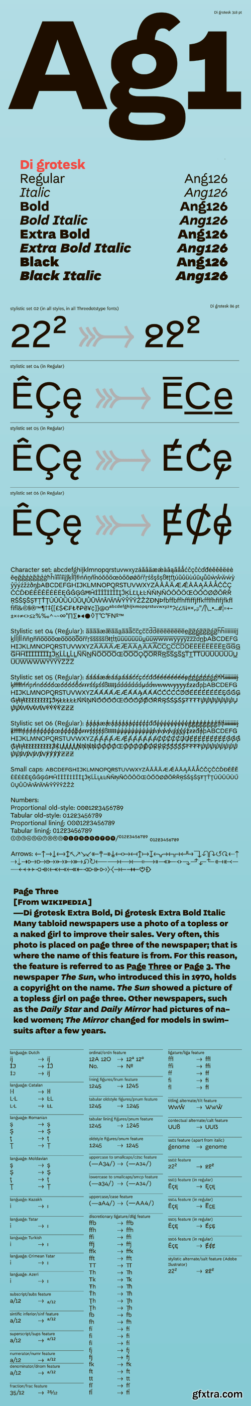
Di Grotesk Font Family
"Di" stands for "diacritics" – the font features multiple versions of them based on historical forms. "Grotesk" refers to the early 19th-century sans-serif fonts the typeface draws upon. The height in the upper case letters is smaller than in the minuscules with ascenders, which provides additional room for diacritics. The diacritics signs, in turn, have variants derived from various typographic traditions - from incunabula to the substitute solutions of the shortage economy of People’s Republic of Poland.
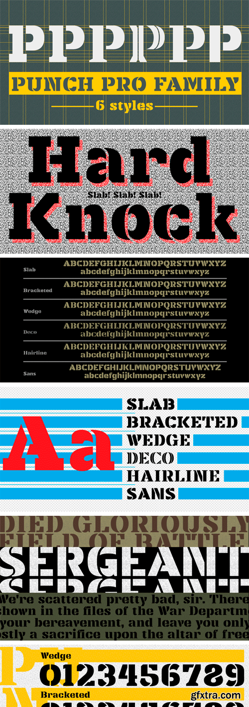
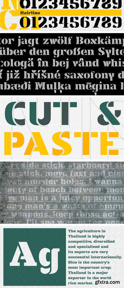
https://www.myfonts.com/fonts/produce/punch-pro/
Punch was born because we wanted to create a stencil font. At first glance, Punch gives out an audacious persona with its bold shape and form. It’s softer side is revealed in it’s carefully cut stencil lines. The balance of heavy and refined gives the font family its very own charm. Punch Pro comes in six different weights; Slab, Bracketed, Wedge, Deco, Hairline and Sans.
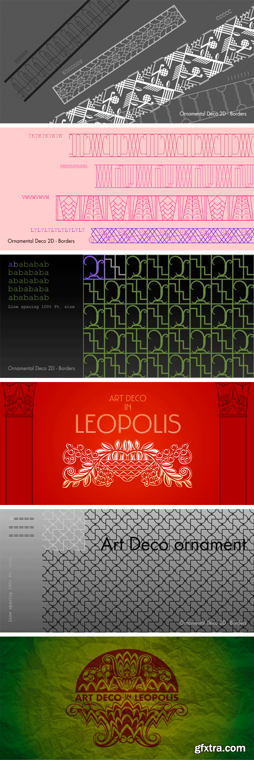
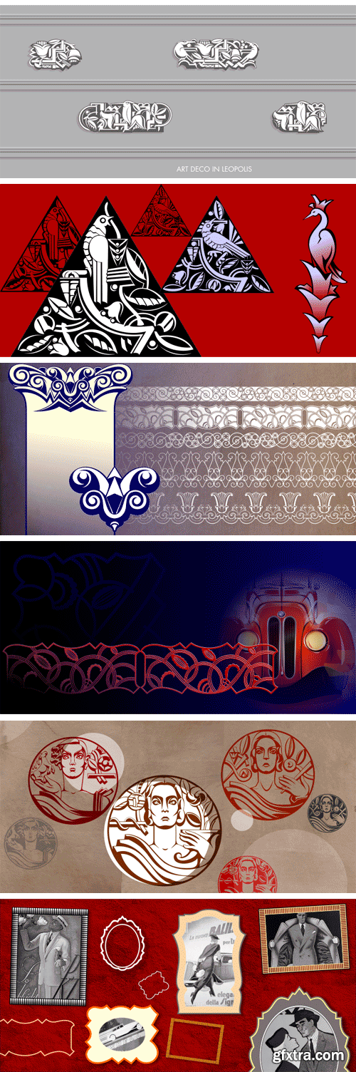
https://www.myfonts.com/fonts/2d-typo/ornamental-deco-2d/
This font was inspired by Lviv ArtDeco architecture dominating in 1920s-30s. This collection of ornaments is a graphic representation of building decorative elements, mostly of metal tracery elements and wall bas-relief. This font can be used for a variety of purposes, in graphic design as well as in industrial design.
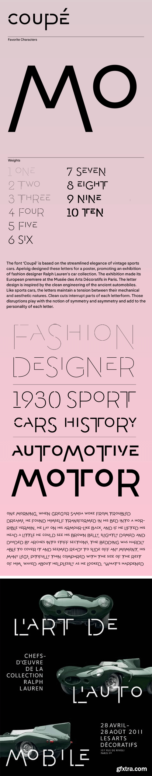
A. Coupe Font Family
The font ‘Coupé’ is based on the streamlined elegance of vintage sports cars. Apeloig designed these letters for a poster, promoting an exhibition of fashion designer Ralph Lauren’s car collection. The exhibition made its European premiere at the Musée des Arts Décoratifs in Paris. The letter design is inspired by the clean engineering of the ancient automobiles. Like sports cars, the letters maintain a tension between their mechanical and aesthetic natures. Clean cuts interrupt parts of each letterform. Those disruptions play with the notion of symmetry and asymmetry and add to the personality of each letter.
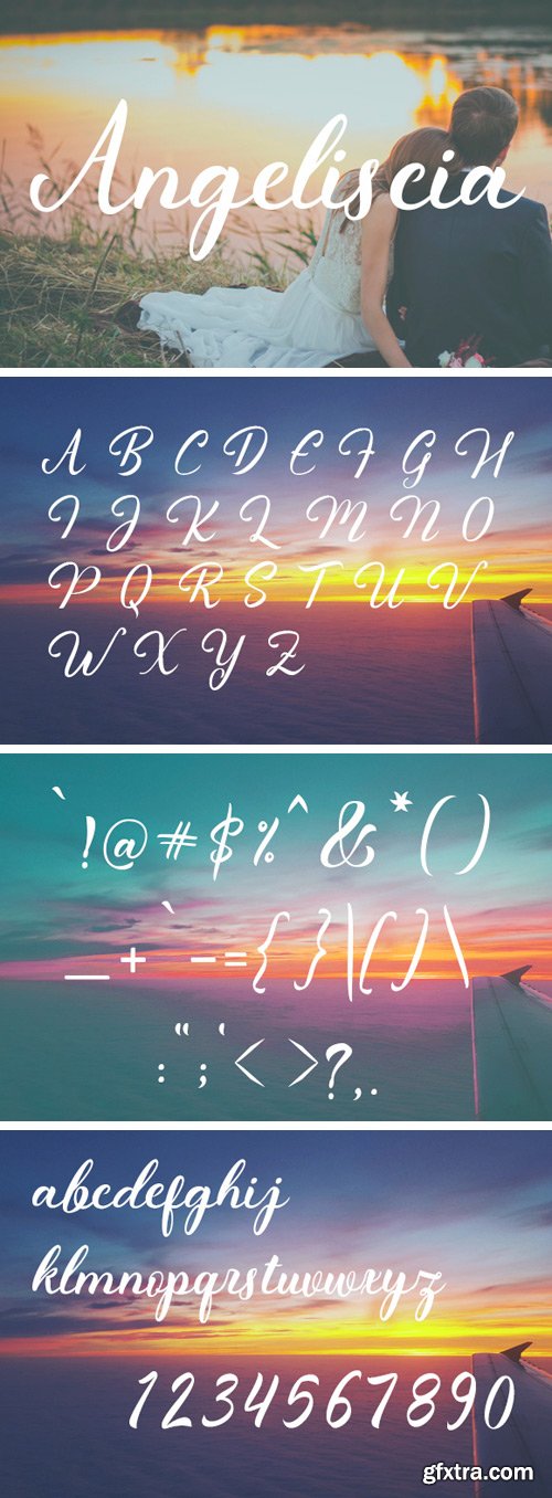
https://www.creativefabrica.com/product/angeliscia/
Angeliscia is a beautiful hand drawn typeface. With it’s clear letters, Angeliscia can help you create a stunning handwriting design.
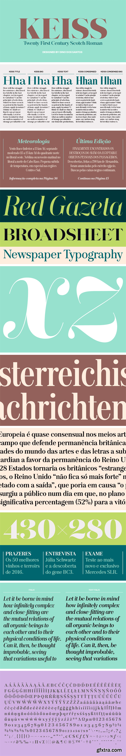
Keiss Type Family - Title, Big, Condensed, Condensed Big
The Keiss type family is our interpretation of the popular nineteen century Scotch Roman typefaces. We intended to keep a very classic approach while introducing a couple of new elements that differentiate this type family from it’s ancestors. This design, with short descenders and ascenders, along with three very distinct optical sizes makes this type family well suited for contemporary newspapers.
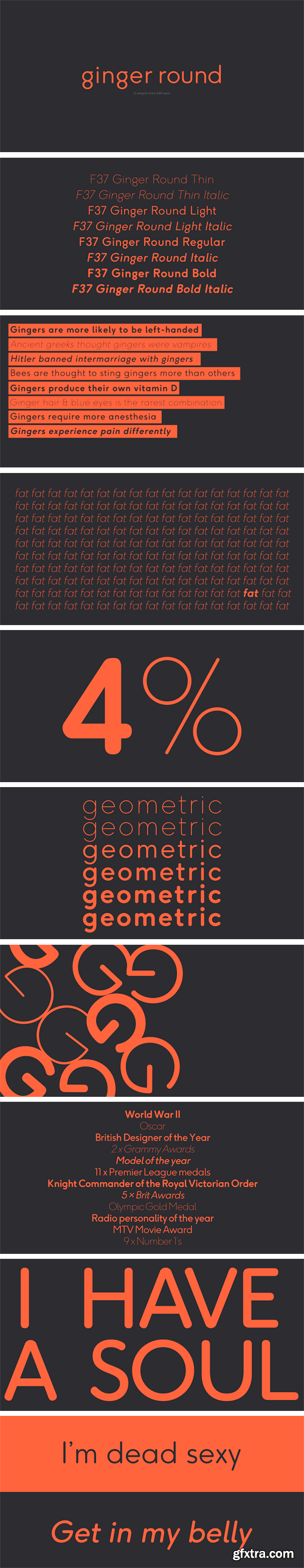
https://www.hypefortype.com/f37-ginger-rounded-10.html
F37 Ginger Round is designed Rick Banks, and is exclusive to HypeForType. F37 Ginger Round is the follow up to the hugely successful F37 Ginger. The family contains alternatives, and covers an extensive range of Latin-based languages, including Western and Eastern European.
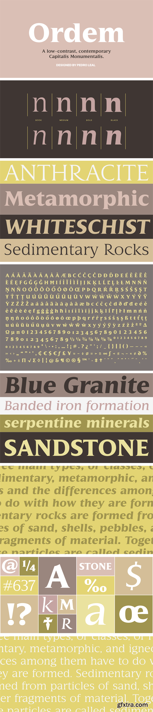
Ordem Font Family
Ordem is the result of a study on the Roman Quadrata, it’s structural proportions and geometric relationships. Reflecting part of the European cultural aesthetic, Ordem is simultaneously very granitic and delicate. The lack of variation in stroke width is part of what makes Ordem look so interesting – a serif font dressed in the more utilitarian clothing of the sans-serif fonts.
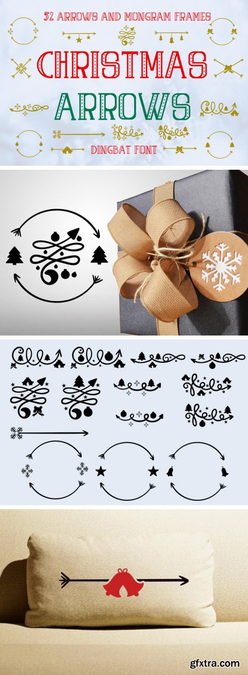
https://www.creativefabrica.com/product/christmas-arrows/
The Christmas Arrows is a beautiful hand drawn dingbat. It includes simple and swirly arrows with stars, bells, bows, globes, Christmas trees and snowflakes.
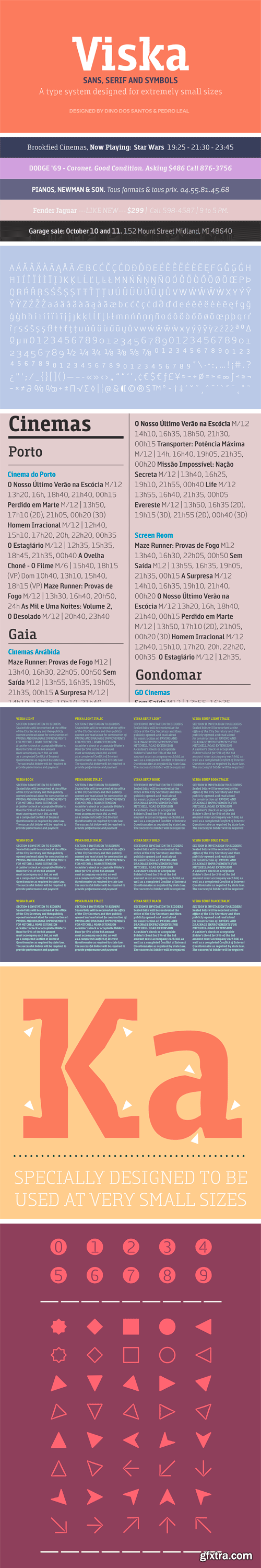
Viska Font Family
Designed to be used in the classifieds section of newspapers and magazines, Viska is a type system containing Sans, Serif and Symbols. Viska might look very weird when used big because it was specially conceived to be used in agate sizes (5.5 points).
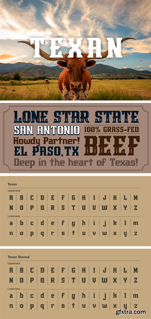
Texan Font Family
They say everything’s BIG in Texas, and this font is no exception. Rustle this one up before it gets away. Comes with both upper and lowercase letterforms and in regular and starred versions.

https://www.creativefabrica.com/product/brougets-script/
The Brougets is a hand-lettered brush script with a strong personality. It’s perfectly imperfect form gives it a fun and personal feel.

Stradivarius Font
Stradivarius, sometimes known as Symphonie was designed by Hungarian born Imre Reiner (1900-1987). Reiner was not only a type designer, he was a fine artist. He enjoyed sculpture, painting, graphic and industrial design. In 1921, F. H. Ernst Schneidler, (Schneidler Initials) introduced Reiner to type design. Stradivarius was designed and first released by the Bauer Type Foundry in 1938.
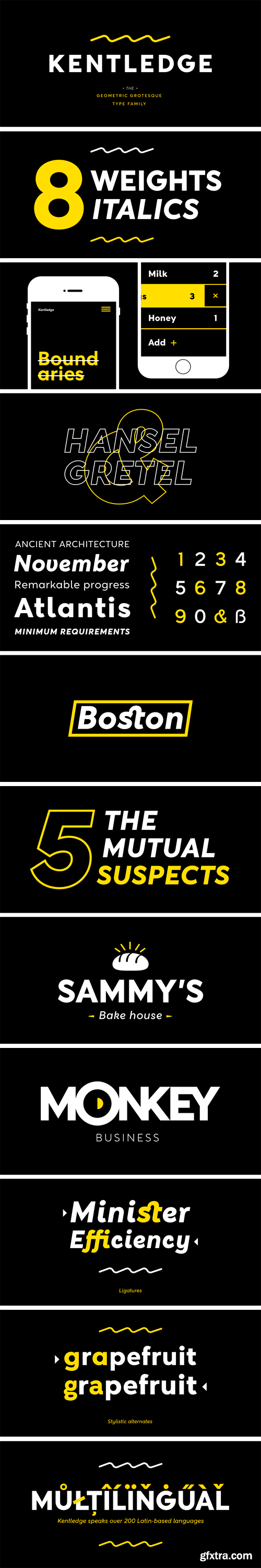
https://www.myfonts.com/fonts/namogo/kentledge/
Kentledge is a grotesque sans type family based on geometric forms that have been optically corrected for better legibility. The family includes extended language support (over 200 languages), alternates, ligatures and more. It is best suited for graphic design and any display / text use.


Creativefabrica - The Quiet Nite
The Quiet Nite is an elegant script font. It has beautiful swashes which will give your design a striking, yet feminine feel.
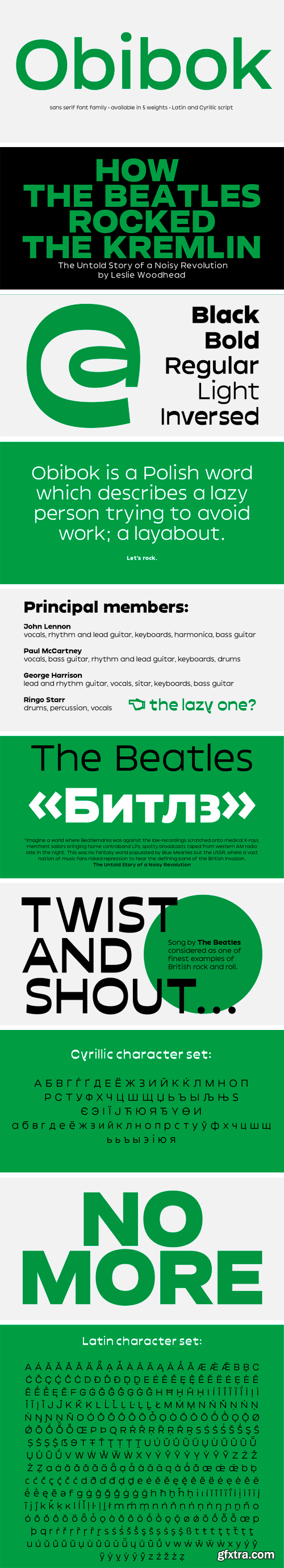
Obibok Typeface
Round shapes building the glyphs seem to be somewhat squarish and lazy – like a tire low on air. Obibok is built on geometric shapes and has a uncommon proportion between lowercase and uppercase letters. The latter are distinguishably lower compared to classical letter proportions, feeling almost like small caps. Besides the height proportion, uppercase letters are quite wide, which is an overall quality of the typeface.

Makro Font Family
The concept of Makro typefaces was to make a compact display type which taken inspired by modern architecture with a technical approach. With a subtle appearance like static ink traps and crotch details which makes this typeface feels like soften at the end. Makro has been updated to its newer version with correspondence lowercase added.

Roslindale Font Family
Roslindale is a text and display serif that takes its inspiration from De Vinne, a typeface named for the famed nineteenth century printer and attributed to Gustav Schroeder and Nicholas Werner of the Central Type Foundry.
