
Categories: Tutorials » Other Tutorials
Statistics graphs using Excel
MP4 | Video: h264, 1280x720 | Audio: AAC, 44.1 KHz, 2 Ch
Genre: eLearning | Language: English + .VTT | Duration: 34 mins | Size: 284 MB
Genre: eLearning | Language: English + .VTT | Duration: 34 mins | Size: 284 MB
Way to display large amounts of data graphically
What you'll learn Homepage: https://www.udemy.com/course/statistics-graphs-using-excel/
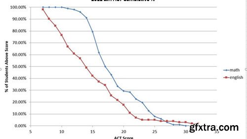
Create box plots, histograms, cumulative percentage graphs.
Requirements
excel software
Description
If you work with large amounts of data, you may want to present data graphically to get your message across quickly and effectively. You will be able to make box plots, histograms, correlation coefficients, pie charts. You can search for my standard deviation video if you want to add some statistical soundness to your presentation.
Who this course is for:
people who work with large amounts of data.

Related Posts
Information
Members of Guests cannot leave comments.
Top Rated News
- Sean Archer
- AwTeaches
- Learn Squared
- PhotoWhoa
- Houdini-Course
- Photigy
- August Dering Photography
- StudioGuti
- Creatoom
- Creature Art Teacher
- Creator Foundry
- Patreon Collections
- Udemy - Turkce
- BigFilms
- Jerry Ghionis
- ACIDBITE
- BigMediumSmall
- Boom Library
- Globe Plants
- Unleashed Education
- The School of Photography
- Visual Education
- LeartesStudios - Cosmos
- All Veer Fancy Collection!
- All OJO Images
- All ZZVe Vectors
