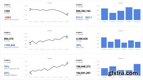
We all live in a time when most decisions for people, small businesses, and big companies are based on data. And it's very important that designers, product managers, and analysts know how to show these data in the right way. How to make sure people can read the information quickly. So this is what it means to display data. It helps us organise and show complex information in a way that everyone can understand. This course will give you a basic understanding of data visualization, which is the graphical representation of information and data. You will understand how to use visual elements like charts, graphs, and maps. In addition, we'll talk about visualisation principles such as layout basics, color schemes, how to use icons, symbols, and typography. You will see the main mistakes you must avoid when designing a dashboard. You will get an idea of how data visualization provides an accessible way to see and understand trends and patterns. In the world of big data, visualization and technologies are essential for analyzing massive amounts of information and making data-driven decisions. By following simple rules and guidelines from this course, you will be able to create effective data visualisation. Let's get started.
Top Rated News
- Sean Archer
- AwTeaches
- Learn Squared
- PhotoWhoa
- Houdini-Course
- Photigy
- August Dering Photography
- StudioGuti
- Creatoom
- Creature Art Teacher
- Creator Foundry
- Patreon Collections
- Udemy - Turkce
- BigFilms
- Jerry Ghionis
- ACIDBITE
- BigMediumSmall
- Boom Library
- Globe Plants
- Unleashed Education
- The School of Photography
- Visual Education
- LeartesStudios - Cosmos
- All Veer Fancy Collection!
- All OJO Images
- All ZZVe Vectors


