WordPress: Building Responsive Themes
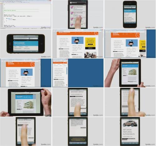
The many ways visitors access web sites, via mobile devices, tablets, and desktops, now requires sites to incorporate responsive design elements that adapt to different screen sizes and browsers. In this course, Morten Rand-Hendriksen demonstrates design strategies, best practices, and actual code examples for creating a responsive web site. The course covers layout, navigation, responsive video embedding, and content sliders. The final chapter shows how to create an index page with jQuery Masonry, a jQuery plugin that helps you create dynamic grid layouts.
Topics include:
Introduction 4m 5s
Welcome 1m 4s
Using the exercise files 1m 27s
What you should know before watching this course 1m 34s
1. Why Mobile Matters 8m 36s
What is responsive design? 4m 16s
The different faces of WordPress on mobile 1m 55s
Exploring the finished Anaximander theme 2m 25s
2. Starting with a Solid Theme 9m 38s
Getting and installing the Anaximander theme 1m 53s
Configuring basic theme options 7m 45s
3. Design First, Then Develop 23m 51s
Deciding what screen sizes to design for 4m 11s
Thinking responsively: Designing for many different screen sizes 6m 23s
Visualizing content realignment for better markup 4m 35s
Designing menus 4m 52s
Adding responsive images and videos 3m 50s
4. Using Media Queries 26m 8s
What are media queries and how do they work? 4m 18s
Exploring CSS3, progressive enhancement, and graceful degradation 3m 27s
Understanding best practices for media queries 3m 57s
Creating a responsive frame 5m 12s
Customizing media queries with the Chrome Developer Tools 5m 28s
Taking device width into account 3m 46s
5. Creating a Responsive Header 11m 1s
Resizing the site title and the description 8m 22s
Adding media queries to the header 2m 39s
6. Creating a Responsive Menu 11m 22s
Making the menu responsive 3m 35s
Creating a different menu design for small screens 7m 47s
7. Creating a Responsive Main Area 19m 22s
Making a responsive single-post layout 6m 11s
Making images responsive 4m 37s
Making videos responsive by including FitVids 8m 34s
8. Creating a Responsive Sidebar 7m 45s
Making the sidebar responsive 5m 10s
Hiding sidebars on mobile 2m 35s
9. Creating a Responsive Footer 7m 28s
Dealing with footer widgets 5m 11s
Adding navigation links that return to the top of the page 2m 17s
10. Adding a Responsive Featured Content Slider 12m 54s
Using FlexSlider to create a responsive slider 6m 2s
Creating a loop to show sticky posts in a featured slider 6m 52s
11. Making a Responsive Index Page That Dynamically Reorganizes with Masonry 24m 37s
What is jQuery Masonry? 3m 41s
Installing jQuery Masonry 4m 45s
Configuring the index page with Masonry 7m 0s
Using CSS to finalize the Masonry layout 6m 17s
Adding media queries to the Masonry index 2m 54s
Next steps 9m 11s
Exploring hidden features of the Anaximander theme 5m 51s
Where to go from here 3m 20s
For America
TO MAC USERS: If RAR password doesn't work, use this archive program:
RAR Expander 0.8.5 Beta 4 and extract password protected files without error.
TO WIN USERS: If RAR password doesn't work, use this archive program:
Latest Winrar and extract password protected files without error.


