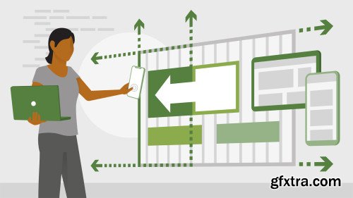
Responsive Layout 2.0
English | 2h 2m | Video 720p | Subtitles
When responsive web design was first introduced, it was at once magical and inefficient. Designers had to work with floats to lay out their grid-based systems, as well as hack media queries. Recent advances in CSS simplify this process, letting your design adapt to circumstances more fluidly. But leveraging these new features requires abandoning current practices and shifting to a model where you trade precise control for consistency and ease of implementation. This course can help you make that shift. Jen Kramer lays out how to do math directly in CSS via the calc() function and leverage custom properties, or variables, to streamline your CSS. Along the way, Jen shares examples of how to use these properties, including how to add custom properties to type scale and work with Flexbox and Grid.
Topics include: Advantages and disadvantages of CSS calc() Working with CSS custom properties Using Sass variables Creating layouts Adding custom properties to type scale Adding media queries to a grid system Rewriting CSS to integrate calc() and custom properties Homepage: https://www.lynda.com/CSS-tutorials/Responsive-Layout-2-0/2811028-2.html
Top Rated News
- Sean Archer
- AwTeaches
- Learn Squared
- PhotoWhoa
- Houdini-Course
- Photigy
- August Dering Photography
- StudioGuti
- Creatoom
- Creature Art Teacher
- Creator Foundry
- Patreon Collections
- Udemy - Turkce
- BigFilms
- Jerry Ghionis
- ACIDBITE
- BigMediumSmall
- Boom Library
- Globe Plants
- Unleashed Education
- The School of Photography
- Visual Education
- LeartesStudios - Cosmos
- All Veer Fancy Collection!
- All OJO Images
- All ZZVe Vectors


