English | 3hr 2m | Video: 1080p | 932 MB
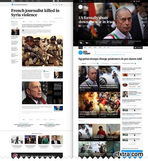
Considering sites like Reuters or the new iteration of New York Times and USA Today we can see how the web is shifting towards typographic compositions where the content is king and the user interface is minimal but relevant. During this course we will learn how to structure an effective layout for a splash page and a news article template. We will go through the basics of responsive design, grid composition and using typography to build the visual hierarchy of the composition.
What You'll Learn This is a design only course. No development will be taught! What You'll Make You'll design a news reading app that relies heavily on tasteful typography. During the process of creating a wireframe, you will consider user interaction, asset placement, and responsive design elements. By the end of this class you will have a detailed mock-up displaying all of your app's functions.
Top Rated News
- Sean Archer
- AwTeaches
- Learn Squared
- PhotoWhoa
- Houdini-Course
- Photigy
- August Dering Photography
- StudioGuti
- Creatoom
- Creature Art Teacher
- Creator Foundry
- Patreon Collections
- Udemy - Turkce
- BigFilms
- Jerry Ghionis
- ACIDBITE
- BigMediumSmall
- Boom Library
- Globe Plants
- Unleashed Education
- The School of Photography
- Visual Education
- LeartesStudios - Cosmos
- All Veer Fancy Collection!
- All OJO Images
- All ZZVe Vectors


