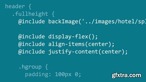
Building a Responsive Single-Page Design with Sass
MP4 | Video: 1280x720 | Duration: 4h 55m | Language: English
Learn how to build dynamic, responsive single-page designs with HTML, javascript, and CSS. The website featured in this course combines docking navigation, columns that adjust without cluttering your site layout or HTML markup, and animated scrolling effects that respond to user direction. Author Ray Villalobos shows you how to build it. He starts with a lean, easy-to-read template, and then explains how to add the features that make single-page designs so great, with these four frameworks
Related Posts
Top Rated News
- Sean Archer
- AwTeaches
- Learn Squared
- PhotoWhoa
- Houdini-Course
- Photigy
- August Dering Photography
- StudioGuti
- Creatoom
- Creature Art Teacher
- Creator Foundry
- Patreon Collections
- Udemy - Turkce
- BigFilms
- Jerry Ghionis
- ACIDBITE
- BigMediumSmall
- Boom Library
- Globe Plants
- Unleashed Education
- The School of Photography
- Visual Education
- LeartesStudios - Cosmos
- All Veer Fancy Collection!
- All OJO Images
- All ZZVe Vectors


