Categories: Fonts » Single Fonts
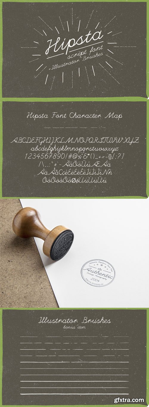
Hipsta Script plus Hand Drawn Brushes
TTF | OTF | WOFF | AI | 260 KB


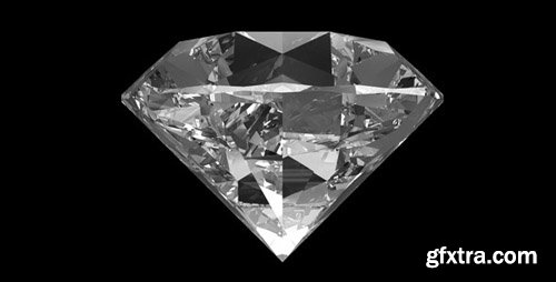
VideoHive - Diamond
Photo PNG + Alpha | Resizable | Looped Video | RAR 337MB
Photo PNG + Alpha | Resizable | Looped Video | RAR 337MB
http://videohive.net/item/diamond/6460862

VideoHive - Refracting Spheres - VJ Pack (120bpm) $13
Created 10 Dec 2014 | Photo JPEG | 1920x1080 | Looped Video | 788 MB
http://videohive.net/item/refracting-spheres-vj-pack-120bpm/9724841
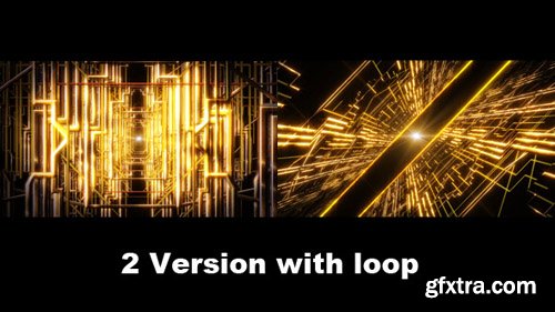
VideoHive - Golden Line Space 7337605
Creates 4 Apr 2014 | H.264 | 1920x1080 | Looped Video | 448 MB
Creates 4 Apr 2014 | H.264 | 1920x1080 | Looped Video | 448 MB
http://videohive.net/item/golden-line-space/7337605

VideoHive - Diamond Glitter Titles $13
Created 24 Apr 2014 | CS5, CS5.5, CS6, CC | 1920x1080 | Requires Plugins: Yes | 151 MB
Created 24 Apr 2014 | CS5, CS5.5, CS6, CC | 1920x1080 | Requires Plugins: Yes | 151 MB
http://videohive.net/item/diamond-glitter-titles/7576415
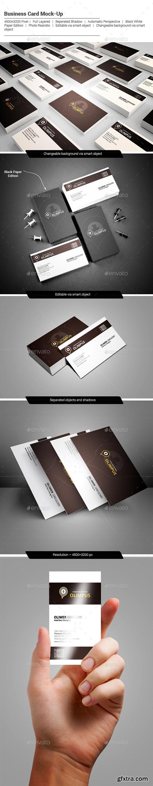
Photoshop PSD, JPG Image | 4500x3200 | Layered | High Resolution | 167 MB
http://graphicriver.net/item/photo-realistic-business-card-mockup/9959550


25 EPS + Ai | + HQ JPEG Preview | 215,8 Mb


Collection of images of Themis
25 UHQ Jpeg | min 4840*3460 | max 8510*5670 | 290 Mb


Collection of beautiful girls in fur coats
25 UHQ Jpeg | min 44750*3160 | max 8510*5670 | 265 Mb

Girl with balloons, Valentine's Day - stock photos 6 JPG | max 6000x5917 | 300 dpi | 73 Mb


Collection of carbonated drinks
25 UHQ Jpeg | min 44630*3320 | max 9400*6270 | 259 Mb
