

Genre: eLearning
This course is for people who already have a basic understanding of excel. We will learn how to work with different functions and alleviate daily tasks. Because of the importance,I will include a chapter of financial functions as well. You will be able to download the spreadsheet. After finishing this course, you will have mastered the advanced features and functions of Excel.

Genre: eLearning

Skillfeed - Model complex 3D architectural geometry with Rhinoceros
English | 1h 49m | Video: AVC (.mp4) 960x540 15fps | Audio: AAC 48KHz 2ch | 1.08 GB
Genre: eLearning | Project files Included
This is a basic introduction and overview of modelling complex 3D Freeform shapes in the context of architectural design.

Kadpy is a Powerful Professional WordPress Theme, with Fullscreen background designed to be used for a online store, portfolio, web designers, photographers and videographers alike, built to showcase your work at a large scale.

Austin is a clean and creative wordpress theme that is stylishly multi-purpose and fully responsive. With a modern design, new technology and powerful suite of features Austin is ideal for creatives, corporates or blog websites. Austin comes with many preconfigured pages and has unlimited possibilities to customize them in other different ways.

iSloping it is a wordpress theme with a clean and modern design, this theme is perfectly to be used for any business websites.

Alexio is a Responsive WordPress theme with a minimalist design that is perfectly to be used for a portfolio website, online store or blog.


VueScan is a scanning program that works with most high-quality flatbed and film scanners to produce scans that have excellent color fidelity and color balance. VueScan is easy to use, and has advanced features for restoring faded colors, batch scanning and other features used by professional photographers.


CM - Vintage Effects Pro
Included: txt,atn | Size:2.66 KB | Adobe CS5.5+
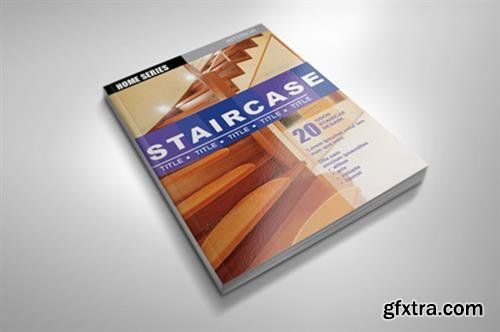
CM - Interior InDesign Magazine Template
Included: pdf,indd,txt | Size: 3.02 MB | Adobe CS4+ | DPI:300 DPI | 8.5 x 11 in

PSD | 12.45 Mb
16 PSD | Print Format | 13.6 MB


PSD | 3500×2500 | Layered | High Resolution | 464 MB
Sale Page


PSD | 2480x1754 | Layered | High Resolution | 1.1 GB
Sale Page

