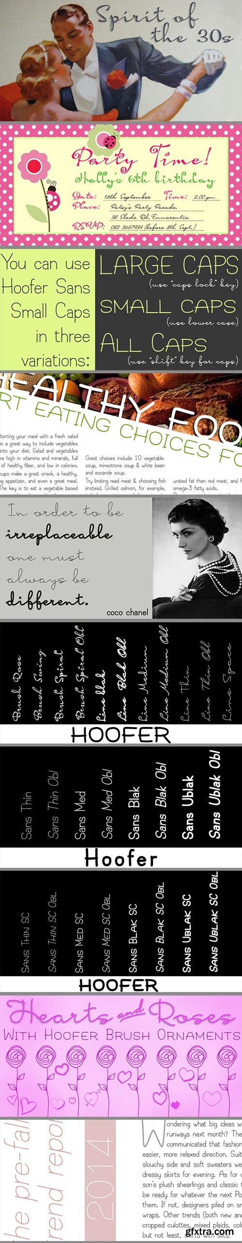
Hoofer - Brush Script, Mono Line Script and Sans-Serif with Ornaments Mega Family $89
28 OTF Font Files | Designer: Anton Scholtz
http://www.myfonts.com/fonts/scholtz/hoof/
![]()
![]()
![]()
![]()
![]()
![]()
![]()
Light and flexible, slightly retro, casual and readable, Hoofer combines 28 brush script, mono line script and sans-serif styles with ornaments into one Mega-Family. The different styles of the Hoofer Mega-family have been chosen to work together and to harmonize in a pleasing way. The Hoofer Mega-Family of fonts can be divided into three sub-families:
Hoofer BRUSH subfamily: An eclectic group of five fonts. These are mainly joined scripts.
Hoofer LINE subfamily: Seven mono-line scripts with joined letters in a number of weights, widths and styles.
Hoofer SANS subfamily: Sixteen casual, Sans-Serif fonts. They are very readable and in a variety of weights & styles
The mood of the Hoofer mega-family is light and flexible, slightly retro, casual and readable. It combines script and many sans-serif styles with ornaments into one Mega-Family. The different styles of the Hoofer Mega-family have been chosen to work together and to harmonize in a pleasing way.
The Brush Sub-Family is designed for titling, packaging and display purposes,
The Line Sub-Family can also be used for titling, packaging and display, however, it is less “showy”, and conveys an air of informality.
The Sans Sub-Family is designed to shine as sub-heads and as body text. The wide range of Hoofline styles gives you, the designer, great flexibility in creating just the mood or impression that you want.
Most of the fonts can use one or more OpenType Features. These can be accessed in a number of ways. The reason for this is that the major software producers provide different (and often conflicting) ways of accessing OpenType Features. In some cases such software manufacturers provide NO way of accessing certain OpenType Features. We have tried to remedy this by providing a highly flexible family of fonts. You can access two sets of figures (numbers) in Hoofer Sans fonts. Both sets are tabular and lining but they differ in the height (but not the width) of the figures.
The height of the alternate figures has been chosen so that they are compatible with the small caps. However, these alternate figures are available in ALL Hoofer Sans fonts, whether they feature small cap fonts or not.
Hoofer has all the features usually included in a fully professional font. Language support includes all European character sets, Greek symbols and all punctuation. Opentype features include automatic replacement of some characters and discretionary replacement of stylistic alternatives.
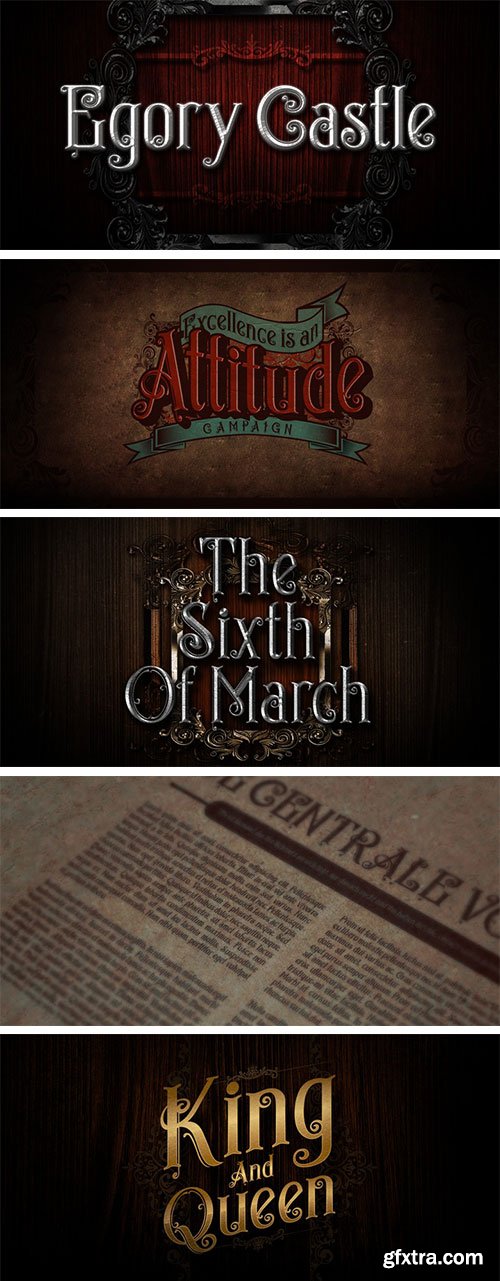
Egorycastle - Antique Medieval Headline Font OTF $40
OTF Font File | Designer: Cucu Supriyadi | Design Date: Apr 21, 2015
http://www.myfonts.com/fonts/seventh-imperium/egorycastle/
Egory castle was inspired from the history of the medieval age. The idea was to make us interested to explore in the aspect of art and decorative letters forms. Lots of studies that we have learned from history in middle age and inspiration from many different sources make very valuable references for us to develop a new idea in the development of this typeface.
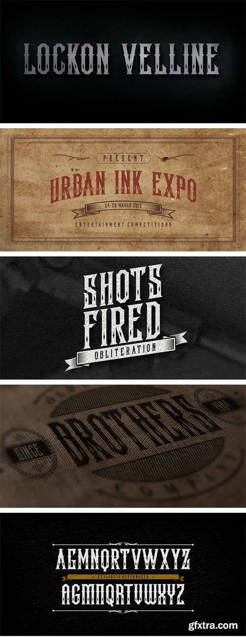
Lockon Velline - Tattoo Style Antique Font $25
OTF Font File | Designer: Cucu Supriyadi | Design Date: Apr 21, 2015
http://www.myfonts.com/fonts/seventh-imperium/lockon-velline/
Lockon Velline wass inspired from a biker and tattoo style with progressive edge and sharp tips, to make the fonts more bold and dynamic. Equipped with Open Type features to activate the stylistic alternates to play with as desired for your individual taste.
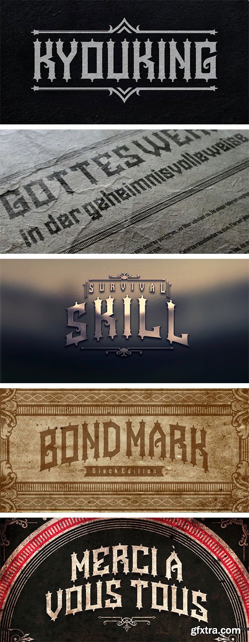
Kyouking - Effective Ghotic Font $25
OTF Font File | Designer: Cucu Supriyadi | Design Date: Apr 21, 2015
http://www.myfonts.com/fonts/seventh-imperium/kyouking/
The Kyouking design is basically the structural century blend with a modern feel approach to make it a flexible and epic, effective font for the creation of ambitious poster headlines, Book covers, logos and so on.


25 UHQ JPG | up to ~ 9000 x 6000 | 300 dpi | 188 Mb RAR


295 JPG | ~1500x1000 | 105 Mb


- Fully customizable jQuery Scrollbar Plugin which made to simplify your work and save you time in developing any kind of web template or application. It can be easily inserted in any context and has a wide range of parameters that can make your scrolling unique.

Cookie prevents third parties from hijacking your browsing experience. The sites you visit store "cookies" in your browser without your knowledge or consent. Some are helpful, but others are frustrating and invasive. Cookie can help.


http://www.myfonts.com/fonts/trinerask/north/
North is a small type family designed for books and pages of text in smaller or bigger sizes. It has been designed with special care for the Scandinavian languages, their letter combinations and special characters, but contains accented characters for all European languages. North is a soft and warm typeface, legible and friendly, very suitable for setting text that you just want to be read as easily as possible. Also very usable for children’s books with its simple forms.
OTF, WOFF | 3 Fonts | JPG Preview | 2.5 Mb RAR

25 UHQ JPG | up to ~ 9000 x 6000 | 300 dpi | 210 Mb RAR

http://www.myfonts.com/fonts/dizajndesign/dezen-stencil-03/
Dezen is a contemporary, mechanical grotesque typeface. Its letters were first constructed from individual modules and then optically refined to enhance its rhythm. Its tight letter spacing and narrow proportions make the typeface particularly well suited for display sizes and headlines. ?When you add spacing, font can be used for shorter amount of text, ?bigger than 12 points. The Dezen type family consists of a wide variety of styles – solid and stencil. The Dezen Pro subfamily combines all 4 styles (Solid, Stencil 01, ?Stencil 02, Stencil 03) in a specific sequence, which originates a “pattern” for the alphabet (or dezen, in Slovak).
OTF, WOFF | 8 Fonts | JPG Preview | 2.7 Mb RAR