
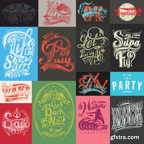



CS4 CS5 CS5.5 CS6 | Full HD 1920×1080 and HD 1280×720 | No Requires Plugins | 466 MB
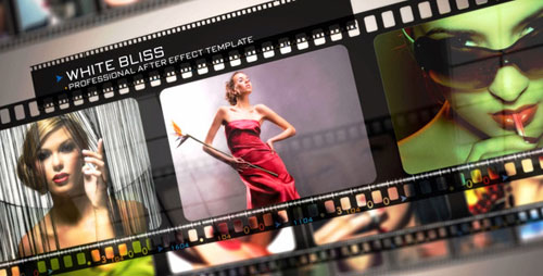
HD 1920x1080 | Adobe After Effects CS4, CS5 | RAR 214 MB

VideoHive - Holographic Touch Bundle $91
Bundle Content:


Templates business flat design concept vector 40
EPS | 31 files | 103.16 Mb
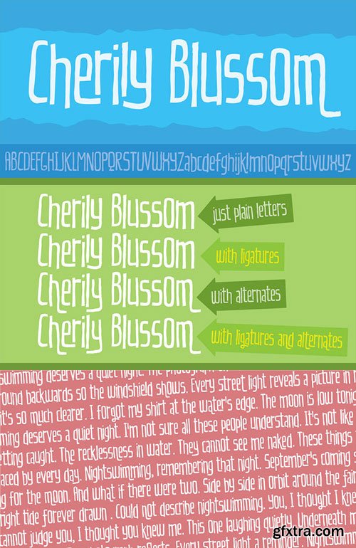
OTF Font File | Designer: Jakob Fischer | Design Date: Jun 26, 2015
http://www.myfonts.com/fonts/pizzadude/cherily-blussom/
![]()
![]()
![]()
![]()
![]()
![]()
Cherily Blussom was made with an inky pen, and little was done to correct the blurry edges. That’s why Cherry Blussom stands out in such an authentic way! Comes with both ligatures and alternates - combine them and spice up your text!
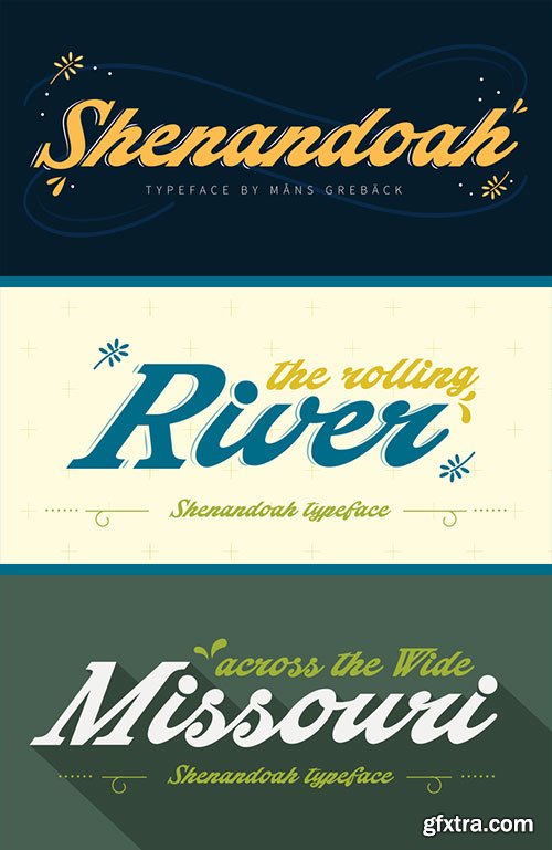
Shenandoah - Lovely, Flowing & Professional Typography $59
OTF Font File | Designer: Mans Greback | Design Date: Jun 25, 2015 | TURKISH SUPPORT
http://www.myfonts.com/fonts/mawns/shenandoah/
![]()
![]()
![]()
![]()
![]()
![]()
![]()
![]()
![]()
![]()
Shenandoah is a beautifully crafted script by Måns Grebäck, and is made for lovely, flowing and professional typography. Shenandoah has bold, crisp lines, giving it a rustic and retro effect whilst keeping it sleek and modern. This typeface and a bit of love could be used for fashion, apparel, stationary, magazines, typography, film, books and marketing!

Prillwitz Pro - Enthusiasm for the Greek & Roman $588
12 OTF Font Files | TURKISH SUPPORT
Designers: Johann Carl Ludwig Prillwitz, Ingo Preuss | Publish Date: Jul 1, 2015
http://www.myfonts.com/fonts/preusstype/prillwitz-pro/
![]()
![]()
![]()
![]()
![]()
![]()
![]()
![]()
![]()
![]()
![]()
![]()
![]()
![]()
Johann Carl Ludwig Prillwitz, the German punch cutter and type founder, cut the first classic Didot letters even earlier than Walbaum. The earliest proof of so-called Prillwitz letters is dated 12 April 1790. Inspired by the big discoveries of archaeology and through the translations of classical authors, the bourgeoisie was enthused about the Greek and Roman ideal of aesthetics. The enthusiasm for the Greek and Roman experienced a revival and was also shared by Goethe and contemporaries. »Seeking the country of Greece with one’s soul«. All Literates who are considered nowadays as German Classics of that time kept coming back to the Greek topics, thinking of Schiller and Wieland. The works of Wieland were published in Leipzig by Göschen. Göschen used typefaces which had been produced by until then unknown punch cutter. This punch cutter from Jena created with these typefaces master works of classicist German typography. They can stand without any exaggeration on the same level as that of Didot and Bodoni. This unknown gentleman was known as Johann Carl Ludwig Prillwitz. Prillwitz published his typefaces on 12th April 1790 for the first time. This date is significant because this happened ten years before Walbaum. Prillwitz was an owner of a very successful foundry. When the last of his 7 children died shortly before reaching adulthood his hope of his works was destroyed, Prillwitz lost his will to live. He died six months later. His wife followed him shortly after.
The typeface Prillwitz as a digital font was created in three optical styles (Normal, Book and Display). The typeface Prillwitz Press was created especially for a printing in small sizes for newspapers. '‘‘Prillwitz Press’’' combines aesthetic and functional attributes which make written text highly readable. It was originally designed for a newspaper with medium contrast to withstand harsh printing conditions. Its structure is quite narrow which makes this typeface ideal for body text and headlines where space is at premium. For the Normal – even more for the Book – a soft and reader-friendly outline was created through a so-called »Schmitz« and optimized in numerous test prints. The arris character and the common maximal stroke width contrast of the known classicist typefaces (Didot/Bodoni) were edited by the study of the original prints. This was also done in order to reach a very good readability in small type sizes.
This typeface is perfectly suited to scientific and belletristic works. Accordingly it has three styles: Regular, Bold and Italic as Highlighting (1).
The typeface Prillwitz is a complete new interpretation and continuing development of the conservated originals from 1790. They have been kept in the German Library in Leipzig. It was always given the priority to keep the strong roughness and at the same time optimizing the readability of this striking font.
The type family has all important characters for an efficient and typographic high quality work.
-----------
(1) Accentuation of particular words or word orders (e.g. proper names, terms etc.).
Typographic means for Highlighting could be Italic, SmallCaps or semi-bold.

http://www.myfonts.com/fonts/ywft/formation/
OTF, WOFF | 10 Fonts | JPG Preview | 1.6 Mb RAR

CM 299644 - Just Wedding Photoshop Action
ATN | PDF Guide | JPG Preview | 2.8 Mb RAR


25 UHQ JPG | up to ~ 9000 x 6000 | 300 dpi | 357 Mb RAR


CM 182763 - Leggins & Hoodie & Top & Blouse
15 PSD Mock-ups | JPG Preview | 287 Mb RAR


25 EPS | + JPG Preview | 59 Mb RAR

https://www.myfonts.com/fonts/andreas-leonidou/alt-lautus/
OTF, WOFF | 10 Fonts | JPG Preview | 5.4 Mb RAR


PSD | Layered | 91 MB

cmiVFX - Lua Scripting Language Quick Start
Duration 49m MP4
cmiVFX brings you a brand new Lua Scripting Language Quick Start video in crystal clear English. Get ready for a very informative journey as we explore the breadth of the Lua scripting language. We have listened to you, our customers, and seen the need to cover this brand new topic in our software technology category. This video will have you quickly productive in Lua, whether for simple scripting, embedding Lua into your C/C++ application, or extending Lua for your needs.


