CreativeMarket - 3 Tropical-Botanical Presets 4057352
LRTEMPLATE, DNG


CreativeMarket - AMELLIA Photography Portfolio 4085450
INDD, PDF


CreativeMarket - ROSE Outfit Editorial Lookbook 4048242
INDD, PDF

Marceila Font
Marceila is a modern script font with a lot of alternate characters and unique flourishes. It will add a romantic touch to any crafting project!


Wild Nebraska Font
Wild Nebraska is inspired by wildlife, endless plains, and breathtaking mountains. Fall in love with its vintage appearance!
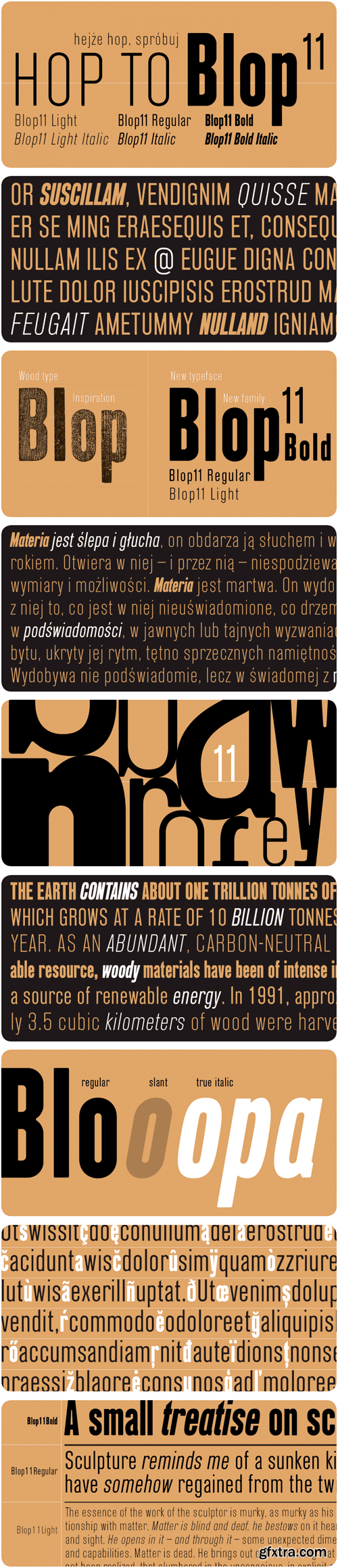
https://www.myfonts.com/fonts/osialus/blop11/
Blop11 is a geometric sans-serif type family, consisting of 3 weights. Blop11 Bold is inspired by 1800s-style wood, poster typeface. Owing to its rounded terminals, Blop preserves natural organic quality of wood typeface. The Regular and Light versions are contemporary original projects. Blop11 is well-suited to headlines and short text.


Jellyfish Font
Jellyfish is a lovely font that combines copperplate and contemporary styles, and features a dancing baseline. It is perfectly suited for a wide variety of projects!
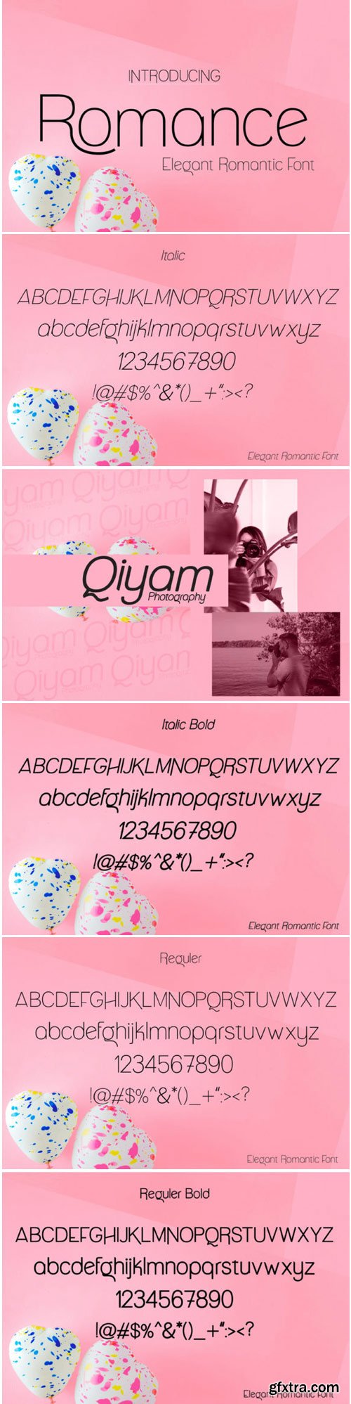
Romance Font
Romance is a modernly minimalist font with beautiful ligatures and tons of special alternative glyphs. Fall in love with its charming look & feel!

Rollex II Font
Rollex II is an elegant display font with curly characters. Get inspired by its contemporary coolness!

Nathasya Font
Nathasya is a fresh & modern script that features a handwritten calligraphy style and is packed with decorative characters. It will add a romantic touch to any crafting project!

Antagonist Font
Antagonist is a beautiful script font with elegant style. Get inspired by its flowing curves!
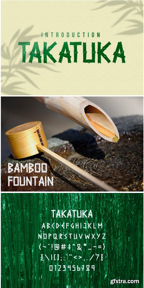
TakaTuka Font
TakaTuka is a bamboo inspired display font with exciting character. Fall in love with its friendly look & feel!


Featuring:
28 Seamless pattern brushes for texturing and shading
103 Floral pattern brushes
57 Floral stamp brushes
75 Acrylic brushes
57 Watercolor brushes
330 Artistic stamp brushes
8 Background paper textures
20 Background watercolor textures
12 Background acrylic textures


This is a hand drawn watercolor autumn floral graphic elements. The kit contains 96 separate files including flowers, leaves and branches; 16 floral backgrounds; 7 watercolor textures. And 32 seamless patterns.
JPG Image | Transparent PNG