
https://www.revolvertype.com/typefaces/dinamit/
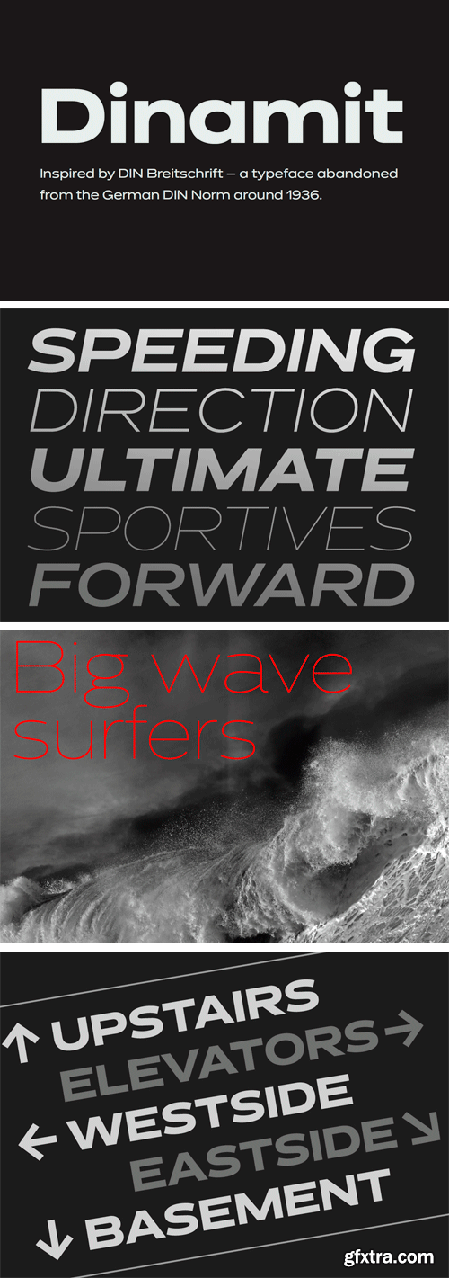
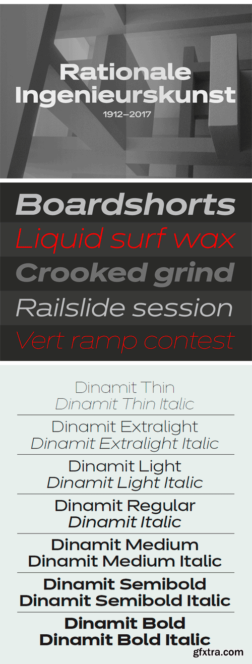
Dinamit is a grotesque of lavish width. It started out as a reinterpretation of DIN Breitschrift, the extended member of the DIN 1451 trio defined by the German standards body in the 1930s. With its stretched look, DIN Breitschrift was never as widely used as its regular and condensed siblings. Lukas Schneider has resurrected this forgotten style and eliminated all of its awkwardness while maintaining its rigor, transforming letterforms made by engineers into an alluring tool set for contemporary designers. Dinamit spans seven weights from Thin to Bold with seemingly monolinear strokes, complemented by obliques.
It provides the amenities of a cutting-edge font family, like small caps, various sets of numerals, and arrows. All styles come with a number of alternates, organized in five handy stylistic sets. For example, Stylistic Set 5 swaps all round dots for square ones, lending the typeface a more technical feel. For those who are fond of DIN Breitschrift’s stiffness, Set 2 brings some of that back with unapologetically boxy forms for ‘a’ and ‘ß’.
TO MAC USERS: If RAR password doesn't work, use this archive program:
RAR Expander 0.8.5 Beta 4 and extract password protected files without error.
TO WIN USERS: If RAR password doesn't work, use this archive program:
Latest Winrar and extract password protected files without error.


